UI permission checks that avoid false confidence traps
UI permission checks should guide what people can try, but the backend must still enforce every action. Learn a simple way to shape screens safely.
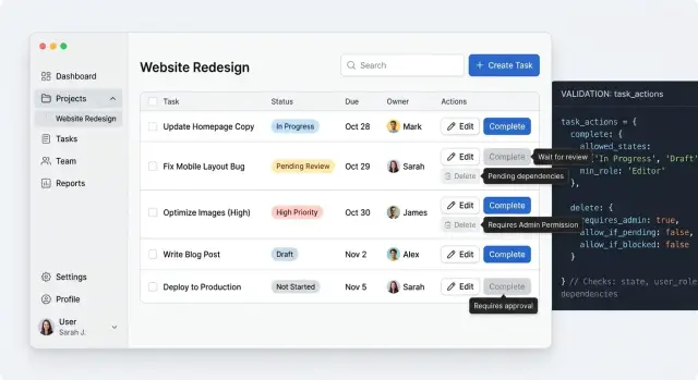
Table of Contents
Why this goes wrong in real products
Most permission bugs look small at first. A user sees an action, clicks it, and gets denied by the server. Nothing leaked, but the screen still feels broken.
That mismatch is common because people judge a product by what they can try, not by what your API blocks later. If a page shows "Delete project" or "Change billing plan," users assume they can use it. When the backend says no, they do not think security worked. They think the app wasted their time.
The opposite problem is just as frustrating. Some teams hide every control unless they are completely sure the user can use it. That sounds tidy, but it often leaves people guessing. They land on a page with half the actions missing and no clue whether they lack access, need a higher plan, or opened the wrong screen.
UI permission checks also drift over time. The backend rule changes because of a new role, a trial limit, or an exception for account owners. The frontend keeps the old logic because nobody updated the page. A month later, support sees a strange mix of problems: buttons that appear but fail, actions that should show but do not, and screens that behave differently depending on where the user clicks.
One mistake sits underneath all of this. Teams treat hidden buttons as security. They are not. Hiding a control can reduce confusion, and that matters, but the backend still owns enforcement. If the server does not check the action, anyone who can call the endpoint directly can still try it.
This gets worse as features pile up. One small gap on a billing page turns into another on invoices, another on seat management, and another in admin settings. Each gap looks harmless on its own. Together they create a product that feels random.
That is why role-based UI gets messy so quickly in growing products. Teams ship one screen, copy its rules to the next screen, then patch exceptions one by one. After a while, nobody trusts what the page shows, and nobody can explain why one user sees a button that another user never gets.
What the UI decides and what the backend decides
The UI should help people understand what they can try, what will happen next, and where they will hit a limit. That means showing or hiding actions, disabling controls when a rule is clear, and adding short notes like "You need admin access to change this." Good UI permission checks save time. They cut down on clicks that can only end in rejection.
Still, the browser does not get the final say. Anyone can change a request, replay it, or call the API outside the page. If the server trusts the screen, the rule is already broken.
A simple split works well. The UI decides what to show, enable, and explain. The backend decides whether a read or write is allowed. The UI tries to prevent obvious dead ends, and the backend checks every request anyway.
That split avoids false confidence. A hidden button is only a hint to the user. It is never protection.
Write actions need the strictest checks. If someone tries to delete a record, invite a user, change a plan, or export private data, the server must verify the permission every time. The same applies to reads when the data is sensitive. If a person should not see payroll numbers, private notes, or another team's settings, the API must block that data even if the page asks for it.
The UI still has real work to do. It can make the rule feel clear instead of random. If a user opens a form but cannot save changes, tell them before they spend ten minutes editing. If a page shows part of a feature but not the risky action, explain why the action is unavailable.
Clear answers from both layers matter. The screen should set expectations early. The server should return a plain result when it approves or rejects a request. Then the UI can show a useful message instead of a vague error.
A good rule is simple: let the UI guide behavior, but let the backend protect the system. When both do their part, users waste less time and your app stays safe even when the browser lies.
Start from actions, not role names
Role names look neat on a whiteboard, then fall apart in the product. "Admin" or "manager" can mean one thing on one screen and something else on another. The UI should ask a simpler question: what may this person try to do here?
Start with the screen, not the org chart. Write down the actions a real person reaches for when they open that page: view the page, create a new item, edit existing data, delete something, or approve a sensitive change.
That list sounds basic, but it exposes the real rules fast. A user may view a customer record but not edit billing details. Someone else may edit a draft but never approve it. Approval, deletion, and money movement usually need tighter checks because the cost of a mistake is higher.
Risk should shape the UI. Low-risk actions can stay visible and easy. Higher-risk actions may need a clearer explanation, an approval step, or no control at all. This is where permission design starts to matter. The screen should not promise actions the user cannot finish.
Keep one action map
Scattered role checks age badly. If ten components each say role === "admin", the screen starts lying as soon as the business adds a new role or changes a rule. One button updates, another does not, and people lose trust.
A better pattern is to name actions once, then map roles to those actions in one place. The UI checks action names such as invoice.view, invoice.edit, or invoice.approve. Roles map to those permissions behind the scenes. When rules change, you update the mapping instead of hunting through the whole app.
This also makes product discussions clearer. "Support can refund up to $50 but cannot close an account" is easier to review than "support is almost admin." Action-based rules sound less tidy at first, but they match how people actually work and leave much less room for false confidence.
A simple build order
If you start with the screen, you usually end up guessing. The safer order starts on the server. Write the rule for each action first: view, edit, delete, invite, approve, export. Keep that rule next to the endpoint that does the work. That is where backend enforcement lives.
Then let the page response tell the UI what the current user may do right now. Send the page data and a small set of allowed actions together. For example, the response might say a user can update_plan and download_invoice but cannot change_owner. That is easier to trust than reading a broad role name and hoping it means the same thing everywhere.
A short sequence works well:
- Define the server rule for each action and test it.
- Return page data and allowed actions in the same response.
- Render buttons, menus, and empty states from those actions.
- Send every click back to the server, even if the UI allowed it.
- If the rule changed during the session, show a short error and move on.
This is where frontend authorization helps most. It shapes the screen so people do not waste time clicking things they cannot use. It does not replace the server check. A tab can stay open for hours. Someone can change a role, remove a user from a team, or lock a feature after a billing change. The UI can only reflect what it knew when it rendered.
When that mismatch happens, keep the message plain. "You no longer have access to this action" is enough. If a refresh will fix the screen, say that. Do not dump internal rule names into the error.
This server-first order also holds up well as products get more complex. It keeps the rule in one place, lets the UI read the result, and avoids the false confidence that causes the worst permission bugs.
Example: a team billing page
A billing page is a good test for UI permission checks because people with different jobs all need something from the same screen. If the page only thinks in role names, it gets messy fast. If it thinks in actions, the UI stays clear and the server keeps control.
Start with the workspace owner. This person can change the billing plan, update payment details, and confirm upgrades. The screen should show those controls plainly. No hidden menus and no disabled buttons that make them guess.
A finance lead often needs less. They may need invoices every month, cost history, and tax details, but they should not touch the saved card or switch the plan. On the same page, they can download invoices and review charges, while plan controls and card actions stay out of view.
A regular member may only need spend details. They can see the current plan, usage, renewal date, and recent charges, but the page should not invite them to edit anything. It can stay useful without pretending they have control.
This is where action-based checks beat broad role labels. Instead of asking whether someone is an admin, ask whether they can view invoices, update payment details, or change the plan. The UI becomes easier to reason about, and the API still verifies every one of those actions when the request arrives.
Show limits without making the screen useless
A locked screen can still help people finish their job. Good UI permission checks do not turn every restricted page into a dead end. They show what a person can see, what they can ask for, and what they cannot do right now.
Disable an action when the user needs to know that action exists. A grayed-out "Delete project" button tells a team member that deletion is possible, but reserved for someone else. That matters when people need to understand the workflow, ask an admin for help, or confirm that the product supports the action at all.
Hide an action when showing it would only create noise. If a user will never manage SSO settings, the SSO tab can disappear from their view. Showing blocked controls everywhere does not teach them much. It just makes the page feel broken.
A simple rule helps. Disable when visibility teaches the product. Hide when visibility adds clutter. Show a short reason next to blocked actions. Keep read-only data visible when it is safe.
That short reason matters more than many teams expect. "Only workspace owners can edit billing" is enough. "You need the Finance Admin permission" is even better when roles get more specific. People stop guessing, and support tickets drop because the screen answers the first question for them.
Read-only access often does more good than full lockdown. A person may not change team roles, but they may still need to see who has access. They may not update a payment method, but they may need to check the current plan, renewal date, or invoice status before they ask a manager to step in. When you hide all of that, people have to ask around for basic facts.
Blank pages are usually a bad sign. If someone has limited access, give them a reduced version of the page instead. Show the safe details, block the risky actions, and add one clear path forward, such as asking an owner or requesting access. That keeps the screen useful without pretending the frontend has the final say.
The backend still enforces every real rule. The UI just helps people understand the boundaries before they hit an error.
Mistakes that create false confidence
Most broken UI permission checks fail in quiet ways. The screen looks careful, buttons disappear, and everyone feels safe. But the browser is not a trusted place. If your app treats a role value in local storage, a cookie, or client state as truth, a user can change it, or it can simply go stale.
That problem gets worse when teams copy permission rules into many components. One page checks canEditBilling, another checks role === "admin", and a modal uses its own version from six months ago. Soon the app disagrees with itself. Keep client rules in one place, use them for display only, and let the server make the final call every time.
Another common trap is showing success before the server confirms the action. A user clicks "Delete," the row disappears, and a toast says it worked. Two seconds later the server rejects the request because the user lost access five minutes ago. Now the UI has lied. For actions tied to money, access, or destructive changes, a short loading state is usually better than fake certainty.
Old permission data causes the same kind of confusion. Imagine a finance lead removes billing access from a manager during a meeting. The manager still has the billing page open in another tab. If the app keeps permission data for too long, the page still shows edit controls and invites an action that will fail. Refresh permission data when users switch teams, change plans, enter sensitive screens, or return after a long idle period.
Teams also forget the paths that do not start with a visible button. Bulk actions in tables, CSV imports, bookmarked URLs, keyboard shortcuts, and retry flows after a failed request all need the same checks. Users do not follow the neat path designers had in mind. They paste links into a new tab, reopen old pages, and run imports with outdated access.
Good role-based UI reduces confusion. It does not prove authority. If someone can attempt an action from any path, the backend still needs to stop or allow it there.
Quick checks before release
A screen can look safe and still tell you a lie. The usual lie is simple: the button is gone, so the action must be blocked. Before release, test the screen the way a real person breaks it, not the way the happy path describes it.
Open the same page with every role you support. Do not stop at the first load. Click around, open drawers, edit a field, and watch what changes. Many bugs hide in cached page state, where one role sees controls left over from another session.
Then bypass the page on purpose. If a user cannot see "Delete invoice," send the action request anyway. Use browser tools, a saved request, or a tiny script. The backend must reject it every time. UI permission checks lower confusion. They do not replace backend enforcement.
Partial refreshes deserve extra suspicion. Change a user's role, then refresh only the panel or modal that usually updates in place. If the screen still shows old actions, people get mixed signals. Worse, they may start a task they can no longer finish.
Use the back button too. Reopen an old tab after a role change and see whether the page quietly trusts stale data. Single-page apps often keep more state than people expect, and that can make the UI look correct until one old view slips through.
Also interrupt a task with an expired session. Start editing, wait until the session dies, then click save. The app should explain what happened in plain words and keep as much user input as it can. "Your session expired. Sign in again to save changes" is better than "403 insufficient privileges."
Read each denial message out loud. If it sounds like a server log, rewrite it. People need three things: what they tried to do, why it failed, and what they can do next.
Ten minutes of checks like these can catch the bugs that polished demos miss.
Next steps when the rules start to sprawl
Permission logic rarely stays small. A product starts with simple roles, then exceptions pile up. Contractors can view invoices but not download them. Team admins can edit billing, except during a renewal window. Support staff can enter an account for troubleshooting, but they cannot change a plan. Once that spreads across many pages, scattered checks in view code start to drift.
UI permission checks age better when the team treats permissions as product rules, not page logic. Move scattered rules into one shared model. That model can describe the action, the resource, the scope, and the denial reason. The UI uses it to decide what to show, disable, or explain. The backend still enforces every request.
This shared model does two practical things. It cuts down on contradictions between screens, and it gives designers, engineers, and support staff the same language. Instead of saying "billing is weird for admins," people can point to a specific rule and fix the screen or the API.
After launch, denial errors deserve a review. They show where the screen gave users false confidence. If many people click "Edit card" and then hit a 403, the problem is not only access control. The page invited an action that would never work. A short note on the page can save wasted clicks and angry tickets.
Support usually spots the pattern first. Ask which screens trigger the same permission questions every week. Billing, member management, exports, and destructive actions are common trouble spots because people assume a visible screen reflects their full access. Often, it does not.
Before a large release, do a short permission review. List the actions a user may try, map each action to the real backend rule, write the denial message before shipping, and test one allowed path and one blocked path for each action.
If the rules now touch many parts of the product, this is no longer a small frontend cleanup. It is product flow work and backend boundary work. That is often the point where outside review helps. Oleg Sotnikov does this kind of product architecture and Fractional CTO work through oleg.is, helping teams simplify messy permission models before they harden into policy code.


