UI composition patterns for enterprise setup flows
UI composition patterns for enterprise setup flows help teams split long onboarding into reusable steps, reorder them, and avoid rewrites.
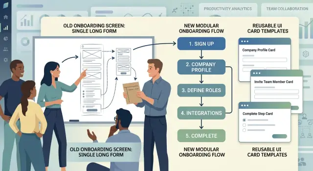
Table of Contents
Why long setup screens break down
A long setup screen looks efficient on paper. One page, one save button, one place to finish onboarding. In practice, it turns into a pile of unrelated decisions that are hard to scan, test, and change.
The first problem is coupling. When teams put company details, billing rules, user roles, security settings, and integrations on one screen, a small change in one area often spills into the others. A new tax field should not affect how SSO settings render, but on a giant shared form it often does. That's where maintenance gets expensive.
Order becomes a bigger fight than content. Instead of asking, "What does the admin need right now?" teams argue about whether permissions should sit above branding, whether billing should come before users, or where legal settings belong. Those debates drag on because the screen is one big block. Move one section and everything around it shifts.
Admins feel that mess too. Halfway through a long form, people forget why they're entering certain details and what they already finished. Enterprise onboarding can ask for dozens of inputs. If the screen doesn't separate them into clear business steps, users lose context, skim labels, and make more mistakes.
QA pays for it again later. A tiny copy edit can trigger a full regression pass because the page is packed with conditional logic. Testers have to check the whole screen, not just the part that changed. Release cycles slow down for reasons that have nothing to do with real product risk.
A setup screen should not behave like a giant document. It should behave like a set of focused tasks that teams can move, update, or remove without rewriting the whole experience.
If one page keeps causing debates, bugs, and retesting, the wording usually isn't the real problem. The screen is doing too many jobs at once.
Split the flow by business step
Start with the user's job, not your data model. When a setup flow mirrors database tables, the form feels random. People see account fields next to billing rules and permission settings even though those choices happen at different moments.
A better split follows real work. Each step should help the user finish one business task and reach one clear outcome. When that outcome is done, the next step can begin.
For a typical enterprise onboarding flow, the sequence often looks like this:
- Company info: name, region, and basic identity
- Users: invite teammates now or later
- Billing: choose a plan, add payment details, or request an invoice
- Permissions: decide who can approve, edit, or view
This works because each step answers one question.
Give every step a clear contract
Each step should behave like a small feature with fixed inputs, outputs, and rules. If a team can answer "what does this step need, what can it change, and what happens when it finishes?" they can move that step around without breaking the rest of the flow.
Write that contract down before building the UI. Keep it short enough that a designer, product manager, and engineer can all read it quickly.
For each step, define:
- what data it reads
- what data it writes back
- when it becomes available
- what must be true before the user can continue
- what side effects it triggers
Side effects need extra care. A step that only collects input is easy to move. A step that creates a workspace, charges a card, or sends invitation emails changes real data outside the screen. Make those actions explicit. Don't hide them inside a field component or a generic "Next" button.
Events matter too. Other steps often need to react when something changes. If the billing step emits "billing_country_changed," the tax step can update its fields without hard wiring the two together. That keeps the flow flexible. Teams can add, remove, or reorder steps with less cleanup.
A simple example makes this clearer. Imagine a setup flow with "Create company," "Choose plan," and "Invite team." The invite step should not guess whether the company exists yet. Its contract should say it needs a company ID, it writes a list of invited emails, it can finish with zero invites, and it may send email only after the user confirms. That's much safer than burying those rules inside the page.
Loose screens lead to rewrites. Clear contracts keep changes local.
Build with stable parts
A good setup flow usually follows one simple rule: keep the frame stable and swap the step content inside it. Teams move faster when they don't rebuild the whole screen every time legal, billing, security, or user roles change.
A shared shell does most of the dull work. It handles the page title, back and next actions, progress, errors, and save state. Once that shell is solid, teams can rearrange steps without touching layout code in five places.
Then each step can focus on one job. A company details step collects the company name, region, and tax info. An access control step handles admins, roles, and approval rules. If the order changes, the shell stays the same and the steps move like blocks.
A simple setup often has four layers:
- one shell for navigation, progress, and page actions
- one step component for each business task
- small field widgets such as pickers, selectors, and upload inputs
- reusable summary cards for review screens and confirmation
This separation matters because field widgets should not hold business rules. A country selector should only select a country. It should not decide whether VAT is required or whether a company can invite contractors. Put those rules in the step logic or a domain layer so policy can change without rewriting the widget.
Review pages are another common waste point. Teams build a special confirmation screen, then rebuild the same information again in account settings, admin pages, and approval flows. Reusable summary cards fix that. The same card can show billing details during setup, on the review step, and later on the account overview page.
A useful test is simple. If you can insert a new compliance step between billing and user invites without changing the shell or rewriting field widgets, the structure is doing its job.
Put state and validation in the right place
A setup flow gets messy when every field writes straight into one shared store. Users type half an answer, switch steps, and now the whole flow treats the data as final. That's where strange validation bugs begin.
A better pattern is simpler: let each step manage its own draft while the user is editing. When they click Continue, the step commits clean data to the shared flow model. That gives teams more freedom to move steps around because each step has a narrow job and clear boundaries.
Keep drafts separate from shared flow data
Think of the flow as having two layers. Inside a step, keep temporary state close to the fields. Across the full setup, keep only the data that other steps actually need.
For example, a company setup step may collect legal name, billing country, and tax ID. While the user types, that data stays inside the step. After they continue, the flow saves the approved values in one central model. A later billing or compliance step can read from that model without caring how the earlier screen was built.
This also makes back buttons less painful. If the user returns to a step, you can load the saved values, let them edit again, and update shared data only when they confirm the change.
Validate at the right time
Fast checks should run early. Empty required fields, wrong date formats, and obvious length limits should appear while the user is still on the step. These checks are cheap and help people fix problems before moving on.
Slower checks should wait until they matter. If you need to verify a tax number, check domain ownership, or call an internal policy service, run that when the user continues or when they reach the step that depends on it. The screen stays responsive.
When something blocks progress, show the error next to the step that caused it. Don't drop a vague message at the top of the whole flow. If the billing step failed, the billing step should own that message. People fix problems faster when the screen points to the exact field or section that needs attention.
Example: setting up a new company account
A company admin opening a new workspace should move through decisions in the same order the business makes them. One long screen usually mixes legal details, login rules, billing, and data import into a mess. A modular flow keeps each step focused.
Start with the company profile and region. The admin enters the company name, business unit, and where the team operates. Region is not a minor detail. It can affect tax settings, language defaults, data handling rules, and which later options make sense.
After that, the flow can branch based on how people will sign in. If the company already uses SSO, the next step should ask for identity provider details and test the connection. If it doesn't, the product should skip straight to password rules, invite settings, and reset policies. Most teams do not want to read both paths.
Billing usually works better a little later. First set workspace limits such as seat count, storage, or usage caps. Before those limits are clear, pricing feels vague and the admin can't make a clean choice. After that, the billing step can show the right plan, expected cost, and who will own payment.
Data import belongs near the end. Teams often rush this part and pay for it later. If users import employees, customers, or documents before roles and permissions exist, they can give access to the wrong people on day one.
Set roles first, then import. The admin decides who can manage billing, who can invite users, and who can only view data. After that, the import step can map records to the right owners and default access rules.
This order feels natural because each step unlocks the next one. It also gives product teams room to adapt the flow without rewriting the whole screen. A smaller customer might skip SSO and import completely, while a larger company might add approval steps in between.
Move from one long form to modular steps
Most teams don't need a full rewrite on day one. Start by mapping the screen you already have. Print it, sketch it, or list every field in a doc. Then mark the places where the user changes mental context, such as company details, billing, team roles, or security settings. Those are the likely step boundaries.
Don't rebuild the entire flow at once. That's how teams lose weeks and still ship something that feels unfinished. A better move is to split the old screen into three or four steps first, even if some parts still use the old form under the hood.
A practical first pass usually looks like this:
- audit the current screen and group fields by business task
- choose a small first cut, usually the parts users already understand
- place the existing form inside a temporary step shell so the new flow can ship early
- move one domain area at a time into its own step component
- test each move before touching the next area
The temporary shell matters more than it sounds. It lets product and engineering teams change the order of steps, add progress, and track completion without waiting for a full rewrite. Users get a cleaner flow right away while the team keeps risk low.
Say your current onboarding screen mixes company name, legal info, user invites, permissions, and payment on one page. Start by breaking out company details and invites as separate steps. Leave the rest inside a "More setup" step for now. That isn't perfect, but it's already easier to use and easier to change.
Add analytics as soon as the steps exist. Track where users stop, how long each step takes, and which fields trigger retries or errors. Those numbers settle arguments quickly. If 40 percent of users quit at permissions, you know where to focus next.
A staged migration is often faster than a clean rewrite. Better still, it gives the team proof that each change helped or hurt.
Mistakes that lead to rewrites
Rewrites often start with one bad split. Teams divide the flow by internal ownership instead of by the job the user is trying to finish. That may look tidy on an org chart, but it makes the product feel stitched together.
A buyer setting up a new company account doesn't think in terms of the billing team's screen and the security team's screen. They think, "I need to get this account ready today." If each team builds its own section with its own assumptions, moving one step later can break two others.
Another common mistake is letting one step reach into another step's internals. A company profile step should not quietly change billing flags or identity settings that live somewhere else. Once steps do that, they stop being reusable. A small reorder turns into a hunt for hidden dependencies.
Hidden required work causes the same damage. Teams sometimes tuck important fields into a side panel, an accordion, or an "advanced" area because the main screen already feels crowded. Users skip it, then hit a validation error at the end, or worse, they finish with defaults nobody meant to choose.
Step order causes trouble too. Teams rearrange screens to improve completion rate, then forget to revisit validation and defaults. A step may work only because an earlier screen filled in region, company type, or admin permissions. Move that step, and empty values start leaking through the flow.
A few warning signs show up early:
- the same field appears in more than one step
- one step can't render without another step's local state
- an "optional" panel contains fields the user must complete
- changing step order also changes business rules
Good setup screens keep each step narrow, explicit, and a little boring. That may not look clever, but it lets teams reorder screens in a day instead of rewriting half the flow.
Checks before release
A modular setup flow is not ready just because each screen works on its own. Release it only after you test how a real admin moves through it, skips around, refreshes the page, and comes back later.
Start with step titles. Give them to someone new to the product and ask what they think each step does. If they can't explain a step from the title alone, the label is too vague or the step mixes two jobs. "Company details" works. "Configuration" usually means almost nothing.
Then test the structure, not just the UI. A good modular flow lets the team remove or reorder one step without breaking the others. If deleting "Billing" breaks "Users and roles," the steps are still coupled in the wrong place.
A short release checklist helps:
- refresh the browser on every step and confirm saved progress returns
- leave the flow halfway through, sign in again, and check that setup resumes in the right place
- remove one step in a staging build and make sure navigation, validation, and summaries still work
- open the review screen with missing fields and confirm it points to the exact step that needs attention
The review screen matters more than many teams expect. It should not dump a wall of errors after submit. It should show what is missing before submit, in plain language, and let the admin jump back to fix it quickly.
One simple test catches a lot: create a fake company account, fill only half the flow, refresh twice, skip one optional step, and try to finish. If that path feels messy, users will feel it too.
What to do next
Pick one setup flow and fix that first. Choose the one that creates the most friction: the screen people abandon, the form sales has to explain on calls, or the setup that creates the most support tickets. A messy flow gets much easier to improve when you solve one real problem instead of trying to clean up the whole product at once.
Before anyone opens Figma or starts coding, draw the step map on one page. Keep it plain. List each business step, the input it needs, the rule that decides whether a user can continue, and what the product should save at that point. If two teams can't agree on the order or ownership of a step, that's a product problem, not a design problem.
A good first pass is straightforward:
- split the current long screen into business steps
- note which steps are fixed and which may change by customer type
- write the contract for each step: inputs, outputs, validation, and save behavior
- build one pilot flow with as few custom cases as possible
- watch a real team use it before rolling it out wider
That pilot matters more than a polished mockup. Ask a customer success or sales team to use the new flow with a real account. They'll spot confusing labels, missing fields, and awkward step order quickly. You don't need a full redesign to learn a lot. Even five live setups can show where the boundaries between steps are wrong.
If the pilot works, move the next high-friction flow into the same pattern. Reuse the same step shell, navigation, state rules, and validation rules where you can. The hard part usually isn't the UI. It's agreeing on where one step ends and the next begins.
If your team needs a second opinion on that boundary work, Oleg Sotnikov at oleg.is does this kind of product and architecture review as part of his Fractional CTO advisory. It can help when product, design, and engineering all see the same setup flow differently.
Frequently Asked Questions
Why is one long setup screen a problem?
One big screen mixes unrelated decisions and makes every change riskier. Users lose context, teams argue about order, and QA has to retest too much.
Split the flow when the page covers different business tasks like company info, billing, roles, and security. That keeps changes local and makes the setup easier to follow.
How do I decide where one step ends and the next begins?
Start with the user's job, not your tables or team structure. Group fields by the task the admin wants to finish in that moment.
A good step answers one clear question and gives one clear outcome. If a step mixes two jobs, split it again.
What should every setup step define?
Give each step a small contract. Write down what data it reads, what it saves, when it unlocks, what blocks progress, and which side effects it triggers.
That keeps rules out of random field components and lets the team move steps without breaking the whole flow.
Should fields save straight into a shared store?
Let each step hold its own draft while the user edits. Save clean values to the shared flow only when the user continues.
This pattern cuts down on strange cross-step bugs and makes back navigation much easier to manage.
When should I validate data in a setup flow?
Run simple checks inside the step while the user types. Catch empty required fields, bad formats, and obvious length issues early.
Save slower checks for continue actions or for the step that depends on them. When something fails, show the error right where the problem started.
How should I handle optional steps like SSO or data import?
Treat optional paths as separate steps with clear entry rules. If a company uses SSO, show the identity step. If not, skip it and move on.
Do not make users read both paths. The flow should ask only for what the company needs.
What order usually works for company onboarding?
Most company setups work better when you start with company details and region, then handle sign-in rules, then limits and billing, and only then import data.
Set roles before import. That helps the system place records under the right owners and access rules from day one.
Can I move from a long form to steps without a full rewrite?
No. Start with the current screen and mark the places where the user changes mental context.
Break out two or three obvious steps first and keep the rest inside a temporary catch-all step. You can ship that early, learn from real usage, and keep risk low.
What signs show that my steps are still too tightly coupled?
Watch for repeated fields, hidden required inputs, and steps that need another step's local state to render. Those signs mean the flow still has hidden dependencies.
Another bad sign shows up when changing the order also changes business rules. Step order should not carry secret logic.
What should I check before I release a new step-based flow?
Test more than the happy path. Refresh on every step, leave halfway through and come back, skip an optional step, and open the review screen with missing data.
Also try removing one step in staging. If navigation, summaries, or validation break, the structure still needs work.


