Token streaming in AI: when it helps and when it distracts
Token streaming can make AI feel quicker without reducing total wait time. Learn when it builds trust, when it distracts, and how to test it.
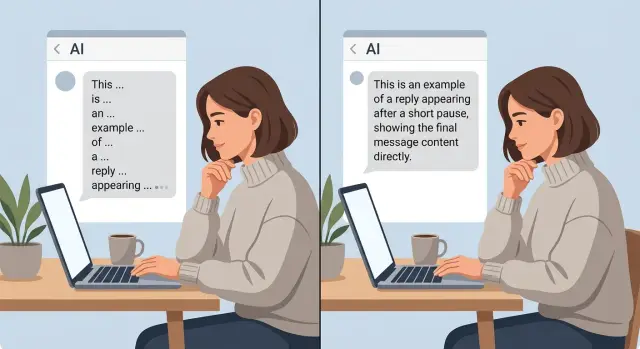
Table of Contents
Why streaming feels faster than it is
People judge waiting by the first sign of life. If a reply starts to appear almost at once, users feel the system is working, even if the full answer still takes several seconds.
That is why token streaming changes the mood of a wait more than the stopwatch. A blank screen feels longer than it is. A moving reply feels shorter because people stop asking, "Did it freeze?"
The total time can stay exactly the same. Imagine two answers that both finish in 8 seconds. In the first version, the user sees nothing for 8 seconds and then the full reply appears. In the second, the first few words show up after half a second and the last word still lands at 8 seconds. Same completion time, very different experience.
Early motion also lowers anxiety. In a chat UI, silence often looks like failure. Users may think their message did not send, the model got stuck, or the page needs a refresh. Even a small trickle of text can calm that fear. People often forgive a slower finish when progress starts early and stays visible.
This is mostly about perceived performance, not raw speed. The system did not get faster. The user got feedback sooner. That distinction matters because teams sometimes treat AI response streaming as a performance win when they only changed presentation.
There is a simple reason this works. People react to milestones, not just totals. "It started" is a milestone. "It is still moving" is another. Those moments break one long wait into smaller parts, and smaller parts feel easier to tolerate.
Token streaming works best when the first words arrive quickly and continue at a steady pace. If the text starts, stalls, then jerks forward, the effect weakens. Users notice the pause, and the old doubt returns.
When streaming feels faster, the interface usually reduced uncertainty. That is useful. It is easy to confuse with real speed, and they are not the same thing.
What changes when words arrive one by one
Streaming splits one wait into two waits. First comes time to first token, which is the delay before any text appears. Then comes time to final answer, which is the full time until the answer is done. Users feel both, and teams should measure both. A fast start does not always mean a fast result.
That split changes how people judge the system. A quick first token tells them the app is awake and working. Silence feels risky. Moving text feels safer. Still, the total job may take just as long as before.
People also read differently when words arrive in a stream. They rarely sit back and wait for the final paragraph. They skim the first line, decide whether the answer looks relevant, and start planning their next move while the model keeps writing.
A support chat makes this easy to see. If the reply starts with "I found the failed payment and the card was declined," the user already knows where this is going. They can open billing settings, check another card, or get ready to ask a follow-up before the full explanation lands.
Early words help most when they give direction fast. A clear opening sentence, a short answer followed by detail, or the first step of a fix can save a few seconds of hesitation. That matters in chat because users are not only waiting. They are deciding.
Streaming does not fix slow retrieval, slow tools, or slow back-end work. If your system spends four seconds searching documents and three more calling an API, users still wait seven seconds for the full answer. Streaming only changes what they see during that wait. In some cases it makes the delay more obvious, especially when text starts, stalls, and starts again.
So the interface changes from one silent pause to a visible process. That can feel better, but only when the first words give real signal and the pauses between them stay short.
When streaming builds trust
People relax when a long answer starts moving within about a second. A blank screen for three seconds often feels broken, even if the total wait is the same. The first few words tell the user that the system heard them and started working.
Token streaming works best when the opening is clear and steady. If the reply begins with a direct sentence instead of filler, people stop wondering whether the app froze. This matters most for replies that take time to build, like summaries, plans, code suggestions, or answers that pull from several sources.
Small progress cues help too. A plain note like "thinking," "checking your files," or "drafting answer" can make the wait feel honest if it matches what the system is actually doing. Most people do not need fancy motion. They want a simple sign that the app is alive and some hint about what stage it has reached.
Trust also grows when users can catch a bad turn early. If the model starts answering the wrong question, names the wrong product, or heads into too much detail, people can see that before the full reply lands. That makes the system feel less like a black box. It also saves time because users can stop the answer and correct it instead of waiting through a full mistake.
This changes the rhythm of the conversation. A person can interrupt, add missing context, or ask a follow-up while the reply is still unfolding. In a chat UI, that feels closer to a real exchange than a long silent pause followed by a wall of text.
Streaming does not make the model smarter. It makes the process easier to read. When people can see progress, notice direction, and step in early, they usually trust the experience more.
When streaming adds visual noise
Streaming can make a weak interaction feel busier, not better. If the reply is only a few words long, showing each token arrive one by one turns a half-second wait into a twitchy little performance.
A support bot that types "Yes, you can change that in settings" letter by letter does not feel thoughtful. It feels slow. For short answers, most people would rather see the whole sentence at once.
The cursor causes its own problem. People track movement without trying, so a blinking caret at the end of each new fragment keeps pulling the eye away from the message. Instead of reading for meaning, they end up watching the typing effect.
This gets worse when the model changes course while it streams. A sentence starts one way, then shifts, then replaces its own opening. Users do not read that as careful reasoning. They read it as doubt.
Fast bursts of text can also hide a slow final result. Some interfaces spit out a few words quickly, pause, then dump the rest. The screen looks active, but the user still waits the same amount of time for the full answer. The animation covers up delay instead of fixing it.
On mobile, the downside is harder to ignore. Text wraps more often, lines jump, and the reading position moves while the answer is still growing. If someone is holding a phone in one hand or reading in a noisy place, that shifting layout gets old fast.
Streaming usually hurts when the reply is shorter than a sentence or two, when the model tends to rewrite its early phrasing, when the UI leans on an aggressive cursor or typing effect, or when most users read on phones instead of large screens.
A calm interface usually wins here. If the user gains nothing from watching the words arrive, token streaming is just motion on the screen. For quick replies, a stable block of text often feels clearer, faster, and more confident.
How to decide if you should stream
Do not turn on token streaming just because it looks modern. Make the choice from timing and user behavior. A response that arrives in 700 milliseconds does not need words trickling onto the screen. A response that takes 8 seconds often does.
Start with two numbers for every reply type: time to first token and time to final answer. The first tells you when users see life on the screen. The second tells you how long they actually wait. If the gap is tiny, streaming changes very little. If the gap is wide, streaming can make the wait feel less uncertain.
Sort replies by wait length
Put your replies into simple groups: short waits, medium waits, and long waits. You do not need fancy labels. You need patterns.
For short waits, use a plain loading state. A spinner, typing dots, or a short "Thinking..." message is often calmer than text that starts and stops after a split second. Fast answers should feel clean, not busy.
For medium waits, test both options. Some teams find that streaming helps when the answer is a bit longer and users want to see progress. Others learn that partial text causes more rereading than comfort.
For long waits, streaming usually earns its place. Users can see that the system is working, and they can start reading before the full answer lands.
A simple rule works: if replies finish before a brief pause, do not stream them. If replies often take long enough for users to wonder whether the system froze, stream them. If answers arrive in bursts or revise themselves a lot, test carefully before rolling streaming out.
Watch what users actually do
Behavior tells you more than opinions. Look at where users stop reading, cancel, send the same prompt again, or ask a follow-up because they missed part of the answer. Those moments show friction.
If streaming lowers repeat prompts and fewer people abandon the reply, keep it. If users interrupt more often, skim poorly, or wait for the final text anyway, the moving text is probably visual noise.
This product choice looks subjective until you measure it. Once you compare short, medium, and long waits against real user actions, the better option usually becomes obvious.
A simple example from a support chat
A customer opens a support chat and asks, "Why was I charged twice this month?" The assistant cannot answer from memory. It needs to check the billing record, match the invoice dates, and confirm whether the second charge is real or just a pending hold.
This is where streaming can help. A short pause, then a brief line such as "Checking your latest billing activity now" tells the customer that the system started working. That tiny delay feels natural because a billing lookup should take a moment.
Once the system has the result, the first streamed line should answer the question right away: "You were charged once for your plan renewal, and the second item is a temporary card hold." That gives the user relief in one sentence. After that, the chat can add the invoice date, the amount, and what happens next.
That order matters more than the streaming itself. If the assistant starts with filler like "I understand your concern" or "Let me look into this carefully," the user still does not know whether money actually left the account. Words appear on screen, but no real progress shows up. That kind of token streaming looks busy, not helpful.
A better pattern is simple: show a short sign of work, then give the answer, then add detail if detail helps. In a billing chat, people usually want the result before the explanation.
The opposite case is even simpler. If the user asks, "How do I update my card?" and the answer is one short instruction, a single finished message often works better than a stream. Making a one-line fix arrive word by word can feel slow and a little theatrical.
Support chat works best when the pacing matches the task. Stream when the system is truly checking something and you can reveal the answer early. Skip it when the reply is tiny, obvious, or blocked by filler.
Mistakes teams make with streaming
Many teams turn on token streaming for every reply and call the job done. That is usually lazy product thinking. A one-line answer, a confirmation message, or a short error fix often feels better when it appears all at once.
Another common mistake is using streaming to cover slow back-end work. The screen starts moving, so the app looks busy, but the real task is still waiting on a search, a database call, or a tool run. Users notice the gap. Motion is not the same as progress.
The worst version happens when the model prints filler while the system waits. A support bot types "Checking that for you..." word by word, then stalls for eight seconds. That does not build trust. It teaches people that the product performs a little play before doing the real work.
Meaning can also shift in messy ways when partial text shows too early. A user may read "Yes, you can cancel" and stop there, while the full sentence becomes "Yes, you can cancel after the current billing period ends." That is not a small UX issue. It creates wrong expectations.
Teams also forget what happens when a long streamed reply fails near the end. If the connection drops, the tool times out, or the model errors after 200 words, users need a clear state: incomplete answer, a retry option, and a plain explanation. Sending them back to an empty chat feels broken.
Older phones and weak networks expose problems fast. Text can jump, scroll can lag, and the input box may freeze while new tokens arrive. On a fast laptop in the office, streaming may look smooth. On a train with bad signal, it can feel cheap.
A useful rule is this: stream when the partial answer stays useful as it grows. Do not stream when the system still does heavy work off-screen, when wording may flip the meaning, or when the reply is short enough to return cleanly in one shot.
Quick checks before you turn it on
A fast demo can hide small problems that annoy real users. Before you enable token streaming, test the parts people notice in the first few seconds.
Start with the opening line. If the model begins with filler like "Sure" or "I can help with that," the wait feels longer, not shorter. The first words should do real work, even if that only means giving a short answer first and details after.
Watch how the reply ends. The cursor should stop the moment the answer is complete. If it keeps blinking, pauses for a beat, or adds one last word after looking finished, the interface feels shaky.
Copying is another easy test that teams skip. Select the text while it is streaming, then copy it again after it finishes. If line breaks move around, bullets collapse, or code blocks paste as a mess, users will blame the product, not the renderer.
Screen size changes the experience more than people expect. A reply that looks smooth on desktop can jump around on mobile, especially when the text reflows every second. Long paragraphs, lists, and code make this worse.
One more check matters for trust: people need to tell the difference between thinking and typing. If the model is still working, show that clearly. If it is already writing, stream the answer. Mixing those two states makes users think the system is stuck or confused.
A good pass means the first line helps right away, the ending looks clean and final, copied text keeps its formatting, the reply stays readable on phone and desktop, and the wait feels clear instead of mysterious. Miss two of those and streaming is probably adding motion instead of clarity.
What to do next
Start with one user flow where waiting changes behavior. A support chat is a good choice, especially when a user asks about a refund, a failed payment, or an account problem. Build two versions of the same reply path: one with token streaming and one that shows the finished answer at once.
Keep the test clean. Use the same model, the same prompt, and the same back-end steps so the only real change is how the answer appears on screen. If you change the wording, latency, and UI at the same time, you will learn almost nothing.
Track what users actually do: whether they cancel or close the chat before the answer finishes, ask the same question again in the same session, leave the page after the first wait, or continue to the next step after reading the answer. Those numbers tell you more than opinions in a product meeting.
If streamed replies lower cancels and repeat questions, keep them. If users still wait, reread, and drop off at the same rate, the motion on screen may be decoration rather than help.
Keep streaming where it cuts anxiety. That often means longer answers, multi-step checks, or moments when users worry the system has stalled. Skip it for short factual replies, tables, dense instructions, or any answer that becomes harder to scan when it appears word by word. In those cases, a finished response feels calmer and easier to trust.
Teams often overuse token streaming because it looks alive in demos. Real users care more about clarity than theater. If the moving text makes people chase the sentence as it changes, turn it off.
If you want an outside review, Oleg Sotnikov at oleg.is can help assess whether streaming improves the product or only masks delay. His Fractional CTO and startup advisory work includes AI-first product design and operations, which makes this kind of UX trade-off easier to judge with real delivery constraints in mind.
Frequently Asked Questions
Does token streaming make an AI answer faster?
Not by itself. It changes when users see the first words, not how long the full job takes. If your model, search step, or API call still needs 8 seconds, streaming can make that wait feel calmer, but it does not cut the full time.
When should I stream a reply?
Use it when replies often take long enough for people to wonder if the app froze. It helps most in chats, support flows, summaries, and tool based answers where early text gives direction before the full reply finishes.
When should I avoid streaming?
Skip it for very short answers, simple confirmations, and one line instructions. In those cases, showing the full sentence at once usually feels cleaner and faster than making users watch it appear word by word.
What should users see before the first token appears?
Show a small, honest status message if real work happens before text can start. A short note like "Checking billing activity" works better than filler because it tells the user what the system is doing right now.
What makes streaming feel smooth instead of annoying?
A good stream starts quickly, gives useful words early, and keeps a steady pace. If text starts, stalls, and then jumps ahead, people notice the pause and lose confidence.
Can streaming make the experience feel less trustworthy?
Yes. It hurts trust when the model opens with filler, changes its meaning mid sentence, or prints fake progress while the real work waits off screen. Users can tell when motion hides delay instead of showing real progress.
What should I measure before turning streaming on?
Track time to first token and time to final answer for each reply type. Then watch user behavior like repeat prompts, cancels, early exits, interruptions, and follow up questions. Those signals show whether streaming helps or just adds motion.
Does streaming work well on mobile?
Sometimes, but mobile exposes problems fast. Wrapping text, jumping lines, laggy scrolling, and a busy cursor can make the reply harder to read. Test on smaller screens before you turn it on everywhere.
How should a support chat use streaming?
Start with a brief sign of work if the system needs to check something, then give the answer as soon as you know it. In billing chat, users want the result first and the explanation after, not a long polite preface.
How do I test streaming without fooling myself?
Run the same flow in two versions: one streamed and one finished at once. Keep the model, prompt, and back end steps the same so only the presentation changes. If streaming lowers cancels or repeat questions, keep it. If not, turn it off for that flow.


