Technology board deck: show choices, risks, consequences
A technology board deck should show the decision, the risk, and the likely consequence so directors can act, not just watch status slides.

Table of Contents
Why progress slides fail
Progress slides feel safe because they show motion. The team shipped features, closed tickets, hired an engineer, moved a service, and hit uptime goals. That sounds reassuring, but a board meeting is not a sprint review.
Boards need to decide what the company should do next. They need enough context to judge a tradeoff, back a choice, or push back on one. A slide that only lists activity makes the room observe work instead of discuss the decision behind it.
This is where many founders lose the board. They bring a busy technical deck with timelines, status colors, and a long list of completed tasks. The slide looks full, yet the most important fact is often missing.
Maybe the team can ship the new enterprise feature on time, but only if it delays reliability work. Maybe the migration is marked "green," but it locks the company into a higher cloud bill for another year. Maybe hiring is on track, but the real problem is that the product needs a senior architect, not three more generalists.
A green status can hide a bad tradeoff. Teams mark work green when it is moving according to plan. That does not mean the plan is still the right one.
Picture a startup that reports an API refactor at 80%, a dashboard release shipped this month, uptime above target, and two engineering hires in process. None of that tells the board whether the company should keep pushing roadmap work or pause and fix scaling before a big sales push. That is the hard part, and that is why the board is in the room.
Busy slides also hide risk by spreading attention across too many small updates. When every box has a color and every project gets two lines, urgent issues blend in with routine work. People leave thinking things are fine because the page looked organized.
Good board reporting for tech is less about proving the team was busy. It is about making the tradeoff visible. If the deck does not show the choice, the risk, and what happens if the company gets it wrong, the board sees motion instead of reality.
What the board actually needs
Board members rarely need more updates. They need enough context to make a decision and to see the cost of waiting. A slide full of completed tasks can look busy while hiding the only thing the room should discuss.
Each topic should come down to one clear choice. Not a broad theme. Not a traffic light. A real choice sounds like this: keep shipping new features for the next quarter, or pause feature work for six weeks and fix reliability problems.
A strong board deck turns technical status into a decision the board can judge.
The next piece is risk. Say what can go wrong if the company picks that path, and say it in plain language. If you keep pushing features, outages may rise, churn may grow, and support may eat more team time. If you pause for stability work, sales may wait longer for promised features and revenue may slip.
Delay also has a cost, and many decks hide it. No decision is still a decision. If the board waits another month, the team may split focus, build temporary fixes, and come back with a bigger bill. Technical debt gets more expensive when people already know where the weak spot is and keep working around it.
The board also needs a direct ask from the team. Approval to hire one senior engineer is clear. Permission to cut a low-value feature is clear. Extra budget for a migration is clear. "We wanted to keep you informed" is not clear, and it usually leads to a long discussion with no owner and no deadline.
They do not need every architecture detail. They need the detail that changes cost, timing, or risk. If a data model blocks an AI feature, say that. If a migration freezes releases for a month, say that too.
A good slide answers four questions:
- What choice is in front of us?
- What can go wrong if we pick it?
- What happens if we wait?
- What does the team need approved now?
That is enough for a useful board conversation. Everything else can go in the appendix.
Put every topic into a choice
A board slide should answer one clear question. If the topic is "platform work," "AI plan," or "security update," the room has to guess what decision sits underneath it. That guesswork wastes time.
A strong deck does not ask the board to decode ten status updates. It names the decision in one plain sentence, such as: "We need to decide whether to rebuild the billing system now, patch it for 12 months, or replace it with a third-party tool."
That sentence does two things. It tells the board why the slide exists, and it forces the team to stop hiding behind progress theater. If nobody can write the decision in one line, the team probably is not ready for board discussion.
Keep the options real and limited. Two is often enough. Three is fine. More than that usually means the team has not cut weak ideas yet.
A simple structure works well: one sentence that states the decision, two or three options the company can actually take, one named owner for the recommendation, and one short note on what the team already rejected.
The owner matters more than many founders think. The board should know who did the homework and who will carry the result. If the CTO recommends one path, say that. If the CEO owns the call because it changes hiring or runway, say that instead.
Ruled-out options also deserve a line. This shows judgment. It saves the board from circling back to ideas the team already tested and dropped.
For example, a startup deciding on search might frame the slide like this: keep the current basic search for one more quarter, buy an external search product, or build a better in-house version now. Recommendation owner: CTO. Ruled out: a full data platform rewrite, because the team would spend months on plumbing and miss sales goals.
That framing changes the discussion. Directors stop asking, "What have you done so far?" and start asking, "Why this option, and what happens if we choose the other one?" That is a much better use of board time.
Add the risk and the consequence
A board slide gets clearer when the risk is plain and the consequence is concrete. Skip labels like "technical debt" or "scalability issue." Write what may happen, to whom, and when.
"If we keep the current billing service through Q3, invoice failures will likely rise during annual renewals" is clear. "Billing system risk" is not. The first version gives the room something they can discuss.
Then state the business effect in terms the board already uses. Time, cost, and customer impact work well because they force a real tradeoff. If the risk matters, it should show up as a delay, extra spend, lost revenue, support load, churn, or contract risk.
A useful slide often fits into five short lines: the choice being made, the main risk, known facts, assumptions, and the likely consequence.
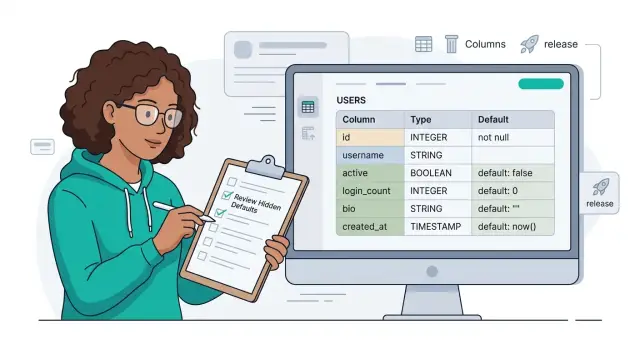
Known facts and assumptions should never blur together. If your team has measured slow query times in production, that is a fact. If you expect traffic to double after a launch campaign, that is an assumption. Put both on the slide, but label them honestly.
That distinction matters because boards make decisions under uncertainty, not under fantasy. If the consequence depends on an assumption, say so. "If the campaign brings 40% more traffic, checkout delays may add 2 seconds at peak and push conversion down" is much stronger than a vague warning.
A small startup roadmap example makes this easier to see. Bad version: "There is migration risk if we postpone infrastructure work." Better version: "If we postpone the database split until after launch, checkout may slow during peak hours. Known: response times already spike above our target on current volume. Assumption: the partner launch adds 30% more orders. Likely effect: 2 weeks of emergency work, higher cloud spend, and lost sales during peak days."
That kind of wording changes the discussion. The board stops reacting to progress theater and starts weighing a real decision: accept the risk, spend more now, or change the plan.
How to build the slide step by step
Start with the decision in plain language. The title should not say "Platform update" or "Q3 engineering status." It should say what needs approval or discussion, such as "Choose whether we rebuild billing now or delay six months." If a board member reads only that line, they should still know the point.
Right under the title, add one sentence on timing. Keep it factual. Mention the trigger: rising support load, a customer promise, a security issue, a hiring freeze, or a runway limit. This turns the slide from progress theater into a business choice.
In the middle of the slide, show the real options. Two or three is enough. Give each option a short tradeoff in plain words. Avoid feature lists. The board does not need every task. It needs to see the shape of the decision: slower launch, more cash spent, more operational risk, or more team strain.
A board deck gets easier to follow when one path is clearly marked as the recommendation. Put it in a shaded box or add a short note like "Recommended: delay mobile work and fix billing first." Then explain the reason in one sentence. Do not make the board guess what you want.
Close with a direct ask. Say whether you want approval, feedback, budget, or agreement on the risk. If the board needs to choose between options, say by when. A vague ending often turns the discussion into side comments.
A simple slide skeleton looks like this:
Decision: Rebuild billing in Q2, postpone partner API to Q3
Now: Failed invoices rose 18% and support time doubled in 6 weeks
Option A: Rebuild billing now - slows partner launch by 8 weeks
Option B: Patch billing, keep roadmap - more failed payments likely
Recommendation: Option A
Board ask: Approve timeline change and temporary hiring pause
That format is blunt, and that is the point. Oleg Sotnikov often helps founders cut crowded technical updates down to one slide like this because boards respond better to a decision than to a wall of status notes.
A simple example from a startup roadmap
A startup has a familiar problem. The team can spend the next six weeks shipping a customer-facing feature that sales wants now, or it can use that time to fix scaling issues that already show up during peak traffic.
On a normal roadmap slide, this often turns into progress theater. The deck shows a green status dot for the feature, a vague note about performance work, and a cheerful launch date. The board sees movement, but not the actual tradeoff.
A better slide puts the choice on one page. It says the team has one engineering slot left before a major launch and must pick where to use it. That forces a real discussion.
What the slide might say
Option one is simple: ship the new feature this quarter. The likely upside is more demos, faster deal movement, and maybe a short-term sales lift.
Option two is less exciting to present, but often more honest: delay the feature and fix the scaling bottleneck first. That work does not give the sales team a fresh story right away, yet it lowers the chance of slowdowns or outages when marketing brings in a larger wave of users.
The risk and consequence should sit right next to each option. For example:
- Ship now: revenue may rise this quarter, but uptime may drop during launch.
- Fix scaling first: the launch story gets weaker, but the service stays stable under heavier load.
That framing helps the board do its actual job. Directors can decide whether the company should accept service risk for near-term revenue, or protect reliability before the bigger push.
Why this works better
This style also makes ownership clear. If the board chooses growth over stability, everyone understands the consequence before it happens. If it chooses stability, sales knows why the feature moved.
This is the kind of call where a technical choice is really a business choice wearing engineering clothes. That is the level a board needs. Not a long task list. One decision, one risk, and the cost of getting it wrong.
Mistakes that confuse the room
A board gets lost when a slide tries to do two jobs at once. If you report status and ask for a decision on the same page, people talk past each other. One person asks about delivery dates, another asks about budget, and the actual decision stays blurry.
The first mistake is hiding the recommendation. Many founders describe the situation, add a few charts, and hope the board will infer the answer. That rarely works. Say what you want the board to approve, reject, or delay in one plain sentence.
Another common problem is cramming five decisions onto one slide. That usually means none of them gets the focus it needs. A good board slide holds one choice, one reason, and one likely result.
A few habits create more noise than clarity. Traffic lights without context waste time. "Green" tells the room almost nothing if you do not say what changed, what could break, or why the item still deserves confidence. Notes do not count either. If the downside matters, put it on the slide. People cannot react to a risk they never see.
General uncertainty is not the same as risk. "The market may change" is vague. "If we postpone the data migration by a month, we may miss the signed customer launch date" is a real risk. Slides full of metrics can miss the point too. Uptime, velocity, and hiring numbers matter only if they support a decision.
A simple example makes this obvious. Imagine a roadmap slide that says the platform is "on track" and marks infrastructure in green. In the speaker notes, you mention that the current setup may not pass an upcoming enterprise security review. That is the part the board needed first, not last. If the review fails, revenue slips and the team gets pulled into rework.
Confusion also grows when people soften the downside to sound calm. That usually backfires. Boards handle bad news better than vague news.
If a slide leaves the room asking, "Wait, what are we deciding?" the slide failed. Fix that before you send the deck.
Quick checks before you send the deck
A good slide survives a cold read. If a director can scan it in 20 seconds and say, "You are choosing X or Y," the slide is probably clear enough. If they need your voice-over to understand it, rewrite it.
Start with the choice. One line should tell the room what decision sits in front of them. "Delay the mobile rewrite by one quarter to finish billing stability" is clear. "Engineering update" is not. The decision should be easy to repeat, not buried under status notes.
Then look at each option and name the downside plainly. Boards do not need fake certainty. If option A cuts cost but slows hiring, say that. If option B ships faster but adds support load, say that too. When every path looks clean, people assume the slide hides something.
You also need one sentence on the cost of doing nothing. Teams often skip this, and it leaves the board guessing. Sometimes the right move is to wait. But if waiting means another quarter of outages, lost leads, or a missed launch window, put that on the slide in plain words.
A fast check helps:
- Ask a non-technical colleague to read the slide once and tell you the decision.
- Ask what could go wrong with each option.
- Ask what happens if the team does nothing for 60 days.
- Ask what response you want from the board.
That last point matters more than most founders think. Say whether you want approval, feedback, or a warning. "Approve option B and its budget" is better than ending with a vague discussion prompt.
Keep the language simple. Cut acronyms unless the board uses them every week. Replace system detail with business effect. "This raises cloud spend by about 15%" lands faster than a paragraph about architecture.
If the slide still feels crowded, it usually mixes updates with a decision. Split them. One slide can inform. The next can ask the room to act.
What to do next
Your next board deck does not need more status. It needs one slide that makes a decision easy to discuss. Start with the weakest update slide in your current deck and rebuild it around a board choice.
Use a simple structure. Name the choice in one plain sentence. Write the risk if the team picks the wrong option or waits too long. State the consequence in board terms: revenue, timing, hiring, cost, or customer impact. Cut any line that only proves the team has been busy.
Then test that slide with someone outside the product team. A founder from another function, an operations lead, or a trusted advisor works fine. Give them a minute to read it, then ask three questions: What is the choice? What is the risk? What happens if we do nothing?
If they hesitate, the slide still sounds like an internal update. Fix the wording until a non-technical reader can answer fast. That small test catches vague language better than another long review inside the team.
Keep the next deck shorter. Most teams can remove a few slides by merging repeated updates and moving extra detail into an appendix for follow-up questions. The board rarely needs every milestone. It needs the moments where a decision changes the plan.
If the room still gets stuck in technical detail, get another set of eyes before the meeting. Oleg Sotnikov at oleg.is works with startups as a Fractional CTO and advisor, and this is exactly the sort of translation work that helps: turning engineering tradeoffs into plain business choices the board can act on.
One clear choice on one clear slide is better than ten pages of progress.
Frequently Asked Questions
What should a technology board slide include?
Start with one sentence that names the choice. Then show the main risk, the cost of waiting, and the exact approval you want. If a director can read it fast and repeat the decision back to you, the slide works.
Are progress updates enough for a board deck?
No. A board meeting is for decisions, not a sprint recap. If you only show shipped work, the room sees motion but misses the tradeoff behind it.
How many options should I show on one slide?
Use two or three real options. That gives the board a clear choice without turning the slide into a menu of half-formed ideas. If you need more than three, cut the weak ones first.
How do I explain technical risk without too much jargon?
Write the risk in plain business terms. Say what may break, who feels it, and what it may cost in revenue, timing, support load, or cloud spend. That lands better than labels like technical debt or scalability risk.
Should I tell the board which option I recommend?
Show one recommendation and name the owner behind it. The board should not guess what you want. A clear recommendation speeds up the discussion and makes ownership obvious.
How much technical detail belongs in the main deck?
Only include details that change cost, timing, or risk. Keep the deeper system notes in an appendix for follow-up questions. If a detail does not affect the decision, cut it.
Can one slide cover several decisions?
Usually not. One slide should hold one decision. When you pack several choices together, the discussion gets muddy and the room jumps between topics.
Should I use red, yellow, and green status labels?
Skip the color unless you explain the tradeoff behind it. Green only means work follows a plan, not that the plan still makes sense. A green status can still hide a bad call.
What if the best move is to wait or do nothing for now?
Say what waiting will cost. If a month of delay means more outages, a missed launch, or extra rework, put that on the slide in plain words. No decision still changes the outcome.
How can I test if my slide is clear before the meeting?
Give the slide to someone outside the product or engineering team and ask three questions: what is the choice, what can go wrong, and what do we need from the board now? If they hesitate, rewrite it until the answer feels obvious.