Streaming responses: when to show text and when to wait
Learn how to design streaming responses so users see useful progress, not broken output. Covers holdbacks, final states, and simple UI checks.
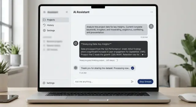
Table of Contents
Why partial output looks broken
People decide fast. In a streaming response, the first two or three lines often shape the whole answer in the user's mind. If those lines look cut off, oddly formatted, or too thin, many people assume the system is failing before it has time to finish.
Partial output is easy to misread because users do not see the model's internal state. They only see what appears on screen. If the answer starts mid-thought, opens a list and stops, or leaves a sentence hanging, it does not feel like progress. It feels like a mistake.
Lists are one of the worst cases. A half-finished list almost never looks intentional. If someone sees:
- Step 1: Reset your password
- Step 2:
and then waits two seconds, that pause does not feel thoughtful. It feels broken.
Trust drops even faster when names or numbers change on screen. If the assistant first says a refund takes 3 days, then changes it to 5 days, people notice. The same thing happens with product names, plan limits, dates, and prices. Even when the final answer is correct, the visible correction makes the whole reply look careless.
Timing matters as much as wording. A short pause after a complete sentence usually feels normal. A pause right after "Your account issue is caused by" feels like a crash, because the interface made a promise and then stopped.
A support chat shows this clearly. A user asks when an order will arrive. The assistant starts with "Your package should arrive in 2-" and then hangs for a moment before changing to "5-7 business days." That tiny wobble is enough to make the answer feel unreliable.
This is why partial output UX fails so often. The model may be working fine in the background, but users judge what they can see, and they judge it almost immediately.
What to stream right away
In streaming responses, the first few words do more than fill time. They tell the user whether the system is working or drifting. If the task will take more than a moment, show a short status line that says what is happening in plain language.
Keep that status text boring in a good way. "Checking your order" works. "Running advanced retrieval pipeline" does not. People want a clear sign of progress, not your internal process names.
When you start streaming actual text, lead with sentences that can stand on their own. Each line should still make sense if the next line arrives two seconds later, or never arrives at all. That usually means full thoughts, simple words, and no half-finished claims.
A safe opening might be: "I found the issue and I'm checking the last two steps that caused it." It gives direction without locking you into details too early. That is much better than opening with an exact error cause that might change after one more check.
Start with the part that is least likely to change. A short summary is usually safer than names, dates, prices, or technical terms pulled from a slow tool call. If those details arrive later, the message still feels steady instead of broken.
Early output works best when it includes only a few things:
- a short status message when work is slow
- one or two complete sentences, not fragments
- a plain-language summary of the issue
- facts you already confirmed
The first visible words should also be easy to scan. Avoid IDs, raw logs, JSON, or long qualifiers at the start. If a user opens a chat and sees "Let me check that for you" or "I'm reviewing the payment status now," they can follow the flow right away.
One rule helps more than many teams expect: do not stream unstable details just because you have them first. Hold them for a moment. Users forgive a short wait. They do not forgive text that starts confident, then rewrites itself three times.
What to hold back until it is ready
Some content looks worse when it streams. If a number, source, or layout can still change, showing it too early makes the whole answer feel shaky.
Totals, prices, scores, and rankings are the clearest examples. A user who sees "$480" and then "$365" does not think "the system is still working." They think the system got it wrong. A short delay is usually better than a number that jumps around.
Tables need the same care. If rows reorder while new data arrives, people lose their place fast. They start reading line three, then it moves to line six, and now the table feels broken. In that case, hold the table back until the sort order settles, or show a simple text summary first.
Citations should also wait. A source that appears, disappears, or changes mid-answer hurts trust more than a short pause does. If you plan to show references, verify them first, then attach them when they match the final wording.
A simple rule works well: stream language, hold back anything users are likely to treat as final.
That usually includes:
- money amounts, totals, and discounts
- rankings, scores, and top results
- tables with sorting or grouped rows
- citations, footnotes, and source labels
- action buttons tied to the current answer
Buttons need extra care. If the answer is still changing, buttons like "Approve," "Send," "Copy result," or "Pay now" can push people into the wrong step. Show them only after the text stops moving and you mark the result as complete.
A refund estimate makes this easy to see. You can stream the plain-language explanation right away: what the policy checks, which details matter, and what happens next. But the final refund amount, supporting policy quote, and "Confirm refund" button should wait until the system finishes its checks.
This is less about speed and more about trust. Users forgive a two-second pause. They do not forgive numbers, sources, or controls that change after they have already started acting on them.
How to show progress without fake movement
Users lose trust fast when the interface wiggles, flashes, or counts up with no real change behind it. Good progress UI feels calm. It tells people what the system is doing, where to look, and when the answer is ready.
For streaming responses, that usually means one small status area and plain language. A spinner by itself says almost nothing. A short label gives people a reason for the pause.
Keep that status in one fixed spot through the whole reply. If the message body keeps changing shape while the status jumps around the screen, people read that as failure.
Simple labels work better than clever ones. "Thinking," "Checking," "Looking up details," and "Finishing" are usually enough. If a tool call or search will take more than a moment, say so.
The goal is not to fake activity. It is to explain the pause without adding more noise.
When to mark a result as final
Users should never have to guess whether the system is still working or whether the answer is complete. If that state feels fuzzy, people hesitate. They wait, reread, or click too early.
Pick one clear signal for completion and use it everywhere in your chat interface. That signal might be a small "Done" label, a status chip that changes to "Ready," or a clear shift from live typing to a stable message. The exact style matters less than consistency.
The typing cursor needs special care. While text is still arriving, the cursor tells users more is coming. The moment the answer ends, remove it. If the cursor keeps blinking after the last word, the whole reply looks unfinished even when nothing else will appear.
Actions like Send, Save, Copy, Approve, or Continue should wait for stable content. Freeze values first, then show the action. If numbers, dates, summaries, or suggested steps can still change, early buttons create doubt. A user who saves a draft and then watches the text shift a second later will stop trusting the product.
A small final label helps more than many teams expect. "Done" works. "Ready" works too. Keep it short and plain. Place it near the message, not far away in a corner where users will miss it.
A simple rule set is enough:
- stream words as they form
- mark the message final only when content stops changing
- show save or send actions only after that final state appears
Picture a support chat drafting a refund summary. It can stream the explanation sentence by sentence. But if the refund amount and case ID may still update, hold those fields back. Once the amount, case ID, and next step are fixed, remove the cursor, show "Ready," and enable the save button.
That final moment should feel quiet and obvious. No flicker. No extra movement. Just a clear stop that tells the user this result is complete and they can act on it now.
A simple setup flow
Start away from the screen. Take one typical reply and break it into parts on paper first. Write down every piece a user might see: a short status line, the opening sentence, the main answer, any structured list, tool results, warnings, and the done state.
This sounds basic, but it prevents messy streaming rules later. If a team cannot name each part of the reply, it usually ships a chat box that feels random.
Then give each part one clear label: stream now or wait. Stream text that still reads well when it arrives bit by bit. Hold back anything that looks broken while incomplete, such as a table, a numbered list that may change order, a code block, or a conclusion that depends on tool output.
A practical first pass looks like this:
- List the response parts in the order users notice them.
- Mark each part as safe to stream or safer to hold.
- Write one exact rule that changes the screen from in progress to final.
- Test a slow run, an instant run, and a failed run.
- Watch a few people use it and note where they get confused.
The final-state rule needs to be precise. "Done" should not appear when the model still waits for a search result or when the answer may still change. A plain rule works better than a clever one: mark the response final only after all background work ends and no more text edits are pending.
Then test the ugly cases, not just the happy path. Slow runs show whether early text is useful or just noise. Fast runs show whether the interface flickers. Failed runs show whether users can tell the difference between "still working" and "stopped with a problem."
Real users will show you what to fix. If they start reading too early and miss later corrections, hold more back. If they stare at an empty box for two seconds, stream a short sentence sooner. Small rule changes usually do more than a full visual redesign.
A realistic support chat example
A support chat is a good place to see why streaming responses need rules. Users like fast feedback, but they hate text that changes its mind.
Picture a customer who types, "I was charged twice for my order. Can I get a refund?" The assistant should answer in two layers.
First, stream the safe part right away. That means a short greeting and a summary of the issue: "I can help with a possible duplicate charge. I'm checking your order and payment status now." This feels responsive, and it confirms that the user was understood.
Next, show background activity in plain words. Skip vague spinner text like "processing." Say what the system is doing: "Looking up your account," "Checking the last two payments," or "Reviewing refund eligibility." People do not need every technical detail, but they do need to know the chat is still working.
The refund amount should stay hidden until the billing system confirms it. If the assistant streams "$48.00 refund approved" and then changes it to "$24.00 pending review," the whole exchange looks broken. Even if the final answer is correct, trust drops fast.
A cleaner flow looks like this:
- Stream: "I found your recent order and I'm checking the duplicate charge now."
- Show status: "Looking up account details" and "Checking payment records."
- Wait for confirmation from the payment system.
- Post the full answer with the confirmed amount.
- Mark that reply as final.
That final message can say: "I confirmed a duplicate charge on order 18452. A refund of $48.00 is approved and will return to your card in 3 to 5 business days." The important part is timing. The amount appears once, in the final answer, not as a guess.
Only after the reply is marked final should the interface show next actions. That might be "Email me the receipt," "Talk to support," or "Check another order." If those actions appear before the answer is settled, users may click away while the system still changes the result.
That small order of events makes the chat feel calm, clear, and reliable.
Mistakes teams make
Users forgive a short wait. They do not forgive a screen that keeps changing its mind. Teams usually get streaming wrong when they treat every internal step as something the user should see.
The worst version is raw notes on the screen: tool traces, draft phrasing, internal reasoning, or sentence fragments that disappear a second later. That material may help during testing, but it looks broken in a live product. If you expect to rewrite it, do not stream it.
Layout drift causes a different kind of confusion. If buttons slide around while the answer is still growing, people stop trusting the interface. A copy button, retry action, or follow-up prompt should stay put, and it should not invite a click until the related text is stable.
A few mistakes show up again and again:
- draft text appears beside final numbers such as prices, totals, or dates
- the answer stops, but the UI gives no clear sign that it is finished
- the model restarts mid-sentence and begins again with no explanation
- action buttons appear before the text settles, then move or change state
- silent rewrites change the meaning after the user has already started reading
Numbers need extra care. People read them as facts, even when the rest of the answer still looks rough. If totals, deadlines, or quoted amounts can change, hold them back until they are ready. Mixing tentative wording with final-looking numbers is one of the fastest ways to lose trust.
Restarts need plain language. If the system retries, say so in a short note and continue cleanly. Starting over with no message makes users think the app glitched or erased part of the answer.
The finish matters too. Do not let the text simply stop and hope people guess it is done. End the motion, keep the layout fixed, and show a clear final state. Even a small visual cue is enough if it tells the user, "this answer is complete."
A checklist before launch
If someone glances at a live answer for two seconds, they should still know what is happening. That test catches most weak streaming behavior before users do.
Run through it with real prompts, not demo cases. Short questions, slow questions, tool calls, and failed requests all need to feel readable.
- Read only the first sentence of the streamed reply. If it stands on its own, the user can follow along even if they scroll away or the model pauses.
- Hide shaky parts until they settle. Tables, code blocks, citations, and numbers often look wrong mid-stream.
- Give every pause a plain reason. "Searching files," "Checking order status," or "Waiting for tool response" is enough.
- Make draft and final states easy to spot. A small "Draft" label, dimmer text, or a final checkmark works well.
- Replace failures cleanly. If a tool errors out, do not leave half a sentence hanging on screen.
One extra test helps a lot: interrupt the answer on purpose. Stop it halfway, force a timeout, and trigger a tool error. If the interface still makes sense, you are close.
Good final-state design is quiet. People should not notice the mechanics. They should just feel that the interface stayed readable, honest, and stable from the first token to the last line.
What to do next
Start with one screen, not the whole product. Pick the place where streaming matters most, such as a support chat reply, and map every state a person can see: waiting, streaming, paused, done, failed, and retried. That simple map forces the team to decide what appears right away, what stays hidden, and what counts as a finished answer.
Then test that one screen with five people who have never used your product. Give each person a small task and watch in silence. Do not ask for polished feedback. Watch for hesitation, early clicks away, and the exact second they decide the answer is over.
A small test run works well:
- ask each person to say when they think the answer is final
- show one reply that streams smoothly and one that pauses, then resumes
- compare a clear final marker with a weak or missing one
- ask what felt broken, abrupt, or incomplete
- write down the exact words they use
Fix the confusion before you add more polish. If people think the answer ended too soon, change that moment first. A clearer final marker, a short completion cue, or tighter timing often helps more than a visual redesign.
This work does not need a long research cycle. One mapped screen and five short tests can uncover most trust problems in partial output UX. After that, repeat the same process on the next screen instead of trying to rewrite every response pattern at once.
If your team wants a second opinion before launch, Oleg Sotnikov at oleg.is can review the flow, define clearer AI response states, and tighten the rules for when a reply becomes final. That kind of review is usually most useful before launch, when small changes still cost little.
Frequently Asked Questions
Why do streaming replies often feel broken?
Users judge the reply in the first seconds. A cut-off sentence, a hanging list item, or a number that changes looks like a mistake, not progress.
What should appear first in a streamed answer?
Lead with a short status line or one complete sentence that still makes sense on its own. Show facts you already confirmed, not details that may change a second later.
Should I stream prices or totals right away?
Wait on numbers, prices, dates, and names until you confirm them. People treat those details as final the moment they see them, so a later correction hurts trust fast.
How do I show progress without looking fake?
Show progress in one fixed spot with plain words like "Checking order status" or "Looking up payment details." A spinner alone says very little, and bouncing labels make the screen feel unstable.
When should I show action buttons?
Hold buttons until the text stops changing and the result reaches a final state. If users can click Save, Approve, or Pay while values still move, they may act on the wrong answer.
What makes a result feel final?
Use one consistent signal such as "Done" or "Ready," remove the typing cursor, and freeze the layout. People should know at a glance that no more text or edits will appear.
Are tables and citations safe to stream?
Usually no. Tables, citations, rankings, and sorted results look messy while they update, so show a short summary first and post the full version once it settles.
How should I handle pauses, retries, or errors?
Tell users what happened in plain language and continue cleanly. If the system retries or a tool fails, say so instead of restarting mid-sentence with no note.
How can I test if my streaming UX works?
Test slow replies, fast replies, and broken runs with real prompts. Then interrupt the answer on purpose and see whether people still understand if it is working, done, or failed.
Where should I start if I want to improve streaming UX?
Pick one high-traffic screen, often support chat, and map every visible state: waiting, streaming, paused, done, failed, and retried. Fix that flow first before you polish the rest of the product.


