Startup system map: what to trace in your first week
A startup system map shows how users, money, and data move through the product so you can spot weak points, set priorities, and act fast.
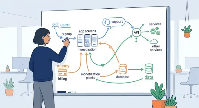
Table of Contents
What breaks when you lack a system map
When you inherit a startup, you almost never get a clean handoff. You get half-finished docs, a few stale diagrams, and a lot of confident opinions. One person says onboarding is fine. Another says billing is the real issue. A third blames support tickets on user error.
That creates noise fast. Teams start fixing what feels urgent instead of what actually causes the problem. They tweak a landing page, rewrite an email, or patch checkout, but the numbers still look wrong because the real break sits earlier or later in the flow.
Without a shared map, simple questions turn into arguments. Where do users drop off? Which event triggers a payment? What happens after a refund, a failed card, or a canceled trial? If nobody can trace the path end to end, each team only sees its own piece.
One weak step can damage three parts of the business at once. A broken signup form cuts new accounts. If billing starts before activation works, revenue drops too. Support then gets flooded by users who cannot finish setup.
The same thing happens with data. If the product logs the wrong event, marketing reads bad conversion numbers, product makes the wrong call, and finance stops trusting the dashboard. People start building workarounds in spreadsheets, and the confusion spreads.
A shared map fixes that before bigger work starts. It gives engineering, product, sales, and support the same picture of how users move, where money changes hands, and which systems store or send data. Once everyone looks at the same flow, it becomes much easier to rank the weak spots.
That matters in the first week. You do not need a perfect diagram. You need one honest view of reality, clear enough to show where a small fix could stop churn, recover revenue, or cut support load by tomorrow.
What to put on the first draft
Your first map should fit on one page. If it needs colors, swimlanes, and twenty boxes, it is already too big. Start with the moments where the business can lose a user, lose money, or lose track of data.
Begin outside the product. Write down how people arrive in the first place. That might mean paid ads, referrals, direct visits, partner mentions, outbound demos, or a founder sending prospects by hand. If you skip entry points, you miss where low-quality traffic or broken tracking begins.
Then follow the product path in plain steps. Mark where someone signs up, where they hit the first useful moment, and what daily or weekly use looks like. You do not need every screen. You need the points that change behavior. A signup form matters. The first successful import matters. A daily dashboard check matters.
A good first draft usually covers five areas: traffic sources and first touch, signup and activation, recurring product use, billing events and payment failures, and data movement with any manual work around it.
Money needs its own line. Show the trial start, plan choice, charge attempt, invoice, refund, and failed payment recovery. Many startups assume revenue problems start with pricing. Often the mess is in dunning emails, coupon logic, or a refund process handled in chat.
Data needs its own line too. Mark every handoff between the app, analytics, CRM, support tool, email system, warehouse, and storage. If a user updates an email in one place but billing keeps the old one, write that down. Small breaks like that create support work fast.
Do not stop at software. Include the work people do outside the product. A founder who manually approves accounts, a sales rep who fixes bad imports, or an ops person who copies refunds into a spreadsheet belongs on the map. Those steps often hide the real bottleneck.
If you are inheriting a startup, this first draft is enough to show where attention will pay off first.
Trace the user path
Start with the few things users actually came to do. Do not map every feature. Pick the goals that drive the business, such as signing up, inviting a teammate, creating the first project, upgrading, or getting a result worth paying for. A map gets useful fast when it follows real intent instead of the menu structure.
Then walk the path step by step. Open the product, click through each screen, and write down every action a user must take. Include small choices that change outcomes, like picking a plan, confirming an email, granting permissions, or skipping setup. Tiny decisions often create the biggest drop-offs.
For each step, capture five things: what the user wants to do, what they must click or enter, what they must wait for, what can confuse them or force a retry, and what happens if they stop there.
Waiting matters more than many teams think. A ten-second import, a spinner with no message, or a page that asks for the same input twice can push people out fast. If users retry a step, the product probably did not make the next move clear.
Support history helps you separate real friction from guesses. Count the tickets tied to each step, even if the volume looks small. Five tickets about billing setup often matter more than fifty questions about a minor setting, because billing blocks revenue and trust at the same time.
Watch the moments where users ask themselves, "Is this safe?" or "Is this worth it?" Those are trust and conversion points. Common ones include signup forms, payment screens, permission requests, trial limits, and any page that asks for data before showing value. If a step feels vague, risky, or slow, mark it for review.
A simple map can fit on one page. One row per step is enough. When Oleg audits an inherited product, this is often where quick wins show up: fewer clicks in setup, clearer feedback after actions, and a faster path to the first useful result. Those changes can cut support load and lift conversion within days.
Trace the money path
Revenue problems often hide in small gaps, not obvious failures. A customer can want your product, click "buy," and still never become paid revenue because checkout, tax setup, card retries, or refunds break somewhere in the middle.
Start where a free user sees paid plans. Mark the pricing page, the plan picker, the checkout form, the payment provider, and the moment the account changes from free or trial to paid. If there is more than one route, such as self-serve checkout and sales-assisted billing, draw both. They often behave very differently.
The map gets much more useful when you follow money past the first payment. Trace what happens after checkout: invoice creation, tax handling, subscription renewals, failed renewals, refunds, credits, and cancellations. If finance exports data into a spreadsheet every month or someone sends invoices by hand, put that on the map too. Manual billing work is easy to miss until it delays cash or creates errors.
A simple test is to follow one real scenario from start to finish. A customer picks the Pro plan, pays, gets an invoice, renews next month, then asks for a partial refund. If your team cannot explain each step in two minutes, the billing flow is messier than it looks.
Pay close attention to failed cards. Many startups lose quiet revenue here. Map the retry schedule, the email or in-app reminders, and who watches the failed payment queue. If nobody owns recovery messages, unpaid accounts can pile up for weeks.
Also mark who can change money-related settings. That includes prices, discount codes, credits, refund approval, tax rules, and plan limits. You want to know whether one founder edits these directly, support can issue credits without review, or billing logic lives in custom code that only one engineer understands.
By the end, you should be able to answer five plain questions. Where does a user choose a plan? Who or what charges the card? How do invoices, taxes, and renewals happen? What happens when payment fails or a refund starts? Which billing steps still depend on a person?
That map usually shows where cash leaks first, and those leaks deserve attention before almost anything else.
Trace the data path
Start with the first field a user fills in. That might be an email on a signup form, a company name in onboarding, or a card number at checkout. Put that field on the map first, then follow it until it lands in a database, a dashboard, a support tool, or a CSV export.
Most teams know where data starts. Fewer know everywhere it goes after that. This part often exposes the quiet mess: duplicate records, old sync jobs, and tools nobody remembers adding.
Write down each stop in plain language. Note where the app stores the data, where another service copies it, and where someone exports it by hand. If customer data leaves your main product and lands in billing, email, analytics, CRM, support, or AI tools, mark that clearly.
A simple format works well: field entered by the user, service that receives it first, database or table where you save it, other tools that get a copy, and jobs or scripts that change it later.
Do not stop at the first save. Many records change after signup. A nightly job may enrich a profile, a webhook may update account status, or a billing event may overwrite plan data. If a background job edits records later, put that on the map with a rough schedule and the trigger.
Then look for drift. Drift happens when the same customer detail lives in two or three places and stops matching. A user changes their email, but support still sees the old one. Finance refunds an order, but the product still shows it as paid. These are common problems, and they create both support tickets and bad decisions.
Also mark where data can disappear. That includes failed webhooks, expired queues, manual imports, silent validation errors, and cleanup scripts that delete more than they should. If the team cannot answer "what happens when this sync fails?", flag it.
By the end, you want one visible path from user input to every store, copy, export, and update. That gives you a much clearer view of what needs fixing first.
Build the map in one afternoon
Use a timer. If you give this job a full week, it turns into an architecture project and stalls.
Start with a blank board, a sheet of paper, or a plain spreadsheet. Fancy diagram tools can wait. Your first map only needs to answer one question: what happens when a real customer signs up, pays, and starts using the product?
Draw three horizontal lanes and label them users, money, and data. Then move left to right.
In the user lane, sketch the visible path: ad or referral, landing page, signup, email check, first login, first task, support contact, and return visit if that matters. Keep each step short. If people leave at one step, mark it.
In the money lane, trace where cash moves, or where it should move. Include checkout, subscription start, invoice, refund, failed payment, and any manual fix done by finance or support. A lot of startups lose time in handoffs here, not in code.
In the data lane, follow what the product stores and where it goes next. Note the form input, database write, third-party tools, analytics, alerts, exports, and deletion requests. If data jumps between systems and nobody watches the jump, circle it.
Then run one real signup from start to finish. Use a live account if you can. Click every screen, read every email, and watch for manual steps hidden behind the product. Those hidden steps often explain slow support, billing mistakes, and odd bugs.
You will hit blanks. Ask product for the intended flow, support for the messy real-world flow, and engineering for services, jobs, and failure points.
Stop when each step has an owner and a risk note. "Owner unknown" is a risk note. "No alert if this fails" is a risk note too.
That is enough for day one. People inheriting a startup, including a fractional CTO, often get more value from this rough map than from a polished diagram nobody uses.
A simple SaaS example
Picture a small SaaS team that sells access to a reporting app. A trial user lands on a demo page, clicks "Start free trial," fills out a form, and reaches the app in under a minute. On the surface, that feels smooth. Underneath, the flow has a crack.
The app creates the account right after signup, before the card charge fully clears. That decision looks harmless until billing depends on a webhook from the payment provider. If that webhook arrives late or fails, the billing system never flips the account to paid, even though the user already entered the product.
Now the user can log in, invite a teammate, and start using features that should sit behind a paid plan. Finance sees no active subscription. The product sees an active workspace. Support sees a confused customer saying, "I paid, but your app says trial expired."
Support usually patches this by hand. Someone adds credits, extends access, or changes the plan in the admin panel just to calm the customer down. That solves today's ticket, but it creates a second problem: the account history no longer matches billing records. A refund, renewal, or upgrade gets messy fast.
A one-page map makes the problem obvious: demo page signup, account creation, payment attempt, webhook confirmation, plan activation, and support override.
Once you see that chain, one fix removes several issues at once. Do not grant full account access before billing confirms success. Create a pending account instead, then activate the workspace only after the payment event arrives or after the system verifies the charge directly.
That one change cuts support work, stops free access after failed payments, and keeps billing and product data in sync. It also gives the team a cleaner place to handle retries when the webhook fails, instead of hiding the problem behind manual credits.
Mistakes that waste time
The biggest time sink is trying to draw a perfect map on day one. You do not need every edge case, every retry path, or every admin exception before you can act. A rough map that shows how users sign up, how money moves, and where data lands will tell you more than a polished diagram nobody tested.
Old diagrams cause trouble for a simple reason: startups change faster than their docs. A flowchart from six months ago may still look neat while the product has already drifted away from it. Open the product, click through the main path yourself, and compare what happens to what people say happens. The gap is often where the mess lives.
Manual work hides in places teams stop noticing. Someone exports a CSV every Friday. Someone copies failed payments into a spreadsheet. Someone pastes support requests into Slack so another person can fix records by hand. If your map skips those steps, it skips the real work.
Another common mistake is starting with code modules instead of business flow. Founders inherit names like billing-service, auth-worker, or event-processor and assume the map should begin there. It should not. Start with what the customer does, what the company charges for, and what data must stay correct. Then trace which parts of the code support those moments.
One more trap is letting one team explain the whole system. Engineering sees one slice. Support sees another. Sales knows where deals stall. Finance knows where revenue leaks. Put those views next to each other and the weak spots show up fast.
A useful map is often ugly at first. That is fine. If it helps you spot one broken signup path, one manual billing fix, and one risky data handoff, it already did its job.
Quick checks before you act
A map helps, but it does not tell you what to change first. Run a few fast checks against the live product. If one of them fails, pause the bigger cleanup and fix that weak point first.
Start with the customer path that matters most: a new person arrives, signs up, and pays. Use a fresh browser, a real card if you can, and no internal shortcuts. If signup works but payment fails, you do not have a product problem to study later. You have a revenue problem now.
Then ask the team where money actually gets stuck. Do refunds need a developer? Do failed charges disappear into email? Do invoices go out late because one webhook silently breaks? If support, finance, and engineering give three different answers, the billing flow is still too blurry.
Next, count every copy of customer data. Most startups keep more than they think: the main database, analytics, CRM, support tools, exports, backups, and old staging snapshots. If nobody can explain why each copy exists, who can access it, and when it gets deleted, stop adding new tools.
Ownership matters just as much as visibility. Every risky step needs one person who owns it end to end. That does not mean they do every task themselves. It means everyone knows who answers when signup breaks, a payout fails, or a data export goes wrong.
One small test tells you a lot: ask support to recover a broken account while you watch. Lock a test user out of login. Remove or delay one payment event. Trigger a password reset issue. Ask support to restore access without engineering help. Time the whole process.
If recovery takes 30 minutes, touches four people, or depends on a script nobody trusts, that part of the system needs attention before any bigger rewrite. These checks are plain, fast, and a little blunt. That is why they work in the first week.
What to do next
Your map only matters if it changes the next seven days of work. Take every red spot on the page and turn it into a short action list, then cut that list hard. If an item does not affect users, revenue, risk, or support load soon, move it down.
Start with one path where all three problems meet: users feel pain, cash gets blocked, and the team spends time answering tickets. In many startups, that path sits around signup, trial conversion, checkout, failed payments, or account access. One clean fix there often does more than five small fixes spread across the product.
A simple filter helps. Pick one broken path, not five. Name one owner for each action. Set a date, even if it is only one week away. Use one simple measure for success. Write down what you will not fix yet.
Keep the measures plain. "Failed payments drop from 8% to 3%" works. "Support tickets about login fall by 30%" works too. Avoid vague goals like "improve onboarding" because nobody knows when that is done.
The map should keep changing. Review it after every release that touches signup, billing, permissions, integrations, reporting, or pricing. Even a small pricing change can create a new support problem or break a revenue path that looked fine last month.
Keep the review short. Twenty minutes is enough if the map is current. Check what changed, what got fixed, and what new risk appeared. Then update owners and dates right away.
Sometimes the map shows a bigger problem than one team can sort in a week. You may find tangled product logic, duplicate systems, weak observability, or infrastructure that costs too much for what it does. In that case, an outside review can save time. Oleg Sotnikov shares his Fractional CTO and startup advisory work on oleg.is, with a focus on product architecture, infrastructure, and practical AI adoption for small and medium businesses.
The goal is not a perfect diagram. It is a short list of actions that removes friction for users, protects cash flow, and gives the team fewer fires to fight next week.
Frequently Asked Questions
What is a system map in a startup?
A system map shows what happens when a real customer arrives, signs up, pays, and uses the product. It also shows where data moves and where people step in by hand.
Keep the first version simple. If the team can trace users, money, and data from start to finish on one page, you have enough to spot weak steps fast.
How detailed should the first map be?
Keep it to one page. You do not need every screen, edge case, or service name on day one.
Focus on the steps where you can lose a user, lose revenue, or lose track of data. That usually gives you a useful draft in one afternoon.
What if the current docs are wrong or stale?
Ignore the old docs at first and test the product yourself. Open the site, sign up, try to pay, read the emails, and note every step that feels slow, unclear, or broken.
Then compare what you saw with what product, support, finance, and engineering say happens. The gaps usually show the real mess.
Why should I map users, money, and data separately?
Separate lanes stop teams from talking past each other. A signup bug, a billing gap, and a bad sync can all hit the same customer journey, but each team often sees only one part.
When you draw users, money, and data side by side, one weak step becomes much easier to spot.
Do manual workarounds belong on the map?
Yes, include every manual step you can find. A founder approving accounts, support fixing plans, or finance editing refunds by hand belongs on the map.
Those handoffs often cause the slowest support work and the hardest billing mistakes.
How do I find the biggest problem quickly?
Run one real customer path from start to finish. Use a fresh browser, a normal signup flow, and a real payment if you can.
Watch where the path slows down, where the team needs a manual fix, and where the system gives no clear feedback. That usually shows the first problem worth fixing.
Which billing issues should I check first?
Start with failed payments and plan activation. If a customer pays and the product does not unlock correctly, you lose revenue and trust at the same time.
After that, check refunds, renewal failures, invoice timing, and who owns recovery when cards fail. Quiet billing gaps can drain cash for weeks.
How do I map the data path without getting lost?
Start with one field, like the signup email or plan name, and follow it through every system that stores or changes it. Write down where the app saves it, where other tools copy it, and who edits it later.
You do not need every table name. You need a clear path that shows where data can drift, disappear, or stay wrong.
Who should help create the first system map?
Pull in product, support, engineering, and finance early. Each group sees a different part of the same flow.
Support knows where users get stuck, finance knows where cash leaks, product knows the intended path, and engineering knows the jobs and failure points. One team alone will miss too much.
What should I do after the map is finished?
Turn each red spot into a short action with one owner, one date, and one simple measure. Pick the path that hurts users, revenue, or support load the most and work on that first.
Then update the map after any release that touches signup, billing, permissions, or integrations. A map only helps if it changes the next week of work.