Admin, operator, and analyst flows: when to split them
Learn when admin, operator, and analyst flows should live apart in a B2B product, with simple checks, examples, and common design mistakes.
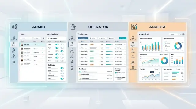
Table of Contents
Why one screen starts to fail
A shared screen feels efficient when a product is young. One menu, one dashboard, one place to put every feature. That works for a while, mostly because the team still knows the product by memory.
Problems start when different jobs pile into the same space. An admin logs in a few times a week to manage users, permissions, billing, or account rules. An operator logs in all day and needs to move through repeat tasks fast. An analyst opens the product to compare numbers, spot changes, and export reports. Put all of that on one screen and everyone has to sort through options that don't belong to their work.
New users feel the pain first. They scan a crowded menu, hesitate, click around, back out, and ask for help. A 10 minute task turns into 30 minutes of training because the product asks them to learn the whole system instead of just their part of it.
People also learn to ignore whatever doesn't match their job. That sounds harmless, but it creates a bad habit. When half the sidebar never matters to someone, they stop reading carefully. Then a rare but relevant item shows up and they miss it, or confuse it with something else.
Wrong clicks usually follow that confusion. If billing settings, shift tasks, user permissions, and reporting all live side by side, labels have to do too much work. Someone in a hurry opens the right area for the wrong reason, or uses the wrong action because it looked close enough. In a B2B product, that usually leads to slower work and permission mistakes that were easy to avoid.
Setup work and daily work rarely belong in the same flow. Setup is occasional, higher risk, and usually done with more care. Daily work is repetitive, fast, and often done under time pressure. When those two modes share one interface, the careful parts feel buried and the fast parts feel blocked.
A warehouse system makes this easy to see. An operator only needs today's pick list and a scan screen, but lands on a page full of team management, access controls, invoice settings, and report filters. By the time the real task appears, the screen already feels harder than it should.
That's usually the point where separate admin, operator, and analyst flows stop sounding like a nice UX idea and start looking like a practical fix.
What each role needs from the product
Admins need control and safety. They handle setup, billing, permissions, team structure, and the rules that decide who can do what. They may not open these screens every hour, but when they do, they need clear labels, strong warnings, and an easy way to review changes before saving them.
Operators need speed. Their day is full of repeat work: updating records, moving items through a queue, fixing small mistakes, assigning tasks, and keeping work moving. They don't want a page full of settings. They want the next action to be obvious, the form to be short, and the system to remember context so they can finish one task and move to the next.
Analysts need answers. They spend more time reading than changing. They compare time periods, filter large tables, export data, and check whether numbers match reality. A good analyst view gives them flexible filters, sortable columns, saved views, and enough detail to explain why a number changed.
Those needs clash when one shared screen tries to do everything.
Admin controls add extra menus, warnings, and permission checks that operators rarely need. Operator shortcuts hide detail that analysts depend on. Analyst tools add dense tables, filters, and exports that make a routine task screen feel crowded.
Take an order or ticket dashboard. An admin wants to set access rules and queue logic. An operator wants to update status in seconds. An analyst wants to break the data down by team, date, and outcome. Put all of that on one page and each role pays for features built for someone else.
The data can stay shared, but the entry point, actions, and level of detail should match the job. When the product fits the job, new staff learn it faster and permission mistakes drop because people see fewer controls they should never touch.
Signs it's time to split the flows
One screen can work when the same small team does everything. Trouble shows up when the work splits but the interface doesn't. The product still makes sense to the people who built it, yet everyday users slow down, click around, and guess.
Training time is usually the clearest signal. If a new operator needs a long walkthrough to finish one repeat task, the product is mixing jobs that should stay separate. People shouldn't need to learn settings, reports, and exception paths they will barely use just to do work they do every day.
Support tickets tell the same story in plain language. When messages often start with "I can't find it" or "Where do I do this?", users are not failing some secret test. They're looking at a screen built for another role. Watch a few sessions and you'll often see the same pattern: users open three tabs, back out, try search, then ask for help.
Permission requests are another warning. If people keep asking for broad access just to do one rare action, your roles are too coarse or the flow lives in the wrong place. Teams often accept that trade-off because work has to move. Then an operator changes setup data, or an analyst edits something that should only be reviewed, and nobody feels fully at fault because the product invited the mistake.
Clutter also creeps in slowly. A team adds one more tab, then another, then a hidden section for advanced options. That can buy a few months, but it rarely fixes the real issue. It just hides different jobs inside the same crowded shell.
At that point, separate flows usually help. You may not need three separate products. A different starting page, simpler navigation for each role, and tighter edit rights often cut training time quickly and reduce the permission workarounds people invent when the product gets in their way.
How to map jobs before you redesign
To split admin, operator, and analyst flows well, start with work, not screens. Open a blank doc and list the top tasks each role does to finish real work. Use plain verbs such as "approve invoice," "update order status," or "check weekly churn." Vague labels like "manage system" hide too much.
Then mark how often each task happens. Daily work should sit close to the front. Weekly work can live one step deeper. Rare tasks, especially risky ones, don't need prime space. This simple frequency check stops teams from designing around edge cases.
Next, write down what each role must see before acting. An operator may need the current queue, due times, and alerts. An analyst may need a date range, clean filters, and last week's trend. An admin often needs account status, permission rules, and integration health. If people click around to gather context before every action, the flow isn't ready.
Setup work should move away from routine work. Admins change rules, edit permissions, connect tools, and fix account issues. Most operators should never land near those actions during normal work. When setup and routine actions share the same page, permission mistakes rise fast.
A quick draft helps more than a polished mockup. Create one simple start page per role and test whether it answers four basic questions: What needs my attention now? What can I act on right away? What do I need to know before I click? What should stay out of my way?
Keep these start pages plain. An operator page might open with today's tasks and status changes. An analyst page might open with saved reports and recent shifts in the numbers. An admin page might open with user issues, system settings, and audit items.
If you're unsure, watch one person from each role do the same task. Ten minutes of real work often reveals more than a long planning meeting. You'll see where training time comes from, where people hesitate, and where one shared interface asks too much from everyone.
A simple example from a B2B product
Picture a customer support platform used by a company with 60 agents, 4 team leads, 2 analysts, and one system owner. When everyone lands on the same home screen, the product feels crowded. Agents see settings they never touch. The system owner sees live queues mixed with charts and ticket details. Analysts click through work screens just to find trend data.
Separate flows help because each role uses the same product in a different way.
The admin's day looks nothing like an operator's day. She invites new staff, assigns them to teams, sets permissions, and decides who can export data or change routing rules. She might do this a few times a week, not every hour. She needs clear settings, audit history, and safe defaults. A noisy queue view only gets in the way.
Operators spend most of the day inside incoming work. They pick up new tickets, change status, add notes, tag issues, and escalate cases. They care about speed, focus, and fewer clicks. If the same screen also shows user management, report builders, and automation settings, the work slows down fast.
Analysts open the tool for another reason. They check response time trends, backlog by team, reopened tickets, and where work gets stuck. They want filters, date ranges, saved views, and exports. They rarely need the controls that let someone add users or change permissions.
Once the team gives each role a separate entry point, the product feels calmer. Admins open to people, access, and rules. Operators land in the live queue with the actions they use all day. Analysts open to reports, trends, and backlog views.
The change is usually obvious within a week. New operators learn the system faster because half the screen is gone. Admins make fewer permission mistakes because they aren't editing access in the middle of ticket work. Analysts stop asking teammates for manual exports because the reporting area already fits their job.
You don't need three separate products to get this result. Different home screens, navigation, and defaults are often enough. That small shift usually does more for B2B product UX and training time in SaaS than another round of tooltips.
How flow design reduces permission mistakes
Permission errors usually start with the screen, not the role matrix. When people see controls they should never touch, they assume those controls are part of their job.
A mixed interface teaches bad habits fast. An operator opens a daily work screen, notices billing settings or user management, clicks around, and now your team has a support issue instead of finished work.
Risky actions belong in the admin area only. Keep them out of everyday task screens, even if the permission system would block the action later. Hiding these controls early removes doubt and cuts accidental clicks.
That usually includes a short list of actions: changing roles and access, editing system-wide settings, managing integrations or API tokens, and deleting records or changing billing.
Operator screens need a narrower shape. If someone spends the day processing orders, reviewing tickets, or moving cases forward, the page should focus on that work and almost nothing else. Remove settings, account controls, and setup options from those screens. People move faster when the page matches the job in front of them.
Analysts need different treatment. If their job is to inspect data, compare trends, and export reports, give them read access without edit buttons. Don't fill the screen with disabled controls. Disabled buttons make people ask for access they never needed. A clean read-only view makes the boundary obvious.
Names matter too. If the role says "Operator" but the menu says "Control center" and the access form says "Standard user," people will ask for the wrong access. Match labels across the product, support docs, and internal requests. When the words line up, teams request the correct role the first time.
One small naming fix can save a surprising amount of time. "Analyst - read only" creates fewer tickets than a vague role like "Business user." Users understand what they can do before they click anything.
Mistakes teams make when they split too late
When teams split flows late, they often make the UI look tidier without making the work easier. They copy the same crowded screen three times, hide a few buttons, and call it done. Users still face the same noise, just with different labels on top.
That clone-and-trim approach keeps the worst part of the old product. Operators still see reports they never read. Analysts still step around edit controls they shouldn't touch. Admins still hunt through pages built for daily operations instead of setup and oversight.
Another common mistake is using department names instead of real tasks. A company might create screens for "Operations," "Management," and "Finance" even though the actual work cuts across those lines. One person reviews exceptions, another fixes bad records, and a third approves changes. Those jobs matter more than the org chart.
Teams also hide common actions behind role switches. That sounds clean in a design review. It feels awful in real work. If a manager spends most of the day checking team output but needs to approve one urgent change, forcing a full mode switch breaks focus and invites mistakes.
Managers often get the worst version of the product. Teams assume oversight means full access, so managers must learn every flow at once. Most don't need that. They need a clear summary, fast approval paths, and a simple way to step into details when something looks off.
Temporary access gets ignored too, and that's where role-based permissions usually break. Real teams cover for each other. A supervisor fills in during a vacation week. An analyst helps during month-end cleanup. A new hire needs extra access for training. A contractor needs one narrow action. An incident forces cross-team support for a day.
If the product only supports fixed, permanent roles, people work around it. They share accounts, ask for broad access, or keep old permissions longer than they should. That creates the same permission mistakes the split was supposed to prevent.
A late redesign works better when the team treats it as a task problem, not a screen-count problem. Keep each flow focused on daily work. Add narrow paths for rare actions. Plan for temporary access before launch, not after the first support ticket lands.
Quick checks before you ship
A split flow is only better if people can move through it without stopping to think. Before release, ask a few blunt questions and watch real users try the product. Five minutes of testing now can save weeks of support tickets later.
Start with the first screen each role sees. An admin should land where account settings, team access, billing, or setup work make sense. An operator should see the work queue, task list, or next action. An analyst should open into reports, filters, trends, or exports. If any role has to hunt through menus before they can begin, the split isn't done yet.
Then check where risky actions live. Delete, disable, approve, publish, and permission changes should appear only in the flow where that action belongs. If operators see admin-level controls just because "they might need them one day," you're asking for mistakes.
A useful test is to sit a new user down and ask, "Show me how you would do your daily task." If they can explain where to click in under a minute, the flow is probably clear. If they say "I guess it's under settings" more than once, labels or navigation need work.
Names matter more than teams expect. Use words people say at work, not words the product team likes. "Dispatch board" often beats "operations hub." "Monthly report" often beats "insight center." Plain labels cut training time fast.
Support teams need clarity too. When a user says, "I don't see that button," support should know which flow that person sees right away. If support has to ask six follow-up questions just to identify the interface, the split is still fuzzy.
A short pre-launch review usually catches most problems:
- Each role can start its main task from the first page
- Destructive actions stay inside the right flow
- New users can explain the path quickly
- Labels match the real job, not internal jargon
- Support can identify a user flow in seconds
When these checks pass, the product feels calmer. People make fewer permission errors, and training gets shorter for a simple reason: each screen has one job.
What to do next
Start with the mess your team already sees every week: support tickets, onboarding notes, and the questions people ask in training. If admins keep asking where daily tasks live, or operators keep opening settings they should never touch, the product is telling you that one shared flow no longer fits.
Look back at the last month or two of support issues and training pain points. You are not hunting for every complaint. You want patterns. Repeated permission errors, slow onboarding, and workarounds like saved bookmarks to deep screens usually mean the interface mixes jobs that should stay separate.
Before you change the product, sketch three simple home pages on paper or in a mockup tool. One should help an admin manage people, settings, and approvals. One should help an operator start work fast. One should help an analyst get to reports, filters, and exports without stepping through task screens that don't matter to them.
Then test those drafts with three real people: one admin who manages setup and access, one operator who does repeat work every day, and one analyst who needs clean data and reporting. Ask each person to do one common task and one less common task. Watch where they pause, what they ignore, and what they click by mistake. If two of the three drift toward the wrong area, the split is still too fuzzy.
This is also the time to check permissions and rollout steps together, not later. A cleaner start page helps, but it won't fix a permission model that still assumes everyone can see almost everything. Separate flows work best when navigation, defaults, and access rules all match the same job.
If your team keeps circling the same UX and permission problems, outside product architecture help can save time. Oleg Sotnikov does this kind of work through oleg.is as a Fractional CTO and startup advisor, especially for teams that need to untangle product flows without turning a cleanup into a much bigger rebuild.
Keep the first version small. One clearer start page for each role often cuts more confusion than a full redesign.
Frequently Asked Questions
When should I split admin, operator, and analyst flows?
Split them when people do different jobs in the same product and the shared screen slows them down. If training takes too long, users keep asking where things are, or people request broad access for one rare task, the current flow no longer fits the work.
Do I need three separate products?
No. Most teams get good results with one product, shared data, and different entry points for each role. Separate home screens, simpler navigation, and role-based actions usually fix the problem without a full rebuild.
What is the first sign that one shared screen is failing?
Long onboarding usually shows up first. A new operator should finish a common task with little guidance, not sit through a tour of settings, reports, and edge cases they will barely use.
How do I decide what belongs on each role's home screen?
Start with real tasks, not menus. Write down what each role does, how often they do it, and what they need to see before they act. Then put daily work on the first screen and push rare or risky actions deeper.
Should admins and operators use the same page?
Keep them apart most of the time. Setup work needs care and warnings, while daily work needs speed and focus. When both live on the same page, operators slow down and admins miss details.
How do separate flows reduce permission mistakes?
They cut mistakes by hiding risky controls before someone clicks. If operators never see billing, permissions, or system settings during routine work, they stop wandering into areas that do not belong to their job.
What if one person needs more than one role?
Give that person a normal default flow and a narrow path for the second job. Do not force a full mode switch for one urgent approval, and do not leave broad access turned on forever just because someone covers two roles sometimes.
Should analysts see edit controls if they cannot use them?
Usually no. Analysts read, compare, filter, and export. A clean read-only view makes the boundary clear and stops people from asking for access they do not need.
Can better labels really reduce training time?
Yes, because people click words before they understand structure. Clear names like "Monthly report" or "Analyst - read only" help users choose the right path faster and send the right access request the first time.
What is the fastest way to test split flows before launch?
Test with one real user from each role and give each person one common task. Watch where they pause, where they guess, and whether they can explain the path in under a minute. If they hunt through menus, the split still needs work.


