Monitoring stack for smaller teams that still gets work done
A monitoring stack for smaller teams should point to action, not busywork. Learn what to keep, what to cut, and how to review alerts and dashboards.

Table of Contents
What changes when the team gets smaller
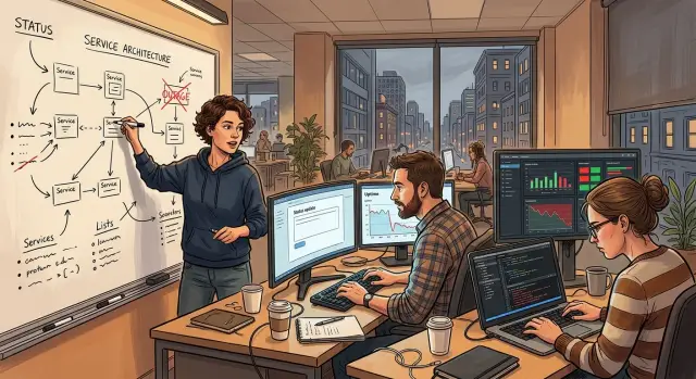
A large team can carry a bloated monitoring setup for years. One person watches infrastructure graphs, another tracks app errors, and someone else leaves a dashboard open because that's how the team has always worked.
When the team shrinks, that quiet division of labor disappears. The same systems still run, but fewer people have time to watch them, tune them, or ask whether they still help.
That's when the trouble starts. Old dashboards rarely disappear when old roles disappear. A chart built for a dedicated SRE, support lead, or analyst can sit untouched for months. Nobody deletes it because deletion feels risky, and nobody owns the cleanup because everyone is busy.
For small teams, monitoring should do one job well: help people decide what to do next. If a graph looks impressive but never changes a decision, it's decoration. Decoration costs attention. It also costs money when every extra metric, retention setting, and tool license stays in place by habit.
Alert fatigue gets worse even faster. The phone buzzes, the message pops up, and nothing bad happens. Then it happens again. After enough false alarms and low-value warnings, people stop trusting the feed. They mute channels, swipe notifications away, or tell themselves they'll check later. That's how real problems get missed.
A lean team needs fewer signals, but those signals need to matter more. Oleg Sotnikov has written about running production systems with a tiny AI-augmented team while keeping uptime extremely high. That only works when monitoring stays close to action. Nobody can spend half the day staring at charts that don't change a fix, a rollback, or a customer reply.
A blunt rule helps: if nobody acts on a signal, ask why you collect it. Maybe it belongs in a report. Maybe you should sample it less often. Maybe it should go away.
Which signals still matter
A monitoring stack for smaller teams works best when it answers one plain question: what needs action right now?
Start by separating alerts, charts, and logs. Alerts interrupt the day because something needs attention now. Charts help people spot patterns during reviews or after deploys. Logs explain what happened after an alert fires. When teams mix these together, every spike starts to look like an incident.
The signals worth keeping usually connect to customer pain. If users can't sign in, pages slow down, payments fail, or background jobs stop finishing, the team needs to know fast. If CPU jumps for two minutes and nobody notices outside the infrastructure panel, that signal probably doesn't deserve a loud alert.
For most small teams, a short list is enough:
- service uptime and failed health checks
- error rate on the main user paths
- latency on the pages or APIs people use most
- failed jobs, stuck queues, or retries piling up
- disk, memory, or database pressure only when users will feel it
Ownership matters as much as the metric itself. Every alert needs a name next to it. One person, or one small group, should know what the alert means, what to check first, and when to escalate. If nobody owns it, delete it or turn it into a quiet chart until someone does.
That same rule helps trim dashboards. Teams often keep old views because an engineer built them during a migration, outage, or launch. Months later, nobody opens them. If a chart has no regular user and no decision attached to it, archive it.
A smaller startup can run well with one alert board, one service health dashboard, and searchable logs. That setup sounds modest, but it gives a busy team something better than coverage theater: a clear answer when things break.
How to trim the stack step by step
When a team gets smaller, the old monitoring setup usually stays the same. That's the mistake. The stack should shrink too.
Start by listing every alert, dashboard, scheduled report, and on-call notification in one shared document. Most teams quickly find the same metric showing up in three places across different tools. If you already use Grafana, Prometheus, Loki, or Sentry, check where they overlap instead of treating each tool as its own world.
Then go item by item and force two labels onto each one: owner and action. The owner is the person who checks it. The action is what they do next. If nobody owns a chart, or the alert doesn't change anyone's next step, it shouldn't stay by default.
A simple cleanup process works:
- Write down every monitoring item in one place.
- Add a real owner name, not just "engineering" or "ops".
- Describe the next action in one sentence, such as "restart the worker" or "check the error spike in Sentry."
- Merge duplicates when two tools tell you the same thing.
- Pause noisy items first, then delete them after a short trial.
Pausing matters. Deleting too quickly makes people nervous, and sometimes an alert looks useless only because its threshold is wrong. Mute it, watch what happens for a week or two, and see whether anyone actually misses it.
Dashboards need the same test. If nobody opens a dashboard during incidents, deploys, or weekly reviews, it's probably decoration. Keep the views people use to answer live questions. Drop the ones built for curiosity alone.
Small teams can usually cut more than they expect without losing real visibility. A startup might begin with 40 alerts, pause 15 noisy ones, merge 10 duplicates, and keep the dozen that drive actual decisions. That's not less visibility. It's less wasted attention.
After a week or two, review what remains. Look for gaps, false alarms, and anything people opened only once. Then trim again.
How to decide what stays
Use one test: if a signal doesn't change what your team does, cut it.
Alerts should push people to act now. Dashboards should help people spot trends or debug a problem. Logs should answer basic incident questions in minutes, not after an hour of digging.
When you review any metric, panel, or log stream, ask four blunt questions:
- Did someone act on this in the last month?
- Would this wake a person up at night for a real outage?
- Did this help explain the last incident faster?
- Can we move this to cheaper storage and still get it when needed?
If the answer is "no" more than once, it probably doesn't belong in your daily view.
Alerts need the hardest filter. Keep the ones tied to user pain or revenue loss: the site is down, errors jump, signups fail, payments stop, or a queue stalls. If an alert can wait until business hours, turn it into a daily summary or remove it.
Dashboards help when people use them for trends and troubleshooting. They do not need to run like a TV wall. Most small teams need a few simple views: service health, recent deploys, error rate, and resource use. If nobody checks a chart before or after a release, trim it.
Logs earn their place when they shorten the first ten minutes of an incident. Keep request IDs, error messages, deploy markers, and enough context to trace what happened. Drop noisy logs that nobody reads, especially debug output left on by habit.
Some data still matters, just not every day. Archive raw events and old metrics you rarely inspect. You can keep them for audits, postmortems, or one odd bug without paying to stare at them all week.
Where waste usually hides
Monitoring gets expensive long before the bill looks scary. The waste usually hides in places nobody questions anymore: alerts that never lead to action, charts nobody opens during incidents, and extra tools that answer the same question twice.
Start with alert history from the last month. Count every alert that fired, then mark the ones that led to a real response such as a rollback, a config change, a support reply, or a bug ticket. If 90 alerts fired and only 7 changed what the team did, the other 83 trained people to ignore noise.
Dashboard sprawl is another common leak. Teams build panels after one outage, then keep them forever. During real incidents, people usually return to the same small set of views. If a chart hasn't helped during an outage, an on-call check, or a review meeting in months, archive it.
Tool overlap adds cost fast. A small team might keep Sentry for errors, Prometheus and Grafana for metrics, Loki for logs, plus a cloud dashboard and an APM product. That setup can work, but only if each tool answers a different question. If two tools show the same error rate or the same CPU spike, pick one and drop the other bill.
Time is the hidden cost many teams miss. A weekly 40-minute review of graphs that changes nothing is still expensive. Track how much time people spend reading reports, checking charts, or discussing anomalies that never turn into action. If the data doesn't change a threshold, a ticket, a deploy plan, or a customer response, it probably doesn't deserve the time.
A quick filter helps. Ask whether the alert led to action last month, whether anyone opened the chart during a real incident, whether another tool already answers the same question, and what decision changed because of that report. If a signal fails those checks, cut it first.
A simple example from a smaller startup
One SaaS startup cut its engineering team from eight people to three in a rough quarter. The product stayed live, customers kept using it, and the old monitoring setup kept firing as if a larger team still had time to inspect every chart.
That setup had grown over years. It sent alerts for CPU jumps, memory swings, queue depth changes, container restarts, disk warnings, and service metrics that only made sense when a specific engineer owned that service. With three people left, most of those alerts produced the same result: nobody trusted the feed anymore.
The team changed one rule. If an alert didn't point to a clear action, they removed it. They kept signals tied to user pain or missed work, not internal noise.
Their alert list ended up very short:
- customer-facing errors
- latency spikes on the main API
- failed background jobs affecting billing, emails, or data syncs
Everything else moved out of the alert channel. Some metrics stayed on a dashboard for rare investigations, but they no longer interrupted the day.
The cleanup went beyond alerts. Their Grafana workspace had dashboards for old experiments, retired workers, copied database views, and boards nobody had opened in months. They deleted the unused ones, merged the useful charts into one simpler view, and cut the weekly review from about 45 minutes to 15.
Incidents got easier almost at once. When response time jumped, the team didn't have to sort through ten unrelated warnings to guess what mattered. They could answer three plain questions: are users seeing errors, is the main flow slower than normal, and did an important job fail?
That's what a monitoring stack for smaller teams should feel like. Less coverage on paper, but faster decisions when something breaks.
Mistakes that create more noise
A small team can miss a real outage because five harmless alerts fire first. That happens when monitoring keeps growing while the number of people who can respond keeps shrinking.
The first mistake is simple: alerts stay alive after their owner disappears. A developer changes teams, a contractor leaves, or a service gets replaced, but the alert still fires at 2 a.m. Nobody knows whether it matters, so people either ignore it or overreact. If one person can't say, "I own this and I know what I'll do when it fires," that alert should not page anyone.
Another common problem is treating every metric like an emergency. CPU spikes, queue depth bumps, and short error bursts often fix themselves. They deserve visibility, not panic. A page should mean someone needs to act now. Everything else can sit in a dashboard, a daily report, or a ticket.
Teams also cut too hard when they get tired of noise. They delete dashboards, logs, and traces in one sweep, then lose the context they need during the next incident. Keep the signals that help answer basic questions fast:
- Is the service down or just slow?
- Did users fail to complete an action?
- What changed right before the problem started?
Noise doesn't disappear just because you move it. Sending the same useless alerts from email to Slack, or from one dashboard tool into another, only changes the shape of the problem.
Perfectionism makes this worse. Teams wait for a full redesign, a new naming system, or a complete observability audit. Meanwhile, the junk stays in place for months. Small cuts work better. Remove one alert nobody uses. Merge two duplicate dashboards. Lower one noisy threshold. Review what changed after a week.
A quick checklist for weekly reviews
The weekly review should stay short and a little strict. If it takes an hour, the stack is already too big. Fifteen to twenty minutes is enough.
Start with alerts, not charts. Pick one alert at a time and ask someone on the team to explain it in one plain sentence: what happened, why it matters, and what they should do next. If nobody can do that without rambling, the alert is too vague.
A useful weekly review covers five checks:
- Did each alert that fired lead to a clear action?
- Did anyone open each dashboard during a real issue, not out of habit?
- Are two tools tracking the same problem?
- Would customers notice if this signal vanished tomorrow?
- Does this item create discussion without changing a decision?
That last question catches more waste than most teams expect. A graph can look neat and still do nothing. If a chart never helped fix an outage, spot a slowdown, or confirm a release issue, it's decoration.
Keep a short note for the week. Write down which alert helped, which one annoyed people, and which dashboard nobody touched. After three or four weeks, patterns show up fast. You'll usually find duplicate checks, old alerts tied to retired features, and dashboards built for a team size you no longer have.
A small startup might begin with ten alerts and six dashboards. After a month of reviews, many teams cut that in half without losing real coverage. They usually respond faster because there is less noise.
What to do next
Put 30 minutes on the calendar every month to review alerts, dashboards, and monitoring bills. Small teams drift into noise fast because nobody has spare time to question old checks once they keep running.
Use the same four questions every month:
- Which alerts led to a real action since the last review?
- Which dashboards did someone open to make a decision?
- Which tools cost money but didn't change any response?
- What can we delete today with low risk?
One person should own the stack. That person doesn't need to build every check, but they need the authority to say no, remove old items, and keep monitoring tied to actual work. If five people share ownership, old charts stay forever.
Write a few rules before the clutter comes back. Keep them plain:
- Every new alert must name who responds and what they should do.
- Every new dashboard must answer one question the team asks at least monthly.
- Every new tool must fill a real gap, or it stays out.
These rules sound strict, but they save time. A team that adds one panel every week ends up with dozens nobody trusts. A team that adds less and removes more usually responds faster when something breaks.
If your team is too close to the system to judge it well, an outside reviewer can help. A Fractional CTO or advisor can spot duplicate tools, alerts that never change behavior, and gaps that still matter. That kind of practical review is part of Oleg Sotnikov's work at oleg.is, especially for startups and small businesses trying to run leaner infrastructure without losing control.
Start small. Delete one unused dashboard this week and rewrite one noisy alert. That small reset often changes the whole stack.
Frequently Asked Questions
Why should monitoring shrink when the team shrinks?
Because fewer people can watch noise. Keep the signals that change a fix, rollback, or customer reply, and cut the rest. If you keep old checks by habit, the team will mute alerts and miss the one that matters.
What should a small team alert on first?
Start with customer pain. Alert on downtime, sign-in failures, payment failures, error spikes on main flows, slow core pages or APIs, and failed jobs that block billing, emails, or syncs. If users will not feel it soon, do not page on it.
Which metrics should stop paging people?
Do not page on short CPU jumps, brief memory swings, or restarts that heal on their own. Keep those as charts or quiet summaries unless they clearly hurt users or revenue.
How do we know if a dashboard still deserves to stay?
Ask two blunt questions: who opens this dashboard, and what decision do they make from it? If nobody used it during an incident, deploy, or weekly review in the last month, archive it.
What is the easiest way to audit our monitoring stack?
Put every alert, dashboard, report, and notification in one shared document. Add one person’s name and one next action to each item. Then merge duplicates, pause noisy checks, and review what nobody missed after a week or two.
Should we delete noisy alerts right away?
Pause first, then delete. A noisy alert may still point to a real issue with a bad threshold. Mute it for a short trial, watch what happens, and remove it if nobody needs it.
How many dashboards does a small startup usually need?
Most small startups do fine with one alert board, one service health view, and searchable logs. Add more only when someone uses a view often enough to make faster calls during incidents or releases.
Where does monitoring waste usually hide?
Waste usually hides in alert history, unused dashboards, overlapping tools, and review time. If an alert never led to a fix, a chart never came up in an outage, or two tools answer the same question, cut one.
What should a weekly monitoring review look like?
Keep it short, around 15 to 20 minutes. Review the alerts that fired, ask what action each one caused, note which dashboards anyone opened during a real problem, and remove one noisy item every week.
When does it make sense to bring in outside help?
Bring in outside help when the team feels blind even with lots of data, or when nobody owns cleanup. A good advisor can spot duplicate tools, bad thresholds, and missing checks fast. That kind of practical review is part of Oleg Sotnikov’s Fractional CTO work.