Show product complexity to investors before you fundraise
Use a simple map of setup time, exceptions, and support work to show product complexity to investors and explain the real operating load.
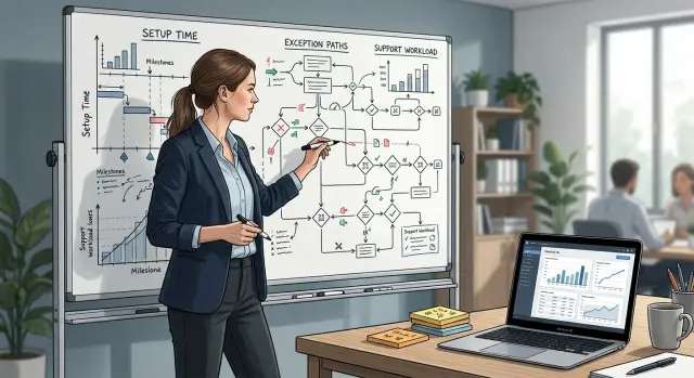
Table of Contents
Why investors miss the hidden work
Investors usually see a clean story: revenue up, churn under control, renewals steady. On a slide, that makes the product look clean too. The day-to-day work behind those numbers is often much messier.
A SaaS product can look simple while the team spends hours every week fixing edge cases, walking customers through setup, and patching odd requests. If nobody tracks that work, it disappears into chats, calls, and one founder's memory. The business looks lighter than it really is.
Manual setup is easy to understate. A founder might say onboarding takes 30 minutes, but that often leaves out the prep before the call, the follow-up message, the custom import, and the small fix that comes two days later. None of that shows up in the demo. Investors see a smooth screen flow. They do not see the labor holding it together.
Exception work grows the same way. At first it feels manageable. One customer needs a custom field. Another needs a billing workaround. A third uses the product in a way the team did not expect. Each case looks small on its own, so founders treat it as normal startup hustle. A few months later, a large part of the week goes to work that does not scale.
That gap creates trouble during fundraising. If you never show the operating load, investors assume margins will improve on their own as revenue grows. Then due diligence starts, support tickets come up, and they realize the product still depends on manual steps and founder judgment. The problem is not that this work exists. The problem is that nobody mapped it clearly.
A simple operating view fixes that. When you show how long setup takes, where exceptions happen, and how often support pulls people away from planned work, investors can judge the business as it actually runs. Your story becomes easier to trust.
What product complexity actually includes
Product complexity shows up in daily work, not just in the feature list. A polished demo can hide a lot of extra effort once a real customer signs.
Start with setup time. If a new account needs custom fields, data cleanup, permission changes, or guided onboarding before the customer can use it, that work counts. The product may look simple on screen, but the team still spends real time getting each account live.
Manual fixes are another clear sign. Many SaaS teams have a standard flow and then a pile of unusual cases that need custom handling. A billing rule needs an override. An import fails because the customer uses a messy spreadsheet. A workflow works for most accounts, but one customer needs a special branch. If this happens every week, it is part of the product as it exists today.
Support after launch matters just as much. Repeated questions in the first few weeks expose hidden complexity faster than the roadmap does. If customers keep asking how to import data, change roles, recover records, or fix confusing settings, the product needs more support than it first appears.
Watch for work that only one person knows how to do. If the founder handles tricky migrations, one engineer fixes sync failures, or one support lead knows the workaround for a broken rule, you have a bottleneck. Investors notice this quickly when they ask what happens as customer volume grows.
A simple filter helps. Count any step outside the normal customer flow. Mark tasks that need manual judgment. Mark tasks that depend on one person. Add repeated support questions after launch. Anything that breaks the normal flow belongs in your complexity picture.
The focus should stay on repeated labor, not feature count. A product with ten features and clean operations is often easier to scale than a product with three features and constant exceptions.
Build a simple operating load map
You do not need a fancy system for this. A spreadsheet with five columns is enough.
Start at the signed deal and stop when the customer uses the product in a normal week without extra help. That full path matters more than the first demo and the final renewal. Add one row for each step in between. A small SaaS team might include account creation, data import, permissions, integration setup, team training, and first live use. If one customer type needs extra approval or manual cleanup, give that its own row.
For each row, record the step name, the average time in minutes or hours, who does the work, how often it happens each week or month, and the most common exception with the extra work it creates.
Map the messy version, not just the clean one. Mark every place where the team leaves the standard process. That might be a failed import, a billing edge case, an API limit, or a customer who needs manual setup because their data is a mess. Those detours often matter more than the standard steps.
Be honest about ownership. Founders often write "support" when the real answer is "support first, then a senior engineer, then sometimes the CTO." Investors read that difference fast because it tells them whether growth adds routine work or expensive work.
Volume is what makes the map useful. A task that takes 15 minutes does not look serious until it happens 40 times a month. A rare exception can also be a problem if it pulls in your most experienced person for two hours every time.
Keep the map on one page. If it takes three tabs to explain onboarding, the product probably asks the team for more care than the deck admits. A plain table with time, owner, exceptions, and volume gives a much clearer picture than a polished funnel slide.
Track exceptions with a shared sheet
Most teams do not need a new tool. A shared sheet is enough if people update it every time a customer case falls outside the normal path. That includes manual fixes, unusual setup requests, billing edge cases, failed imports, or anything that pulls an engineer or founder into one-off work.
This sheet often tells a better story than the roadmap because it turns scattered support anecdotes into a pattern you can count.
Keep it simple so the team will actually use it. Each entry should include the date and customer, the exception type, the time to fix, what the customer experienced, and a short note on the workaround.
The labels matter. Group similar cases into a small set of types instead of creating a new name for every incident. "CSV import cleanup," "manual billing correction," and "account permission mismatch" are clear enough. If two cases need the same kind of fix, put them in the same bucket.
Then count how often each type appears every month. A case that shows up once may be noise. A case that appears eight times a month is part of your operating load. It is much stronger to say, "This issue affected 14 accounts last month," than "It comes up sometimes."
Time matters too. Note how long each fix takes, even if the number is rough. Ten minutes, 30 minutes, and two hours already tell a useful story. A problem that happens often and eats 25 minutes each time can quietly remove half a person from roadmap work.
Write customer impact in plain language. "Setup delayed by one day" is better than "onboarding exception." "Customer could not export reports until support stepped in" is better than "temporary workflow issue." That wording helps investors see the cost, not just the internal task.
A small SaaS team might discover that manual data import cleanup happened 11 times in one month, took 35 minutes on average, and delayed first use for new customers. That is not a minor edge case. It is recurring work the product still hands to people.
Measure support burden with plain numbers
Teams often ignore support work when they talk about growth, even though it often decides whether the product scales cleanly or drains the team. Investors do not need a long story here. They need a few numbers that show how much human help each customer needs.
Start with the first 30 days after signup or contract start. Count every ticket, chat, email thread, call, and message asking for help. Then divide by the number of new customers in that cohort. If 10 new customers created 60 support contacts, that is six contacts per customer in month one. It is simple, and it is easy to compare across months.
Do not put all support into one bucket. Split it into two groups. The first is basic help: password resets, setup guidance, permission questions, and simple training. The second is product trouble: broken flows, confusing behavior, missing edge cases, and bugs. That split matters because the first group points to onboarding gaps, while the second points to product risk.
Also mark which issues pull engineers into the work. A founder answering a chat for five minutes is annoying. An engineer spending two hours tracing a bug is a real cost. Track the number of engineering touches and the hours spent. Rough numbers are fine if you record them the same way every week.
A short weekly table can cover the basics: new customers in the period, total support contacts, basic how-to questions, product problems, engineer hours, and any urgent or after-hours work.
One more comparison makes the picture clearer. Split customers into light-touch and heavy-touch groups. Light-touch customers need little help after setup. Heavy-touch customers keep coming back with questions, exceptions, and urgent requests. If 20 percent of customers create 70 percent of the support load, say that plainly. That is where margin pressure comes from.
This is a practical way to show operating reality without drama. You are not claiming the product is weak. You are showing where the work sits today.
Imagine a small SaaS team that signed 15 customers last month. Nine customers needed one or two support contacts each. Six needed more than eight, and four of those cases pulled engineering in after hours. That pattern says more than a slide full of general claims.
Example from a small SaaS team
A five-person SaaS team sells workflow software to small logistics firms. The founder closes deals by promising "fast onboarding" and a setup that takes one day. On the slide, that sounds simple. In practice, each new customer brings messy CSV files, odd field names, and one or two rules that only that account needs.
Two engineers then spend three to six hours per customer fixing imports, mapping columns, and adding small custom checks. None of that work appears in the demo. The product looks self-serve, but part of every launch still depends on people doing manual work.
The support load starts right after setup. Each custom rule creates new inbox questions: "Why did this row fail?" "Can we skip this step for one client?" "Why does this export look different now?" Each ticket looks minor on its own. Together, they can eat half a day.
When the founder looks at revenue alone, the margins seem fine. A $2,000 monthly contract looks attractive. Once the team counts the hidden work, the math changes. Each customer may need about five hours of engineering setup, two hours of support in the first week, an hour each month for follow-up fixes, and one custom rule the team has to retest after every product change.
Multiply that by ten new customers in a busy month. Revenue goes up, but so do setup hours, support tickets, and release risk. Growth does not stay light just because the product is sold as SaaS.
This is why a basic map helps so much. Put customer types in rows. Track setup time, common exceptions, and support hours after launch. That is enough to make the operating load visible before fundraising.
The point is not to make the business look messy. It is to make the work visible early. Investors can then see that sales growth adds strain unless the team fixes imports, reduces custom rules, or changes pricing. That is a much stronger story than claiming onboarding is fast while engineers quietly carry the extra work.
Mistakes that weaken the investor deck
Weak decks usually make the product look cleaner than daily work allows. That may sound attractive at first, but it creates doubt fast when an investor asks who handles setup, edge cases, and support spikes.
One common mistake is showing feature count instead of the work behind those features. "We support 40 workflows" sounds impressive. It means much less if 15 of those workflows need custom setup, manual checks, or special handling every week. Investors are funding the process needed to keep the product running, not just the feature list.
Another mistake is hiding manual effort inside a broad "operations" line. When founders group onboarding fixes, account cleanup, import corrections, and customer hand-holding into one bucket, the real load disappears. It is better to name the work plainly, even if the number is uncomfortable.
Averages also hide trouble. If you say setup takes "about 2 hours," you may be covering up the real story. Maybe simple accounts take 20 minutes and complex ones take 6 hours. That spread matters because investors think about scale.
The deck gets stronger when it replaces soft claims with a simple distribution. For example, 60 percent of new accounts may finish setup without help, 30 percent may need one manual fix before launch, and 10 percent may need several exceptions and half a day or more. That is much more useful than one neat average.
Founders also mix one-off fires with repeated load. A broken integration last month is not the same as a customer path that fails every week. If you combine them, the picture gets muddy. Investors need to see which work is random noise and which work is built into the product right now.
Another easy mistake is calling a manual patch automation. If a support agent still exports a CSV, edits it, and re-imports it, that is manual work with a script nearby. Investors usually catch this with one follow-up question. It is better to say, "We partly automated this, but one step still needs a person."
Plain language wins. A good deck shows where the product is smooth, where it is fragile, and how often a human has to step in.
Quick checks before the meeting
Five minutes before the call, read your operating slide like a stranger. If it needs a long explanation, it is still doing too much.
Start with setup time and say it in one plain sentence: "A new customer usually needs 90 minutes from signup to live use, and support owns the last 20 minutes." That tells an investor more than a vague claim about easy onboarding.
Next, name the top exceptions without looking at your notes. If you cannot say the top two or three from memory, the story is still too wide. Keep them concrete: failed imports, custom permission requests, billing edge cases, account migration requests. Investors do not need every odd case. They need the repeat offenders.
Support burden also becomes clearer when you split it by customer group. A self-serve customer who asks one billing question per quarter is very different from a larger account that needs weekly help. Even a rough split works: self-serve customers are low touch, small businesses need more setup guidance, and larger accounts create heavier exception work.
Put the whole picture on one slide. A small table is enough: issue type, monthly volume, average time per case, and owner. When one row says "data import fixes, 18 per month, 25 minutes, engineer," the operating load becomes real immediately.
Then test for speed. Can someone read the slide in 20 seconds and repeat the point back to you? If not, cut labels, shorten sentences, and remove side notes. You do not need a bigger deck. You need one slide that makes hidden work obvious.
One last check matters more than polish. Make sure the numbers match what your team would say out loud. If sales says setup is "quick" but support knows it takes half a day, the room will feel that gap right away.
What to do next
Start with the last month, even if the picture is incomplete. Pull a small sample of recent deals, onboarding work, support tickets, and odd cases the team had to fix by hand. That is usually enough to show the real operating load in a way that feels concrete instead of theoretical.
Do not wait for a perfect model. A rough map with honest numbers beats a polished slide built on guesses. If one customer needed six hours of setup, two rounds of data cleanup, and three support touches in week one, write that down.
A simple rhythm works well. Review last month's deals and new accounts. Note setup time, manual steps, and exception cases. Count support contacts by customer or account type. Then add one short sentence on what drives the extra load.
Revisit the map every quarter. Product complexity changes quickly. A process that felt minor at 20 customers can turn into a hiring problem at 200, or a margin problem much earlier than expected.
Use the numbers to make decisions, not just slides. If one segment creates twice the support burden, raise the price, reduce custom work, or tighten what you promise during sales. If one feature keeps creating exceptions, simplify it before you add headcount.
An outside read can help because founders get used to their own workarounds. Ask someone who understands product, engineering, and operations to pressure-test the story. They should be able to answer simple questions fast: why this takes so long, which customers create the most load, and what changes first if growth picks up.
If you want that kind of review, Oleg Sotnikov at oleg.is works with startups on product architecture, operations, and Fractional CTO support. A short outside pass before the deck is final can expose hidden delivery costs, weak pricing, and manual steps before investors do.
A clean map will not close a round on its own. It will make your numbers easier to trust, and that trust moves the conversation forward.
Frequently Asked Questions
What does product complexity mean in a SaaS company?
It means the work around the product that a clean demo does not show. Count setup time, exception handling, repeated support, and any step that needs human judgment. If your team does it again and again, it belongs in the real product picture.
Why do investors care so much about setup time?
Setup time shows whether new revenue stays light or brings more labor with it. If each account needs cleanup, imports, and follow-up fixes, growth adds cost before it adds margin. Show the average time and the spread between easy accounts and messy ones.
What should I track first?
Start with the path from signed deal to normal weekly use. Write down each step, who does the work, how long it takes, how often it happens, and the common exception. A simple spreadsheet works fine.
How do I track exceptions without buying a new tool?
Use a shared sheet and log every case that falls outside the normal flow. Record the date, customer, exception type, time to fix, customer impact, and the workaround. Keep the labels simple so you can count patterns by month.
How do I measure support burden in a way investors understand?
Count every ticket, chat, email thread, and call in the first 30 days for each new customer group. Then split the contacts into basic how-to help and product trouble, and note any engineer hours. That gives investors a plain view of where the load sits.
Should I hide manual work so the business looks cleaner?
No. Investors usually trust an honest map more than a polished claim that breaks after one follow-up question. Show where people still step in, how often it happens, and what you plan to fix next.
How much detail should I put on the slide?
Keep it short enough that someone can read it fast. One small table with issue type, monthly volume, average time per case, and owner usually says enough. If the slide needs a long speech, trim it.
What if a few customers create most of the support and exception work?
Say it plainly. A small group of heavy-touch accounts can create most of the load and squeeze margin. Once you see that pattern, you can change pricing, narrow the offer, or fix the product for that segment.
How do I deal with one-person bottlenecks before fundraising?
Mark every task that only one founder or engineer can handle. Then document the steps, move routine parts to support or ops, and fix the product area that keeps sending work back to that person. That lowers risk and makes growth easier to explain.
When should I ask for an outside review of my operating load?
Do it after you map a month of real work. A fresh reader can spot soft averages, hidden labor, and weak assumptions very quickly. That gives you time to tighten the story before diligence starts.


