Service dependency map: how to show real outage impact
A service dependency map helps teams see which apps, queues, and vendors fail together by combining traces, incident notes, and review.
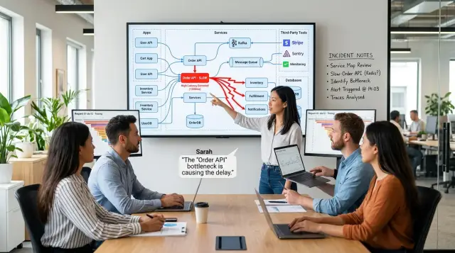
Table of Contents
Why slow services cause bigger failures
A slow service rarely stays local. If an auth API adds two seconds to every request, the damage spreads into sign in, checkout, admin tools, and support screens at the same time. Users do not care which service caused it. They only see that "the site feels broken."
Teams often catch the first symptom and miss the chain behind it. One alert says latency rose on Service A. Another says errors climbed on Service C. A third says queue depth jumped. Each signal looks separate, so people chase noise instead of the cause. Meanwhile, retries pile up, workers sit waiting for responses, and timeouts spread across the stack.
This gets worse when one user action depends on several calls. A simple "place order" click might touch pricing, inventory, payments, email, and fraud checks. If one call slows down, the whole action can hang even when the other services stay healthy. Support hears "orders fail sometimes" while engineers stare at graphs showing that most systems are still up.
Distributed tracing helps because it shows the path of real requests. You can see which service called which, how long each hop took, and where the delay began. That is much better than guesswork. But traces do not tell you who felt the problem first or which business task actually stopped.
That missing part usually lives in incident notes. Notes from support, operations, and on call engineers explain what people really saw: customers could not finish payment, staff could not refund orders, or internal users had to retry the same action three times. Those details turn a technical slowdown into a clear picture of impact.
A useful service dependency map brings both views together. It shows the live call chain from traces and the real world pain from incident notes. Then teams can see more than "Service B is slow." They can see which user actions broke, which teams got blocked, and why one small delay turned into a much bigger failure.
What a dependency map should show
A service dependency map should start with real traffic. It should show which services talk to each other during normal requests, not what an old diagram says. When the web app calls auth, auth checks a cache, and the order service writes to a database, the map should show that chain clearly.
It also needs the parts teams forget. Databases, queues, caches, search indexes, storage, email gateways, payment providers, and other vendors belong on it. Many incidents start in one of these places and then spread into customer facing errors.
Business paths, not just service names
A box and line diagram is not enough. The map should mark which dependencies sit on sign in, checkout, billing, password reset, or other user actions that matter to the business. That changes the conversation fast. A slow analytics pipeline can wait. A slow billing path cannot.
It also helps to separate required systems from optional ones. Some calls must succeed or the request fails. Others add extra features, like recommendations, fraud checks, or event tracking, and the product can survive without them for a while. If you do not show that difference, every alert looks equally urgent.
Each service should have a few plain labels: who owns it, whether it is required or optional, which user journeys depend on it, and whether it is internal or run by a vendor. Ownership matters more than most teams expect. During an incident, people lose time just figuring out who can answer for a service. If every node has a clear owner, the team can move faster in the first ten minutes, when confusion does the most damage.
Think about a checkout flow that depends on an API gateway, auth, cart, pricing, inventory, payment, a message queue, and email. If payment slows down, customers may still browse, add items, and sign in, but revenue stops. A good map makes that obvious before the incident call even starts.
Start with traces, not guesses
A dependency map should come from real traffic. If you sketch it from memory, people will miss slow calls, hidden retries, and side services that only appear under load.
Start with the user flows that carry the most business weight and the most traffic. For many teams, that means login, search, checkout, billing, or API requests that run all day. A quiet admin screen may look simple, but it will not tell you much about outage impact.
Then group repeated calls into clear service paths. You are not trying to capture every edge case on day one. You want the paths users hit again and again, such as web app -> API -> auth service -> user database, or API -> payment service -> fraud check -> queue.
For each path, measure the signals that change user experience: latency at each hop, error rate, retries between services, and where timeouts begin. Those four numbers explain more than a static diagram ever will. A service can look healthy if it answers eventually, while users still wait eight seconds because another service keeps retrying behind the scenes.
Healthy periods can fool you, so check recent incidents too, even small ones that lasted ten minutes. Those traces show the paths that bend first under stress. They also reveal fallback behavior, queue buildup, and odd dependencies that stay invisible on normal days.
Clean the data before you trust it. Test traffic, load tests, internal scripts, and backfills can distort the map. If a nightly job hits ten services in sequence, that does not mean a normal customer action depends on all ten. Keep production user traffic separate or the map turns into noise.
A simple example makes the difference clear. A team may think checkout depends on the cart, payment, and database. Traces often show more: tax calculation, fraud scoring, email confirmation, a feature flag service, and a retry loop on inventory. That is the version of the service dependency map you can use during an incident, because it reflects what users actually trigger.
Add what traces do not tell you
Traces show requests moving through services. They do not show the messy parts people patch by hand at 2 a.m. If support refunds orders in a back office tool when checkout stalls, that workaround belongs on the map. If sales starts taking phone orders when the site slows, add that too. A service dependency map should show both software links and the human paths teams use to keep the business moving.
Incident notes are the fastest way to find this missing context. Read old postmortems, chat threads, and on call summaries. Look for lines like "ops restarted the importer," "support disabled fraud checks," or "engineering switched traffic to cached prices." Those are real dependencies, even if no trace records them.
Some missing links look minor until they fail. DNS timeouts can make healthy services look down. Auth or session stores can block every login. Feature flags can hide checkout or search. Vendor limits on payments, email, or SMS can turn into customer facing outages. Cron jobs and batch imports can hammer a database every hour and slow everything around them.
Business impact matters as much as technical shape. A slow image service may annoy users. A slow tax, payment, or pricing call can stop revenue in minutes. Mark which failures block sales, freeze support work, or create compliance risk. That makes outage impact analysis more honest, because teams judge damage instead of just counting errors.
Also write down who gets paged first and who actually fixes the issue. Sometimes the first alert hits the API team, but the real owner is identity, networking, or a vendor. That gap can waste twenty minutes before anyone starts on the actual problem. Put that on the map too.
When the next incident starts, people should see more than "service A calls service B." They should see the hidden chain: if B slows, checkout fails, support workload doubles, a vendor limit may be involved, and the platform team gets pulled in before the right owner confirms the fault.
Build the map step by step
Start with the user journeys that cost you money or trust when they break. Pick a small set first, such as signup, checkout, password reset, and invoice delivery. If you try to map every flow at once, the work stalls and the service dependency map turns into a wall of boxes nobody uses.
Then follow each journey through real traces. Start at the first request and keep going until the customer sees a result, even if part of the work moves into a queue or runs later in a background job. A clean request path is not enough if the outcome depends on a worker, a webhook, or a third party API that finishes the job minutes later.
As you draw each connection, add plain notes about the business effect. A line between two services should say more than "A calls B." It should also say what breaks if B slows down, how long users wait before they notice, and whether revenue, support volume, or data quality takes the hit.
A simple format helps. For each connection, note normal latency, slow latency, timeout or retry behavior, the service owner, what the user sees when it fails, and any manual workaround.
Then look for single points of failure. Some are obvious, like one auth service used by every product surface. Others hide in fallback paths. A fallback can keep the system up on paper while making the experience much worse, such as switching to stale inventory data or delaying order confirmation until a job catches up.
This is where incident notes earn their place. Traces show that a dependency went slow. Notes from past outages explain the real damage: support tickets spiked, refunds increased, or the team had to pause deploys for six hours. That context keeps the map honest.
Before you trust the draft, review it with three groups. Engineers usually catch missing async work and retry loops. Support can point out failure patterns customers report first. Product can tell you which journeys deserve the most attention because they affect renewals, conversion, or onboarding.
If you do this well, the map stops being an architecture diagram and starts acting like an outage playbook.
A simple outage example
A store starts getting complaints at 10:12 a.m. Customers say checkout spins for too long, then some try again. Support soon sees a second problem: duplicate orders. At first glance, those issues look separate. They are not.
The traces show the busiest path within minutes. Most slow requests pass through checkout, then pricing, then Redis. Pricing waits on Redis for cached discount rules, and when Redis responds late, the whole checkout request stacks up. That gives the team one clear chain instead of five random guesses.
But traces still miss part of the story. They show that payment calls got slower around the same time, yet they do not explain why. The incident notes fill that gap. Someone had already written down that the payment vendor reported rising latency in one region about ten minutes before customer complaints started.
Now the service dependency map becomes useful. It does not just say "checkout depends on pricing" and "pricing depends on Redis." It also shows that retry behavior at the customer edge can turn a slowdown into duplicate orders, and that the payment vendor issue adds more delay at the worst possible moment. One weak point triggers another.
That picture changes the response. The team should alert on Redis latency where it affects pricing, not only on checkout timeouts. They should also alert when payment latency rises enough to push retries up. For fallback logic, pricing may need a default rule set or a stale cache option, while checkout may need idempotency protection so the same order does not get charged twice.
A good service dependency map makes this easier to see quickly. Traces answer "where is time going?" Incident notes answer "what else changed around us?" Put them together and the team can see the real outage impact instead of treating each symptom like a separate fire.
Mistakes that make the map useless
A clean diagram can still mislead the team. The most common problem is scope. People try to draw every internal call on day one, then end up with a wall of arrows nobody reads during an outage.
Start smaller. Map the paths that matter for customer actions first, such as sign in, checkout, search, or report generation. If the map cannot help someone answer "who breaks next if this slows down?" in a minute or two, it is already too busy.
Another common miss is leaving out work that happens outside the main request path. Scheduled jobs, batch imports, cron tasks, admin panels, and support tools often cause real damage when they fail. A nightly sync can flood a database. An internal back office tool can lock records. Those links matter, even if users never see them directly.
Teams also flatten the map when reality is not flat. If every line looks equally important, the picture says almost nothing. A cache timeout, a payment gateway outage, and a typo in an internal metrics call should not carry the same weight.
Use simple labels to show how much each dependency matters. Mark whether a dependency is hard, soft, async, rare, or staff only. That one step turns a messy picture into something people can trust.
Outside services are easy to forget because they feel external and someone else owns them. They still break your product. DNS, authentication providers, email delivery, cloud storage, feature flags, and rate limited APIs can take down flows that look healthy inside your own code.
Auth is a good example. One team may think only login depends on it, but token refresh, admin actions, mobile sessions, and background workers may all call the same auth service. If you leave that out, your outage impact analysis will miss the widest blast radius.
The last mistake is simple: teams never update the map after real incidents. A service dependency map gets stale fast because systems change fast. New retries appear, old queues disappear, and someone adds a fallback that nobody documents.
After each incident, update the map while the details are still fresh. Add the hidden dependency, remove the dead one, and note which path failed first. If you do that every time, the map stays small, honest, and useful when pressure is high.
Quick checks before you trust the map
A service dependency map earns trust only when someone new can use it under pressure. Open one common user journey, such as login, checkout, or file upload, and ask a teammate who did not build the map to follow it from the first request to the last side effect. They should see the main path, the background jobs, and the external calls without asking around. If they get lost, the map reflects the org chart more than the system.
Ownership should be obvious. Every service that can wake people up at 2 a.m. needs a named team or person, plus a short note on what they control. A box with no owner creates delay during an outage. People waste time asking who can restart it, who knows the database, or who can approve a rollback.
A useful map also shows business pain, not just traffic. Mark which slowdown hits money first. For one product, that may be checkout. For another, it may be signup, search, or ad delivery. If every service looks equally serious, the map will not help when you need to choose what to fix first.
Then compare traces with incident notes. Traces show timing and call paths. Notes explain workarounds, hidden dependencies, rate limits, and human steps that traces miss. If traces say service A caused the problem but the incident log says the real pain started when billing retries flooded the queue, investigate the gap. One of those records is stale, incomplete, or both.
Before you call the map done, check five things:
- A new teammate can follow one customer flow end to end.
- Each service with outage risk has a clear owner.
- The map marks which failure hurts revenue first.
- Incident notes and trace data tell the same story.
- The team updated the map after the last outage, migration, or major release.
That last point matters more than most teams admit. Systems change quietly. One new cache, one renamed queue, or one moved cron job can make the map look neat and still mislead everyone when production gets weird.
What to do next
Do not start with every service. Pick one flow that hurts when it breaks and map that first this week. For most teams, that means signup, login, checkout, billing, or the API path that brings in most support tickets.
A first version of a service dependency map does not need to be perfect. It needs to answer a simple question fast: if this service slows down, who feels it, how soon, and what should the on call person check first?
A simple weekly routine works well. Choose one user flow and follow it through traces from the first request to the last downstream call. Add the context your traces miss, such as rate limits, batch jobs, vendor APIs, feature flags, and known weak spots. Mark the failures users actually notice, like slow page loads, failed payments, or delayed emails. Then save the map where engineers and on call staff already work, and update it after the next incident.
Once you have that first map, use it in every outage review. Postmortems get better when the team can point to the exact path of damage instead of arguing over guesses. On call reviews improve too. You start to see the same blind spots repeat: a timeout nobody tuned, a queue nobody watches, a fallback that never really falls back.
Repeated incident notes should not stay trapped in old tickets. Turn them into short runbooks and alerts. If engineers keep writing "service B slows when cache misses spike" or "payments fail when the provider returns 429," that is no longer a note. It is operating knowledge.
If you want an outside review, Oleg Sotnikov at oleg.is works with teams on tracing, infrastructure, and fractional CTO advisory. This kind of review is usually most useful when you already have traces, some incident history, and a map that almost works but still misses the real outage impact.
Frequently Asked Questions
What is a service dependency map?
A service dependency map shows how one user action moves through your system. It connects services, databases, queues, vendors, and background jobs so your team can see what breaks when one part slows down.
Why are traces not enough on their own?
Traces show timing and call paths, but they miss human workarounds and business pain. Incident notes tell you who felt the issue first, what users saw, and which manual steps kept things moving.
What should I include besides services?
Include databases, caches, queues, storage, search, email, payment providers, DNS, feature flags, and any batch jobs that touch the flow. If support or ops uses a manual workaround during failures, add that too.
Which user flows should I map first?
Start with the flows that lose money or trust when they fail. For most teams, that means login, checkout, billing, signup, search, or the API path that drives most support tickets.
How do I show which dependencies matter most?
Mark each dependency as required, optional, async, rare, or staff only. Then add a short note about what the user sees if that dependency slows down or fails.
How do incident notes make the map better?
Read past postmortems, chat threads, and on call notes for repeated patterns. Those notes often reveal vendor limits, retry storms, back office steps, and owner confusion that traces never show clearly.
What signals should I track for each dependency?
Track latency, error rate, retries, and where timeouts start. Those four signals usually explain why users feel slowness even when most services still answer.
How do I stop the map from becoming a wall of arrows?
Keep the first version small and centered on one customer journey. If the map cannot help a teammate answer who breaks next in a minute or two, trim it until it can.
How does the map help during an incident?
During an outage, the map helps the team find the failing path faster and call the right owner sooner. It also shows business impact, so people fix the checkout path before they chase a minor internal error.
How often should I update the dependency map?
Update it after every outage, migration, and major release. Systems change quietly, and one new queue, cache, or retry rule can make an old map point your team at the wrong problem.


