Security settings page design people can actually use
Security settings page design helps users pick safe options faster. Learn how to label toggles, set defaults, and cut support questions.
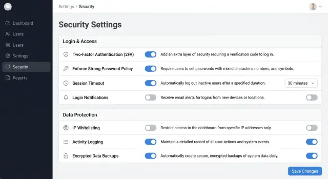
Table of Contents
Why users freeze on security settings
People slow down on a security page because one wrong choice feels expensive. They picture getting locked out, breaking sign-in for the team, or cutting off a coworker right before a meeting.
That fear grows when the page hides side effects. A small toggle can force password resets, sign out active users, or block older devices. If the page does not say that clearly, people stop trusting it.
Near-duplicate labels make the problem worse. "Require two-factor authentication" and "Enforce two-factor authentication at next login" look similar, but they can lead to very different results. Buyers hesitate because they do not want to test the difference on a live account.
Acronyms add another barrier. Terms like SSO, SCIM, TOTP, and session TTL are normal for security teams, but many buyers need a translation before they can choose. If a customer has to ask support what a label means, the page is doing support's job.
Too many toggles on one screen also slows people down. After a few rows, they stop reading carefully. They either leave everything off because that feels safer, or they turn on too much and hope nothing breaks.
A good security settings page lowers that stress. Each setting should answer three plain questions: what changes, who feels it, and whether the change can cause lockouts or extra setup.
A small team account makes this easy to see. A manager wants to tighten access after a contractor leaves. If the page shows five short labels with no explanation, that manager will not feel secure. They will feel trapped between risk and confusion.
When buyers have to guess, compare similar labels, and decode acronyms, support becomes the real interface. Most of the freeze starts with the writing, not the policy.
Replace jargon with everyday words
Most people do not open a security page out of curiosity. They open it because they need to make a safe choice fast. If the page sounds like a security manual, they slow down, guess, or leave the default untouched.
Start with normal words. Put the user outcome first, then add the technical term only if people expect to see it. "Two-step verification" is easier than "multi-factor authentication" for many teams. If your buyers already ask for SSO or SAML, keep those terms, but pair them with a short line that says what they do.
A simple test helps: can a manager explain the setting to a coworker without translating it? If not, the label is asking too much from the reader. Write what changes for the user, not what the system does.
A few small rewrites show the difference:
- "Invalidate active sessions" becomes "Sign out this user on all devices"
- "Restrict authentication by network range" becomes "Only allow sign-in from approved office IP addresses"
- "Enforce password rotation" becomes "Ask users to create a new password every 90 days"
- "Session timeout threshold" becomes "Sign users out after this much inactive time"
These changes work because they answer the first question people always have: "What happens if I turn this on?"
Double negatives create even more trouble. People read fast, miss one word, and choose the opposite of what they meant. "Do not disable login alerts" forces users to decode the sentence before they can act. "Send login alerts" is clear at a glance.
Plain language does not mean deleting every technical term. It means using technical language only when it earns its place. Keep the terms your audience already uses. Translate the rest into normal speech.
Write labels that explain the outcome
A good label answers one question fast: "What happens if I turn this on?" If people need to stop and translate a toggle, the label failed.
Start with the action or result, not the technical term. "Require a sign-in code" works better than "Enable 2FA." "Let team members create API keys" is clearer than "API key management." People scan for consequences, not product vocabulary.
A short helper line removes most doubt. Keep it to one sentence and say what changes after the switch moves. "Users will enter a 6-digit code after their password" is much better than "Adds an extra verification layer." The first version tells people what they will actually do.
Scope matters just as much. Many support tickets start because users cannot tell who a setting affects. Say it in the label or in the helper text: me, one user, admins, or everyone in the workspace.
For example, "Require a sign-in code for my account" tells people only they will need a code at login. "Let team admins invite new members" makes it clear that admins can add people to the workspace. "Make shared reports visible to everyone in the team" tells users exactly who can open those reports.
Use warnings sparingly. If every row has a warning icon, people stop reading them. Add a warning only when a change creates real risk, such as weaker account protection, broader access, or extra login friction that could lock someone out.
Be direct when that risk exists. "Turning this off removes the extra login check for your account" is enough. You do not need dramatic language for harmless choices like email alerts or session length.
When labels explain the result, fewer users guess, fewer users contact support, and more users trust the page enough to make a decision.
Set defaults that protect most people
Most people leave security settings alone. They open the page when they feel worried, not when they want to study every option. That means the default choice does most of the work.
If one option lowers risk for most customers, preselect it. Users should get a safe setup even if they never touch a toggle.
Good defaults protect the account without adding much daily friction. In many products, that means turning on alerts for new logins, requiring 2-step verification for admins, blocking public sharing until a user allows it, and ending old sessions after inactivity.
Take the opposite approach with risky settings. Do not switch on anything by default if it can lock people out, expose data, or create a hard-to-fix mess for the whole team. Settings like "make this workspace public," "allow anyone with the link to edit," or "enforce a new login method for everyone today" need an active choice.
It also helps to separate protection from convenience. Put account protection settings in one group and personal comfort settings in another. "Require 2-step verification" and "Notify me about unusual sign-ins" belong together. "Keep me signed in for 30 days" is a convenience choice and should not sit beside team-wide security controls.
Confirm access changes
When a setting can affect access, ask for confirmation before you save it. One click is too easy to misread, especially for workspace owners managing a team.
Use plain confirmation text that says what will happen next, who it affects, and how to recover. "Turning this off removes 2-step verification for all admins" is clear. If a change could sign people out or block login, ask for a password or 2-step code before you apply it.
Safe defaults cut support tickets because the page makes the cautious choice first. Users can still change it, but they do it with open eyes.
Put the page in a clear order
People move faster when the page follows the task in front of them. They want to protect sign-in, control who gets access, check where the account is open, and choose how they get warned. They do not think in internal names like "authentication" or "session policy."
The page should follow that same mental order. If a team admin has to jump between tabs called "Identity," "Permissions," and "Events" to answer one simple question, the page has already lost them.
Group by task, not by system name
A simple order works well: sign-in methods and password rules first, then team access and approvals, then active sessions and devices, and finally alerts for logins and changes.
That order feels natural because it matches how people think. First they protect the door. Then they decide who can enter. After that, they check who is already inside. Last, they choose when the product should speak up.
Inside each group, keep one decision per row. A row should answer one question and change one thing. If one line has a toggle, a dropdown, helper text, and another click that opens a modal, people slow down and start guessing.
A cleaner row looks like "Email me when a new device signs in" with a short note below it. The user reads it once and knows what will happen. That is much easier to scan than "Device event notifications."
Save behavior matters too. If the page saves automatically, show "Saving..." and then "Saved" in the same spot every time. If the page uses a button, keep the button close to the changed setting and confirm the new state in plain words, such as "Two-factor sign-in is now required for all admins."
A team account page is a good test. Ask one person to require two-factor sign-in, review active sessions, and turn on login alerts. If they can do all three without stopping to decode labels or wonder whether the change worked, the order is working.
Fix an existing page step by step
Most teams try to rewrite every setting at once. That usually slows the work and hides the biggest risks. Start with the controls tied to account takeover: sign-in alerts, two-factor authentication, recovery email, active sessions, and device removal.
If one unclear switch can make a person lose access, move that item to the top of the list. Security pages improve faster when teams fix risky controls before minor preferences.
Read the page like a new customer. Any toggle that makes someone pause needs a short line under it. That line should answer two questions: what happens if I turn this on, and who does it affect?
"Require two-factor authentication for all team members" is clearer than "Enforce MFA." A second line like "Everyone will need a code when they sign in" removes guesswork.
A simple repair cycle works well:
- Pick the five settings most tied to sign-in, recovery, or access control.
- Add one sentence under the first confusing items.
- Ask someone outside the product team to use the page without help.
- Rewrite labels that cause hesitation, wrong guesses, or follow-up questions.
- After release, sort support tickets by topic and fix the most common problem first.
That outside test matters. Your team already knows what each setting means, so you will miss the confusing parts. A customer in a hurry will show you the real problem fast.
Watch where they stop, reread, or ask, "Will this lock everyone out?" Those moments tell you which labels need work. If they cannot explain a setting in their own words, the label still fails.
After launch, support tickets give you the next round of fixes. If the same question keeps coming up, the page is doing extra work for your support team. Small edits often cut those questions faster than a full rebuild.
The best result is simple: buyers read a setting once, understand the outcome, and move on with confidence.
A realistic team account example
A team owner brings in a contractor for a short project, maybe two weeks to clean up analytics or fix a checkout bug. The owner opens the security page because they want tighter rules for that one person, not a bigger change for everyone on the team.
A good page makes that choice obvious. Instead of vague switches like "Session policy" or "Trusted device mode," the owner sees plain options with short notes under each one.
For example, the page might show "Session length for this contractor" with choices like 8 hours, 24 hours, or 7 days. It might show "Require device check for this contractor" with a note that says the person must confirm a known device when they sign in. If there is a workspace-wide rule, it should appear as a separate setting lower on the page and clearly marked for all users.
That wording does two useful things. It tells the owner what will happen after they click save, and it tells them who the rule affects. That second part is where many teams go wrong. Users do not struggle because the rules are too complex. They struggle because the page hides the scope.
The safest version also puts a visible boundary between personal access rules and workspace rules. A label like "Contractor access" above the first group and "Workspace security" above the second group is often enough. The owner can scan the page in seconds and move on.
The last check happens before the change goes live. If the owner changes only the contractor's settings, the confirmation screen should say, "You are updating access for Alex only. Other team members will keep their current settings." If they touch a workspace rule, the message should change to, "You are updating sign-in rules for the whole workspace. This affects all current and future members."
That one screen prevents the worst mistake: a rushed owner locking out the whole team on a Friday afternoon. It also cuts support tickets because the page answers the two questions people ask first: "What does this do?" and "Who does it change?"
Mistakes that send people to support
A lot of support tickets start with the page, not the user. When people open security settings and feel even slightly unsure, they stop clicking and start asking.
One common mistake is reusing the same word for two different controls. A setting called "session timeout" might appear in a personal profile and in a team admin area, but each one does something different. One affects only your own login. The other sets a rule for everyone. If both labels look the same, people guess, and support pays for that guess.
Tooltips also create trouble when they carry the only real explanation. Many people never open them. Others miss them on mobile. If a setting can lock someone out, change alerts, or affect the whole team, add a short line under the label that says what happens in plain words.
Mixing personal options with company-wide rules creates another mess. Users should never have to stop and ask, "Am I changing my own account, or the whole company?" Keep those areas separate and name them clearly. "Your security" and "Team security rules" work better than one long page with mixed toggles.
Reverse labels are another trap. "Disable login alerts" forces people to decode both the label and the toggle state at the same time. That is harder than it sounds. A positive label is easier to scan: "Login alerts" with help text like "Send an email when someone signs in from a new device."
Large save actions create doubt too. If one button saves password rules, alert settings, and device controls all at once, users worry about changing something by accident. They also lose track of what they edited.
In practice, cleaner pages do a few simple things. They use one meaning for each label, show the effect beside the control instead of hiding it in a tooltip, separate personal settings from admin rules, write labels as positive actions or outcomes, and save changes by section when possible.
If people keep asking support what a toggle means, the copy needs work. That is a design problem, and fixing it often takes less time than answering the same ticket every week.
A short check before you ship
A settings page is not ready because the team understands it. It is ready when a new customer can open it, read each option once, and say what will happen if they turn it on or off.
A quick review catches most of the problems that create avoidable support tickets.
Ask someone outside the product team to read every toggle out loud in plain words. If they pause, guess, or ask what a term means, the label needs work. Make sure the safer choice is already selected when that choice fits most customers, because people often leave defaults alone.
Keep each helper line short and specific. "Sends a code to your phone at sign in" works better than "Adds an extra authentication layer for improved account protection." Add a confirmation step for risky changes, such as turning off two-factor sign-in or making a team rule less strict. One extra click is cheaper than one account takeover.
Then check the page on a phone screen. Labels should stay readable, helper text should not turn into a wall of text, and buttons should stay easy to tap.
One small test works well. Give the page to a new customer or a coworker from sales or support. Ask two questions: "Which option is safest?" and "What would you change if you wanted less friction for your team?" If they can answer both without help, you are close.
If they cannot, do not patch the problem with longer text. Shorter labels, clearer outcomes, and safer defaults usually fix more than extra explanation.
Next steps for your product team
Most teams do not need a full redesign first. They need to fix the few settings that confuse people every week. Pull the last month of support tickets, chat logs, and onboarding notes. The same setting names usually appear again and again.
Pick the five settings that cause the most questions. For many products, that means password rules, login alerts, new device approval, session length, or team admin permissions. Progress often comes fast when a team focuses on these high-friction choices instead of rewriting the whole page.
Rewrite those labels first, then watch what changes. A label should tell people the outcome, not force them to decode a technical term. "Require admin approval for new devices" is clearer than "Device trust policy." Small edits like that can cut confusion quickly.
After the rewrite, track a few simple signals: how often customers ask what a setting means, how long it takes a new user to finish the page, how often people change a setting and then switch it back, and which options admins leave untouched because they are unsure.
Do one more review before the next release. Ask three to five non-technical customers to read the page and say what each setting does in their own words. If they guess wrong, the label still needs work. This test is cheap, and it catches wording problems product teams miss because they already know the system too well.
If your team feels stuck, an outside review can help. Oleg Sotnikov at oleg.is works as a Fractional CTO and startup advisor, and this kind of product clarity work often sits close to broader decisions about access rules, team workflows, and support load.
A cleaner settings page does not need fancy copy. It needs fewer guesses, safer defaults, and words people understand on the first read.


