Screen-level loading architecture for faster complex apps
Screen-level loading architecture helps complex apps show useful page shells first, load panels as needed, and refresh data without blocking work.
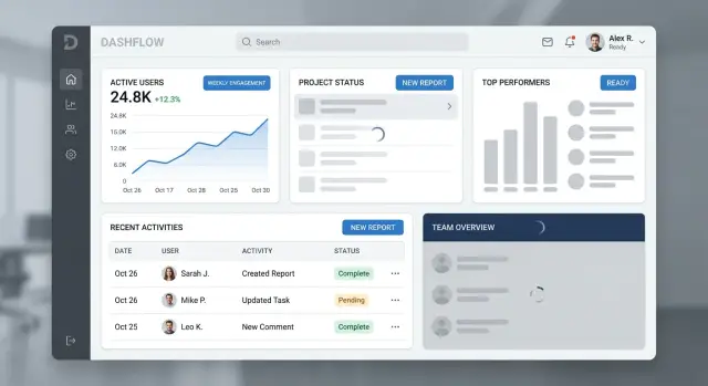
Table of Contents
Why one loading state hurts the whole screen
One spinner for an entire screen makes every request wait for the slowest one. If one panel takes four seconds, the whole page feels four seconds slow, even when the header, filters, and summary cards were ready almost at once.
That wastes the first few seconds of the visit. People usually know what they want to do right away: scan totals, change a date range, open a tab, or start typing in search. When the whole screen stays blocked, they can't do any of it. The app feels slower than it really is.
It also hides good performance. Many busy screens mix fast queries with heavy ones. A stats card might load in 200 milliseconds while an activity table takes much longer. If both sit behind one loading state, the fast panel gets dragged down by the slow one.
People judge speed by the moment they can act, not by the moment the last query finishes. A screen that lets someone read, click, and adjust settings after one second feels much faster than a screen that reveals everything at once after four. The total load time might match, but the experience does not.
Users rarely think, "one API call must still be running." They think the page froze. A blank panel is one thing. A whole screen that doesn't react feels broken, especially when buttons, filters, and tabs are visible but useless.
Picture a sales dashboard with a date picker, revenue summary, team leaderboard, and a large chart. The date picker and summary are ready fast. The chart depends on a heavy query. If the whole dashboard waits for the chart, the user can't even change the date range while the slowest part catches up.
A better approach shows the shell first, reveals fast panels as soon as they are ready, and keeps slow sections contained to their own area. Users start sooner, fast parts stay visible, and the screen feels alive instead of stuck.
Split the screen into clear parts
Slow screens get much worse when every part waits on the same request. The fix usually starts with a simple split: the shell, the panels, and the data that can refresh later.
The shell is the frame people use to understand where they are. It often includes navigation, the page title, tabs, search, and the actions they reach for first. Those parts should appear fast and stay stable. If someone opens a billing page, they should still see the title and click "New invoice" even if the revenue chart is still loading.
Don't tie the shell to panel requests. A delayed chart shouldn't hide the page title. A failed activity feed shouldn't disable navigation. When the frame stays visible, the app feels responsive instead of blocked.
Panels are different. Each panel answers one user need with its own data. A customer list helps people find accounts. An activity feed helps them review changes. A usage chart helps them spot trends. Each panel should load on its own clock because each one supports a different task.
That is why grouping by task works better than grouping by backend service. Users don't care that three widgets call the same reporting API. They care that each part of the screen helps them do something specific. If you group by service, one slow response often drags unrelated parts down with it.
This also makes failure easier to handle. One panel can show an error message and a retry button while the rest of the screen keeps working. On crowded screens, that matters a lot because people often need only one section right now.
A simple test helps. Cover one panel with your hand and ask whether the rest of the page still makes sense. If it does, the screen is probably divided well. If the whole page feels broken, too much logic still sits behind one loading state.
On a busy admin screen, the shell might show the left menu, account name, search box, and "Invite user" button at once. The permissions panel, audit log, and usage graph can then load separately. People can start working before every query returns.
Choose what to load first
Most slow screens don't have a speed problem everywhere. They have a priority problem. When the app waits for every request, the user sits behind a blocker even when half the screen is ready.
Start with the page shell. Show the layout, title, tabs, filters, and empty panel frames right away. People orient themselves fast when they can see where they are and what will appear next. A blank page feels broken. A visible shell feels active.
Then load the part that lets someone do something. On an orders screen, that might be the table with search and status filters. On a support screen, it might be the ticket list and reply box. If a user can scan, filter, type, or click, the wait feels shorter.
A practical order is simple:
- page shell
- main action panel
- data needed for the first decision
- charts, history, and side details
- optional data only after user request
Charts often look urgent because they are visual, but they rarely need to arrive first. The same goes for audit history, activity feeds, and side panels full of extra context. Load them after the working area is ready, or fetch them only when the user opens that part.
This shifts the "I can begin now" moment much earlier, even if the full screen still takes the same time to finish.
Be strict with low-use data. If only a small share of users opens export settings, advanced filters, or a deep detail drawer, don't fetch that data on first view. Wait for the click. One extra request later is better than slowing every visit.
Teams often get this wrong when they load what is easiest for the backend instead of what matters most to the person using the screen. Users don't care that five side widgets finished first. They care that the part they came to use is ready.
When you choose the order well, the app feels calmer. People read the page, start their task, and barely notice the rest arriving a second later.
Build the loading flow step by step
Good loading starts before any data appears. Paint the page shell first: header, tabs, filters, buttons, and the empty frames where each panel will sit. People can read the layout right away, and they know where to look when content lands.
Those controls should be real whenever it is safe. If a user can switch tabs, open a form, or change a date range without waiting for every panel, let them do it. Grey boxes are fine for missing data, but hiding the whole screen makes the app feel slower than it is.
A clean sequence usually works best. Render the shell and panel placeholders as soon as the route opens. Start only the queries that unblock the first useful action, such as account details, current selection, or form defaults. Drop data into each panel the moment it arrives instead of waiting for the slowest request. Push heavier refresh work, side stats, and lower-priority panels until the screen is already usable.
Picture a sales dashboard. The rep mainly needs the customer name, current deal stage, and the note box to start working. Pipeline charts, activity history, and trend summaries can show up a second later without causing trouble.
This changes how the screen feels. Users stop watching a spinner and start doing something. Even when total load time stays the same, the app feels faster because the wait no longer blocks the first task.
Keep loading messages plain. "Loading account" works. "Refreshing chart" works too. Long status text usually creates more confusion than help, especially when several panels change at once.
It also helps to keep each panel independent. If one query fails, show the error in that panel and keep the rest of the screen alive. A broken activity feed shouldn't lock the save button or hide the customer record.
Small timing choices matter. If a panel usually returns in 150 milliseconds, you can skip a loading label and show the content directly. If it often takes two seconds, show the frame early so the space feels stable and the screen doesn't jump around.
A simple example from a busy screen
A support lead opens a customer account screen after a frustrated client calls about a failed payment and a sudden drop in usage. If the whole page waits on every query, the lead loses time before they can do anything useful. That pause feels longer than it is because the person already knows what they want to check first.
A better setup treats that page as separate parts. The shell appears right away with the account name, tabs, and action buttons. The lead can see they are in the right account, switch tabs, and start a note without waiting for charts, billing tables, or older activity to finish loading.
Recent tickets should load before usage charts on this screen. They usually answer the first question: "What happened last, and what did the team already say?" If the lead sees an open ticket about payment retries or a recent complaint, they can respond faster. A chart is still useful, but it rarely drives the first action in the first few seconds.
Billing history can arrive a bit later. That data matters, but it shouldn't block note entry or basic actions like assigning the case, adding an internal comment, or sending a reply. The lead should be able to work while the lower-priority panel fills in. Empty space with a small loader is fine if the rest of the screen is alive.
After the lead starts typing, the app can run a quiet refresh on account activity. New events can appear in the activity panel without stealing focus from the note field or jumping the page around. If the refresh changes something meaningful, show a small status hint instead of forcing the whole screen to redraw.
That screen feels faster because it follows the order of real work. First, show where the user is. Next, load the panel that helps them decide what to do. Then bring in supporting details. Users notice that difference almost at once.
Handle background refresh without breaking focus
A refresh shouldn't make the screen feel unstable. If people can already read, compare, or edit data, keep that data on screen while the new request runs in the background.
Blanking the panel and showing a spinner again is usually the wrong move. People lose context fast, especially on screens with tables, forms, filters, and side panels open at the same time.
Keep the screen stable
Refresh only the part that changed. If the activity feed updates, show a small loading state in that panel instead of dimming the whole page or resetting nearby content.
This matters even more when someone is typing. A background refresh should never wipe a draft, collapse an accordion, reset a selected tab, or jump the page back to the top. Preserve form state, scroll position, sort order, and any row the user has expanded.
A good rule is simple: if the person touched it, treat it as pinned until they finish. Fresh data can wait a few seconds.
Auto-refresh also needs a slower rhythm when someone is working closely with the screen. If a user is editing a record, comparing two totals, or reading a log line by line, frequent updates create stress. Pause the refresh or lengthen the interval until the person stops interacting.
For background refresh UX, small signals work better than loud ones. A subtle spinner, "Updating...", or a timestamp like "Refreshed 10 seconds ago" gives feedback without stealing attention.
Let people control the timing
Some screens need a manual refresh button even if auto-refresh exists. That is true for pricing, inventory, financial numbers, approval queues, and anything else where a sudden change can alter a decision.
Manual refresh gives people a clear moment to pull in the latest state. It also helps when they want to finish a comparison before the numbers move.
Picture a support dashboard with an open customer form on the left and a live event stream on the right. The event stream can refresh every few seconds. The form should stay exactly as the agent left it. That split makes the app feel calm, even when the data behind it changes constantly.
Mistakes that make loading feel worse
A slow screen feels even slower when the loading pattern blocks work people could already do. Bad loading design turns a normal wait into a stop sign.
The most common mistake is one full-screen spinner for everything. If the page shell, left menu, open tab, and saved filters all vanish while one panel reloads, people lose their place and hesitate to click anything.
Another bad move is resetting state when fresh data arrives. Someone picks a tab, sets two filters, opens a row, and then a refresh sends them back to the default view. That feels broken, even if the data is technically newer.
Skeletons can overstay their welcome. When real content is ready but placeholder blocks still flash for another second, the screen feels jittery and cheap. Remove placeholders panel by panel instead of waiting for every request to finish.
Over-fetching causes a different kind of pain. A tiny filter change in one panel shouldn't trigger every query on the screen again. If changing a date range reloads charts, activity logs, side summaries, and unrelated counts, people pay the cost for data they didn't ask for.
Errors often hide behind empty space. A blank panel with no message leaves people guessing: is it still loading, is there no data, or did the request fail? Clear error text and a small retry action beat silence every time.
A busy operations screen shows this fast. Imagine support staff reviewing tickets while a stats panel updates in the background. If each refresh clears the ticket list, resets the selected tab, and replaces numbers with giant skeletons, the screen becomes hard to trust.
Small fixes usually help more than fancy animation. Keep the shell visible, preserve filters and tab choice, update only the panel that changed, and show plain error states when something fails. When the screen stays stable, people feel faster even before the backend gets faster.
Quick checks before release
Release day is the wrong time to learn that one slow query can freeze a whole screen. This pattern only works if the page still feels usable when data arrives late, refreshes in the background, or fails in one corner.
Test a real page, not a design file. Use slow network settings, click around while data loads, and try to break the flow on purpose.
Ask a few direct questions:
- Can the user do the main job before every panel finishes?
- Does each panel have its own loading and error state?
- Do draft text, selected tabs, sort order, and open panels stay in place during refresh?
- If one query fails, does the rest of the screen still work?
- During background updates, is the loading signal local and quiet?
A good test case is an operations dashboard with a task list, a detail panel, and live metrics. If the task list loads first, people can keep moving. If the live metrics fail, they should still finish the task in front of them.
This is also where teams find hidden regressions. A loading plan can look fine in code review and still feel clumsy in real use. Ten minutes of hands-on testing usually shows the truth.
What to fix first in your app
Start with one crowded screen, not the whole product. Pick the page that users open often and complain about most. Usually it is a dashboard, an order view, an admin page, or any screen where several panels wait on different queries.
Map that screen in three parts: the shell, the panels, and the refresh rules. The shell is the frame people need right away, such as navigation, tabs, filters, and page actions. Panels are the separate blocks of content inside it. Refresh rules decide what updates quietly in the background and what should wait for a clear user action.
This small exercise often exposes the real problem. Many teams track only the moment when every request finishes, but users judge speed earlier. They care about when they can click, search, filter, type, or move to the next step. If the shell loads fast and the main action is ready, the screen already feels usable even if slower panels are still catching up.
A first pass is enough:
- mark what must appear first so the screen feels stable
- separate each panel by its own data source and loading state
- decide which panel blocks action and which can load later
- measure time to first useful action, not just full completion
- write down which data can refresh in the background without stealing focus
Do this on one screen, ship it, and watch what changes. If support requests drop and users stop waiting on blank pages, you have a pattern worth reusing. Then apply the same structure to the next busy screen instead of redesigning everything at once.
If your team wants a second opinion on product architecture or app flow, Oleg Sotnikov at oleg.is reviews problems like this in his Fractional CTO work. A short outside review often catches hidden loading blockers that built up one request at a time.


