Read after write consistency in admin tools people trust
Read after write consistency matters most in admin tools after saves and status changes. Learn where users expect instant updates and how to explain delays.
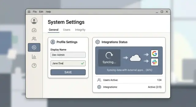
Table of Contents
Why this feels broken to users
People use admin tools like control panels. They change a price, role, or status, click Save, and expect the same screen to show the new value right away.
Most users will never call this read after write consistency. They don't need to. They only need one simple promise from the interface: "I changed it, and now I can see it."
When the old value stays on screen for even a few seconds, people rarely think, "the system is still syncing." They think the save failed. The screen is their proof. If the proof disagrees with their action, trust drops fast.
Then the scramble starts. Some people click Save again. Some refresh. Some open the same record in another tab and compare. Some edit the field a second time because they assume they did something wrong. In a busy team, that turns a small delay into duplicate work, conflicting changes, and avoidable support requests.
The delay itself is not always the worst part. Uncertainty is. A short wait feels fine when the product explains what is happening in plain language. A silent wait feels broken because users can't tell the difference between "saved, still updating" and "nothing happened."
Admin tools live or die in these small moments. People use them to change customer data, inventory, billing rules, access rights, and other live settings. They know a bad update can cause real problems, so they check the result right after they click.
Take a simple case. An operations manager changes an order status from "pending" to "approved." The button shows success, but the table still says "pending." Now they have to guess whether to approve it again, wait, or ask support. That guess is the real failure.
Once users stop trusting save feedback, they stop trusting the admin panel. They slow down, double check everything, and open tickets for problems that might only be a few seconds of lag. The product starts to feel unreliable long before it is actually down.
Where users expect instant updates
Some actions feel local and final. If a person edits a field and saves it on the same page, they expect to see the new value immediately. If the old value flashes back, even briefly, many people assume the save did not work.
This is where read after write consistency matters most. The person just entered the data, clicked save, and stayed on the same screen. Showing anything except the new state breaks trust fast.
Status controls need the same treatment, often even more. If an admin changes something from approved to blocked, or from draft to published, they expect the switch to move, the label to change, and the page to confirm it. A spinner alone is not enough. People want to see the result, not just motion.
Permission changes create even more anxiety. If an admin removes access from a user, they usually verify it right away. They might open the user profile, review the role, or test access in another tab. If those places still show the old permission, they won't think about replication delay. They will think the user can still get in.
Small counts matter too. They look minor, but people use them as proof that the action landed. If an admin approves one pending account, the pending count should drop. If they archive a record, the active count should change. A badge that lags behind the action makes the whole page feel shaky.
The rule is simple: if the user can see or verify the result in the same workflow, the interface should show the new state right away. That includes the field they changed, the status they toggled, the role they updated, and the nearest count tied to that action.
If the whole screen can't update at once, start with the parts people check first. Update the control they used, the visible record, and the closest badge or count. That usually stops the refresh habit, the second click, and the "did it save?" support ticket.
Where a short delay is acceptable
Not every update needs to appear everywhere at the same moment. Users still expect the record they just changed to reflect the new value immediately, but they can accept a delay in places that depend on background work, heavy recalculation, or another system.
Reports are the clearest example. If an admin changes a price, role, or account status, they expect the detail page to show the new value right away. They usually do not expect every chart, summary, and monthly total to recalculate in the same second.
That delay feels normal when the product says so plainly. "Saved. Reports will refresh in a few minutes" works far better than leaving an old number on screen with no explanation.
Search can lag a little too. If someone edits a customer name, the customer profile should show the new name at once. Search results can take a short time if the system updates an index in the background. Most people accept that if the delay is short and the interface warns them.
The same goes for work that obviously takes time, such as imports that need validation, exports that need file generation, bulk edits across many records, or queued notifications and sync jobs. Users rarely expect those jobs to finish instantly. They do expect a clear state like queued, running, finished, or failed.
Data pulled from another system is another common case. If your admin tool syncs billing, inventory, or CRM data on a schedule, people can live with a gap. They get frustrated when the product acts like the data is current when it isn't.
Be specific about the wait. "Last synced 8 minutes ago" or "Changes from Salesforce appear every 15 minutes" removes guesswork.
A short delay is acceptable when the interface makes two things clear: the change itself is safe, and the slower parts are still catching up. If users can see both, they stay calm.
A simple example from an admin panel
A support agent reviews a fraud report and clicks "Block account." At that moment, the page in front of them matters most. If the profile still shows "Active" for even two seconds, the action feels unsafe. The agent may click again, refresh the page, or ask a coworker to confirm the block.
The profile should switch to "Blocked" immediately. The button should change state too, so the agent can't trigger the same action twice by accident. A short note like "Blocked just now" helps because it connects the new status to the action they just took.
Other parts of the admin tool can catch up a little later. Search results may rely on a separate index. Audit history may wait for a background job. Most users will accept that if the screen says so in plain language.
Silence is what makes this feel broken. If search still shows the user as active, the agent starts to doubt the block. If the audit row is missing, they may think the system lost the action. That doubt creates repeat clicks, manual checks, and support tickets.
A better admin tool shows both truths at once. It shows the direct result now, and it labels the delayed parts clearly. Near the search panel, "Updating search results" is enough. Near the history panel, "Recording this action" works well. Both messages explain the wait without forcing people to guess.
When those slower parts catch up, remove the notes automatically. Users do not need every system to update at the exact same moment. They need the screen they just changed to reflect their action right away, and they need honest wording about what still needs a few more seconds.
How to design the save flow step by step
Start by identifying the values people check the moment they click Save. If someone changes a user role, a price, or a feature flag, they expect that same field on the current screen to update first. If the label snaps back, even briefly, the tool feels unreliable.
Do not treat every part of the page the same. The field a person just edited needs the fastest confirmation. Totals, reports, search indexes, and activity feeds can lag a bit, but the page should say so in plain language. "Saved. Reports may take a minute to update." works better than silence.
Most save states fit into four short labels:
- Saving...
- Saved
- Syncing other areas...
- Save failed
Those labels cover most cases, and people understand them without training. Avoid vague text like "Processing request" unless you explain what changed and what hasn't.
After the server accepts the change, update the screen with the saved response from the server, not with the interface's local guess. That prevents small but annoying mismatches like trimmed text, rounded prices, or permission changes that the backend adjusted. If the server says the saved value is "Editor," show "Editor," even if the user picked something slightly different a moment earlier.
For slower parts of the product, refresh in the background. A badge count, audit log, or analytics card can catch up after a short delay. Label that delay near the affected area so people don't keep clicking Save again.
If the action fails, give one obvious retry. One button is enough: "Retry save." Keep the edited value visible, explain the problem in one sentence, and don't force people to reopen the form unless the data is unsafe to keep.
A simple example makes the split clear. If an admin changes a subscription limit from 10 to 25, the form should show 25 as soon as the server confirms it. The billing summary can refresh a few seconds later, as long as it says it is still syncing. That small distinction prevents a surprising number of support tickets.
Messages that calm people down
A vague "Saved" message often makes people more nervous, not less. If they changed a shipping rule, a user role, or a tax rate, they want proof that this exact thing changed. Name it. "Shipping rule updated" is better than "Success." "Password policy saved" is better still because people can stop wondering whether the right field went through.
When some parts update later, say that at the same moment. Keep the message next to the button or field they used, not in a toast that disappears before they read it. People look back at the place where they clicked. If the delayed update affects another screen, name that screen too. "Role updated. Team member list may take a few seconds to refresh" sets a clear expectation.
Plain time hints work better than fuzzy promises. Avoid words like "soon" or "shortly." They mean nothing when someone is under stress. Say "a few seconds" if it is usually fast. Say "about a minute" if background work needs more time. Honest timing calms people down.
A few messages work especially well:
- "Banner text saved. The storefront preview may update in a few seconds."
- "API key revoked. Activity logs can take about a minute to show the change."
- "User role updated. If you still see the old role after refresh, sign out and sign back in."
- "Tax settings saved. Checkout totals may take a few seconds to recalculate."
That last part matters. Tell people what to do if the old data stays on screen. Give one clear next step: refresh the page, reopen the record, sign out, or wait a minute and check again. If there is a real chance the change failed, tell them where to confirm it, such as the audit log or the record details.
Good save feedback is not clever. It answers four small questions fast: what changed, where a delay might appear, how long it usually takes, and what to do next if the old state still shows.
Common mistakes that create support tickets
Support tickets grow when the screen tells one story and the system tells another. Users do not complain in technical language. They say, "I saved it, and your tool changed it back."
One of the fastest ways to create that feeling is to show "Saved" before the server actually accepts the change. A green toast looks final. If the request then fails, times out, or gets rejected by backend validation, users blame the product, not the network.
A similar problem appears right after a real success. Someone edits a setting, sees confirmation, refreshes the page, and the old value comes back. The cause is often stale cache, a delayed replica, or a refetch that overwrites the new state. To the user, it looks like the save never stuck.
That is when repeat clicks begin. Then you get duplicate invites, repeated exports, extra status changes, or the same task queued five times.
A spinner alone makes this worse because it forces people to guess whether the tool is busy, stuck, or broken. One short line does far more work than the animation. "Saving..." is better than a spinner with no text, and "Saved. Other screens may take a few seconds to update" is better than silence.
Teams also misuse error styling. If delayed consistency is expected, do not paint the interface red just because a list takes a moment to reflect a new value. Red means something failed. If nothing failed, say what is true.
Good admin UX also blocks repeated actions at the right moment. Disable the button after the first click, show progress, and offer retry only when the first attempt actually fails. For actions like sending emails or charging a card, that is not a minor detail.
If support keeps getting tickets that start with "I already saved this," the interface is probably making promises before the system can keep them.
Quick checks before you ship
A save flow can look fine in a fast demo and still fail in normal use. The simplest test is to save a record, stay on the same screen, and reopen it right away. If the old value still appears, people will assume the save failed even if the backend catches up a few seconds later.
Do not stop at one screen. Check the detail page, the list view, and search results separately. Many admin tools write the new data correctly, then leave one view stale because it reads from a cache, a delayed index, or another service.
A short test pass should cover these moments:
- Edit a field, save, refresh, and reopen the same record.
- Check whether the new value appears in both the detail page and the list row.
- Search for the changed record and see whether search shows the new state or the old one.
- Repeat the test on a slow connection, where weak feedback is easier to notice.
- Open a second tab before saving, then compare what each tab shows after the change.
Slow networks expose weak feedback very quickly. If saving takes four seconds, does the button show progress, or does the page sit there looking dead? If the save fails, does the message explain the problem in plain language, or does it dump a raw server error that nobody understands?
Second tabs matter more than many teams expect. A user edits a customer record in one tab, then opens the customer list in another. If one tab says "Active" and the other still says "Pending," people start clicking again. That is where duplicate actions appear.
Watch repeat clicks closely. If someone hits Save twice, Archive twice, or Resend twice, your tool should block the second action or make it harmless. Read after write consistency problems often show up as extra invoices, duplicate emails, or a record that flips status twice.
If these checks pass, your admin tool will feel calm. If they fail, support tickets usually arrive very quickly.
What to do next
Start with a plain audit of your admin panel. List every action that changes money, access, or status: refunds, subscription changes, role edits, account suspensions, approvals, and order state changes. These are the moments where people expect instant feedback because the outcome feels immediate and risky.
Then label each action by what the user should see after clicking save. Some actions should appear instantly on the current screen. Some should confirm the save now but explain that another part of the product needs a few more seconds. Others can run in the background while the user moves on.
For every delayed area, write the user-facing message before you change any code. Keep it direct. "Plan updated. Billing sync may take up to 30 seconds." is enough. "Access removed. Active sessions may take a minute to end." is enough too. A sentence like that prevents more confusion than another spinner ever will.
Finally, test the flow with one person from product, one from engineering, and one from support. Ask each of them the same question: after clicking save, what should happen next? If their answers differ, users will get confused too.
This review does not need a big project. One focused hour is often enough to find the risky screens. Start with the actions that can charge someone, lock someone out, or change a public status.
If your team wants a second set of eyes, Oleg Sotnikov at oleg.is reviews admin flows as a Fractional CTO. He helps startups and small teams spot where instant feedback matters, where delayed updates need better messaging, and where the underlying system is making the interface feel less reliable than it really is.
Frequently Asked Questions
What does read after write consistency mean in an admin tool?
It means a person changes data, clicks Save, and sees that new value when the screen reads the record again. If the page shows the old value after a real save, people assume the action failed.
Why do users think a save failed when it actually worked?
Because users trust the screen more than the system message. When the page still shows the old price, role, or status, they think the save did not stick, even if the backend is still catching up.
Which parts of the interface should update right away?
Update the field, status, or control the person just changed on the current screen first. Then refresh the nearest record view and any nearby count or badge people use as proof.
Is it okay for reports or search to lag behind?
Yes, if you make that delay obvious. A detail page should show the new value now, while reports, search, and other heavy views can catch up a bit later if you say how long that usually takes.
What should the save state say while the system works?
Use plain labels people understand at a glance. "Saving..." while the request runs, "Saved" when the server accepts it, and a short note like "Other areas are still syncing" if slower views need more time.
Should I show the client value or the server value after save?
Show the value the server returns after the save succeeds. That keeps the page honest when the backend trims text, rounds numbers, rejects part of the change, or applies a rule the form did not know about.
How do I stop duplicate clicks and repeated actions?
Disable the action after the first click and change the button state right away. If the first attempt fails, offer one clear retry instead of letting people fire the same action again and again.
What should I show when a save fails?
Keep it short and specific. Tell the person what failed, keep their edited value on screen when it is safe, and give one next step like "Retry save" instead of forcing them to start over.
How can I test this before I ship the admin panel?
Test the flow on the same screen, after a refresh, in the list view, in search, on a slow connection, and in a second tab. If any of those places show old data without an explanation, users will file tickets.
When should I ask for outside help with admin save flows?
Bring in outside help when your team sees repeat saves, duplicate actions, stale rows after refresh, or support tickets that say "I already saved this." A Fractional CTO can review the save flow, the backend behavior, and the wording people see so the tool feels reliable again.


