React toast libraries that keep product feedback useful
React toast libraries can clarify loading, success, and error states without crowding the screen. Compare stacking, async handling, and a11y checks.
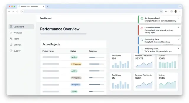
Table of Contents
Why toast messages become noise
Toast messages start as a small helper. Then teams add one for every save, every sync, every warning, and every retry. A week later, the screen feels busy, and people stop reading them.
The first problem is volume. If three or four messages stack in the same corner, users do not read each one in order. They catch a flash of color, maybe one word, then move on. When that happens, the toast is no longer feedback. It is decoration that asks for attention.
Success messages often make this worse because they repeat what the page already said. If a button changes to "Saved", the form closes, and the new data appears on screen, a toast that says "Saved successfully" adds nothing. It only trains people to ignore the next message, including the one they may actually need.
Errors create the opposite problem. Teams often show them as short-lived toasts, then remove them before a person can read the full text. That is especially frustrating when the user needs the message to fix something. If a payment fails or a file upload breaks, the feedback should stay long enough to read and act on.
The mess grows when toasts compete with other UI signals. A modal asks for a decision. A banner warns about a wider issue. Inline text explains a field. If a toast appears at the same time, the user has to decide which signal matters most. Many choose none of them and just try the action again.
A common example is a settings page: the user clicks save, sees an inline success state on the form, a green banner at the top, and a toast in the corner. That is three messages for one event. Most products need one, not three.
This is why React toast libraries matter less than the rules you set around them. Even good React toast libraries become noisy if every event gets an alert. The library only controls the box. Your product decides whether the message deserves to exist.
What to compare before you pick a library
Most teams judge toast tools by looks first. That is usually a mistake. A clean style does not help much if five messages pile up in the same corner and cover the page right when a user is trying to finish a task.
Start with volume control. A good library should let you cap how many toasts stay visible at once. Two or three is enough for most products. Anything beyond that turns feedback into clutter, and users stop reading.
Then test a burst of events. Save a form, trigger a background sync, and force one error at the same time. Some React toast libraries queue messages neatly. Others stack them so fast that the screen feels broken. You want predictable behavior when several actions fire within a second.
Duplicate handling matters more than teams expect. If the same network error happens three times, users should not get three identical warnings. Look for built-in filtering or an easy way to block repeated messages with the same ID or content. This one detail can make notification UX in React feel calm instead of noisy.
Updating an existing toast is another practical check. A common flow starts with "Saving..." and then changes to "Saved" or "Failed." If the library makes you remove one toast and create another, the result often looks jumpy. Libraries that support async toast states or direct toast updates usually feel smoother and easier to trust.
Placement needs a real device test, not a desktop guess. A bottom corner can work fine on a laptop and feel awful on a phone, especially when it sits over buttons, chat widgets, or the keyboard. Open the page on a small screen and tap through a few common actions. If the toast blocks input or hides important text, move it.
A quick comparison usually comes down to five questions:
- Can you limit visible toasts?
- Does it stay readable during event spikes?
- Can it stop duplicates?
- Can one toast change state instead of being replaced?
- Does the placement still work on a phone?
If a library handles those well, the styling part is easy later.
Libraries worth testing side by side
A fair trial for React toast libraries fits on one demo page. Use the same buttons, the same delays, and the same success and error messages for every library. That makes small differences obvious fast: spacing, motion, duplicate alerts, promise updates, and how messy the screen gets after five quick actions.
React Hot Toast is a good first pass because it is easy to wire up and easy to read. On a small demo page, it often feels light and predictable. If your team wants clean defaults and only a few moving parts, it usually gives a clear answer quickly.
Sonner deserves the same test with identical actions and timing. It often feels more polished out of the box, but polish is not the only thing to judge. Check how it stacks messages, how easy it is to update an in-flight toast, and whether the default motion still feels calm when a user triggers several actions in a row.
Notistack makes sense when your app already uses Material UI. In that case, the fit with the rest of the interface can matter more than a longer feature list. If your design system already leans on MUI patterns, Notistack may save time because the notifications feel like part of the app instead of an add-on.
React-Toastify is worth testing when you want a broader set of options without building custom behavior early. It gives you more knobs to turn, which can help, but more control also means more chances to overdo it. A toast system that needs a lot of cleanup before it feels calm may cost more time than it saves.
Use the same short checklist for each library:
- time the first working setup
- trigger five notifications in under ten seconds
- update one toast from loading to success and then to error
- dismiss items with mouse and keyboard
- check whether the screen still feels calm on mobile
Download counts do not tell you much about daily use. Setup friction does. If one library takes fifteen minutes to feel right and another keeps fighting your layout, that result matters more than popularity.
Async states need a clear flow
Most async feedback breaks because the app treats one request like three separate events. A user clicks "Save", sees a loading toast, then a success toast, and sometimes an error from a retry that fired in the background. That pileup feels small in code and annoying in real use.
A better pattern is simple: one request gets one toast, and that toast changes as the request changes. Good React toast libraries make this easy. If a library pushes you toward creating a new alert for each state, that friction will show up in the product.
One request, one toast
Skip the loading state when the action finishes almost at once. If a save takes 200 milliseconds, the toast often flashes too fast to help. Users notice the flicker more than the message. A small delay before showing the loading state usually feels better.
Once the request starts taking real time, show one loading toast and keep its identity. When the request finishes, update that same toast to success or error. The user reads one message thread instead of chasing multiple alerts.
A clean flow often looks like this:
- Wait a short moment before showing loading
- Show one loading toast for the active request
- Replace it with success when the work ends
- Replace it with error if the work fails
- Remove or fade it after the user has time to read it
Errors need more patience than success messages. A success toast can disappear quickly because the user already got what they wanted. A failed action needs a bit more time. People need to read the message, understand what happened, and decide what to do next.
Retry buttons help only when retry has a real chance to work. If the user lost network for a second, retry makes sense. If the server rejected invalid form data, a retry button wastes space and creates false hope. In that case, the toast should point the user back to the form or explain the block in plain language.
A small example makes the difference clear. Imagine a user uploads a profile photo. The app waits a beat, shows "Uploading...", then changes that same toast to "Photo updated" when the upload finishes. If the upload fails, the toast stays long enough to read and offers retry only when the file can be sent again. That flow feels calm, and calm feedback is rare enough to notice.
Accessibility checks that matter
A toast that looks fine to sighted mouse users can still fail a lot of people. If the message announces an error, a saved change, or a finished upload, screen readers need to hear that change at the right time. Good React toast libraries let you set live region behavior clearly, so a success note does not interrupt everything, while an urgent error does.
Focus needs even more care. A toast should not yank people away from the form, editor, or checkout step they are using. Keep focus where the person already is, and make the toast easy to reach if they want it. That usually means a real close button, a clear tab order, and keyboard support for dismissal.
Color is another common miss. Teams often tune toast colors once, then forget dark mode or lower-quality screens. Check contrast for the background, text, icon, and close button. If a warning toast uses pale yellow text on a light card, many people will miss it even if the design looks neat in a mockup.
Motion can also get annoying fast. Sliding, bouncing, and stacking animations may look polished for ten seconds, then feel noisy. Respect reduced motion settings. If a user asks for less animation at the system level, use a simple fade or no motion at all.
A quick manual test
Run a short check before you approve any notification UX in React:
- Trigger a success and an error toast with a screen reader on
- Tab through the page and confirm you can reach and dismiss the message
- Open light and dark themes and read every toast at normal brightness
- Turn on reduced motion and watch how the toast enters and leaves
- Start typing in a form while a toast appears and confirm your cursor stays put
One small example: if a user saves billing details, the toast should announce "Saved" to assistive tech, stay out of the input focus path, and disappear quietly. If the save fails, the message should stay long enough to read, offer a keyboard-friendly close action, and use text people can understand in one pass.
How to test a library in one afternoon
A quick trial beats an hour of reading docs. Build a small test page with real actions, then try to break it. This tells you more about React toast libraries than feature tables do.
Use one page with three actions people actually trigger: save, delete, and upload. Save covers the common success case. Delete shows how the library handles risk and confirmation. Upload reveals what happens when work takes time.
A simple setup is enough:
- a Save button that can succeed or fail
- a Delete button for a list item
- a file upload that takes a few seconds
- one control that fires several notifications fast
Then click things in a messy order. Save twice. Start an upload and delete something before it finishes. Trigger errors on purpose. Watch what the stack does when four messages arrive almost at once.
Some libraries look clean in a demo and fall apart under pressure. Messages overlap, duplicate, or hang on screen too long. If the page starts to feel noisy after 30 seconds, your product will feel worse.
Slow the network in your browser and watch the loading state. A good toast should show that work started, then update to success or failure without leaving old messages behind. Async toast states should feel clear, not busy.
Accessibility pass
Put the mouse away for ten minutes. Open the page with keyboard only, trigger each action, and try to dismiss notifications. Focus should stay predictable. The close button, if there is one, should be easy to reach.
Then run a screen reader and listen to the announcements. You want short, clear messages. You do not want the app reading three alerts in a row while the user tries to keep working.
Write down every awkward part of the API while you test. Note how many lines it takes to handle loading, success, and error. Note whether you can limit duplicates, control stacking, and update an existing toast instead of creating a new one. If you already want a wrapper after one afternoon, that is a warning sign.
A simple product scenario
Picture a finance admin updating billing settings in a SaaS app. They change the billing email, tax details, and invoice rules, then click Save. The first feedback should stay close to the form. Disable the button, show progress near it, and confirm the saved fields inline when the request finishes. A toast can support that moment, but it should not replace the form state.
Next, the admin uploads an invoice file. This is a good case for React toast libraries because the action has a simple flow: upload starts, waits, then succeeds or fails. One toast can handle the whole trip if it changes state instead of stacking three separate alerts. "Uploading invoice" can become "Invoice uploaded" without adding more noise.
Then the app starts a background sync to send the new billing data to another system. That work may finish much later, after the admin has left the billing page. Inline feedback no longer helps because the form is out of view. A short toast makes sense here because the event happens across screens and still affects the user.
Now add a failure. The tab loses focus while one last request runs in the background, and that request fails. Do not hide that inside the old form. Show a toast when the user comes back, with plain language such as "Sync failed. Please retry." Then show the full error inline on the billing or sync screen, where the person can fix it.
A simple rule keeps notification UX in React useful:
- Use inline feedback for field errors, save progress, and anything tied to what the user is looking at now.
- Use a toast for async toast states that finish later, finish off screen, or need brief confirmation across pages.
- Use both for failures that need attention now and details later.
That mix feels calmer. The user sees one message at the right time, not five alerts fighting for attention.
Common mistakes teams make
Teams usually get into trouble when they use toast messages for jobs they were never meant to do. A toast works best for light feedback: a file finished uploading, a draft saved, a background task failed. It does a poor job with form field errors.
If a user types a bad email address or leaves a required field empty, show that error next to the field. A toast in the corner forces the user to hunt for the problem. That adds friction for no good reason.
Another common mistake is showing success after every small click. If someone opens a filter, changes a tab, or expands a panel, they do not need a green "Success" message. Teams often wire toasts to every event because it feels safe, but the result is noise.
A simple rule helps: only show success when the app finished work the user might worry about. Saving account settings makes sense. Closing a modal does not.
Short timeouts cause a different kind of mess. Many teams let error toasts vanish after two or three seconds, even when the action failed hard. If a payment fails or an import breaks, the message should stay long enough to read, or wait until the user dismisses it. Fast disappearance turns a real problem into confusion.
Mobile screens make stacking worse. A toast stack that looks fine on desktop can sit right on top of bottom navigation, chat buttons, or a sticky checkout bar on a phone. Then users tap the wrong thing, or cannot tap at all. Set a low stack limit and test positions on small screens, not just a laptop.
Style drift is the mistake that creeps in over time. One feature uses rounded snackbars, another uses sharp warning boxes, and a third uses tiny status popups with different colors and timing. Users should not have to relearn feedback in each part of the product.
That is why teams should set a few rules early, especially when trying React toast libraries:
- where toasts appear
- how many can show at once
- which messages auto-close
- how errors look and sound
- when inline feedback replaces a toast
A small setup decision saves a lot of cleanup later.
Quick checks before release
A toast system is ready when it stays calm under repeated clicks, slow requests, and small screens. If a simple save action can flood the screen, the library still needs work.
Set a visible limit first. Two or three toasts on screen is usually enough. Anything above that turns feedback into clutter, and users stop reading it.
Each async action should also have one toast lifecycle. A file upload, payment, or profile save should move through loading, success, or error in the same toast. When teams fire a new toast for every state change, users see a pile of messages that all describe the same event.
Run a few blunt checks before you ship:
- Trigger the same action five times and confirm the app still shows only a small number of visible toasts.
- Test one slow async action and make sure the toast updates in place instead of spawning extras.
- Read every error message and check that it tells the user what to do next, such as retry, refresh, or fix a field.
- Zoom the page to 200% and see whether the toast still fits, wraps cleanly, and stays readable.
- Match auto-close timing to severity so minor success notes disappear quickly while serious errors stay long enough to read.
Timing matters more than many teams expect. A success message can close after a few seconds because the user already got what they wanted. An error often needs more time, especially if the message includes a step like checking an email address or trying again later.
If you are comparing React toast libraries, this short test catches most bad fits fast. The best tool is usually the one that stays quiet, clear, and hard to misuse when the product gets busy.
What to do next
Stop comparing five tools at once. Pick one library that handles stacking, async updates, and screen reader support without much extra work. Most teams learn more from a short prototype than from another week of reading feature tables.
Write a small policy before the library spreads across the app. Decide when a toast should appear, how long it stays on screen, where it sits, and which events do not need a toast at all. That single page of rules will save you from the slow creep of noisy product feedback.
Keep a few approved examples ready in your design system or internal docs:
- a loading toast for a real async action
- a success toast in plain language
- a failure toast with a useful next step
- one case where the UI should stay quiet
These examples make reviews faster. They also give engineers, designers, and QA the same standard to work from. When teams test React toast libraries this way, the tradeoffs become obvious fast.
Make toast behavior part of UI QA, not an afterthought. Check what happens when users click twice, trigger several actions in a row, switch to mobile, or use only a keyboard. Good notification UX in React should stay calm under pressure, not pile up alerts until people ignore them.
If your product has a lot of async work, spend extra time on async toast states. Loading should turn into success or failure cleanly. Users should never wonder whether the app is still working, finished, or quietly broke.
A short review now will prevent a lot of messy fixes later. If your team wants a second opinion, Oleg Sotnikov can review product feedback flows as part of Fractional CTO or product architecture work. That kind of outside check is often enough to catch patterns that slipped into the product one toast at a time.


