React markdown libraries: when simple rendering is enough
React markdown libraries fit docs, release notes, and help panels well. Learn when basic rendering works and when you need safer, custom UI.
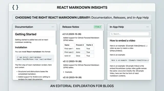
Table of Contents
Why markdown gets messy in React
Markdown looks simple until the same app uses it in three different places.
A docs page reads like an article. Release notes need tighter spacing, version labels, and plain headings people can scan fast. An in-app help panel has less room, so text, callouts, and code samples need to fit beside forms, settings, or a sidebar.
Teams usually notice the mismatch late. They pick a React markdown library, render headings and lists, and move on. Then the awkward cases show up. Tables overflow narrow panels. Alerts need special styling. Code samples need syntax highlighting, copy buttons, or better behavior on small screens.
A blog-style renderer can look fine on a marketing page and still feel wrong inside a product. The spacing is too loose, headings are too large, and the whole block looks like it came from somewhere else. Users spot that quickly.
Things get messier when different teams write the content. Product writes release notes one way. Support writes help articles another. Engineers expect fenced code blocks, tables, and inline code to stay clean and consistent. Then someone pastes raw HTML. Someone adds a giant table from a spreadsheet. Someone wants a warning box that matches the app theme. Simple rendering stops being simple.
Security changes the job too. If only developers touch the content, the risk is lower. If editors, customers, or imported tools can change markdown, sanitization becomes part of the setup. Without it, one bad content field can break the layout or push unsafe HTML into the page.
Markdown itself is not the hard part. The hard part is making docs, release notes, and help panels feel right inside one product while keeping code readable and content safe.
When plain rendering is enough
A lot of teams start with basic markdown output and never need more. That's often the right call.
If your content is mostly headings, paragraphs, lists, and simple links, a default renderer keeps the setup small and easy to maintain. Static docs are the clearest example. A product overview, setup guide, or internal handbook usually doesn't need custom layout rules. You write markdown, render it in React, and move on.
Release notes also fit plain rendering well. Most updates follow a simple pattern: a date, a few bullets, maybe some inline code for a version name, flag, or command. Readers scan release notes fast, so clean text usually works better than extra UI.
Short help panels inside an app can stay simple too. Think of a tooltip drawer, onboarding note, or support article next to a form. If the goal is to explain one task in a couple hundred words, plain markdown keeps the content easy to edit without pulling engineers into styling work.
Plain output tends to work when the content sticks to standard markdown, the visual style rarely changes, editors don't need tabs or custom callouts, and the team wants fast publishing with low upkeep.
There's a cost to every extra rule. More custom rendering means more code to test, more edge cases, and more design decisions to revisit later. If your docs already look fine with default HTML elements, changing them just because you can is usually wasted effort.
Picture a small SaaS team shipping weekly updates. They publish a docs page, a monthly release note, and a short in-app help box. All three can run on the same plain markdown pipeline for quite a while with almost no friction. That's where React markdown tools work best: they turn simple content into readable UI without making the content system bigger than the product.
Use plain rendering when the content is stable, the layout is predictable, and readers mostly want clear text fast.
When custom components make sense
Custom components start paying off when markdown stops acting like plain text and starts acting like product UI.
If a help article sits inside your app, users expect the same spacing, alerts, code styling, and mobile behavior they see everywhere else. A common breaking point is tables. Raw markdown tables look fine on a wide screen, then turn into a cramped mess on a phone. Replacing them with a responsive table component fixes that fast and gives you one table style across docs, release notes, and support content.
Callouts are another good reason to customize. A warning about deleting data should not look like an ordinary paragraph with a bold word at the start. It's better to map a markdown pattern to your alert component so notes, warnings, and tips are obvious at a glance.
Teams also swap out basic elements when product rules matter more than default HTML. Headings may need consistent spacing and anchor behavior. Links may need app routing or tracking rules. Images may need captions, dark mode handling, or tighter size limits. Lists and blockquotes should match the rest of the app instead of looking like generic browser output.
This matters most in tighter interfaces. In a dashboard, settings page, or in-app assistant, markdown that suddenly uses different fonts, link behavior, or oversized images makes the product feel patched together.
Most React markdown libraries make this manageable because they let you map markdown elements to your own React components. Writers still use simple markdown, but you control how it appears.
Imagine release notes inside a product sidebar. A plain renderer might dump a table, a warning block, and some browser-default links. A custom setup can stack table rows on mobile, show the warning in your app's caution box, and route links the same way the rest of the product does.
If markdown needs to match app design, follow product rules, or behave well on small screens, custom components are usually worth the extra work.
What good code blocks need
People stop trusting docs quickly when code is hard to read, hard to copy, or spills out of the page.
Good code blocks do a quiet job. Readers should be able to scan the example, copy it once, and move on.
Syntax colors should fit the rest of your app. If your product has light and dark modes, code blocks should switch too. Bright demo themes can look nice for a minute and feel tiring after that. Good contrast matters more than flashy colors.
Copy buttons help, but only where people actually copy code. A shell command, JSON payload, or config snippet earns a copy button. A tiny two-line example in release notes usually doesn't. If every block gets the same extra UI, readers tune it out.
Long lines need a clear rule. For commands and code that must stay exact, horizontal scrolling is usually safer than forced wrapping. Wrapping can split flags, break indentation, and make correct code look wrong. In a narrow help sidebar, soft wrapping can still work if you preserve spacing and readability.
Inline code and fenced blocks should look different. Inline code sits inside a sentence, so it should stay compact and calm. Fenced blocks need more room, a clear background, and enough padding to separate them from body text.
A quick test catches most problems: try one short snippet and one very long one, check both light and dark themes, copy from desktop and mobile, and compare inline code with full blocks.
Teams often get decent results on day one, then run into trouble when real content arrives. One command in a release note is easy. A narrow in-app panel with dark mode and long API examples is where weak defaults start showing.
If you change one thing first, fix readability before adding extras. Readers forgive plain styling. They do not forgive code they can't use.
How to keep markdown safe
Markdown stays fairly safe only when you control where it comes from.
If your team writes release notes in the repo and reviews them in pull requests, the risk is low. Content pasted into a CMS, help center, or admin panel is different, even if the same React component renders it.
For hardcoded content, simple markdown rendering is often enough if you keep raw HTML turned off. Many libraries can parse more than plain markdown, and that's usually where trouble starts. If you don't need raw HTML, don't allow it.
Strip unsafe HTML before it reaches the page. Server-side filtering is better because it protects published content, not just previews. Then use the same rules in the editor preview so writers don't see one thing and publish another.
A short allowlist usually works better than a long blocklist. Most teams only need paragraphs, headings, lists, blockquotes, emphasis, strong text, inline code, fenced code blocks, and a small set of attributes such as a language class for syntax highlighting.
Skip inline styles, script-related attributes, embedded frames, and random HTML from pasted content. The same rule applies to custom components. A callout box can render plain text and markdown children. It should not accept arbitrary HTML props from the source.
Pasted content is where bugs usually appear. Notion, Google Docs, Word, Slack, and AI chat tools often add extra spans, comments, line breaks, and odd formatting. Test ugly samples, not clean demo markdown. Paste a release note from a docs tool, then a code example from a chat app, and see what your renderer keeps, drops, or mangles.
Code blocks need extra care. Render them as text, not executable HTML. If a snippet includes angle brackets, your renderer should escape them and show the code exactly as written. That one detail prevents a surprising number of problems.
A simple setup path
Most teams should begin with one library and plain content. react-markdown handles headings, paragraphs, lists, quotes, and basic code blocks with very little setup. For docs pages, release notes, or short in-app help, that's often enough.
Things get messy when teams try to solve future problems before they have them.
A simple order keeps the setup easy to maintain. Start with react-markdown and default rendering. Add remark or rehype plugins only when a real content need appears. Introduce custom components when the design actually breaks, not on day one. Add sanitization before more people can edit or paste markdown. Then watch performance if a page renders a lot of long files or heavy code samples.
Plugins deserve a light touch. If writers need task lists, tables, or footnotes, add the one plugin that solves that problem. If you need control over final HTML output, use a rehype plugin for that job and stop there. A pile of plugins becomes hard to debug fast, especially when one changes markup another plugin expects.
Custom components should solve visible design problems. Maybe your release notes need callout boxes, copy buttons on code blocks, or a table style that matches the app. That's a solid reason to replace default elements with your own components. Until then, plain output is easier to test and easier to trust.
Sanitization usually matters earlier than teams expect. A markdown file in the codebase has one risk level. A shared editor used by product, support, or marketing has another. Once more people can add content, protect the rendering layer before someone pastes unsafe HTML into a help article.
Performance usually stays fine at first. It starts to slip when one screen renders many large markdown files, long release histories, or syntax highlighting for every code block at once. When that happens, split content by page, cache parsed output, or load heavier sections only when readers open them.
This path is boring on purpose. For content systems, boring is usually the right choice.
One product, three markdown use cases
A lot of teams start with one markdown setup for everything. That feels sensible at first. Then the product grows, and the same rules start to feel wrong in different places.
Public docs need stability above all. Heading anchors should stay consistent over time, tables should remain readable on small screens, and code samples should be easy to scan and copy. If one oversized table breaks a doc layout, readers notice fast.
Release notes have a different job. They need to go live quickly, usually from a simple template, with almost no hand tuning. Predictable formatting matters more than visual flair. Dates, short summaries, lists, and the occasional code snippet are usually enough.
In-app help lives inside a tight interface. Space is limited, so long headings, wide tables, and roomy paragraph styles can make a small panel feel bloated. Short tips, compact lists, and restrained code samples work better there.
One renderer can still support all three, but a single untouched style layer rarely works well. Docs often need stable heading IDs, table styling, and stronger code block treatment. Release notes usually need a narrower content set and stricter spacing. In-app help often needs smaller margins, fewer heading levels, and more compact components.
Teams usually get the best result from a shared markdown parser with separate display presets for each surface. That keeps the editing flow simple while helping the product feel like one product instead of three unrelated screens.
This pattern shows up all the time in startups. A docs page can afford a full code sample and a comparison table. A release note should publish in minutes. A help drawer inside the app should answer one question and get out of the way.
Mistakes teams make early
Teams often reach for extra power too soon. They add MDX on day one because it sounds flexible, even though plain markdown would handle docs, release notes, and help text just fine. That adds build complexity, editor friction, and more rules for content authors before anyone has a real problem to solve.
Another common mistake is allowing raw HTML without a safety plan. It feels convenient when someone wants a custom callout, an embedded video, or a quick layout fix. Then one unsafe snippet slips in, and the team has to untangle security issues, broken styling, and inconsistent content at the same time.
Code blocks also get pushed to the end, and that usually backfires. If your product includes setup notes, API examples, or release notes with commands, people notice bad code blocks right away. Poor spacing, weak contrast, missing language labels, or too much extra UI can make the whole interface feel unfinished.
Teams also try to force one content model into every screen. That rarely works. A long-form docs page, a release note card, and a tiny help panel do not need the same renderer, the same allowed elements, or the same styling rules.
A common example looks like this: a startup uses one markdown component everywhere. It works on a docs page, then starts falling apart inside a sidebar help widget because headings are too large, tables overflow, and code snippets consume the whole panel width. The content isn't the problem. The presentation is.
A few warning signs show up early. Writers ask for MDX components even though most pages still use plain paragraphs and lists. HTML starts sneaking in to patch layout problems. Code examples look different from one screen to the next. Short help content carries the same heavy renderer as full documentation.
Teams that separate these use cases early usually save time later. Plain markdown works well in many places. It just needs clear limits, safe rendering, and code blocks people can actually read.
Questions to ask before you decide
Most teams don't need a complex markdown stack on day one. A basic renderer works well when a small group writes short content, the input comes from a trusted place, and readers only need headings, lists, and simple formatting.
The decision gets easier when you ask a few plain questions.
Who writes the content, and how often does it change? If one engineer updates release notes once a week, plain rendering is usually enough. If product, support, and marketing all edit the same content, you'll want clearer rules, reusable components, and one consistent look.
Do you trust every markdown file? If not, sanitization isn't optional. User-submitted or copied content can carry unsafe HTML and other surprises.
Do readers need more than text? Tables are common and usually manageable. Tabs, callouts, accordions, and live UI examples often mean you need custom components.
Will people read code on phones? Wide snippets break layouts fast. Good code blocks need horizontal scroll, readable spacing, and syntax colors that still work on a small screen.
Should docs, notes, and in-app help feel like one product? If the answer is yes, shared components matter earlier than you might expect. They save cleanup later.
A small example shows where the line usually sits. A startup with short changelog entries can ship plain markdown in React in a day and move on. The same team may later add onboarding guides, API examples, and support articles inside the product. That's often the point where simple rendering starts to feel cramped.
If your answers stay simple, keep the setup simple. If several answers point to richer content, stricter safety, or tighter design control, build for that before the content pile gets hard to manage.
Next steps for your team
Start with the smallest setup that fits what you publish today. Most teams don't need a complex stack right away. If your content is mostly headings, paragraphs, lists, and links, simple markdown rendering in React is often enough.
Write down your content rules before anyone adds more plugins. Keep the document short. List which markdown features you allow, which ones you block, and which ones need custom handling. That single page saves time later when someone asks for tables, callouts, embeds, or custom components.
Then test real content, not polished samples. Use one docs page with longer text and a couple of code examples, one release note with short updates and version labels, one in-app help panel with tight space, and one unsafe input test to confirm your sanitization rules actually work.
That step usually makes the choice clear. If all three cases render cleanly, stay simple. If only one case needs special UI, add custom components for that case instead of rebuilding the whole system.
Check code blocks early. A plain block is fine for many teams. If readers need copy buttons, line numbers, syntax colors, or language labels, decide that now and test on mobile too. Bad code blocks make good docs harder to use.
If this choice affects your product architecture or editor workflow, an outside review can help. Oleg Sotnikov at oleg.is works as a Fractional CTO and advisor for startups and small teams, with a strong focus on lean software architecture and practical AI-first development. That's often useful when you're trying to keep a markdown setup simple now without boxing the team in later.
Frequently Asked Questions
Do I need a custom markdown setup from day one?
No. Start with plain markdown if your content is mostly headings, paragraphs, lists, links, and short code snippets. Add custom components only after a real layout or product UI problem shows up.
Is react-markdown enough for most apps?
For many teams, yes. react-markdown covers common docs, release notes, and short help content with very little setup. It stays easy to maintain as long as you keep the content simple and avoid extra plugins you do not need.
When should I use custom components?
Swap in custom components when markdown needs to feel like part of your product, not a generic article. Tables in narrow panels, warning callouts, app-aware links, and tighter spacing are common reasons to do it.
Should I allow raw HTML in markdown?
Usually, no. If you do not need raw HTML, keep it off. That removes a lot of security and layout risk before it starts.
What content do I need to sanitize?
Sanitize any markdown that comes from a CMS, admin panel, pasted content, customer input, or shared editor. Keep a small allowlist for normal text, links, quotes, and code, and strip styles, scripts, frames, and odd attributes.
How should code blocks work on mobile?
Make code easy to read and easy to copy. On small screens, let long commands scroll sideways instead of wrapping them into a mess. Keep inline code compact, and give fenced blocks more padding and a clear background.
Can I use the same markdown renderer for docs, release notes, and in-app help?
One parser can support all three, but one style rarely fits all three well. Public docs need stable anchors and stronger code formatting, release notes need fast, predictable text, and in-app help needs tighter spacing and fewer heavy elements.
When do markdown plugins become too much?
Plugins start causing trouble when you add them for future ideas instead of current needs. Each extra plugin adds markup rules, debugging work, and more chances for one plugin to break another. Add one only when a real content case demands it.
Should I pick MDX instead of plain markdown?
Not unless you already need embedded React components inside content. Plain markdown fits most docs, release notes, and help text with less build complexity and less editor friction. Move to MDX only when markdown clearly blocks a real use case.
What should I test before I ship a markdown setup?
Test with real content from your product, not clean demo text. Try a long docs page, a short release note, a cramped help panel, a wide table, a very long code snippet, dark mode, mobile, and one ugly pasted sample. That will show you where your setup breaks.