React drag and drop libraries for boards and lists
React drag and drop libraries differ more than demos suggest. Compare touch support, nested layouts, and custom behavior before you commit.
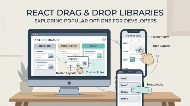
Table of Contents
Why this choice gets messy fast
A simple sortable list looks easy. You grab an item, move it up or down, and save the new order. A kanban board in React is a different job. Now cards move inside a column, across columns, and sometimes between filtered views. A library that feels smooth in a flat demo can get awkward as soon as the layout stops being flat.
That gap is why drag and drop libraries are hard to judge from screenshots or short examples. Most demos show ten boxes on a desktop screen with perfect spacing. Real products have sticky headers, long cards, auto scroll, empty columns, and users who drag too fast.
Phones add another layer of trouble. Touch drag and drop often clashes with normal page scrolling, especially when a board sits inside a scrollable page. If users try to scroll and the app starts dragging, it feels broken right away. If the app waits too long before it starts dragging, it feels slow. Tiny timing choices matter on mobile.
Nested layouts raise the cost again. A planner might have swimlanes, each lane might have columns, and each column might have cards with handles, menus, and input fields. Then the rules pile up: some cards can move anywhere, some only within a lane, some groups can reorder, and some cannot. Each rule sounds small until you try to combine it with the rest.
This is where polished demos mislead people. A package may look clean when it handles one happy path. The pain shows up later, when you need custom collision rules, better keyboard behavior, smoother touch support, or drag previews that do not jump around.
What to compare before you pick a package
Start with the shape of the UI, not the package name. A simple sortable list has very different needs from a kanban board React setup with columns, or a planner with swimlanes, dates, and cards moving across more than one axis. If you also need a tree view, nested drag and drop gets hard fast.
A library can look great in a demo and still fight you once real rules show up. It is easier to judge React drag and drop libraries when you first write down the layout you actually need: list, board, planner, tree, or some mix of those.
Then test input methods early. Mouse support is usually the easy part. Touch drag and drop is where many tools start to feel awkward, especially on tablets. Keyboard support matters too if people need accessible reordering instead of pointer-only dragging.
Before you compare APIs, write down what users can do. Can they reorder items in one list, move cards between columns, copy instead of move, group items, or block drops in certain places? Those rules shape the whole build.
Empty columns are a common trap. Some libraries handle them cleanly, while others need extra code just to let a user drop into blank space. The same goes for blocked drops, fixed cards, and rules like "only managers can move this item."
You should also estimate how much custom logic your team can keep alive. A small product team can handle a few drop rules and one custom preview. It gets painful when the app needs nested containers, touch fixes, auto scroll tuning, and special cases for every column.
If your app will stay close to a plain sortable list pattern, many options can work. If the product already sounds full of exceptions, pick the tool that stays predictable under pressure, even if the first demo looks less polished.
The main options people reach for
Most React drag and drop libraries look similar until you try to build something slightly unusual. A flat list is easy. A board with touch support, nested areas, auto scroll, and custom drop rules is where the differences show up.
dnd-kit is the package many teams try first now. It handles mouse, keyboard, and touch well, and its sortable tools can get a board running without much setup. The tradeoff is control. Once you need nested drag and drop, custom collision rules, or planner style moves between uneven containers, you often end up writing a lot yourself.
React DnD gives you more control from the start. That helps when cards, columns, side panels, and odd drop targets all need different rules. It is powerful, but it also feels lower level. For a standard kanban board React app, it can feel like a lot of wiring for something that sounded simple.
react-beautiful-dnd set the pattern for board style movement, and maintained forks such as @hello-pangea/dnd still feel good for that shape of UI. If your app is basically lists inside lists, it stays pleasant. Once the layout stops being linear, the cracks show. Grids, deep nesting, and unusual constraints can get awkward quickly.
Native HTML drag and drop still matters as a baseline. It costs nothing and can work for desktop-only tools. But touch support is uneven, and details like drag previews and reorder feedback usually become your problem.
Older packages like react-sortable-hoc still appear in tutorials. They can work, but many bring more limits, more patching, and more time spent fighting the library instead of building the feature.
How touch support changes the result
A package that feels fine with a mouse can feel broken on a phone. That changes the whole choice, especially for a kanban board React setup or sortable lists React users touch every day.
Desktop emulation is not enough. Test on a real phone, with your thumb, while standing, scrolling, and switching between short and long lists. That is when small problems show up fast.
Long lists are where many libraries start to feel awkward. If a user tries to scroll and the library starts a drag instead, the board gets annoying within minutes. If the user needs a long press before dragging, that can help, but only if the delay feels natural and not sluggish.
A small drag handle often makes touch much better. It gives people one clear spot to grab, so they can still tap cards, open menus, and scroll the list without moving the item by accident. Without a handle, every card becomes a trap.
A quick phone test should answer a few plain questions. Does drag start on tap, on hold, or after a short move? Can you scroll a long column without triggering drag? Can you still tap buttons inside the item? What happens when your finger reaches the edge of the screen?
That last question matters more than people expect. On a real board, users drag toward the top or bottom while the list needs to keep scrolling. Some libraries handle edge scrolling smoothly. Others stall, jump, or drop the item in the wrong place.
If you are choosing between packages, trust the one that feels boring on mobile. Smooth scrolling, predictable drag start, and clean handles beat flashy demos every time.
Nested layouts expose weak spots
A flat sortable list can make most libraries look fine. Add columns, empty lanes, and child items, and the weak spots show up fast.
Start with a basic board move: drag a card from one column to another, then move it back. Some libraries reorder well inside one list but get awkward when items jump between containers. You start seeing odd index bugs, jumpy previews, or cards that snap back for a frame before they settle.
Empty columns are a common trap. A good library lets you drop into an empty lane without fake spacer items or invisible targets. If you need hacks just to make an empty column accept one card, the rest of the board usually gets harder too.
Nested layouts raise the cost again. A planner with swimlanes, cards, and small subitems inside each card sounds normal, but parent and child drop zones often fight for control. One layer wants to sort the lane. The other wants to sort the checklist inside the card. If the library does not give you clear control over drag handles, sensors, and collision rules, you end up writing a lot of guard code.
The visual side matters just as much. In deep layouts, placeholders can stretch cards, spacing can collapse, and auto scroll can pick the wrong container. That feels minor in a demo. In a real board, it makes the whole UI feel unreliable.
A short test exposes most of this. Build one screen with three columns, one empty column, cards that move across columns, one card with subitems you can reorder, and enough content to force scrolling. Then try it with a mouse and on a phone. For nested drag and drop, that tells you more than any feature list.
When custom behavior starts to hurt
A drag interaction looks simple until the board needs rules. Then the library stops being a neat UI helper and starts shaping your product.
The first pain usually shows up in business logic. A team wants done cards locked so nobody can drag them back. Template cards should copy into a column instead of moving. Some drops should work only for managers, or only when a column is open, or only when the item type matches the target.
Many React drag and drop libraries can do this, but the cost changes fast. If you can express rules in one drag handler, that is fine. If you need custom sensors, manual state patches, and extra code to fix visual glitches after every drop, the library is fighting you.
A small planner makes this obvious. Say you have swimlanes for design, engineering, and QA. A manager drags a template task into engineering, which should create a copy. An engineer drags a finished bug, which should stay locked in done. A QA lead opens a card menu mid drag, and a checkbox inside the card still needs to work. That mix is where simple demos fall apart.
You can usually spot trouble early. If you are writing more guard code than drag code, if clicks and inline editing break once dragging starts, if one column keeps needing special treatment, or if the UI flickers and shows the wrong placeholder, the cost is already climbing.
Custom behavior is not just about rules. It is also about how much code you own around the library. Count the wrappers, event fixes, state transforms, and tests you need to trust a single move.
If a package saves 50 lines on day one but needs 500 lines to support real product rules, that is not a good trade.
A simple way to choose
Most libraries look fine when you sort a flat list on a laptop. That demo does not tell you much. Use one real screen from your app instead, with the layout people will actually touch every day.
A better test is small and specific. Build one planner view, one kanban board React screen, or one sortable list flow. Include the parts that usually break first: an empty column, a crowded column, and one item with a longer title.
Pick only two interactions for the first pass. For example, move a card between columns and reorder cards inside the same column. If you need copy mode instead of move, swap that in early. You will learn more from those two actions than from a full fake prototype.
Then test the parts teams often skip. Try drag on a phone, not just with a mouse. Try keyboard movement between positions. Try dropping into an empty state. After that, add one real rule from the product, such as a blocked column, a card that can copy but not move, or a lane that accepts only certain items.
This is where nested drag and drop setups often start to feel awkward, and where extra code grows fast. Keep the library that needs fewer workarounds. That usually means less state glue, fewer collision fixes, and less custom code around touch behavior.
If one package looks clever but takes twice the effort to support normal product rules, drop it. The boring option often wins because your team can still change it six months later.
Example: a team planner with swimlanes
Picture a weekly planner with five vertical lanes, one for each workday. Each card is a task. People need to drag cards up and down inside a day, move them to another day, and click a card to open details without the drag handle getting in the way.
Now add one more layer: each task card contains a short checklist or a grouped set of subtasks. That nested area changes the whole problem. Reordering cards across days is common. Reordering checklist items inside a card, while the card itself can still move between lanes, is where many sortable list demos stop being useful.
For this planner, the tradeoffs become clear. A lightweight sortable tool feels nice for flat card sorting, but it starts to fight you when cards have their own draggable content. dnd-kit fits a board layout well and gives you control over sensors, collision rules, and touch behavior, but you write more logic yourself. @hello-pangea/dnd feels closer to a prebuilt board for lanes and cards, but nested drag and drop is still awkward and custom rules can pile up quickly. React DnD can handle almost any interaction in this planner, but setup is heavier and the mental overhead is real.
This kind of screen also needs small rules that demos skip. Maybe Friday is read-only after 5 pm. Maybe a day can hold only ten tasks. Maybe tapping a card on mobile should open details, while dragging should start only from a small handle. Those details decide whether a library feels pleasant or exhausting.
If the planner will stay flat, a simple sortable package can be enough. If nested drag and drop is already on the roadmap, dnd-kit is often the safer place to start. It takes more setup early, but it usually hurts less once product requests start stacking up.
Mistakes that cost time
A lot of teams pick a library the same way they pick a UI kit: by GitHub stars, polished demos, or a blog post from three years ago. That usually ends badly. Drag and drop code breaks in small, annoying ways, and those problems rarely show up in screenshots.
The first expensive mistake is skipping phone and tablet testing until the board already works on desktop. Mouse drag can feel great while touch drag feels sticky, delayed, or fails near page scroll. If your users will reorder tasks on mobile, test that on day one, not after you build half the app.
Another trap is starting with nested drag and drop before simple moves feel solid. Teams build swimlanes, cards, subcards, collapsible groups, and custom drop rules all at once. Then nobody knows whether the bug comes from the library, the layout, or their own state logic. A plain list and a basic column move tell you much more than a fancy demo ever will.
Virtualization causes the same kind of pain. It can look smart to optimize early, especially for long lists, but virtualized rows can change measurements and break drag behavior in subtle ways. Get the dragging stable first. Then add virtualization and test again.
The worst time sink is trying to force a package to act like a different package. If you already replaced sensors, collision rules, previews, keyboard handling, and half the event flow, the library is fighting you. Many packages are fine inside their own limits. Outside those limits, they get expensive fast.
A simple rule helps: once your workaround list starts growing every week, stop patching. Switching early is usually cheaper than carrying a fragile setup through the whole project.
Quick checks before you commit
A library can look smooth in a demo and still fight you in a real app. Before you commit, build a rough test screen and try the annoying cases first. Ten ugly minutes now can save days of rewrite work later.
Use real hardware if you can. A phone, a tablet, a laptop with a trackpad, and a desktop mouse do not behave the same way. Many React drag and drop libraries feel fine with a mouse, then turn awkward when a thumb has to scroll and drag in the same space.
- Drag the same card on phone, tablet, and desktop. Watch for jumpy motion, blocked page scroll, or tiny drag handles.
- Move items into an empty column and into a list where cards sit almost edge to edge. Bad drop detection shows up fast there.
- Start a drag, then cancel it with Escape, by dropping outside a target, and by switching focus. The app should return to a clean state every time.
- Open a menu inside a card, type into an input, select text, and then drag. Normal controls should still feel normal.
- Read your custom drag code the next day. If one small behavior needs extra refs, timers, and patches, that pain will grow.
This test says more than any feature table. A package is usually safe when boring actions stay boring: users drag, tap, type, cancel, and recover without surprises.
If your board fails even one of these checks, take that seriously. A drag system sits in the middle of the whole screen. When it acts up, every small task feels harder than it should.
What to do next
Start with one real screen, not a feature wish list. Build a small prototype of the board your team actually needs, and give yourself one day. A planner with two swimlanes, a few cards, and drag between columns will tell you more than hours of package comparisons.
Before you test anything, write down the rules that cannot break. Keep them plain and specific. If a card must stay inside its lane, say that. If mobile users need to drag with one finger, write that down too. This step saves time because you stop judging libraries by demos and start judging them by your product.
A simple checklist is enough: the moves users make every day, what should happen on touch devices, how empty columns or groups should behave, and which layout rules are strict versus flexible.
Leave room for polish. Touch drag and drop often needs extra work, even when a library claims support. Empty states need care too. A blank column that does not show a clear drop area feels broken fast, and users notice that before they notice your code.
If your board already needs nested drag and drop, custom collision rules, or unusual planner logic, be honest about the cost. That is where many teams lose a week, then throw the first package away. A short architecture review can be cheaper than a rewrite.
If you want a second opinion before committing, Oleg Sotnikov at oleg.is advises startups and small teams on product architecture, infrastructure, and Fractional CTO work. For builds with tricky UI behavior and a lot of future edge cases, a short consultation can help you spot maintenance problems early.
Frequently Asked Questions
What should I use for a simple sortable list in React?
If you only need to reorder items in one list, start with the simplest tool that feels smooth on your target devices. For many React apps, dnd-kit works well here, but any small sortable option is fine if it stays stable on phone and desktop.
Which library fits a kanban board best?
For a board with columns and cards, dnd-kit is often the safer default because it handles mouse, touch, and keyboard better than many older options. If your board stays close to a classic list-in-list shape, @hello-pangea/dnd can still feel nicer at first.
When does React DnD make more sense than dnd-kit?
Pick React DnD when your screen has unusual drop targets, many item types, or rules that change by role or context. It gives you more control, but you pay for that with more setup and more code.
Is native HTML drag and drop enough?
Usually not. Native drag and drop can work for a desktop-only internal tool, but touch support, previews, and reorder feedback often take extra work fast.
Why does touch support change the choice so much?
A mouse hides a lot of problems. On a phone, users need to scroll, tap, and drag in the same space, so bad timing or missing handles makes the whole board feel broken.
How do I know if empty columns will be a problem?
Build a test column with no cards and try dropping into it on day one. If the library needs fake spacer items or odd hacks just to accept one card, expect more pain later.
Are nested layouts a bad fit for most drag and drop libraries?
They can be, especially when cards contain their own draggable parts. Parent and child drop zones often fight each other, so you should test one real nested screen before you commit to a package.
Should I add virtualization early for long lists?
No, not at first. Get dragging stable before you add virtualization, because virtual rows can change measurements and create hard-to-find bugs.
What is the fastest way to compare libraries?
Use one real screen from your product and test only a few everyday moves. If one package needs fewer workarounds for touch, empty states, and blocked drops, keep that one even if its demo looks less flashy.
When should I get an architecture review before building drag and drop?
Bring in outside help when the board already needs nested moves, custom rules, and touch behavior at the same time. A short architecture review or Fractional CTO consultation can save you from weeks of patching the wrong tool.


