React design tokens for theme switching in large apps
React design tokens help large teams keep colors, spacing, and runtime themes in sync. Learn when CSS variables work better than context hacks.
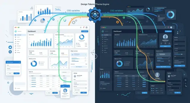
Table of Contents
Why theme code gets messy in large React apps
Theme code rarely breaks all at once. It spreads quietly. A team adds a button with a hard-coded blue, another team copies it into a modal, and a third team tweaks the hover color because it "looks close enough." A few months later, the app still feels mostly consistent in light mode, so nobody stops to clean it up.
Then dark mode arrives, and all the shortcuts show up at once. Text that looked fine on white turns muddy on dark gray. Borders vanish. One card uses a slightly warmer background than the rest, and now it sticks out. Small differences that nobody noticed before become obvious because the contrast rules changed.
Large React apps make this worse because components live for a long time and move across products. A search bar starts in the main app, then lands in an admin panel, then shows up in an internal tool. If each team copied theme code instead of sharing tokens, those versions drift fast. One app updates spacing and colors. The others keep the old values because nobody owns the cleanup.
The mess is not really about styling. It is a coordination problem.
Design, product, and engineering often use different names for the same thing. One person says "brand blue," another says "primary," and a third pastes a hex value straight into a component. Without a shared system, every team makes local choices that feel harmless. Together, they create a UI that is expensive to change.
This is where React design tokens start to matter. They give teams one place to define color, spacing, radius, and type values before those choices spread through dozens of components and several apps.
The pain usually shows up in familiar ways. A button from one app looks slightly off in another. A dark theme fixes headers but misses form fields. A new product launches with a copied theme file and starts its own version of the truth. By the time users notice, the hard part is no longer picking colors. It is getting multiple teams to agree on one set of rules and stick to it.
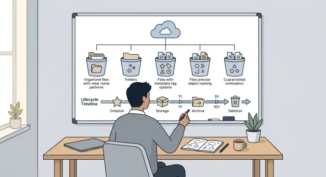
What to put in your token system
A token system should start smaller than most teams expect. In large apps, the first layer usually needs color, spacing, type, radius, and shadow. Those five groups cover most visual decisions, and they stop people from dropping random hex codes, pixel values, and one-off styles into components.
Color tokens often get the most attention, but spacing and type usually cause just as much mess. A clean type set includes font family, size, weight, and line height. Spacing should follow a scale that people can remember, such as 4, 8, 12, 16, and 24, instead of endless custom gaps.
The split between raw and semantic tokens matters a lot. Raw tokens hold actual values, such as "blue-600", "gray-950", "8px", or "shadow-2". Semantic tokens describe purpose, such as "surface", "text-muted", "border-default", or "danger".
That split saves time later. If marketing changes a brand color, the team updates the raw value once and keeps the semantic names the same. React design tokens stay easier to read too, because a component using "surface" and "text-primary" tells you more than a component using "#0f172a" and "#e5e7eb".
Component-level tokens need more restraint. Add them when the same component pattern shows up often enough to deserve its own names. A button used across six products may need tokens for padding, background, text, and hover state. A promo card used on one page probably does not.
A good rule is simple: if reuse is still unclear, stop at semantic tokens. Teams create a lot of noise when they rush into names like "checkout-sidebar-banner-title-color" for something that may disappear next sprint.
Naming rules need to exist before the token list grows. Pick a pattern and stick to it. Many teams do well with names like:
- color-surface-default
- color-text-muted
- space-4
- radius-sm
- shadow-card
The exact pattern matters less than consistency. Decide early how you name states, sizes, and aliases. If one team writes "bg-primary" and another writes "surface-brand", the token set turns into a translation job.
A good token system feels a little boring. That is a good sign. When people can guess the right name before they search for it, the system is clear enough to scale.
Where to store tokens so teams can share them
If every app keeps its own color, spacing, and type files, drift starts fast. One team tweaks a blue by hand, another renames a spacing token, and soon the suite feels inconsistent. For React design tokens, storage is a team problem before it is a code problem.
Keep the source tokens in one shared place. In a small setup, that can be a folder inside the main repo. In a larger setup, use a shared package that every app imports. The point is simple: people edit one source, not five copies.
A few storage patterns work well:
- one folder in a monorepo for all tokens
- one internal package published for web and mobile apps
- one design-tokens repo if teams work in separate codebases
The format matters less than people assume. Pick something your team can read in a code review without stopping to decode it. JSON is easy for most teams. TypeScript is fine if developers own the token layer and want type checks. A fancy format is rarely worth it if only one person understands it.
The shared source should feed generated files for each app. Your web app may need CSS variables. Storybook may need a theme object. Another app may need a typed map of token names. Treat those as outputs. Do not let teams edit them by hand, or they will drift again.
Version token changes like normal product code. Put them in Git. Review them. Tag releases. If a token rename breaks screens across three apps, that change should have the same care as any other shared dependency. Semantic versioning helps here: small color tweaks may fit a minor release, while removed or renamed tokens should trigger a major one.
A simple rule works well: one source, many outputs, zero manual copies. Teams move faster when they know exactly where tokens live and how changes reach every app.
When CSS variables beat custom context hacks
CSS variables win when the browser already knows how to do the job. Color, spacing, border radius, shadows, and typography values all cascade naturally through the DOM. If you push every token through React context instead, each theme change can turn into app state work that React never needed to do.
That difference gets obvious in large apps. A theme switch should feel like a paint update, not a component event. When you set one class or data attribute on the root element, the browser updates every child that uses those variables. You avoid passing token objects through providers, re-reading them in hooks, and wiring theme props into components that only need a background or text color.
Where CSS variables fit best
Use CSS variables for any value that should flow down the tree:
- semantic colors like surface, text, border, and danger
- spacing and sizing scales
- font sizes and line heights
- shadows, radii, and motion timings
Components can read those values in CSS modules, plain CSS, or styled systems that output real CSS. That keeps React components smaller. A button should ask for a class name, not a whole token map.
A simple setup often works best. Store theme values under :root or a root selector like [data-theme="dark"]. Then switch themes by changing that one attribute on <html> or <body>. For theme switching in React, this is usually enough for the visual layer.
Keep React context for user preference and app logic. Context is a good place to store things like theme = dark, theme = system, or theme = high-contrast. It is a poor place to store hundreds of live token values. React design tokens still matter, but React does not need to carry every color and spacing rule at runtime.
A quick example: a product suite has marketing pages, an admin panel, and an internal tool. If all three read --color-text and --color-surface from the root, they can share the same token names while using different theme files. That scales better than custom context hacks, and it is much easier to debug in the browser.
How to add runtime theme switching
Runtime theme switching breaks down when the app shows the wrong colors for a split second. That flash usually happens because the browser paints the page before it knows which theme to use. Set the initial theme on the root element before first paint, with a tiny script that reads a saved choice. If no saved choice exists, fall back to the system setting.
A simple order works well. Check account settings first for signed-in users, because that choice should follow them across devices. If you do not have an account setting, read from local storage. If neither exists, use prefers-color-scheme.
A user who picked dark mode last week should not open your app and see light mode first, even for 200 milliseconds. People notice that.
For the switch itself, update one thing at the top level, usually a data-theme attribute on html or body. Then let CSS variables do the heavy lifting. React can store the current theme name, but it should not push color values through props or custom context to every component. In large apps, that turns a small UI choice into a rendering problem.
This is where CSS variables for theming usually win. When the root theme changes, buttons, forms, cards, and layout surfaces update without a component-by-component rewrite. That keeps React design tokens practical instead of fragile.
One detail gets missed a lot: theme switching does not stop at your main components. Check anything that renders outside the normal tree or brings its own styles.
- Portals such as modals, tooltips, and dropdowns
- Charts that cache colors on first render
- Editors, date pickers, and other third-party widgets
- Email previews, embeds, or iframes that need separate theme input
If charts or widgets do not react to CSS variables on their own, reinitialize them or pass the new token values when the theme changes. Test the switch in the places people use every day, not just on a clean demo page. That is where theme drift starts.
A realistic example across a product suite
Picture one company with three React apps: a customer dashboard, an admin panel, and a settings app. Different teams ship each one, but users still see them as one product. If the colors, spacing, or button states drift apart, the whole suite feels patched together.
A shared token set fixes that. Start with semantic names that describe purpose, not raw values: surface-default, text-primary, border-muted, action-primary, danger-bg. All three apps read from the same token package, so they speak the same visual language even when their screens look very different.
The dashboard might use surface-default for cards and action-primary for chart filters. The admin panel uses the same tokens on tables, alerts, and moderation tools. The settings app uses them for forms, toggles, and help text. Nobody needs to guess whether a blue button should use #2F6BFF or #3A70F2. The token already answers that.
Each app can still keep a small local layer. That matters because not every screen has the same needs. The dashboard may need chart colors, the admin panel may need stronger warning states, and the settings app may need a subtle background for grouped form sections.
Keep that local layer thin. Add tokens like chart-series-a or settings-panel-bg, but map them back to the shared semantic layer where possible. If every team invents its own naming system, drift starts again within a month.
This is where React design tokens pay off. Change one brand color in the shared token source, publish the update, and every app picks up the new action-primary value. Buttons, links, active tabs, and focus states all move together instead of breaking one screen at a time.
CSS variables make this even cleaner in practice. Put the shared semantic tokens on the root theme, let each app add a few local aliases, and the suite stays consistent while each product keeps room for its own edge cases. That is usually enough structure for a large app family without turning theming into a side project.
Mistakes that create theme drift
Theme drift starts with small shortcuts. One team ships a quick override, another hardcodes a color in a modal, and a few months later the same brand color appears in four different shades.
A common mistake is naming tokens after what they look like today instead of what they mean. Names like blue500 or grayText2 feel easy when the palette is fresh. They age badly. When design changes, the token name stops matching its job. Semantic names like color-action-primary or text-muted hold up much better because the meaning stays stable even when the hex value changes.
Another source of drift is passing theme values through custom React context in every component. It can look clean at first, but then theme logic spreads across the whole tree. Buttons, cards, forms, and dialogs all start pulling color and spacing values through hooks or props. That creates more code than the browser needs. In large apps, CSS variables usually do this job with less friction and fewer surprises.
One-off overrides cause trouble too. A product team fixes a special page for a launch, then nobody removes the override after the design system moves on. The old value sticks around in a corner of the app. Later, someone copies that component and the mismatch spreads.
Mixing raw values and semantic tokens in the same layer makes this worse. If one component uses #1a73e8 directly while another uses color-action-primary, you no longer have a real token system. You have a half-token system, which is harder to trust.
These warning signs show up early:
- token names describe a hex color instead of a role
- components read theme data from custom context for basic styling
- old overrides stay in place after a redesign
- teams still paste raw colors, spacing, or radius values into components
- embeds and older UI parts have no fallback values
Fallbacks matter more than teams expect. If you ship embedded widgets, legacy pages, or old admin screens, some parts may load before the active theme does. Without fallback values in your CSS variables, text can disappear or backgrounds can break. A React design tokens setup stays much cleaner when every semantic token has a default, and older surfaces can still render safely.
Quick checks before rollout
Rollout problems usually show up in dull places: a new button, a shared header, a dark mode toggle that flashes the page. A React design tokens setup is ready when a team can add, switch, and trace styles without extra glue code.
Before you ship, run five small tests.
- Build one new component from scratch with only semantic tokens such as
color.text.primaryorsurface.default. If the component needs custom theme props, extra providers, or manual mapping in several files, the system still has gaps. - Toggle dark mode while the app stays mounted. Colors, spacing, and states should update in place. If you need a full remount, users will notice flashes, lost form state, or odd transitions.
- Open two apps that share the same design language. They should use the same semantic names even if each app maps them to different brand values. If one app calls a token
primaryBlueand the other calls itctaMain, drift has already started. - Ask one designer and one developer to trace a token from source to screen. They should find the source file, the semantic name, and the final CSS variable fast. If that path feels like detective work, maintenance will slow down.
- Remove a few old theme props after migration. If nothing breaks, good. If half the component library still depends on fallback props, the move is only half done.
A quick smoke test helps. Sign in, open settings, switch themes, move to another page, and open a modal. If the header keeps old colors or the modal ignores tokens, fix that now. Teams copy existing patterns, so one messy component often turns into ten.
CSS variables for theming usually make these checks easier. They let runtime themes change without rebuilding the whole React tree, and they keep styling work closer to the browser instead of hiding it in custom context code.
One rule saves a lot of pain: every new component should consume tokens the same way as every old one. Most theme drift starts with one shortcut that nobody cleans up later.
Next steps for a stable rollout
Start with one shared area and make it boring. Buttons, page surfaces, and text colors are a good first slice because every app uses them, and people notice breakage fast. If that slice works in light and dark themes, the rest of the rollout gets much easier.
Renaming files too early usually wastes time. First, write down your token layers on a single page so every team uses the same model. For most large React apps, three layers are enough:
- raw values like color scales, spacing, and radius
- semantic tokens like surface, text-muted, and border-default
- component tokens for cases like primary-button-bg or input-focus-ring
That map stops arguments later. It also makes token storage less messy because people know what belongs in shared packages and what should stay close to a component.
Use screenshots from day one. A small visual test set catches the mistakes that unit tests miss, such as a disabled button using the wrong surface color or a modal header pulling from an old token name. Even a simple before-and-after gallery for ten common screens can save hours of manual checking.
Roll out by replacement, not by rewrite. Move shared primitives first. After that, migrate forms, navigation, and status states. Leave one-off marketing pages or old admin screens until the end unless they share the same component library.
If the work keeps stalling, the problem is often not effort. The problem is architecture drift: tokens live in three places, runtime themes patch over old choices, and each app bends the rules a little more. That is the point where an outside review helps.
Oleg Sotnikov can review token architecture and theme switching as a fractional CTO. His background spans large production systems, shared platforms, and practical architecture work, so the conversation can stay focused on what your team can ship next week, not on theory.
When theme drift starts slowing releases across apps, book a consultation. A short review can give you a rollout order, a cleaner token map, and a clear line between what should live in CSS variables and what should stay in React code.