React component libraries for B2B products: how to choose
React component libraries for B2B products can speed delivery or create clutter. Learn how to compare accessibility, theme control, and upkeep.
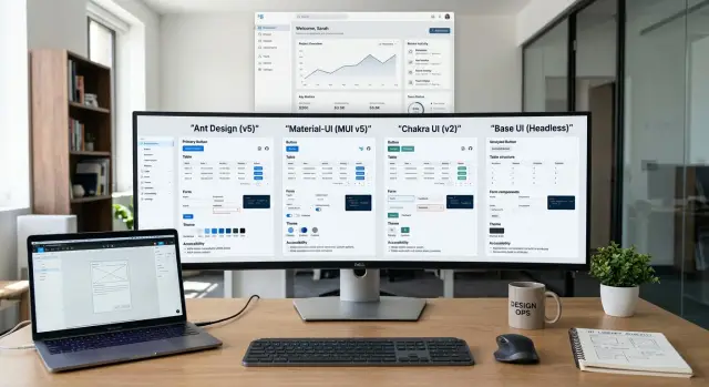
Table of Contents
Why this choice gets messy fast
B2B screens ask a lot from a UI library. One page can hold a dense table, a long form, saved filters, role-based actions, status badges, and three kinds of error messages. That mix is normal in internal tools and SaaS products, but many libraries look better on simple marketing-style demos than on real work screens.
The trouble starts when a team wants speed and consistency at the same time. They pick a library, use the default components, and ship fast for a few weeks. Then every screen starts to feel the same. The product looks generic, small UX problems pile up, and designers keep asking for exceptions that the library did not handle cleanly in the first place.
React component libraries for B2B products often win people over with polished examples. A demo table looks smooth. A date picker feels fine. A modal opens with nice motion. That does not tell you how hard it will be to build a permissions editor, an approval flow, or a dashboard with sticky columns, bulk actions, and inline validation.
Custom work usually shows up later, not on day one. You may need to restyle half the form controls, adjust spacing across dozens of screens, or patch odd behavior in keyboard navigation. A library that felt fast at the start can become slow once your team spends hours fighting defaults, writing overrides, and fixing edge cases after every update.
The mess grows because B2B products do not repeat one neat page pattern. They grow sideways. Sales wants one workflow, support needs another, finance adds export rules, and admins need extra controls that regular users never see. If the library bends badly, the UI gets noisy fast.
A good demo proves very little. Real pressure shows up when the product gets crowded, permissions get complicated, and the team still needs the interface to feel calm.
What to score before you compare options
Start with your product, not the library demo. A polished landing page can hide a weak table, a clumsy date picker, or a form layout that falls apart once your screens get busy. With React component libraries for B2B products, the dull screens matter more than the flashy ones.
Write down the screens your team ships all the time. For most B2B products, that means tables, filters, forms, settings pages, dashboards, modals, and app navigation. If a library looks nice in a simple demo but feels awkward in those screens, cut it from the list.
Next, decide what should stay consistent across the product. Buttons, inputs, table patterns, badges, empty states, sidebars, and dialog layouts usually need reuse. If you skip this step, each team invents its own version, and the interface gets noisy fast.
A short scorecard beats a long debate. Give each library a score from 1 to 5 in a few areas:
- Accessibility: keyboard support, focus states, screen reader labels, and safe defaults
- Theme control: colors, spacing, type styles, dark mode, and how often you need overrides
- Docs: clear examples for real screens, not just tiny component demos
- Upkeep: release quality, issue handling, migration pain, and API stability
Keep the scorecard simple. Four areas are enough for a first pass. Teams often learn more from building one filterable table and one settings form than from three meetings about preferences.
Set the approval rule before testing starts. Design, product, and engineering should all review the finalists, but one person should make the final call after feedback comes in. If nobody owns that step, the choice drags on and teams fall back to whatever feels familiar.
Accessibility checks that catch real issues
A library can look clean in the demo and still fail on the screens your team ships every day. The fastest way to spot trouble is to stop clicking with a mouse and use the keyboard for a few minutes.
Open a menu, move through a dialog, switch tabs, and work inside a data table. You should see where focus is at all times, and every control should work in a sensible order. If focus disappears, jumps behind a modal, or gets trapped in the wrong place, that problem will keep coming back in production.
Forms reveal a lot. Enter bad data on purpose and watch what happens. Good components show clear error text, keep labels attached to fields, and do not rely on color alone to explain a problem.
A few checks catch most of the pain:
- Tab through the screen without touching the mouse.
- Turn on a screen reader and check button names, especially icon-only actions.
- Apply your brand colors and recheck text and border contrast.
- Test a crowded screen with filters, tables, badges, and inline actions.
That last point matters more than many teams expect. A polished example page often hides issues that show up on a dense B2B dashboard. Imagine a sales screen with a left nav, a filter bar, a table, row actions, and an edit dialog. That is where weak spacing, low contrast, and vague button labels start to hurt.
Screen reader names are easy to miss. If a button shows only a trash icon or three dots, the component still needs a readable name such as "Delete invoice" or "More actions". If the library leaves that work to your team every time, mistakes pile up.
When you compare an accessible React UI library with another option, test after theming, not before. Teams often pass contrast checks with default colors, then fail after adding their own palette. A library that stays readable after custom colors will save time, bug fixes, and awkward rework later.
Theme control without endless overrides
A library saves time only if your team can change the look from one place. If spacing lives in one file, colors in another, and table styles in scattered CSS patches, the library will fight you by month two.
Start with the parts people touch every day: buttons, inputs, tables, tabs, badges, and alerts. Change the brand color, base font size, border radius, and spacing scale once. Then check how many screens update cleanly. A good library makes those changes feel boring. That is exactly what you want.
When teams compare React component libraries for B2B products, this test separates a real theme system from a pile of styled widgets. Pick one screen that looks like your product, not a demo card grid. A dashboard page with filters, a table, status badges, a side panel, and a form works well because it exposes most styling problems fast.
A few checks tell you a lot:
- Change the spacing scale and see whether form rows, table density, and modal padding still look related.
- Adjust the type scale and check whether labels, helper text, and table headers stay readable.
- Turn on dark mode and inspect contrast, borders, hover states, and focus rings.
- Add a second brand theme and see whether success, warning, and error colors still make sense.
- Count the overrides needed to restyle that one real screen.
The override count matters more than teams expect. If you need custom CSS for every button variant, extra selectors for every input state, and special rules for table cells, maintenance gets ugly fast. Six months later, nobody knows which styles come from the library, which come from your app, and which one wins.
Watch for libraries that hide styles inside hard-coded classes, inline values, or awkward selector rules. Those choices force your design system to work around the library instead of controlling it. You will feel that pain when one product team wants compact tables and another wants a roomier layout.
Dark mode exposes weak theme control better than almost anything else. Buttons may switch colors correctly while inputs, disabled states, empty table rows, and date pickers stay half light and half dark. If that happens in a basic test, it will get worse once the product grows.
The best sign is consistency with little effort. If one theme change updates buttons, inputs, and tables together, your team can move faster without turning every release into CSS cleanup.
Maintenance signs that matter after six months
The first month can fool you. Buttons look clean, docs feel friendly, and the demo app works. Six months later, you learn whether the library saves time or taxes every sprint.
With React component libraries for B2B products, maintenance shows up in small, repeated costs. A select box that needs a custom wrapper, a modal API that behaves differently from the drawer, a table fix that waits three releases. None of those kills a project alone. Together, they eat weeks.
Start with the changelog. You want a steady upgrade pace, not silence followed by a huge breaking release. Read the last six to twelve months and look for two things: how often the team ships fixes, and how painful version jumps look. If every minor update asks you to rename props, rewrite theme files, or patch styles, your future team will resent this choice.
The bug tracker matters most on boring components. Check tables, forms, selects, dialogs, and date pickers. Those parts carry most B2B dashboard UI work, so slow fixes there are a bad sign. A library can look polished in a demo and still struggle with keyboard focus in a modal or row selection in a dense table.
The API should feel like one team designed it. Props should use the same names, events should follow the same pattern, and layout rules should not change from component to component. If engineers keep building wrappers just to normalize behavior, the library is making your codebase harder to read.
A few checks usually tell the story:
- Read recent release notes for breaking changes and upgrade friction.
- Search issues around tables, forms, modals, and selects.
- Compare three component APIs side by side and look for naming drift.
- Count how many wrappers your team would need in a trial app.
- See how fast the project supports new React releases.
If the library lags behind React for months, that delay becomes your problem. You either freeze upgrades or carry workarounds in production. For a small team, that trade is rarely worth it.
How to test two finalists in one week
A one-week trial tells you more than a feature matrix. Build the same small screen in both libraries, and make it a screen your team will actually ship, not a toy example.
For a B2B dashboard UI, one page is enough if it has a few stubborn parts: a form, a table, a dialog, and validation. That mix exposes the stuff teams usually regret later, like awkward focus states, messy spacing, and components that look fine alone but clash when placed together.
Use one strict brief for both builds
Keep the brief identical. Same layout, same fields, same table actions, same dialog flow, and the same validation rules. If one version gets extra polish, the test stops being useful.
Split your timing into two parts. First, time the first pass: how long it takes to get the screen working. Then time cleanup: fixing alignment, taming defaults, adjusting theme values, and making the page feel coherent. The first number shows delivery speed. The second shows the hidden tax.
Write down friction as you go. Speed alone can fool you, especially with React component libraries for B2B products. A fast start can still lead to hours of small fights.
- table density felt too loose or too cramped
- dialog focus or keyboard flow needed manual fixes
- form validation messages took extra wiring
- theme changes caused odd side effects elsewhere
- docs answered simple cases but stalled on real ones
After both versions are done, ask one engineer and one designer to review them side by side. Keep this practical. The engineer should check how hard it was to wire state, compose components, and fix rough edges. The designer should check visual consistency, theme control, and whether the defaults already feel calm enough for business software.
Do not ask them which one they "like" more. Ask where they had to fight the library. That answer is usually more honest.
A small scorecard helps, but notes matter more. If one library saved 40 minutes on the first pass but burned three hours in cleanup, that is not a win. If both libraries shipped the page, pick the one with fewer recurring annoyances. Your team will feel those every week after launch.
A simple example from a B2B dashboard
A sales ops team spends most of the day inside one dashboard. They sort leads, filter by region and owner, apply bulk actions, open a record, edit a few fields, then jump back to the table. They also check audit history when something looks off. This is where React component libraries for B2B products stop being a style choice and start affecting daily work.
In one trial, the team picks a library that looks great in the demo. It has polished tables, nice menus, and fast setup. By the end of week one, the first screens are already live. Then the real work starts. The team needs rows with custom states: pending sync, locked by finance, recently changed, error on save. They need bulk selection to stay clear while filters change. They need audit entries to open in side panels without breaking keyboard flow. The library can do it, but every change needs overrides and small hacks.
A second library feels slower at first. Its docs take longer to absorb, and the table API is less flashy. But the parts behave more predictably. Dense tables stay readable. Form fields, inline validation, and side panels follow the same spacing and focus rules. After a few days, the screens look calmer. Users move faster because the layout stops shifting under them.
The difference usually shows up in repeated tasks:
- switching from a filtered table to an edit form
- selecting 20 rows and confirming a bulk action
- scanning row status without reading every cell
- checking who changed a value in audit history
- returning to the same spot after saving
If users do those jobs 100 times a day, small UI friction adds up fast. A row state that needs custom CSS sounds minor until three more states appear next month. A modal that steals focus sounds harmless until support teams use it all day.
The better choice is often the one that makes common screens boring and clear, even if setup takes longer. Demo pages reward shiny components. Real teams care about steady patterns, fewer overrides, and less visual noise when they are deep in routine work.
Mistakes teams make when they pick too fast
Fast demos fool people. A library can look calm and polished on its homepage, then turn into a daily headache when your team builds a real B2B dashboard UI with dense tables, filters, permission rules, and messy forms.
The first mistake is picking from screenshots. Pretty cards and landing-page examples do not tell you much about row selection, sticky columns, inline validation, bulk actions, or keyboard use inside a modal. B2B products live in tables and forms, so those parts need attention first.
Teams also wait too long to test accessibility. The mouse path may look fine, but keyboard focus can jump around, form errors can disappear for screen readers, and contrast can break once you apply your own colors. An accessible React UI library saves time only if it stays accessible after you theme it.
Another bad call is letting one engineer choose alone. The engineer may care about install speed and API shape. Design cares about spacing, states, consistency, and how the product feels after twenty screens. Product cares about delivery speed. If one person makes the choice, the team usually pays for that gap later.
Heavy customization is another trap. Some React component libraries for B2B products look flexible until you try to change input height, table density, or status colors across the app. If the API fights back, you end up stacking overrides on top of overrides. That works for a sprint or two. After that, every small UI change takes longer than it should.
The last mistake is forgetting the exit cost. Swapping libraries later is not just a button problem. Tables, forms, date pickers, dialogs, and theme tokens spread through the whole codebase. If the project stalls or the library stops fitting your needs, moving later can eat weeks.
A better approach is boring and effective: build one real screen before you commit. A customer list with filters, pagination, bulk actions, and an edit form will tell you more in two days than ten polished demos.
Quick checks before you commit
Treat the final choice like a trial run. Build one real screen from your product before you approve anything. A dense B2B dashboard UI with filters, a data table, inline validation, a modal, and a few empty or error states will expose problems fast.
If a library looks clean in demos but turns messy on that screen, stop there. Teams often waste weeks trying to make a weak fit look acceptable.
- Ask one developer to ship that screen with the library and no odd CSS hacks. If they need wrapper after wrapper just to line things up, the cost will keep showing up later.
- Put the mouse away and use only the keyboard. You should tab through the page in a clear order, open menus, close dialogs, and return focus without getting stuck.
- Change the brand basics in one pass: color, spacing, radius, typography, and dark mode if you need it. Good React theme control should happen in the theme layer, not through brittle overrides scattered across files.
- Check the upgrade path before you buy in. Read recent release notes and look at how often breaking changes hit common components. If your team has to rewrite wrappers on every major update, design system maintenance gets expensive fast.
- Hand the docs to a new hire and give them a small task. If they can build a form and table in a day, the library is clear enough to support growth.
This is where an accessible React UI library proves itself. Accessibility should not depend on one careful engineer remembering every ARIA detail by hand. The safer choice makes the right behavior the default, then lets your team adjust details when needed.
For React component libraries for B2B products, boring is often better. You want predictable APIs, stable theming, and components that survive six months of product changes without turning into a patchwork. If your trial screen feels calm to build and calm to use, that is a strong signal.
What to do next
Pick two finalists and stop browsing. Most teams learn more from one afternoon of building than from ten comparison tables, especially when they compare React component libraries for B2B products.
Build the same real screen in both libraries. Use a screen your team will ship, not a demo card grid. A good test is a B2B dashboard UI with a table, filters, form states, inline errors, a modal, and dark mode. If a library looks neat at first but gets messy once you add real states, that tells you a lot.
- Give each library the same time box, such as one day.
- Use your real colors, spacing, and type scale.
- Test keyboard use and screen reader labels while you build.
- Write down every override, missing pattern, and awkward workaround.
After that, review the scorecard in one meeting with design, product, and engineering. Keep the questions plain. Which library stayed readable? Which one fought your theme? Which one felt easy to change without breaking three other things? Which one would a new engineer understand in six months?
If the group splits, trust the calmer option. Flashy components can win a demo and still waste hours every week. A library that stays predictable under pressure usually pays off faster.
Then assign one owner for the final pick and the first setup pass. That person should document the theme rules, approved components, and anything the team should avoid early on. A short internal guide now can save a lot of rework later.
If your team wants a second opinion, Oleg Sotnikov can review the trade-offs as a fractional CTO. He works with startups and smaller companies on product architecture, infrastructure, and AI-first development, and he can help you choose a calmer path before the UI turns into a pile of overrides.