React performance budgets for admin panels that do real work
React performance budgets for admin panels should track filter lag, table updates, export impact, and memory use so daily work stays smooth.
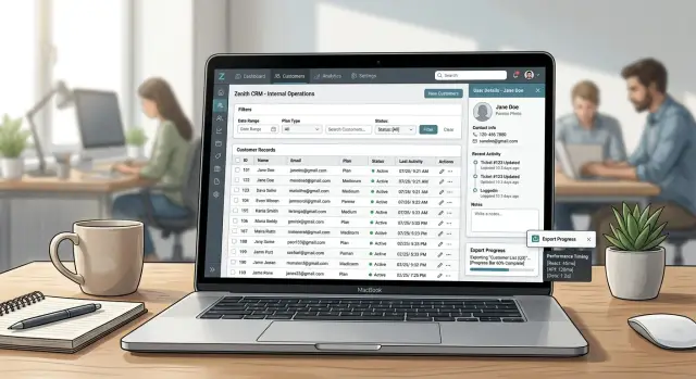
Table of Contents
Why these screens slow people down
A screen can load fast and still waste half a day. That happens all the time in admin tools, where people spend hours filtering records, sorting columns, opening row details, and exporting data. Page load tells you how fast someone arrives. It does not tell you how fast they can work once they are there.
The problem starts after the first second. A user types three letters into a filter and waits for the table to catch up. They sort by date and the whole screen stutters. They open one row, then another, then another, and each click pauses just long enough to break their rhythm. One pause is small. A hundred pauses feel awful.
Many teams stop at homepage-style metrics. They watch load time, paint scores, or bundle size and call the screen "fast." Those numbers still matter, but they miss the kind of slowness people feel during real work. In an admin panel, the pain usually starts after the page is already visible.
The same trouble spots show up again and again: search and filters, sorting large tables, opening drawers or modals, and exporting results. These are not side actions. They are the work itself. If each one adds even 300 to 800 milliseconds, the cost piles up fast. Ten extra minutes per person each day is easy to reach on a screen used by support, finance, or operations teams.
That is why admin panel performance needs a different budget. Measure the work loop, not just the entry point. If someone repeats the same action 50 times a day, that action deserves more attention than a one-time load event.
That mindset also fits the kind of lean, AI-first production work Oleg Sotnikov writes about on oleg.is. The target is not a pretty benchmark. The target is a screen that keeps up with the person using it.
For React admin screens, the useful question is simple: how much delay can a person feel during the tasks they repeat all day? Start there and the numbers become practical.
What to measure on every busy screen
People do not judge an admin panel by page load alone. They judge it by whether the table appears quickly, whether filters react right away, and whether long actions start without making the screen feel stuck. That is the difference between a page that looks fine in a lab and a page people avoid using.
Five measurements tell you far more than generic page metrics:
- Time to first usable table - the moment rows are visible, column widths stop shifting, and a person can click or scroll without the layout moving again.
- Filter latency - the delay from the last typed character to the updated result set.
- Sort response time - the time from a sort click to stable rows. Do not stop when a spinner appears. Stop when the order is final.
- Export start and export completion - users care that export begins quickly, and they care how long the whole file takes.
- Memory growth after repeated actions - apply filters, sort, open details, export, and do it again. If memory keeps climbing, the screen will slow down later even if the first run looked fine.
A small example makes this obvious. Say an operations team opens an orders screen with 2,000 rows. The table appears in 1.8 seconds, which feels acceptable. Then a user types three letters into a filter and waits 900 milliseconds after each letter. That screen is slow in practice, even though the initial load looked decent.
Watch for stability, not just raw speed. A table that paints quickly but keeps re-rendering for another second still wastes time. The same goes for exports. If the button freezes for two seconds before anything happens, people click twice and assume it failed.
If you track only one thing per interaction, track the moment when the user can move on with confidence. That gives your budget a real shape instead of a vague one.
How to set budgets that match real work
A useful budget starts with tasks people repeat all day, not with a generic page load score. On an admin screen, the delay usually comes from filtering, sorting, opening row details, and exporting data. If a slow action steals even two seconds, one person can lose 15 to 20 minutes over a shift.
Pick three to five tasks that happen every hour. Keep the list small. If you track ten tasks, nobody remembers the targets and nobody acts on them.
A billing or operations screen usually needs budgets for actions like loading the default saved view, typing into a filter, sorting or paginating a large table, opening a row drawer, and exporting the current result set.
Give each task a target in milliseconds. Make the numbers match how people work, not what looks good in a demo. Typing in a filter should feel instant, so aim for about 100 to 150 ms before the UI reacts. Sorting a visible table should usually stay under 300 ms. A full result refresh after a complex filter can take longer, but it should usually stay under 700 to 1000 ms.
Do not use one budget for every machine and every dataset. Split the targets by device type and by data volume. A modern desktop with 500 rows is one case. An older laptop with 20,000 rows is another. Write both down, because teams often test only the easy case and ship the harder one.
Keep one memory budget for long sessions. Admin users leave tabs open for hours, switch filters, open modals, and export files. If memory keeps climbing and never drops, the screen will slow down even if the first five minutes feel fine. A simple rule works well: after an hour of normal use, memory should return close to its starting range after heavy actions finish.
Also define what failure looks like. The budget fails if p95 time goes over the target in repeated runs, if scrolling stutters during normal table use, or if memory keeps growing after users close drawers, filters, and export dialogs. Once you write that down, performance stops being a nice idea and becomes a rule the team can enforce.
A simple way to test one screen
A test account with 50 demo rows tells you almost nothing. Use an account that looks like real work: enough records to fill several pages, enough filter values to stress the UI, and enough related data that opening a details panel actually does something.
Start a recording before you touch the screen. Chrome DevTools is enough for most teams. React DevTools helps if you already suspect too many re-renders. The goal is not to collect every chart. The goal is to capture the same user flow each time so the numbers mean something.
A basic run is usually enough:
- Load the screen and wait until the table, counts, and controls stop updating.
- Type into one or two real filters at normal speed, not pasted all at once.
- Sort the same column twice so you catch both directions and any extra work on re-render.
- Open a row or side panel with details and wait for the data to appear.
- Trigger an export and measure both UI response and total completion time.
That flow covers the spots where admin screens usually break down. Filters can lag after each keystroke. Sorting can freeze the main thread. Detail drawers can fetch too much. Exports often block the page longer than teams expect.
Run the same test again with a slower device profile. A modern developer laptop hides a lot of pain. Throttle CPU in DevTools or use an older machine that matches what your operations team actually uses. A screen that feels fine on a MacBook Pro can feel awful on a basic office laptop.
Write down a few plain numbers after each run. Keep them in a shared sheet, not in someone else's memory. Capture load time, time from filter input to visible update, time to open details, time until export starts, and total export finish time. Add a short note if the UI stuttered or ignored input.
That small routine settles arguments fast. Instead of debating whether a screen feels slow, you compare the same actions across builds.
Where tables, filters, and exports burn time
A busy admin screen rarely feels slow because of one giant bug. Small costs stack up until every click drags. The first number to capture is simple: after one tiny action, how many rows rendered again?
If a user checks one row, opens one menu, or types one character in a filter, the table should not redraw 500 visible rows plus headers, totals, and side panels. React DevTools Profiler makes this easy to spot. On data-heavy screens, one local change often spreads because state lives too high in the tree.
Filters create the same problem. A search box or filter chip should update only the parts that depend on it. If changing filter state forces a full sort, full table mapping, and every cell formatter to run again, people feel it before the network even matters. One date range change can trigger thousands of function calls.
Cell rendering is often the quiet culprit. Date helpers, currency formatters, status badges, and permission checks look harmless one at a time. Put them inside 12 columns and 200 visible rows, and one render turns into a lot of work. A common mistake is formatting the same timestamp or number on every render instead of reusing a prepared value.
Exports hurt in a different way. CSV generation is often fine, but large XLSX exports can block the main thread if the browser builds the file in one shot. While that runs, the next click waits. Users think the page froze because, for a moment, it did.
Requests add another layer. A filter change may fire a request, lock buttons, show a full-screen loader, or wait for older requests to settle before handling the next click. The UI then feels sticky even if the server responds quickly.
Watch the gap between "I clicked" and "the UI reacted." That gap usually comes from extra renders, table-wide recalculation, blocking export work, or request handling that stops the next action.
A realistic example from an operations dashboard
Picture a support manager opening the orders screen at 9:05 a.m. The page has 20 filters across the top, 50 visible rows, saved views, and bulk actions for status changes. This is not a page people glance at once. They sit in it for hours.
A normal task looks simple. The manager searches for delayed orders, narrows the list by region and payment state, edits one order from "pending review" to "approved," then exports the filtered results for the warehouse team. If the screen stays quick, that flow feels almost invisible. If it drags, every small step becomes work.
On a good run, the search box responds in about 100 to 150 ms, filter chips update without freezing the table, and the status edit saves in under half a second. The export action starts right away with a clear progress state, so the manager can keep working. Nothing fancy. The screen just keeps up.
Now compare that with the same screen after several filter changes. The manager tries five combinations in a row: date range, region, priority, payment state, assigned agent. After the fourth change, the table starts to stutter. Typing in search lags by almost a second. Clicking a checkbox for bulk actions pauses long enough to trigger a second click. The export button still works, but it waits on the same blocked state and feels broken.
The first budget that usually fails is filter latency, not export time. That surprises teams because export sounds heavier. In practice, the screen often burns time by re-rendering all 50 rows, recalculating totals, rebuilding selected-row state, and firing extra requests every time one filter changes. Users feel that delay dozens of times a day.
The damage adds up fast. If one filter change takes 800 ms instead of 150 ms, and a support manager changes filters 60 times in a shift, that is almost 40 extra seconds spent waiting on one action alone. Add status edits, bulk actions, and second-click mistakes, and the cost stops being abstract. The page starts to slow decisions, not just code.
Mistakes that hide slow screens
Teams miss slow screens because they test the easy version, not the real one. A table with 50 rows feels fast. The same screen with 8,000 rows, five active filters, and a CSV export button can turn into a stop-start mess.
Tiny sample data is the first trap. It hides slow sorting, expensive cell renderers, and filter logic that scans every row on each keystroke. If your users work with large accounts, old records, or wide tables, test with that shape and size from the start.
Lighthouse scores can fool you too. A good score says very little about a screen people use for 40 minutes while they filter, edit, and export. Lighthouse mostly rewards page-load basics. It does not tell you whether typing in a filter takes 600 ms after the third table refresh.
Long sessions expose problems that quick tests miss. Memory use grows when screens keep old query results, large arrays, event listeners, or hidden components alive. The page may look fine for the first five minutes, then slow down after repeated searches and modal opens.
Export code often hides inside the first screen load, and that is wasteful. Many users never export anything, yet they still download the parsing, formatting, and file-generation code on day one. Split that code out and load it only when someone asks for an export.
Teams also blame the network for every slow click. Sometimes the server is slow. Often the browser is doing most of the damage. React can re-render hundreds of cells after one small state change. A date formatter in every row, client-side filtering on a huge array, or a chart that redraws on each click can make a fast API feel slow.
A simple test proves the point. Open a dashboard with production-sized data. Type into a filter, sort two columns, open and close a detail drawer ten times, leave the tab open for an hour, then export a file. If the API stays fast but interaction time keeps growing, the network is not your main problem.
Slow screens rarely come from one giant bug. They hide in friendly demos, clean lab scores, and test data that looks nothing like real work.
Quick checks before release
People notice slowness in the last mile of work, not in synthetic scores. A short hands-on pass catches issues that dashboards and lab tests miss.
Start with the filters. Type three quick changes in a row, the way a real user would during a busy shift. Change status, add a date range, then narrow by owner. The text should appear right away, and the table should keep up without stutter. If typing feels sticky for even a moment, the budget is already too high.
Then sort a large table and watch the rows. Fast sorting matters, but stable rows matter just as much. Selected items should stay selected, expanded details should not collapse, and scroll position should not jump for no reason. Good table performance feels calm. Bad table performance feels twitchy, even when the sort itself finishes quickly.
Leave the screen open for 30 minutes. Keep auto-refresh on if the screen uses it. Then try the same filters and sort again. Memory leaks often hide during short test runs and show up later as slower clicks, rising fan noise, or a tab that starts using far more RAM than it should.
Exports need a real-world check too. Run one export, then keep working on the page. Open a side panel, change a filter, or move between tabs in the interface. Export performance is good when the file builds in the background and the rest of the screen still feels normal. If the whole page locks up, the export is doing too much work on the main thread.
Do one pass on weaker hardware before release. A modern laptop can hide sloppy rendering. An older office machine will not. If the screen still feels smooth there, your budget is probably close to reality.
A simple rule helps: if a user would notice the delay without a stopwatch, fix it before you ship.
What to do next
Pick one screen that people complain about, or one screen your team avoids touching. That is usually the best place to start. A customer list with five filters, a wide table, and a CSV export will teach you more than ten synthetic tests on a marketing page.
Write down a short budget list for that screen and keep it plain. Set numbers for the actions people feel right away, such as filter response time, sort time, table redraw time, and how fast export feedback appears after a click. If the screen handles large exports, include a budget for when the file starts in the background and when the user sees progress.
Then make those checks part of normal work:
- Add a short performance note to pull requests that touch tables, filters, or exports.
- Re-test the screen before each release when new columns or filter rules were added.
- Save a baseline so the team can compare before and after instead of guessing from memory.
- Watch real user behavior after launch, especially on older laptops and busy office networks.
This does not need a huge process. One shared document and one repeatable test path is enough for most teams at first. The win is not perfection. The win is catching the slow creep that starts when each release adds one more filter, one more column, and one more export option until the screen quietly becomes a chore.
If your team is trying to set budgets like this on a real product, oleg.is has practical writing from Oleg Sotnikov's work as a Fractional CTO on lean software systems, infrastructure, and AI-first development. That kind of experience is most useful when it shows up in ordinary screens people use all day.
Frequently Asked Questions
What should I measure first on a busy admin screen?
Start with filter latency. If someone types and waits after each character, the screen feels slow right away even when page load looks fine.
Measure from the last keystroke to the moment the table settles and people can keep working.
What response times feel acceptable for filters and sorting?
For most teams, filters should react in about 100 to 150 ms. Sorting a visible table should usually stay under 300 ms.
A heavier refresh after a complex filter can take longer, but try to keep it under 700 to 1000 ms so the screen does not break a person's rhythm.
Does page load still matter for admin panels?
Yes, but do not stop there. A fast first load only tells you how quickly people arrive.
Admin users spend most of their time filtering, sorting, opening details, and exporting. Those repeated actions decide whether the screen feels fast or slow.
How can I test one screen without building a huge process?
Use a real account with enough rows, filters, and related data to stress the screen. Then run the same flow every time: load the table, type into filters, sort twice, open details, and start an export.
Write down the times after each run. That gives you numbers you can compare across builds.
Why does a screen get slower after 30 minutes?
Long sessions often expose memory leaks and extra work that short tests miss. Old query results, hidden components, or leftover listeners can pile up and slow later clicks.
Leave the tab open, repeat normal actions, and check whether memory returns close to its starting range after heavy work finishes.
Why do exports make the whole page feel stuck?
Large exports can block the main thread when the browser builds the file in one shot. While that runs, clicks wait and the page feels frozen.
Start the export right away, show progress, and move the heavy work off the main thread when you can.
What kind of data should I use for performance tests?
Test with the same shape and size your users handle in real work. Small demo data hides slow sorting, expensive cell rendering, and filter logic that scans too much.
If your users work with thousands of rows or wide tables, use that from the start.
How do I tell whether the browser or the API causes the lag?
Watch the gap between the click and the first UI reaction. If the API returns fast but the table still stutters, the browser likely burns time on re-renders, formatting, or client-side work.
Record one run in DevTools and check whether the delay comes before or after the response arrives.
When should I say a screen failed its performance budget?
Treat it as a failure when repeated runs miss your target, when scrolling stutters during normal use, or when memory keeps climbing after people close drawers and dialogs.
That rule gives the team a clear line instead of a vague feeling.
Which screen should I fix first?
Pick the screen people complain about or the one your team avoids. A customer list or operations table with several filters and an export button usually gives you the clearest problems first.
One painful screen will teach you more than chasing generic scores across the whole app.


