Prometheus histogram buckets for APIs teams can read
Prometheus histogram buckets for APIs work best when they match user wait times and each graph answers one clear question your team can act on.
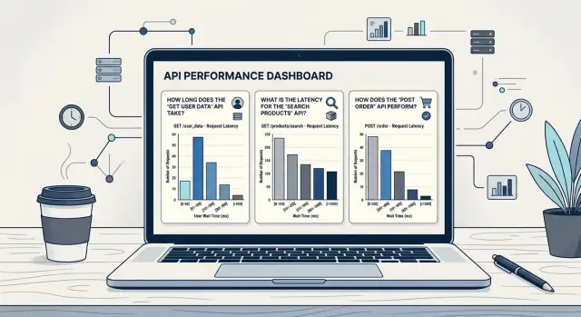
Table of Contents
Why API latency charts confuse teams
Most API latency charts look busy but say very little. During an incident, someone opens a dashboard, sees bars and percentiles jumping around, and still cannot answer a simple question: are users waiting long enough to notice? If the graph cannot answer that quickly, it adds stress instead of helping.
The usual problem is simple. Teams keep the default Prometheus histogram buckets even when those bucket edges do not match real user patience. A person using search will often notice delay around 300 to 500 ms. Someone waiting for checkout or login may tolerate more, but 2 seconds still feels slow. If your buckets jump from 1 second to 2.5 seconds, you lose the gap between "a bit slow" and "people may leave."
That gets worse when one bucket absorbs too many requests. Imagine an API where most slow calls land between 1 and 2.5 seconds. The chart shows one big bucket, but it hides the story. Did latency move from 1.1 seconds to 1.4? Annoying, but maybe not urgent. Did it move from 1.8 to 2.4? That can hurt conversion. The graph makes both cases look the same.
Then the hand-waving starts. People say the API "looks slower" and begin checking random services, caches, or databases.
A readable chart points to one action:
- "Search crossed 500 ms for many users after the last deploy. Check the new query path."
- "Checkout stayed under 1 second, so the slowdown is probably outside this API."
That is the job of the graph. Under pressure, nobody wants to decode bucket math or argue about whether a p95 spike matters. They need a picture that maps to user wait time and points to the next check.
Good latency graphs stay plain on purpose. They do not try to show every truth about the system. They answer one operational question at a time, and they make slowdowns obvious before the team burns an hour chasing the wrong thing.
Start with the wait a user can feel
Users do not care about your buckets. They care about how long an action feels. A search request and a monthly export can both return 200 OK, but people judge them on very different clocks.
Start by grouping endpoints by the action behind them. Login, live search, and checkout steps sit in the same mental space as a button click. People expect them to feel quick. A report export, file import, or invoice sync has more room because the task already feels heavier, especially if the product shows progress.
A simple set of wait bands works better than copying sample Prometheus histogram buckets from a blog post:
- instant
- fine
- annoying
- too slow
The exact numbers depend on the product. For search, "annoying" may start around 300 ms. For checkout, it may start closer to 1 second. The point is not to find perfect universal values. The point is to map bucket boundaries to waits that real users notice.
Choose bucket boundaries step by step
Start with one endpoint group, not the whole API. Group routes by what the user feels. Search requests can share one set of buckets, while checkout or file export may need another.
Pick the slowest response time you still accept for that group. Make it a number a person would notice, not a number that only looks neat on a chart. A search endpoint might have a comfort limit of 300 ms. A payment step might get 1.5 seconds.
That number is your anchor. It gives your Prometheus histogram buckets a clear job: show how much traffic stays under the line, how often requests drift toward it, and how many blow past it.
Set the buckets around that anchor in a simple way. Put several tighter buckets below it so small regressions do not disappear. If the anchor is 300 ms, buckets at 50, 100, 150, 200, and 300 ms work well. Then add a few wider buckets above it to show the long tail. For the same endpoint, 500 ms, 1 second, and 2 seconds often tell a much clearer story than a dozen tiny cuts.
Keep the total count modest. Around 7 to 10 buckets per endpoint group is usually enough. More than that and the chart starts to turn into noise.
Smaller buckets below the anchor help you catch drift early. If search used to cluster around 80 to 120 ms and now more requests land in the 150 to 200 ms range, you will see it before users complain.
Wider buckets above the anchor answer a different question. They show whether you have rare but painful slow requests. A jump in traffic from 1 second to 2 seconds often points to a timeout, a dependency issue, or a query that needs work.
Do not overfit on day one. Run the buckets for a week, then check the shape again. If almost every request lands in one or two buckets, spread them out. If several buckets stay empty all week, remove them. Good histogram bucket boundaries should make the chart readable in ten seconds, even during an incident.
Make every graph answer one question
A graph fails when people need a long explanation before they can use it. If one panel mixes endpoints, percentiles, and deploy notes, nobody knows what to do next. Good Prometheus histogram buckets help, but the chart still needs one clear job.
Are users waiting too long right now?
One panel should answer that question and nothing else. Pick a user-facing target and show how many requests stay under it. For search, that might be 300 ms. For checkout, it might be 1 second.
That view tells the team whether people can feel the delay right now. It is easier to act on than a panel packed with averages and p95 lines. A median can look fine while a painful slow tail grows in the background.
Keep this panel narrow. Use one endpoint group, one target, and a short time window. If the line drops after lunch, the on-call person should know within seconds that users are now waiting too long.
Did the deploy change the shape?
Use a different panel for that. Compare the same endpoint group before and after the release. If more requests move into slower histogram buckets, the deploy probably changed behavior even if the average barely moved.
Then use another panel to answer which endpoint group missed the target. Do not blend search, login, checkout, and uploads into one line unless the team will act on them as one unit. Most teams will not. They need to see which group broke first.
This is where many Prometheus latency graphs go wrong. One panel tries to answer three questions at once: are users seeing delay, did the deploy cause it, and which API area is failing. That usually becomes noise.
Split the panel when that happens. Small charts with one purpose are easier to read, easier to discuss, and much faster to use during an incident. If a graph cannot lead to one next step, it needs a smaller scope.
A simple example with checkout and search
Search and checkout rarely need the same latency view. Users expect search to react almost at once. Checkout gets a little more grace because it often loads prices, stock, addresses, taxes, and payment steps.
That difference should shape your Prometheus histogram buckets. If you use one bucket set for both, the chart stops helping. Search looks fine when it is already annoying, and checkout looks noisy without telling you where the real delay starts.
For search, keep most buckets inside the first half second. A set like 50 ms, 100 ms, 200 ms, 300 ms, 500 ms, 750 ms, 1 second, and 2 seconds gives the team a clear view of the range people actually feel. If the 300 ms to 500 ms buckets start filling up, the next action is obvious: check query time, cache misses, or a slow downstream call.
Checkout needs more room. A set like 200 ms, 500 ms, 1 second, 1.5 seconds, 2 seconds, 3 seconds, 5 seconds, and 8 seconds works better because it shows whether the flow stays comfortably under 2 seconds or spills into slower ranges. When the 3 second and 5 second buckets rise, the team knows where to look next: payment provider latency, tax calculation, inventory checks, or a slow database write.
Now compare that with a shared bucket set such as 100 ms, 500 ms, 1 second, 2 seconds, and 5 seconds. It blurs both stories. Search loses detail right where people notice lag. A jump from 120 ms to 420 ms feels bad, but the chart hides it inside one wide bucket. Checkout has the opposite problem. Anything beyond 2 seconds falls into a broad tail, so you cannot tell whether users wait 2.2 seconds or 4.8 seconds.
Each graph should answer one operational question:
- Search: "Did search drift past the point where users start to feel delay?"
- Checkout: "Which part of checkout pushes requests past the acceptable wait?"
If a graph does not point to the next check, it is decoration. Good API latency buckets do not just describe time. They tell the team what to inspect next.
What to graph day to day
A daily dashboard should answer a few plain questions fast. Are users waiting longer? Did traffic change? Are requests slow, or are they failing? If one chart cannot answer a clear operational question, it usually becomes wall art.
Start with percentiles for user-facing latency over time. Use p50 to see the normal case, p95 to watch the slower edge most users can still hit, and p99 to catch the ugly tail. Averages hide too much. They stay calm while a small slice of requests gets painfully slow.
Keep those percentiles separate by endpoint group. Compare search with search, checkout with checkout, login with login. If you graph the whole API at once, fast noisy endpoints can hide a smaller but more painful slowdown somewhere else.
Put request rate next to latency, not on another screen. When p95 jumps at the same time traffic doubles, load is a better first guess than bad code. If request rate stays flat but latency climbs, a deploy, query change, or slow dependency is more likely.
Split errors from slow successful requests. This matters more than many teams expect. A burst of fast 500s can make latency look better because failed requests end quickly. Keep one latency graph for successful responses and a separate error graph.
When a percentile looks strange, open the Prometheus histogram buckets behind it. Bucket counts show where requests started bunching up. If checkout p95 moves from 400 ms to 1 second, look at the counts around 500 ms and 1 second. You can tell whether most requests shifted a bit or a smaller group got stuck far out in the tail.
A small set of charts is enough for daily use:
- p50, p95, and p99 for successful requests by endpoint group
- request rate for the same endpoint group
- error rate split by status class or timeout type
- one bucket view for the busiest or most sensitive endpoint
That set stays readable. It also makes API latency buckets easier to trust because each graph answers one question and points to the next place to look.
Mistakes that waste time
A common mistake is copying bucket values from another team and assuming they fit your API. They often do not. A chart that makes sense for a high-traffic login service can be useless for a slower admin endpoint or a search API with different user expectations.
Bucket boundaries should match waits that users can feel in your app. If people notice delay around 300 ms, but your chart jumps from 100 ms to 1 second, you lose the detail that matters.
Teams also waste time when they force one bucket set onto every endpoint. Search, checkout, file upload, and background sync do not live on the same clock.
Too many tiny buckets cause trouble too, especially when traffic stays low. A bucket set like 5 ms, 10 ms, 15 ms, and 20 ms looks precise, but low volume turns that precision into noise. You end up staring at empty or barely moving buckets and trying to read a story that is not there.
Scrape interval and sample volume matter more than many teams expect. If Prometheus scrapes every 30 seconds and an endpoint gets only a few requests each minute, short time windows can mislead you. The graph may look sharp and detailed, but it rests on a tiny number of requests.
Check the request count before you trust the shape of the latency graph. If only a handful of requests hit an endpoint during the window, wider buckets and longer time ranges usually tell the truth better.
Averages waste time when tail latency hurts users. An endpoint can show a calm average while a small share of requests drags badly because of a slow query, a cold start, or a retry loop. Users do not experience the average. They experience the request that made them wait.
If checkout averages 180 ms but one in twenty requests takes 2.5 seconds, the average gives false comfort. The better chart shows where those slow requests pile up and whether that pile is growing.
A useful rule is simple: every latency graph should answer one operational question. If the graph cannot tell your team whether users are waiting too long on this endpoint right now, change the buckets or remove the graph.
Quick checks before you keep the chart
Keep a panel only if someone on the team can read it fast and act on it. If people need a five-minute explanation, the chart is not ready for a dashboard.
A panel built from Prometheus histogram buckets should pass a short desk test. Open it, point at it, and ask a teammate, "What question does this answer?" If they say "general latency" or "system health," it is too vague. Good answers sound more like "Are checkout requests staying under 1 second for most users?" or "Did search get slow enough that users will notice?"
The bucket edges should match real patience, not whatever values happened to be in an old config. If users start to feel delay around 300 ms, 1 second, and 2 seconds, those cutoffs belong on the graph. If your service target is 500 ms for p95, show a bucket near that line. A chart with labels like 0.384 or 6.144 seconds may be mathematically fine, but most teams will just guess.
One more test matters a lot: the chart should move before things are clearly bad. If latency slips from 220 ms to 350 ms and the graph barely changes, your buckets are too wide. You want early signal, not a spike after users are already annoyed.
A quick review usually catches the weak panels:
- Ask one teammate which decision this panel supports.
- Check whether each threshold matches user wait time or an SLO target.
- Replay a recent slowdown and see if the graph changes enough to notice.
- Look at the labels and ask a non-specialist what they mean.
- After one glance, name the next service or endpoint you would inspect.
That last point matters. A useful chart narrows the search. If the panel tells you "search is slow for requests above 1 second," the next stop is obvious. If it only says "latency is weird," it adds noise.
Keep the chart that helps a tired teammate make the next move in ten seconds.
What to do next
Pick one busy endpoint group and fix that first. Search, login, and checkout usually work well because people use them all day and feel delays fast. If your Prometheus histogram buckets still come from a default template, redraw them from waits a person can notice, not from round numbers that just looked tidy in a config file.
A simple starting point is to place more buckets where people start to feel friction. For many APIs, that means tighter steps below 1 second and fewer steps after that. A practical set might look like this:
- 100 ms, 200 ms, 300 ms, 500 ms
- 750 ms, 1 second, 1.5 seconds, 2 seconds
- 3 seconds and 5 seconds only if users really wait that long
Then review one full week of traffic. Do not guess from one busy hour. If several buckets stay empty all week, remove them. If two neighboring buckets always move together, keep one and drop the other. The graph should feel readable in a few seconds.
Each panel needs one job. Write that job into the dashboard title or description as a plain question. "Are checkout requests staying under 1 second for almost everyone?" is good. "Did search slow down after the last deploy?" is good too. That small change stops people from staring at Prometheus latency graphs and arguing about what they mean.
One habit helps more than most teams expect: pair the chart with the decision it should trigger. If the answer is no, someone should know what to check next, such as a slow database call, a cache miss, or a noisy downstream service.
If you want an outside review, Oleg Sotnikov at oleg.is works with startups and small teams on API observability, infrastructure, and Fractional CTO support. He has spent years building lean production systems, so the advice tends to stay practical and close to what a team can actually run.
Frequently Asked Questions
Why do default Prometheus buckets confuse teams?
Default buckets rarely match the wait users notice. When one wide bucket covers 1 to 2.5 seconds, the chart hides whether latency got a little worse or crossed into a range people feel. That slows incident work and sends teams in the wrong direction.
How do I pick the first bucket boundary?
Start with the slowest response time you still accept for that endpoint group. If search should feel fine under 300 ms, place several buckets below 300 ms and a few wider ones above it so you can spot both small drift and ugly tail latency.
Should every endpoint use the same buckets?
No. Search, login, checkout, and exports run on different user clocks. Give each endpoint group buckets that match the action, or the graph will blur the part people actually feel.
How many buckets do I need?
Aim for about 7 to 10 buckets for one endpoint group. That usually gives enough detail to catch drift without turning the panel into noise.
What should one latency graph answer?
Make each panel answer one question, such as "Are search requests staying under 300 ms right now?" When one graph tries to explain latency, deploy impact, and failing areas at once, people waste time arguing over it.
Are percentiles enough on their own?
No. Use p50, p95, and p99 for a quick read, then open the histogram buckets when a percentile jumps. The buckets show where requests started piling up, which tells you whether most traffic shifted a bit or a smaller slice got very slow.
Should I graph averages too?
Do not rely on averages for user pain. An API can average 180 ms while one in twenty requests takes 2.5 seconds, and those slow requests are what people remember.
What should I do for low-traffic endpoints?
Check request count before you trust the shape. When traffic stays low and Prometheus scrapes every 30 seconds, tiny buckets and short windows create fake precision. Use wider buckets and a longer range so the chart reflects real traffic.
How do I know my bucket setup works?
Run the buckets for about a week and inspect the shape. If almost everything lands in one or two buckets, spread them out. If several buckets stay empty, remove them so the chart stays easy to read.
What should I fix first if my charts are messy?
Pick one busy endpoint group like search or checkout and redraw its buckets from user wait time, not template values. Then rename the panel as a plain question and tie it to the next check, like query time, cache misses, or payment latency. If you want a second opinion, you can book a consultation with Oleg Sotnikov.


