Mobile form design for long workflows done in bursts
Practical tips on mobile form design for long workflows, with clear rules for autosave, validation timing, and attachments when staff work in bursts.
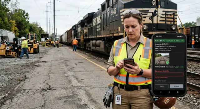
Table of Contents
Why these forms fail in real work
Most form problems start away from the screen. A worker begins a task, gets a call, walks to another area, waits for approval, takes photos, and comes back 20 minutes later. The form may look tidy in a demo, but real work happens in short bursts.
That breaks a lot of design assumptions. Teams often imagine one person filling every field in one sitting, with full attention and a stable connection. Field staff rarely work like that. They pause, switch apps, move between floors or job sites, and sometimes hand part of the task to someone else.
Weak signal makes everything worse. A form can look saved when it is not. A photo upload can stall with no warning. People then repeat the work or leave the task unfinished because they no longer trust the app. Once trust is gone, even a decent form feels risky.
Length matters too, but not only because long forms take time. Long forms hide the next useful action. If a technician only needs to record a serial number and attach two photos, a screen packed with 25 fields slows them down. They start scanning instead of doing the job.
Late errors are another common failure. A worker fills most of a form, taps submit, and only then sees that one earlier field has the wrong format or a required item is missing. Now they have to scroll back through several sections and fix something the form could have flagged much earlier. On a desktop that is annoying. On a phone, during a busy shift, it feels endless.
Picture a site supervisor starting an inspection, adding notes, taking three photos, losing signal in a basement, getting pulled into another issue, and returning later. If the form does not save each step clearly, queue the photos, and show unfinished items near the point of work, the whole flow starts to fall apart.
Start with the job, not the screen
Good form design starts with the job itself. A neat layout is not enough if the form ignores how people actually move through a shift.
Map the work over time before you group fields on a screen. Ask when the worker starts, where they usually pause, and what pulls them away. That tells you more than a wireframe ever will. Common pause points show up right after arrival, after photos or measurements, during a handoff, or back in the vehicle when someone finishes the last details.
Then split the form into what must happen on site and what can wait. If the worker cannot recreate it later, collect it early. Photos, signatures, readings, location notes, and short observations usually belong in that first group. Cost codes, billing notes, internal tags, and office review fields usually do not.
A simple rule helps: if the worker can fill it in accurately from memory at the end of the day, move it later. If they need to see it, hear it, measure it, or photograph it on site, keep it near the moment it happens.
It also helps to separate different kinds of input instead of stuffing everything into one long page. Proof is one thing. Notes are another. Follow-up details belong in their own step. A photo with a short caption should feel quick. A longer explanation can wait until the urgent part of the visit is done.
Think about a technician checking equipment in a noisy plant. On site, they need readings, two photos, and a quick fault note. They do not need to choose a final billing category while wearing gloves next to a running machine. That choice can wait until they are back in the truck.
Set autosave rules people can trust
People trust autosave only after it saves them once.
In long jobs done on a phone, staff stop and start all day. They answer two fields, take a photo, walk to the next area, lose signal, and come back later. If the form loses even one step, trust disappears fast.
The safest rule is simple: save when a person finishes something, not only when they submit the whole form. That usually means saving after they leave a field, tap "Done," choose an option, or add a photo. Saving every keystroke can feel jumpy and waste battery. Saving only at the end is worse.
Status text should stay plain. "Saved" is enough. "Syncing" tells them the phone has the data and is trying to send it. "Offline draft" tells them the work is safe even without a connection. Fancy icons are easy to miss. Clear words work better.
A reliable setup usually follows a few basic rules. Keep a local draft on the device as soon as the user completes a field or adds a file. Sync that draft in the background when the network returns. Never delete the draft after a failed submit. When the person reopens the form, take them back to the same step with the same scroll position and the same attachments.
That last point matters more than many teams expect. People often return hours later. If the app sends them back to the top of a 40-field form, they feel lost. If it opens exactly where they stopped, the job keeps moving.
Photos need the same care. Save the photo entry right away, then upload the file in the background. If the upload stalls, keep the thumbnail, mark it as "Syncing," and let the user continue. Do not block the rest of the form because one large image is slow.
A simple example shows why this works. A site inspector fills six fields in a plant basement, takes three photos, and loses signal before submitting. The phone still shows "Offline draft." Later, upstairs, the app syncs quietly and the inspector finishes the report from the same spot. That feels boring, and boring is exactly what you want.
Time validation so it helps
Bad validation feels like a fight. Staff enter a few fields, pause to do the real job, come back, and the form suddenly blocks them for reasons they cannot fix yet. That usually happens when every rule fires at once, no matter where they are in the task.
Short fields should get quick checks right after entry. If someone types an email, phone number, asset ID, or date, the form can check the format as soon as they leave that field. A short note like "Enter a valid phone number" works better than waiting until the end, when the mistake is harder to find.
Longer rules need more context, so save them for submit or final review. A service report may need a closing photo only if the job status is "completed." A safety note may become required only when someone marks a risk. If you show those errors too early, people see warnings before they have made the choices that trigger them.
Required fields also need a light touch. Mark them clearly, but do not yank the screen to another section while someone is still working. Sudden jumps are frustrating on mobile, especially for field staff who fill forms in short bursts between calls, site visits, and handoffs. Let them stay where they are, then show a clear summary at submit if anything is still missing.
Error text should sit next to the field, not in a disappearing banner. Keep the wording plain. "Add a photo of the installed unit" is better than "Attachment requirement not satisfied." People fix forms faster when the message says exactly what to do.
Recheck only what changed. If a worker edits one phone number, validate that phone number again. Do not rerun every rule across every section. That keeps the form calm and fast, and it avoids the mess where one small edit wakes up ten old warnings.
Good validation is quiet. People notice it most when it stays out of their way.
Handle photos and files without blocking work
Attachments break momentum fast. A worker finishes part of a job, takes two photos, adds a document, and then gets stuck waiting for uploads or digging through the phone gallery. Files should fit into the task with almost no friction.
Open the camera from inside the form. If someone needs a photo of a meter, a damaged package, or a signed sheet, one tap should launch the camera and return them to the same draft. If they have to leave the form, many will lose their place, forget a step, or put off the attachment until later.
Large images cause most of the pain on weak mobile connections. Compress photos on the device before upload so staff can keep moving. A clear smaller image is usually enough for proof of work, delivery checks, or service notes. Save full-size files only when the job really needs that level of detail.
Background uploads matter just as much. Staff work in bursts: fill a few fields, take a photo, walk to the next spot, then finish the rest. The form should save the draft first, queue the upload, and show plain progress so people know what is happening without staring at a spinner.
The little details matter here. Show a thumbnail as soon as the person adds a photo. Keep the filename in the draft even if the upload is still pending. Use simple status words like "uploading," "saved," or "retry." Let people replace or remove the wrong file in one tap.
That last part matters more than many teams expect. People attach the wrong image all the time, especially when they move fast between jobs. If fixing the mistake takes six taps and a reload, they will either leave the error in place or stop attaching evidence unless someone forces them.
A good attachment flow feels calm. The worker sees the photo, sees the name, sees whether it uploaded, and can swap it out in seconds. The form keeps moving even when the network does not.
Put the flow together step by step
For long jobs, the form should follow the job, not the database. Staff do not complete everything in one smooth pass. They stop, move, answer questions, lose signal, and come back. A good flow respects that rhythm.
Start with the facts that define the visit: who is doing the work, where they are, and what the current task status is. Then make proof fast to capture while the person is still on site. Photos, short notes, scans, and simple checkboxes work well here because the details are fresh and the worker may only have one free hand.
Save the longer follow-up fields for later. Once the worker leaves the noisy area, they can write a clearer summary, record parts used, explain what changed, or add next actions. Ask for one full review at the end. Repeated confirmation screens slow people down and train them to tap past warnings.
Submission should also match reality. If the device does not have a stable connection yet, keep the record on the phone, show whether it is pending or synced, and do not block the next task.
This is where forms often succeed or fail. Autosave should run quietly after each stage, not only at the end. Validation should match the moment too. If a worker has not reached the follow-up part yet, the form should not complain about missing details from that later step.
Attachment handling carries a lot of weight here. A field tech taking six photos in a basement should not wait for each upload before moving on. Let the app capture first, queue the files, and sync them when the connection improves.
A simple service visit shows why this order works. A technician arrives, confirms the site, marks the task as started, takes two photos of the equipment, adds a voice note, and finishes the repair. Ten minutes later, back in the van, they write the full summary, review everything once, and the app submits when the signal returns.
A realistic field example
A maintenance technician opens a work order in a basement plant room with weak signal. Before touching anything, they take two photos: one of the leaking valve and one of the serial label. The form saves each image as soon as it can and keeps a local draft on the phone, so a bad connection does not wipe out the visit.
They enter the fault type, add a short note, and start the repair. Then the phone rings. Another job needs a quick answer, so the technician locks the phone and leaves the form half done.
Nothing disappears. When they open the app later, the same draft is still there, tied to the same task, with both photos attached. The fault note is still in place too, so they do not have to remember what they already entered.
The form also validates the right things at the right moment. It does not block the technician with end-of-job fields while they are still diagnosing the issue. Early in the visit, it asks for basics like the fault and photo evidence. When the technician moves to close the task, it checks for parts used, final status, and repair notes.
Back in the van, the technician adds one replacement seal, marks the leak as fixed, and submits the job. The office does not receive scattered records - one partial form, one photo message, and one follow-up note about parts. They get one complete record with timestamps, images, fault details, materials used, and the final outcome.
That changes daily work in a practical way. Billing can use the record without chasing the technician. A supervisor can review the job in one place. If someone returns to the same site next month, they can see what failed, what got replaced, and what the technician saw on arrival.
Mistakes that slow teams down
Bad mobile forms usually fail in the same places. The form may look clean in a planning meeting, but real work happens in a van, a warehouse aisle, or a plant room where people stop and restart all day.
The first mistake is saving only when someone taps Submit. That breaks trust fast. A technician can answer 18 questions, take two photos, get pulled into another task, and return to an empty form after the app reloads.
Another problem is blocking the whole form because one field is missing. If a device ID must be filled before the record closes, that is fine. But the app should still let the worker add notes, photos, or a follow-up task while they wait for that detail.
Photo handling trips teams up too. Full-size uploads over weak mobile data are slow, and they fail often. When a 12 MB image hangs from a basement or a rural site, people stop using the form the way you planned. They take photos in the camera app and tell themselves they will attach them later.
Generic error messages make the damage worse. "Something went wrong" is useless when someone is standing on a noisy job site with bad signal and five minutes left. A better message names the failed step, confirms what the app already saved, and tells the person what to do next.
Teams also lose time when they mix urgent data with nice-to-have questions. If the job needs site status, a signature, and three photos, ask for those first. Put optional tags, long comments, and internal admin notes later, or leave them out.
A quick check catches most of these issues:
- Save after each meaningful change, not only at the end.
- Let people continue when a missing field can wait.
- Resize photos before upload and queue them when signal is poor.
- Write error messages that explain the problem and the next action.
- Put required job data before optional extras.
Forms do not fail because staff resist change. They fail because the app expects perfect behavior in imperfect conditions. If people can pause, resume, and finish without losing work, the team gets more complete records with less friction.
Quick checks before rollout
A form can look smooth in a demo and still break down on a job site. Staff use it between calls, in poor signal, with dirty hands, and often under time pressure. Reliability matters more than polish.
Run a short test before launch, but make it feel like real work instead of a conference room exercise. A manager tapping through the form at a desk will miss the small failures that frustrate field teams every day.
Put one phone in airplane mode and complete part of the form. Move between screens, add notes, and wait a minute before touching anything again. The draft needs to stay intact, and the app needs to make it obvious that work is saved locally.
Then kill the session on purpose. Close the app, lock the phone, and reopen it later. People should return to the same draft with the same attachments and field values, not a blank start.
Add a few photos in a row, especially large ones. Switch between weak signal and no signal if you can. Uploads should retry on their own, and the form should show which files are done and which still need attention.
Try one bad field at submission. Use a wrong date, skip a required value, or enter the wrong format. The error message should land on the exact field, explain the problem in plain words, and let the person fix it quickly.
Finally, time the whole task with real staff. Watch someone who does this work every week. If they pause, backtrack, or ask what a field means, the form still has rough edges.
Stay quiet while you watch. If you explain what to tap, you hide the problem instead of finding it.
A simple test makes the point. If a technician fills half a service report in a basement, snaps three photos, gets a phone call, and opens the app again upstairs, the draft should still be there and the photos should keep moving when signal returns. If that fails, fix it before rollout.
Next steps for updating old workflows
Old forms rarely need a full rebuild first. Start with the one that causes the most rework, missing data, or follow-up calls. If a team keeps reopening the same job report to fix dates, add photos, or finish notes later, start there.
One form usually tells you where the real friction sits. A broad redesign sounds tidy, but it often hides the actual problem. One weak autosave rule or one annoying upload step can waste more time than the rest of the form combined.
Track a few signals before you change anything: how often staff reopen a draft instead of finishing in one session, how many save attempts fail and where they fail, how often attachments retry or stall on weak mobile data, and how many records need manual cleanup later.
Those numbers help you choose the first fix and stop opinion fights. If drafts resume all the time, improve save trust first. If photos keep failing, fix attachment handling before you touch field layout.
A small example makes this clear. Say a service team fills out a maintenance report across a whole day. They add parts used at noon, upload photos from a basement with poor signal, and finish notes from the van. If the app loses one photo or throws validation errors too early, the team starts keeping side notes on paper. That is the workflow you need to repair.
Fix one pain point at a time. Tighten autosave. Then adjust validation timing. Then clean up attachment retries and status messages. Small changes are easier to test, and teams feel the difference quickly.
Sometimes the form problem is bigger than the form itself. It can involve product decisions, API behavior, offline storage, sync rules, and team process. In cases like that, an outside technical review helps. Oleg Sotnikov at oleg.is works as a fractional CTO and startup advisor on product architecture, infrastructure, and AI-first workflow design, so a short review can help you tell whether the real issue is the UI, the backend, or the process around it.
Frequently Asked Questions
Why do mobile forms fail in field work?
They break when the form assumes one person will finish everything in one sitting with a stable connection. Field staff stop, move, lose signal, take photos, answer calls, and come back later, so the form needs to save progress and resume cleanly.
What should the form ask first on site?
Collect anything the worker cannot recreate later while they are still on site. That usually means photos, readings, signatures, location notes, and short observations, while billing notes and office fields can wait.
When should autosave happen?
Save after each meaningful action, like finishing a field, choosing an option, or adding a photo. That gives people a draft they can trust without draining the phone by saving every keystroke.
How do I show that work is saved offline?
Use plain status text that tells the truth. Words like "Saved," "Syncing," and "Offline draft" work better than subtle icons because staff can read them fast and know whether the work is safe.
When should validation show errors?
Check simple fields right after entry, such as dates, phone numbers, or asset IDs. Save conditional rules for submit or final review, so the form does not complain about later steps before the worker reaches them.
How should photo uploads work on weak signal?
Let the form save the draft first and upload files in the background. Show a thumbnail right away, keep the attachment in the draft, and mark it with clear status text if the upload stalls.
Should one missing field block the whole form?
No, not unless that missing field truly stops the next step. Let people keep adding notes, photos, or follow-up details, then ask for the remaining required field when they close the job.
What is the best flow for a long job done in bursts?
Match the flow to the job itself. Start with task identity and on-site proof, then leave longer summaries, parts used, and final notes for later when the worker has time and a better connection.
How should I test a form before rollout?
Test it in real conditions, not at a desk. Put a phone in airplane mode, add several photos, close the app mid-task, reopen it later, and make sure the same draft, attachments, and step are still there.
Do I need a full rebuild to fix old forms?
Usually not. Start with the form that creates the most rework, fix the biggest trust problem first, and improve one area at a time, such as autosave, validation timing, or attachment retries.


