Mobile design tokens when web products keep changing
Learn how mobile design tokens keep iOS and Android aligned with a fast-moving web product, using naming rules, component mapping, and simple review checks.
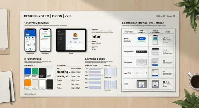
Table of Contents
Why styles drift when web moves faster than mobile
Web products change in small ways all the time. A button radius gets softer, a headline gets darker, spacing gets tighter on a pricing page. The web team can ship that in hours. The mobile team often ships on a longer cycle, so old visual values stay in the app for days or weeks.
That gap creates drift. It usually starts with good intentions. Someone sees a new brand color in Figma, copies the hex value into iOS, then another person updates Android padding by eye, and nobody notices that both teams interpreted the change a little differently. After a few rounds, the app still feels close to the brand, but not quite right.
Hand copying is the real problem. Teams copy colors, corner radius, type sizes, and spacing from mocks into code because it feels faster than maintaining a shared system. It is faster once. It gets expensive on the fifth or tenth update, when every screen has tiny mismatches.
A few patterns show up again and again:
- Web ships small visual tweaks every week.
- Mobile keeps older values until the next release window.
- Designers and developers paste raw values instead of updating shared tokens.
- Native controls use platform defaults that look fine at first, then drift from the brand.
Those native defaults hide problems longer than people expect. A segmented control, switch, tab bar, or text input can look acceptable during development because it matches the platform. Then a late QA pass compares it with the latest web screens and the gaps show up all at once. The font weight is off. The inset is slightly wrong. The pressed state still uses an older color.
This is why mobile design tokens matter so much for fast-moving products. They turn brand decisions into named values that both platforms can reuse, instead of asking each developer to remember the latest visual rules.
If a team skips that layer, style drift becomes weekly cleanup work. Nobody makes one big mistake. People make many tiny ones, and the app slowly stops looking like the same product people see on the web.
What should go into your token set
A good token set is small enough to understand and broad enough to cover the UI you ship every week. If it grows into a dumping ground for every visual idea, your team will stop trusting it. Mobile design tokens work best when they hold the repeated decisions, not every pixel on every screen.
Start with two layers. Raw tokens store the plain values: brand blue, gray 100, spacing 8, radius 12, font size 16, motion 200ms. Semantic tokens describe the job: primary text, screen background, button fill, card border, danger state. That split matters because brand changes usually hit the raw layer first, while the product keeps using the same semantic names.
Your base set should cover the parts people notice again and again. That usually means color, type, spacing, radius, border, and motion. If a designer or developer picks one of those by hand more than once, it probably belongs in the system.
Color needs more than a brand palette. Include text, background, surface, border, success, warning, and error use cases. Type should cover size, line height, and weight for the text styles you actually use. Spacing should follow a scale. Radius and border width should stay limited. Motion should define duration and easing for common actions like opening a sheet or confirming a tap.
Write down where each semantic token should appear. Keep it plain. For example, "surface-primary" might be for cards and modal backgrounds, while "text-muted" is for helper text and secondary labels. This small note prevents guesswork, and guesswork is where style drift starts.
Keep campaign art, seasonal promos, and one-off launch graphics outside the token set. A holiday gradient for one screen is not a foundation rule. Put those styles near the feature that uses them, then remove them when the campaign ends.
A simple test helps. If the brand team changes one blue and your buttons, links, tabs, and badges still make sense after a few token updates, the set is doing its job. If the team has to inspect dozens of screens by hand, the set is too loose or too mixed up.
Name tokens so brand changes stay small
Teams create cleanup work when token names describe the current color, not the job that color does. If you call a token blue-500, every brand update turns into a rename task, a search task, or both. If you call it surface-primary, you can change the value and leave most app code alone.
Good names describe role, contrast, or state. text-muted tells you how the text should read on screen. surface-primary tells you where the color belongs. A designer can move that token from blue to plum in one release, and the mobile app still makes sense.
Keep the naming shape close on web and mobile. If web uses text-muted, mobile should not invent secondaryLabelSoft unless the platform truly needs it. Similar names cut translation work, reduce mistakes, and make review faster because everyone talks about the same token set.
A small set usually works better than a clever one. Start with groups people use every day:
- Surface tokens for page, card, raised areas, and brand surfaces
- Text tokens for default, muted, inverse, and error text
- Border tokens for subtle lines, strong dividers, and error borders
- Action tokens for primary, secondary, and destructive actions
States need names too. Teams often remember the default button color and forget what happens when a user presses it, loses access, or hits a form error. Add state tokens on purpose, such as action-primary-pressed, action-primary-disabled, and text-error.
One rule works well: one token name should answer one question. Is this text muted? Is this surface selected? Is this button disabled? When names try to encode color, platform, component, and tone at the same time, they age fast.
For example, a team with green-button-text and green-button-bg will touch many files when marketing changes green to coral. A team with action-primary-label and action-primary-surface updates token values, checks contrast, and moves on. That is why mobile design tokens matter: brand updates stay local instead of leaking into every screen.
Map tokens into native components step by step
The safest way to make mobile design tokens stick is to map them into a small set of app components first, not every screen at once. Pick the pieces people touch every day: buttons, text fields, labels, cards, tabs, alerts, and the spacing around them. When those pieces stay in sync, most of the app keeps a consistent look even when the web team changes colors or type styles.
Use one source for token values. That can be a token file, a design export, or a small shared package, but it has to be the only place where color, type size, radius, spacing, and elevation live. If iOS reads one copy and Android reads another, style drift starts again almost right away.
A practical rollout looks like this:
- Pick 5 to 8 common components and keep their current styles unchanged while you rebuild them.
- Create thin wrappers on iOS and Android, such as AppButton, AppInput, and AppCard.
- Feed those wrappers with the same token names, even if each platform renders them a bit differently.
- Replace old components screen by screen instead of trying to rewrite the whole app in one push.
- Compare before and after screenshots for each screen, then fix small gaps before you merge.
Those wrappers matter more than many teams expect. They give you one place to map brand tokens to native behavior. A primary button token might map to UIButton configuration on iOS and Material components on Android. The token name stays the same. The code under it can follow each platform.
Do the replacement in small batches. Checkout, onboarding, and settings usually expose style issues fast because they mix text, forms, buttons, and error states. When a screen still uses hard-coded hex colors or custom padding, fix it in the same pass. If you leave those scraps behind, they pile up.
Screenshot review catches the tiny mismatches people notice later. Put old and new images side by side and check text size, spacing, corner radius, disabled states, and contrast. Ten minutes of visual review can save hours of weekly cleanup.
Handle platform differences on purpose
Good mobile design tokens keep one shared language across iOS and Android. The names should stay the same even when the final UI does not render in exactly the same way. If the brand color changes, you want to update color.surface.brand once, not hunt through two separate systems.
That does not mean both platforms should look identical down to the pixel. Native UI has its own rules. Text, touch targets, shadows, and top insets behave differently, and users notice when an app fights the platform instead of fitting into it.
Text is where teams usually get tripped up. A body text token might map to 16 on both platforms, but native font behavior can still make one side feel tighter or looser. iOS often needs a different line height than Android. Dynamic type and font scaling also matter. If you override them too aggressively, the app may look neat in screenshots and awkward in real use.
Spacing needs the same care. Content spacing and device insets are not the same thing. A card gap of 16 is a design choice. A top safe area or system bar inset is a device constraint. Keep those separate in your token model, or engineers will start adding one-off padding just to stop headers and tab bars from colliding.
A practical setup looks like this:
- Keep shared token names across platforms.
- Add small platform aliases only for real native differences.
- Let native text scaling work before you add manual fixes.
- Define safe area and system bar spacing as their own tokens.
- Store every exception in one mapping layer.
That last part saves a lot of cleanup work. When exceptions live inside screen code, they multiply fast. One developer adds an Android-only title offset. Another adds extra iOS padding for a modal. A month later, nobody knows which values belong to the brand system and which ones are local hacks.
A better pattern is boring, and that is the point. Keep the shared tokens stable. Keep the platform aliases small. Keep every exception in one place. Then a brand refresh changes the app once, while native differences stay contained and easy to review.
A simple example of a brand refresh
A common brand refresh looks small on paper and messy in apps if the team handles it screen by screen. Marketing picks a new primary color, changes corner radius from 8 to 12, and expects everything to feel updated by the next release.
The web team usually moves first. They do not repaint every button by hand. They change semantic tokens such as action-primary-bg, action-primary-text, and control-radius, then let the component library pick up the new values.
Mobile should follow the same path. If your mobile design tokens are set up well, the team changes the token source once and leaves individual screens alone. That is the whole point: change the meaning in one place, not the paint in fifty places.
Say the old app used a bright blue for primary actions. The new brand color is a softer purple, and rounded controls are now part of the visual style. The mobile team updates the shared token file, then maps those values into native components:
- Buttons read the new background, text color, and radius
- Chips pull the same radius but use a quieter background token
- Inputs keep their own border and fill tokens, but adopt the new control radius
- Disabled states stay separate, so they do not become too bright or too low contrast
This is where teams often slip. Someone updates the main button and forgets the outlined button. Another person tweaks chips locally because they "look a bit off". A week later, the app has three shades of purple and two corner styles.
A short QA pass catches most of that drift. Check the obvious screens, but also check the states people skip:
- Dark mode
- Disabled buttons and inputs
- Pressed and focused states
- Error states on inputs
- Mixed screens with old cached components
Native component mapping works best when the team treats components like consumers of tokens, not owners of style. Then a brand refresh becomes a small source change plus a careful QA pass, instead of a cleanup sprint that keeps coming back every Friday.
Mistakes that create weekly cleanup work
Weekly cleanup usually starts with a simple mistake: teams paste raw brand values straight into screens. A new hex color lands from the web team, and someone updates buttons, badges, and headers one by one. That feels fast for a day. A month later, nobody knows which blue is the current one.
Mobile design tokens only help when screens point to tokens, not to raw colors, font sizes, or corner radii. If a designer drops brand values directly into a mockup, engineers often copy the same values into code. Then every brand update turns into a search party.
Naming causes another slow leak. Designers may call a token "brand-primary," while engineers use "buttonBlue" or "mainActionColor." Both sides mean the same thing, but the mismatch creates guesswork. Guesswork creates exceptions, and exceptions pile up.
It gets worse when teams rename tokens every sprint. A name change looks harmless, yet it breaks documentation, code references, and shared habits. Stable names matter more than perfect names. If a token already maps well to a role in the interface, keep it and change the value behind it.
Dark mode often gets pushed to the end because the light theme feels like the main job. That choice usually doubles the cleanup work. People ship a new light theme first, then patch dark mode later with one-off fixes. You end up with cards, inputs, and empty states that almost match, but not quite.
The last trap is skipping component review after token edits. One token change can affect far more than the team expects. A small update to spacing or text color can throw off tabs, alerts, and form states across the app.
A safer routine is boring, and that is why it works:
- Map raw brand values to semantic tokens first
- Keep one shared naming set for design and code
- Rename tokens rarely, with a clear reason
- Ship light and dark updates together
- Check real components after every token change
A team that does these five things spends less time cleaning up little visual mismatches every Friday.
Quick checks before each release
A release check should take about 15 minutes. If it takes longer, the token layer is probably too fuzzy, and the team is fixing screens by hand instead of fixing the source.
Put the five most-used screens side by side on web and mobile. Do not compare every page. Compare the screens people open every day, because small mismatches there feel bigger than a rare edge case. Look at type size, button shape, surface color, border radius, and icon weight. When something feels off, trace it back to the token or the native component mapping.
Run one real task in light mode and one in dark mode. A simple pair works well: sign in, then edit a profile or submit a short form. Dark mode often exposes the weak spots first. Muted text may turn too faint, borders may disappear, and surfaces that looked separate in light mode can blend together.
State changes need a hands-on pass. Tap buttons in their pressed state. Open screens where actions are disabled. Force one clear error, like an invalid email or empty required field. If those states use hardcoded colors or spacing, design system drift shows up fast.
Spacing deserves its own check because it slips quietly. Forms and cards usually drift first. One screen gets 12 px under a label, another gets 16, and a card body picks up a custom margin during a rush fix. None of that looks dramatic alone. Together, it makes the app feel less finished than the web version.
A short review helps:
- compare screenshots of real screens, not isolated components
- test one light path and one dark path
- tap pressed, disabled, and error states
- inspect form rows, card padding, and helper text spacing
- remove old tokens, or map them to current names on purpose
Old tokens cause repeat cleanup work. If the code still has names from the last brand update, people will keep using them. Delete unused tokens when you can. If you cannot delete them yet, alias them clearly so no one guesses which color or spacing rule is still safe to use.
Next steps for a team that wants less drift
Teams usually fail when they try to fix everything at once. Start with the few native components that show up on almost every screen. That gives you a small test area, and it tells you fast whether your mobile design tokens are clear enough.
A practical first batch is:
- buttons
- inputs
- cards
- text styles
If those four stay in sync, most product updates stop turning into cleanup work. A button color change, a new corner radius, or a text scale tweak should flow through shared tokens and then into these components. If a change still needs manual edits in ten places, the model is not finished yet.
Keep one short review on the calendar every week between design and the mobile team. Fifteen minutes is often enough. Look at what changed in the product, which tokens moved, and whether any native component started to drift. This works better than a long meeting once a month, because drift grows in small steps.
Treat token changes the same way you treat product changes. Give each change an owner, a short reason, and a release note. Track when a token changed, which components use it, and whether iOS and Android should match or differ on purpose. A simple log beats memory every time.
It also helps to set one rule: no direct styling in screens unless the team agrees it is a one-off case. That rule sounds strict, but it cuts rework. When designers refresh the brand, the team updates the token set and the shared native components first. Screens inherit the change instead of fighting it.
A small team can set this up in a week or two. A larger team may need more cleanup, especially if old screens already mix hardcoded values with shared styles.
If your team keeps getting stuck on token naming, native component mapping, or platform rules, an outside review can save a lot of time. Oleg Sotnikov can review your token model and native component plan as a Fractional CTO, then point out where drift will keep coming back unless you change the structure.