Long-running task UX for exports, imports, and AI jobs
Long-running task UX helps users trust exports, imports, and AI jobs with clear status, honest wait times, and retry rules that prevent duplicate work.
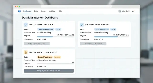
Table of Contents
Why users stop trusting the button
Bad long job UX often starts with a quiet screen.
A person clicks "Export," "Import," or "Run AI job," and nothing obvious happens. There is no status, no wait estimate, and no sign that the request even reached the server.
Most people do not think, "the system is busy." They think the click failed. That is a fair assumption because many products look exactly the same before and after a long job starts.
When the screen stays quiet, people try to get certainty on their own. They click again. They refresh the page. They open another tab. They close the laptop and come back later. If the task matters, they send a support message after a minute or two.
That is not user error. The product taught them not to trust it.
Once doubt shows up, the guesses are predictable: "Maybe I missed the button." "Maybe the site froze." "Maybe it started, but I can't tell." "Maybe I should try one more time."
That second click is where the real mess starts. Now you can get two exports, two imports, or two AI runs for the same request. Users lose time, and the business pays for duplicate work. AI jobs can burn tokens twice. Exports can queue duplicate files. Imports can create repeated records and cleanup work later.
The problem is easy to see in a simple import flow. Someone uploads a CSV, clicks import, and sees no change for ten seconds. They refresh and submit it again. Later, the app shows duplicated customer rows. From their side, the app made a mistake. From your side, both requests were valid. The gap is the interface.
Trust breaks fast. One or two bad experiences are enough for people to start hovering over buttons, taking screenshots, or asking support to confirm that "it really started." After that, every slow task feels risky, even when the backend works exactly as planned.
What a long job screen should show
A spinner by itself does not calm anyone down. If a job takes more than a few seconds, people want evidence that the click worked and that the system is doing real work.
The screen should answer five questions right away: did the job start, what is happening now, how long might it take, can I do something else while I wait, and where will the result appear?
Start with immediate confirmation. Change the button state, show a new job row, or add a short message like "Export started." That tiny response matters. Without it, people click again and create duplicate jobs.
Use plain language for status. "Queued" is fine if the job is waiting. After that, say what the system is doing: "Uploading file," "Checking rows," "Generating report," or "Writing final CSV." Most users do not care about worker allocation, model orchestration, or any other internal detail.
Wait estimates should stay rough. Exact countdowns look smart for about ten seconds, then they start lying. A range feels more honest: "Usually 2 to 5 minutes" or "Large imports may take 10 to 20 minutes." If the estimate changes, update it quietly instead of pretending nothing changed.
The screen should also tell people what is safe to do next. Can they stay and watch? Move to another page? Close the tab and come back later? Keep that answer plain. If the job continues in the background, say so.
Then say exactly where the result will show up. "Your file will appear in Exports" is clear. "Processed records will show in the customer list" is clear. For AI jobs, say whether the output lands in the draft area, chat thread, or asset library.
A calm screen does not need constant motion. It needs clear status, a believable wait range, and one obvious place to find the result.
Show wait time without false promises
People usually forgive waiting more than they forgive uncertainty. If the screen says only "processing," they start clicking again, refreshing, or leaving the page open and hoping for the best.
A range works better than a countdown when the system depends on queue depth, file size, or model load. "Usually 2 to 5 minutes" feels honest. "About 3 minutes left" sounds precise, so users notice every missed second.
If you can split the wait into queue time and work time, do it. "Waiting for an available worker: about 1 to 3 minutes. Processing file: about 2 minutes." That explains why nothing seems to happen yet, and it lowers the urge to click the button again.
Keep the estimate alive. When the queue grows, change the message. If ten large exports land ahead of the user, a 2 to 5 minute range should become 5 to 12 minutes. A moving estimate builds more trust than a cheerful lie.
Sometimes you cannot predict the finish time at all. Say that plainly. "We started your import. Large files and slow source systems make finish time hard to predict. You can leave this page and we will keep working." That message is far better than a stuck spinner.
Progress bars need the same honesty. Do not race to 99% and sit there for ten minutes. People read that as almost done, even when the hardest step has not started. Stages usually work better: queued, validating, processing, finalizing. If you use a bar, tie it to real milestones, not wishful math.
A few message patterns hold up well:
- "Queued now. Expected start in 1 to 4 minutes."
- "Processing started. Most jobs finish in 2 to 5 minutes."
- "This job has no reliable finish estimate yet. We will update status as steps complete."
Small honesty beats fake precision. Users can handle a wait when the product tells them what it knows, what it does not know, and whether the work is still moving.
Write status messages people understand
People stay calmer when the screen uses plain words. "Processing" is too vague. Most users want two facts right away: what the system is doing now, and what happens next.
Use the same small set of states across exports, imports, and AI jobs. For example: Queued, Running, Needs fix, Finished. That consistency matters more than many teams expect. If one page says "Pending," another says "In progress," and a third says "Working," users start guessing whether each job follows different rules.
Pair each state with one short sentence about the current action. That sentence should answer a simple question: what is the system doing right now?
- Queued - waiting for an available worker
- Running - generating your CSV file
- Running - checking 428 rows from your upload
- Needs fix - row 17 has an invalid date in "start_date"
- Finished - your report is ready to download
These messages work because they are concrete. They do not sound technical, but they still tell the truth.
When a job fails or stalls, name the next action in the same message. Do not stop at "Failed" or "Error." A blocked job should tell the user what to do next: upload a CSV with the required header, reconnect an API key, fix a missing column, or try a smaller file.
Imports need the most detail because users often have to fix the source data themselves. Point to the exact problem, not a broad category. "Import failed" creates support tickets. "Needs fix - row 52 is missing email" gives the user a path forward. If you can include the row number, column name, and short reason, do it.
AI jobs need the same clarity. "Running - summarizing 12 documents" is much better than "Thinking." If the model cannot continue, say why in plain language. "Needs fix - the prompt is empty" or "Needs fix - the source file could not be read" is enough.
Clear status text does a lot of work. It lowers repeat clicks, cuts support messages, and helps users trust that the button did work.
Build safe retry behavior
Retries should reconnect people to the same work, not quietly start a second copy. When that breaks, users click again, open another tab, or contact support because they cannot tell what already happened.
The fix starts before any progress appears on screen. Save the job the moment the user clicks. Give it an ID, store the request details, and mark it as queued or running right away. If the page reloads two seconds later, you still have a real job to show.
A simple flow works well:
- When the user clicks Start, create the job first and return its status screen.
- Change the button text from Start to View status after the first click.
- If the same request comes in again, reopen the existing job instead of creating a new one.
- If the job fails, say whether retry resumes the same run or starts a fresh one.
- Keep the error message and the retry action on the same screen.
That second step matters more than it looks. "View status" tells people the system heard them. It also gives them a safe place to return to after a refresh, browser crash, or lost connection.
Reusing the same job on repeat requests is what stops duplicate exports, imports, and AI runs. Match requests by whatever makes them the same in your product: the same user, the same file, the same settings, or the same prompt. If nothing changed, open the existing job.
Retry rules must stay plain. "Retry safely" is enough for an export that rebuilds a file. An import is different. If a retry might add rows twice, say that before the user clicks. For an AI job, be honest if retry may create a new result or another charge.
Keep recovery on one screen. Show the error, what happened before the failure, and the next step together. A user should not have to read an error toast, hunt for an old job, and guess which button is safe.
The best retry flow feels boring. That is the point.
Three examples from a busy morning
Picture a Monday morning with three jobs running at once. The people using the product are busy, a little impatient, and not interested in clicking the same button twice just to feel safe.
A sales manager starts an export ten minutes before a meeting. Right after the click, the screen changes to "Export started" and shows a job ID, a rough wait like "about 2-4 minutes," and a plain next step: "You can stay here or leave this page. We will keep building your file." The button becomes disabled, a spinner appears beside the status, and the manager stops wondering if the request vanished.
Now an ops teammate uploads a customer import with 4,200 rows. The system scans the file first, then says, "Import running. 4 rows need attention." Instead of a vague error at the end, the screen shows progress, a rough estimate like "about 6 minutes," and one clear next step: "You can download the problem rows and retry only those rows after you fix them." The teammate does not need to restart the whole import. They know what failed, what succeeded, and what to do next.
A marketer starts an AI summary for a large batch of call notes. This job may take longer, and the timing may swing more than an export. So the message stays honest: "AI summary in progress. Most batches this size finish in 8-15 minutes." The screen can also say what the system is doing now, such as "Reading notes" or "Writing summaries." If some notes time out, the next step stays specific: "23 summaries are ready. Retry 5 failed notes." That is much better than a full rerun.
All three flows follow the same pattern. Show that the click worked. Show the current status. Show a rough wait, not a made-up promise. Show the next action people can take right now.
When teams get this right, support tickets drop for a very ordinary reason: users stop asking, "Did it start?" They already know.
Mistakes that create duplicate jobs and support tickets
Most duplicate jobs start with uncertainty, not impatience. Someone clicks "Export," sees a spinner with no text, and wonders if anything happened. After a few seconds, they click again, open another tab, or refresh.
A blank spinner creates doubt fast. Users need a plain message like "Preparing your file" or "Importing 2,400 rows." Better yet, show the job in a visible queue or history panel so people can see that the system recorded their action.
Fake motion causes a different problem. If a progress bar keeps moving while nothing actually changes, people stop trusting the screen. Use a real percentage only when the system can measure real progress. Otherwise, show the current step and a simple status like "Still working" or "Waiting for processing to finish."
Refresh should not restart the job. If a user reloads the page after an export begins, the product should reconnect to the same task and show its current state. When refresh starts a second export, import, or AI run, users get duplicate results and support gets a messy ticket.
Teams also break trust when they show "Finished" too early. Success should mean the file exists, the import results are ready to review, or the AI output can open right now. If the system still needs to store the file or finalize the result, say that instead.
Error messages often make things worse. "Something went wrong" tells the user almost nothing. A better message explains what failed, says whether the original job is still running, and gives one next action such as retry, wait, or contact support with a job ID.
Users can wait longer than most teams think. They just need the product to tell the truth.
Quick checks before release
You do not need a huge QA plan for this. You need a short pass that copies what real people do when an export, import, or AI task takes longer than expected.
Run the flow like an impatient user, not like the person who built it:
- Refresh the page while the job is still running. The same job should still appear with the same status.
- Close the tab, wait a minute, then come back. The status should still be there and still make sense.
- Start the same job twice. Click twice fast, press Enter again, or open a second tab. The system should keep one run or clearly say that a run is already in progress.
- Break an import on purpose. Add one bad row to a file and check the error text. "Row 18: email is missing" helps. "Validation failed" does not.
- Read every status message out loud. If it sounds like server jargon, rewrite it.
These checks are small, but they expose weak spots fast. A job that survives refresh and tab close feels dependable. A job that blocks duplicates feels safe. A failed import with a precise error feels fixable.
If even one of these checks breaks, users start guessing. They retry too soon, create duplicate work, and send support messages that say, "I clicked the button, but nothing happened." It is cheaper to fix that before release than to clean up confused jobs later.
Next steps for your team
Put the whole job flow on one page before you change the product. Many teams keep the details split across design files, backend notes, and support docs, so nobody sees the full path a user goes through. Write down every state a person can see: queued, starting, running, delayed, done, failed, canceled, retrying, and anything in between.
That simple map usually exposes the messy parts fast. You will spot screens with no status, jobs that fail silently, and buttons that still look clickable when the system already has work in progress.
Then run three real checks from start to finish: one export, one import, and one AI job. Use normal accounts, not shortcuts. Watch what the user sees after every click, how long the wait feels, what happens if they refresh the page, and whether they can tell the difference between "still working" and "stuck."
A short review usually covers enough:
- Compare the visible states with the real backend states.
- Check whether the wait message stays believable over time.
- Try retry behavior after a delay, a network drop, and a browser refresh.
- Make sure users can find the result, error, or next action without asking support.
After that, read support tickets and chat logs with one question in mind: where did people stop trusting the button? The answer is usually specific. They clicked twice because nothing changed. They retried because the first job vanished. They waited twenty minutes because the page never said the file was ready.
Fix those moments first. Small changes usually matter more than a redesign. A clearer "still processing" state, a real retry rule, or a visible job history can cut duplicate jobs and confused support messages very quickly.
If the flow crosses product, backend, and support, give one person ownership of the state model. Otherwise each team patches its own piece, and the user gets mixed signals.
If you want an outside review, Oleg Sotnikov at oleg.is can review the state model, retry rules, and handoff points as a Fractional CTO. That is useful when the problem is not one screen but the way the whole system behaves under real load.
A good result is easy to spot. Users click once, understand the wait, and know what to do next.
Frequently Asked Questions
How do I show that the button click worked?
Show a visible change right away. Disable the button, change its label, or open a job row with a short message like "Export started." That instant response tells people the request reached the server and cuts repeat clicks.
Is a spinner enough for a long-running task?
A spinner alone rarely helps for jobs that take more than a few seconds. Pair it with plain status text, a rough wait range, and a clear note about where the result will appear. If you can show real stages like queued, validating, running, and finalizing, people stay much calmer.
What kind of wait time should I show?
Use a rough range instead of a countdown. "Usually 2 to 5 minutes" feels honest and gives people a useful expectation without fake precision. If the queue grows or the system slows down, update the range instead of leaving the old estimate on screen.
Which status labels work best?
Keep the states short and consistent across the product. Labels like "Queued," "Running," "Needs fix," and "Finished" work well because people learn them fast. Add one plain sentence under each state so users know what the system is doing now.
What should happen if the user refreshes the page?
Reconnect the user to the same job. Save the job as soon as they click, give it an ID, and load that job again after a refresh or tab close. If a reload starts a second run, users will stop trusting the flow.
How do I prevent duplicate jobs?
Create the job first, then treat repeated clicks as the same request when nothing changed. Reopen the existing job instead of starting a new export, import, or AI run. Changing the button from "Start" to "View status" also nudges people toward the safe path.
What should an error message include?
Tell users what failed, whether the job still runs, and what they should do next. "Row 18 is missing email" helps far more than "Validation failed." For AI jobs and exports, say if retry resumes the same work or starts a fresh run.
How should retry work for exports, imports, and AI jobs?
Retry should feel safe and predictable. For exports, retry can often rebuild the file without much risk. Imports need more care because a second run may create duplicate rows, and AI jobs may create a new result or another charge, so say that before the user clicks.
Should users be able to leave the page while the job runs?
Yes, if the job keeps running in the background, say so in plain language. Tell them they can leave the page and come back later, and tell them exactly where the result will appear. That removes a lot of nervous waiting.
What should my team test before release?
Test the flow like an impatient user. Refresh during a run, close the tab and return, click twice fast, and break an import with one bad row. Then read every status message out loud and rewrite anything that sounds like server jargon.


