Long running job status design that cuts support tickets
Long running job status design helps users understand waits, cancel safely, and read results clearly, so your team gets fewer support tickets.
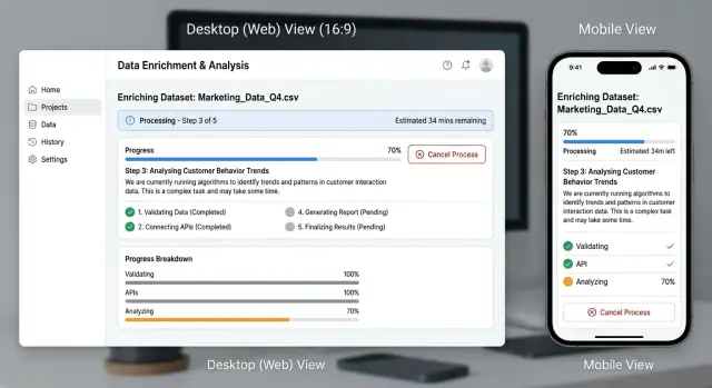
Table of Contents
Why waiting without context creates tickets
When a screen shows a spinner and nothing else, people fill the silence with worry. They do not know if the task started, stalled, or failed right away. Many open a support ticket just to ask, "Did it work?"
Time makes that worse. Most users can wait longer than teams expect, but only when the product gives them a believable sense of what is happening. If the message stays vague, ten seconds feels broken and ten minutes feels endless.
Large imports and exports are a common example. Someone clicks "Start," sees "Processing...," and then has no idea whether they should keep the tab open, refresh the page, or try again. If they think a refresh might break the task, they stop experimenting and ask support for reassurance.
The problem does not end when the job finishes. Users leave the page, come back later, and cannot tell whether the task completed or where the result went. Support ends up answering basic status questions instead of solving real problems.
Clear status design lowers anxiety, cuts duplicate actions, and stops users from guessing. The interface should answer four simple questions early:
- Did my task actually start?
- How long might this take?
- Can I leave this page safely?
- Where will I see the result?
If the product answers those questions up front, many tickets never get written. People stay calm, avoid double submissions, and trust the product enough to wait.
Pick status names people grasp fast
Good status design starts with plain language. If users have to decode a label, they stop trusting the screen and open a ticket instead.
Many products use too many states or borrow terms from engineering. Users do not care that a worker picked up a batch. They want to know what is happening right now, in words they already understand.
Each status should mean one thing. If "Processing" sometimes means "waiting in queue" and sometimes means "almost done," people learn that the label is vague and stop believing it.
A simple set usually works better than a clever one: "Queued," "In progress," "Needs action," "Completed," and "Failed." If your system has more steps than that, show the extra detail in supporting text instead of the main label. Keep the headline status as "In progress," then add a short note such as "Generating pages 12-40."
The label also has to match real behavior. If a job can sit for three minutes before any work starts, call it "Queued," not "Starting." If the user can still stop it, do not say "Finalizing" unless the system is truly in the last step.
Internal terms usually make things worse. Labels like "Pending worker," "Batching," "Dispatching," or "Post-processing" may make sense to your team, but they force users to learn your architecture. That is not their job.
A report export is a good test. If a user sees "Worker allocated," many will ask support what that means. If they see "Queued" and then "In progress," the story is already clear. That small change prevents confusion before it turns into a ticket.
Show progress people can trust
People stop trusting a waiting screen when the numbers feel invented. A bar that jumps from 7% to 63% and then sits for five minutes creates more worry than no bar at all. The best progress updates admit what the system knows and avoid pretending to know more.
Use stages when the work has clear steps. "Preparing data," "Generating file," and "Final check" tell people more than a spinning icon. Even if one step takes much longer than the others, users can still see movement and understand where the job is.
Use percentages only when the number is real. If your system counts items, pages, or records, a percentage can help. If the amount of work changes while the job runs, skip the fake precision and show a simple stage instead.
Time estimates should stay modest. "Usually 2 to 5 minutes" feels honest. "42 seconds remaining" feels wrong the moment the number stops moving.
Small updates matter too. If a job may run for several minutes, refresh the status often enough to prove it is still alive. Even a plain line like "Still working. Last updated 10 seconds ago" can calm people down.
When the system pauses or retries, explain that in normal words. "Retry attempt 3 of 5" means little on its own. A short explanation works better: the file source is slow, so this may take longer; the connection dropped for a moment and the system is trying again; the job is still running and there is no need to start over. That last point prevents a surprising number of duplicate submissions.
Tell users what they can do while they wait
A wait feels shorter when the screen answers the practical question in the user's head: "Do I need to stay here?" If they can close the tab, say so plainly. If they need to keep the page open, say that too. Guessing leads to refreshes, repeated actions, and support messages.
The page should also survive a refresh. When someone comes back, they should still see the job in recent activity with the same status, start time, and a way to reopen it. A long-running job should feel like a saved task, not a temporary spinner.
While the work runs, one safe action is usually enough. Let people leave and come back later, keep working elsewhere in the product, copy a job ID for support if needed, or cancel the job if cancel is truly safe. Too many choices create doubt. One clear action lowers stress.
When the result is ready, send a notice people can trust. Use the same language they saw during the wait and tell them exactly what is ready. "Your export is ready" works better than "Task completed." If you support email or in-app alerts, send one clear message instead of a stream of status noise.
A simple example shows the difference. Someone starts a large report export, leaves to answer customer emails, then refreshes the browser later and still sees the export in history with its current status. When the file is ready, they get a clear notice. They never have to wonder whether the export failed, restarted, or vanished.
How to map the full job flow
Start by mapping what happens after the user clicks "Start." Do this before you design the screen. A rough flow on paper often reveals more than a polished mockup.
Write the path in order from the first click to the final result. Include the quiet parts too: input checks, queue time, background work, handoff to another service, and the moment the result becomes available. If a job can sit idle before any real work begins, give that delay its own state.
Then map the paths that break the happy flow. That is where many support tickets come from. Think through what happens if the job takes too long and times out, if the user cancels before work starts, if they cancel after work has started, if a temporary error should trigger a retry, or if a permanent error requires a clear next step.
Once that flow is on paper, write the actual words for every state and screen. Do not leave placeholder copy until the end. Labels such as "Queued," "In progress," "Still processing," "Canceled," and "Failed" look simple, but each one sets expectations. If the wording is fuzzy, users assume the job is stuck.
Decide early what the system saves along the way. If a report export finishes step one of three and then fails, can retry continue from there, or does it start over? Users do not care about the internal reason. They care whether retry will take 10 seconds or 20 minutes.
Time matters more than many teams expect. Test the flow with real job lengths, not demo data. A pattern that feels fine for 8 seconds can feel broken at 90 seconds, and very different again at 15 minutes. It helps to test one short task, one average task, one slow task, and one task that fails near the end. That exercise usually exposes missing copy, bad timing, and dead ends before users find them for you.
Make cancel and retry feel safe
Users often hesitate over two buttons: Cancel and Retry. If they are not sure what will happen, they do nothing, wait too long, and open a ticket.
Label cancel with the real effect. "Cancel export" is better than "Stop job," and the best version adds scope. Are you canceling the upload, stopping future processing, or ending the whole run? If the system can only stop the next step and cannot undo work already finished, say that before the click.
When cancel will discard work, warn people in plain language. A short note like "Your generated file will be deleted and your filters will stay the same" is enough. If some of the work will remain, say that too. People accept bad news more easily when it is specific.
After a failure, put Retry next to the error message. Do not make users hunt for it on another screen or hide it in a menu. If they must fix something first, name it right there: credentials expired, file too large, network lost.
A failed run should not erase the form. Keep filters, file choices, and settings exactly as the user left them. Retyping the same inputs feels like a penalty, and it turns a small failure into a support issue.
Keep Retry, Start over, and Cancel separate because they mean different things:
- Retry runs the same job again with the same inputs.
- Start over clears the form or sends the user back to step one.
- Cancel stops the current run and should not reset everything by default.
This matters most when jobs take minutes, not seconds. If someone spent ten minutes setting up a report, one safe retry button can save their time and keep them out of your support queue.
Build result pages that answer the next question
A result page should settle the first doubt in two seconds: did it work, fail, or only partly finish? Put that answer at the top in plain language. "Export complete" is better than "Job 18492 succeeded." If only part of the work finished, say that right away.
Then spell out what the system completed and what it did not. People should not have to compare timestamps, scan logs, or guess from missing data. Sometimes a short summary is enough:
- 8 of 10 files exported
- 2 files skipped because they were locked
- Your CSV is ready to download
Keep the actual result in view. If the job produced a file, show the download button near the status. If it created a report, open the report summary on the same page. If it updated records, show how many records changed and offer a way to review them. Users relax when they can see the outcome, not just a message about it.
The next action should fit in one sentence. "Download the file now, or rerun the export after closing the locked files" is enough for most people. Long blocks of help text slow them down.
Technical detail still matters, but it should stay tucked away. Most users do not care about error codes, stack traces, or internal step names unless something broke and support asks for them. Put those details behind a simple "Show details" control.
A good result page also handles partial success with some grace. Tell users what is safe to use now, what needs another attempt, and whether retrying will create duplicates. That bit of clarity can save a support ticket, especially after a long wait.
A simple example: exporting a large report
Picture a finance manager exporting a year of orders, refunds, and invoices. The file is large, so the system needs a few minutes to build it. If the page only shows a spinner, the same questions appear every time: Is it stuck? Do I need to stay on this tab? Did the export fail?
A better flow starts with plain status text. Instead of a vague loading state, the page says "Preparing data" and then moves to "Building file" or "Finalizing export." Those names tell the user that work is happening, even if the exact time still varies.
The export should keep running after the user closes the tab. That one choice removes a lot of anxiety. People can go back to work, open another page, or leave the browser and return later without starting over.
When the job finishes, the result page should answer the next questions before the user asks them. Show the file name, format, file size, finish time, and whether the export includes everything requested. If some rows are missing, say how many and why. Maybe 213 rows were skipped because the user no longer had permission to view archived records. That is much better than letting them discover a mismatch in Excel and contact support.
A flow like this cuts off the most common tickets before they start. Users do not need to ask whether the export has been loading too long, whether closing the page will stop it, why the CSV has fewer rows than the report, or whether they need to run it again.
Good design here does not need fancy visuals. It needs calm, clear answers at each step.
Mistakes that create avoidable tickets
A few small UX mistakes can turn a normal wait into a support problem. Users usually do not mind waiting. They mind feeling lost, tricked, or afraid to click the wrong thing.
The classic example is progress that races to 99% and then sits there. Users see that number and expect the job to finish in seconds. If it hangs for ten minutes, many assume the process froze, refresh the page, or start another job.
Vague errors cause the same damage. "Something went wrong" tells people nothing about what failed, whether their work is safe, or what to do next. Even a basic message like "Export failed because the file was too large. Try a smaller date range or run it again" cuts confusion fast.
Cancel actions also create trouble when the wording feels harsher than the real effect. If the button says "Cancel" but users read it as "Delete," many will avoid it. One short line of helper text often fixes that: cancel stops the current job, but it does not remove past data or settings.
Where teams trip up most
Result pages often miss the next question in the user's head. People want a quick summary of what finished, what was skipped, how long it took, and what they can do now. If the page only says "Done," support gets messages that start with "Did this work?"
Another common mistake is losing the job after a refresh. If the page reloads and the status disappears, users assume the whole process failed. Keep the job visible in a recent activity area, even if they leave and come back later.
These mistakes usually lead to the same questions: Is it stuck? Did I lose my work? Can I cancel safely? Did it finish correctly? Where do I find it now? If the interface answers those five questions on its own, ticket volume usually drops. Progress updates are often less about visuals and more about plain language, safe actions, and a result page that feels complete.
A short checklist before launch
Support tickets often come from one simple problem: the screen makes sense to the team, but not to a first-time user. A quick review before launch catches most of that.
Use this test with someone who has never seen the feature before. Give them the page and stay quiet for 30 seconds. If they hesitate, look again at the labels, status text, and button names.
- Can a new user tell what started, what the system is doing now, and what happens next within five seconds?
- Can they leave the page without fear, and do they know where to find the result later?
- Can they find the task again after closing the tab or coming back much later?
- Can they cancel without guessing what the action will do?
- Can they tell what to do after success or failure?
One detail matters more than it seems: use plain status names. "Preparing export" works better than "Initializing pipeline." If someone has to decode the wording, they will ask support instead.
If this checklist feels almost too simple, that is usually a good sign. Clear status design looks obvious once you fix it.
What to do next
Pick one slow task that already causes questions, such as exporting a report, importing data, or generating a file. Then put product, support, and engineering in the same short review.
Keep that meeting practical. Support brings the exact messages users send when they are confused. Engineering lists the real states, delays, and failure points. Product decides what users need to hear at each moment. That is usually where the gaps become obvious.
Then clean up the text people actually read. Replace internal labels with plain language. Remove fake precision if your percentage is only a guess. Add short action text when users can leave, wait, retry, or cancel. Write the finished state so people know what happened and what to do next.
Fix the result page before you spend time on visual polish. A simple page that says whether the job worked, what failed, what was skipped, and what the user can do now will cut more tickets than a nicer spinner. If users finish a task and still need support to explain the outcome, the flow is not done.
If the job spans product logic and back-end work, an outside review can help. Oleg Sotnikov at oleg.is reviews states, edge cases, cancellations, retries, and result pages as a fractional CTO. That can help when a system already works, but users still open tickets because the flow feels unclear.
Start with one task, ship the changes, and watch ticket volume for two weeks. Small wording fixes often do more than a full redesign.
Frequently Asked Questions
What statuses should a long-running job usually have?
Start with plain labels people grasp at a glance: Queued, In progress, Needs action, Completed, and Failed. Keep each status tied to one real state. If you need more detail, add one short sentence under the main label instead of inventing more labels.
Should I show a percentage or just stages?
Use stages when the system knows the step but not the exact finish time. Show a percentage only when you can measure real work, like records processed or pages generated. If the number is mostly a guess, skip it and show honest stage text instead.
How do I tell users whether they can leave the page?
Say it directly on the screen. If the job keeps running in the background, tell users they can close the tab and return later. If they must stay on the page, warn them before they leave them guessing.
What should the result page include?
Put the outcome at the top in plain language, then show the result right next to it. Users should see whether the job finished, failed, or partly finished, where the file or report is, and what to do next without hunting around.
How should Cancel work?
Name the action clearly and explain the effect before the click. If cancel stops only future work, say that. If cancel deletes the generated file or discards progress, say that too so users do not freeze or avoid the button.
What should Retry do after a failure?
Keep Retry close to the error and reuse the same inputs by default. When people need to fix something first, name the problem in simple words, like expired credentials or a file that is too large. Do not make them retype the whole form for a small failure.
Why do users submit the same job twice?
Most duplicate submissions happen when the screen feels silent or fake. People click again because they do not know whether the first job started, whether it is still alive, or whether a refresh broke it. Clear status text and a recent activity view stop a lot of that behavior.
How often should I update the status?
Refresh often enough to prove the job still runs, even if the status text does not change much. For slower jobs, a simple note like Still working with a recent timestamp calms people more than a frozen spinner.
What mistakes create the most support tickets?
Teams usually create tickets with vague labels, fake progress, missing result pages, and errors that say almost nothing. Users ask support when they cannot answer four basic questions on their own: did it start, how long might it take, can they leave, and where will the result appear.
How can I test this flow before launch?
Test with real wait times, not demo data. Give the screen to someone new, stay quiet, and watch whether they can tell what started, what is happening now, whether they can leave, and what happens after success or failure. If they hesitate, fix the wording before you polish the visuals.


