Internal admin tools: when simple screens need real rules
Learn when internal admin tools need clear permissions, action history, and task-focused screens so your team can move fast without risky workarounds.
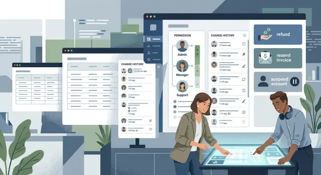
Table of Contents
Why simple admin screens stop being simple
Most admin pages begin as a shortcut. Someone needs to fix an order, change an email address, or unlock an account without pulling in an engineer every time.
That first version often works because the person using it knows the product, knows the customers, and knows what can go wrong. A rough screen with a few fields and a save button can save hours in a small team.
Problems start when that page spreads beyond its first user. Support uses it to solve tickets. Operations uses it to correct records. A founder jumps in during an urgent case. Now one screen serves people with different goals, habits, and levels of caution.
At that point, it is no longer a private shortcut. It affects real accounts, real payments, and real access. One wrong click can change customer data, remove a feature, trigger a refund, or lock someone out.
The risk is easy to miss because the tool still looks simple. It may be one page with a few buttons. But if it can change what a customer sees, buys, or can do, it is part of the product whether customers ever see it or not.
Small teams usually feel this shift all at once. On Monday, the screen helps one person move faster. A month later, three teams rely on it, and nobody agrees on the safe way to use it. People overwrite each other, fix the same issue twice, or make a change without leaving any clear record.
That is why internal admin tools need more care than most teams expect. The moment a screen can change customer outcomes, it needs rules, not just inputs.
When an internal screen becomes product surface
A screen stops being a private shortcut when several teams depend on it to do real work. If support, finance, and operations all open the same page every day, that page shapes how the company acts. Customers may never see it, but they feel the result.
The shift gets serious when one action changes billing, account access, or live data. A vague label, a hidden warning, or two similar buttons can cause a refund error, lock someone out, or change the wrong record. What looked like a simple admin page now carries the same weight as a customer-facing flow.
Support work makes this obvious. Picture an agent on a call with an upset customer. They need to check an invoice, extend access, add a note, and fix a setting while the customer waits. If the screen is hard to scan, or if risky actions sit next to routine ones, the agent slows down or clicks too fast. Either way, the customer feels it.
You can usually spot the turning point by the requests people make. They ask for an undo option, internal notes, approval steps, and a way to see who changed what. They ask because memory stops working once several people touch the same account over a few days.
A few signs show up again and again:
- More than one team uses the screen every week.
- Actions affect money, permissions, or live customer records.
- Staff need notes, approvals, or a way to reverse mistakes.
- People use it during calls, chats, or urgent support work.
Once those signs appear, the tool needs product thinking. The page needs clear language, safer actions, and a layout that matches real tasks instead of database fields.
Set permissions by job, not by trust
Friendly teams often hand out access based on trust. That feels harmless when five people sit in the same room. It breaks once the team grows, shifts change, and internal screens touch money, customer accounts, or production data.
A better rule is simple: give access by job.
Start by writing down the actual tasks people perform each week. Most teams quickly find that one screen mixes several jobs that should stay separate. Support may need to view customer details, add notes, and start a refund request. Finance may need to approve refunds and change billing status. Operations may need to fix shipping data and order errors. Engineering may need emergency tools, but only for production incidents.
That exercise exposes the first problem. "Can use the admin" is too broad. Viewing a record is one level of access. Editing it is another. Approving a risky change is a third.
This split matters more than founders expect. A support agent may need to open an order to answer a question, but that does not mean they should change the price. A contractor may need to review logs, but not export customer data. If someone can delete records, reset passwords, issue credits, or change permissions for others, keep that power inside a small role group and make the reason clear.
Write the rules in plain language. A simple table with role, allowed actions, and why that role needs them is enough. When a new person joins, you assign a role instead of making a one-off choice. When someone asks for more access, you can check the job need instead of arguing from memory.
This also helps when the team changes. If a founder is away for a week, approvals still follow the same rule. If someone moves from support to operations, you switch roles instead of stacking old permissions on top.
If a screen can affect payments, customer access, or production data, define the role before you add the button. That small habit prevents a lot of mess later.
Keep a clear history of every risky action
Once a team can change money, access, pricing, or customer status, history stops being a nice extra. In internal tools, a clear record cuts support time and stops blame games.
A good history answers four questions fast: who did it, when they did it, what changed, and why. If your screen only says "updated" or "edited," it will fail the first time a customer asks, "Who changed my plan?"
Show the old value next to the new one. Do not make people open two screens and compare them by eye. If a teammate changed a credit limit from 500 to 5000, or turned auto-renew from on to off, that difference should be visible in one line.
For risky actions, ask for a reason before the change goes through. Keep it short. A dropdown plus a short note works well. "Customer requested refund" is better than silence. "Matched signed contract" is even better when finance checks it later.
Search matters too. People do not open history for fun. They open it when something feels wrong and they need an answer in under a minute. Let them filter by account, action type, teammate, and date range. Keep the history near the record itself, not in a hidden admin page nobody remembers.
One rule helps a lot: make logs write-only for regular staff. The system should add entries, and staff should not edit or delete them. If people can rewrite history, the log turns into a story instead of a record.
A simple example shows the difference. A support lead sees that a customer lost access after a billing change. The history says: plan changed from Pro to Free, by Nina, at 14:12, reason "duplicate subscription cleanup." That usually ends the confusion in seconds.
If your team still relies on chat messages or memory to explain risky changes, the tool is already too loose.
Build around tasks instead of raw fields
People do not open admin screens to admire a form. They open them to finish a job. If a support agent needs to issue a refund, the screen should feel like a refund flow, not a database table with 40 editable fields.
Many admin tools start as raw record editors because they are quick to build. Later, that same screen handles customer credits, password resets, order changes, and account locks. When every action sits next to every field, people hesitate, click the wrong thing, or miss a step.
A better design starts with the task itself. For a refund, show the order total, payment status, refund limit, reason, and a clear submit action. For a password reset, show identity checks, recent login activity, and the exact reset option. Keep the details that help finish the job on screen, and move everything else out of the way.
In admin tools, hiding fields is often the right move. If a support agent never needs to edit tax settings, shipping rules, or internal IDs during a refund, do not put those fields in front of them. Less noise means faster work and fewer mistakes.
Before any action that affects a customer, add one short checkpoint. That can be a confirmation step, a warning, or a required reason field. The checkpoint should match the risk. Resetting a password might require identity confirmation. Refunding a large amount might require a second review.
Imagine a support rep handling an angry customer who says they were charged twice. A task-based screen can show the duplicate payments, the allowed refund amount, and a simple choice between full and partial refund. The rep finishes in one place, with much less chance of editing the wrong record.
Raw fields help teams move fast early on. Task-based screens help them work safely once the tool becomes part of daily operations.
A practical way to fix a growing tool
You do not need a huge rebuild to improve a messy admin tool. Most teams get better results by tightening the risky parts first and leaving harmless parts alone for later.
Start with real usage, not guesses. Pull up the screens your team opens every day and describe them in plain language: orders, refunds, account changes, status updates, plan changes.
Then work through them in order.
First, rank screens by frequency and risk. A page opened 40 times a day deserves attention before a rarely used settings page. If a screen can change money, access, or status, move it near the top.
Next, mark the actions that need extra care. Those actions should have clearer permissions, better labels, confirmation steps, and visible history.
After that, define roles before you redesign fields. Decide who can view, edit, approve, and reverse each risky action. If a task needs a second person, add that rule now instead of after a mistake.
Then add a useful history for every important change. Show who did it, when they did it, what changed, and any note they left. Add small guardrails where they help: confirmation text, reason fields, warnings on unusual values, and a visible undo path when possible.
Finally, test the flow with the people who use it every day. Watch them do real work. If they pause, ask a teammate for help, or open a spreadsheet to finish the task, the tool still has gaps.
One rule keeps this manageable: design around the job, not the database fields. If a person needs to suspend an account, review payment status, and leave a note, keep that work in one flow instead of scattering it across five tabs.
This kind of cleanup rarely takes months. A small team can often fix the biggest risk in a few focused sessions.
A support team example
Support teams usually feel the pain first. A customer writes in and says, "Please pause my subscription for two weeks. I do not want to lose my account data." That sounds simple, but the admin screen decides whether the task stays simple or turns into a mess.
If the agent has to open three tabs to do one job, mistakes creep in. They need the subscription status, current plan, next billing date, last payment result, and any open refund request on the same screen. Without that context, an agent may pause the wrong account, miss an unpaid invoice, or promise something finance later rejects.
A better screen keeps the action focused. Instead of a wall of raw fields, it gives the agent a clear choice: pause subscription until a set date, restore access, or send a refund request for review. Each action asks for a short reason. That sounds minor, but it saves a lot of back-and-forth later.
Permissions matter here too. The support agent can pause a subscription or restore access, but they should not approve a large refund alone. If the refund is above a set amount, the tool should route it to finance for approval. The agent can still see the request status, so they do not have to chase people in chat.
History is what keeps the whole flow clear. When someone pauses an account, changes renewal settings, restores access, or approves a refund, the record should show who did it, when they did it, and what changed. If a customer comes back a week later angry about lost access, the team can check the history in seconds instead of guessing.
That is the point where internal tools stop being "just for staff." They start shaping customer outcomes every day.
Mistakes that create confusion and risk
Most problems in admin tools begin as a shortcut. A founder gives full access to everyone because the team is small and busy. That feels fine for a week. Then someone edits the wrong customer record, changes a live setting, or closes a task that another person still owns.
Broad access is one problem. Crowded screens are another. When every setting lives on one page, people scan instead of read. They click the first thing that looks close enough. Even careful staff make mistakes when billing options, user controls, and system toggles all live in the same place.
Confusion grows faster when the tool uses the builder's private language. Labels like "manual hold," "sync state," or "tier override" may make sense to the person who built the screen. A new hire sees those words and guesses. Guessing inside an admin panel is expensive.
Manual changes also need a reason, not just a timestamp. If someone changes a limit, reopens an account, or edits a payment by hand, the tool should ask for a short note. Without that note, the team starts asking around in chat, memory fills the gap, and the story changes every time.
Written rules matter more than people think. If the safe way to handle a chargeback or account block lives only in one person's head, the process breaks the moment that person is sick, busy, or gone.
A small team can fix most of this with a few boring changes: give access by role, split crowded pages into clear tasks, require a note for risky edits, rename labels in plain language, and write short rules where the team can actually find them.
These are not fancy upgrades. They are the difference between a tool that helps the team and one that quietly creates risk every day.
A quick check before release
A screen is not ready because it looks clean. It is ready when someone new can use it without guessing, and when the team can recover fast if something goes wrong.
That check matters even more with internal tools. A rough screen may work for the person who built it. It usually breaks down when support, ops, finance, or a new hire needs to use it under pressure.
Run one short test before release. Ask a teammate who did not build the screen to complete one real task, such as issuing a refund, changing an account status, or fixing a bad order. Watch where they stop, what they ask, and what they click first.
Use five checks while they do it:
- The task should feel obvious within a minute.
- The last change should be easy to find.
- A bad action should be reversible.
- Each screen should support one job.
- Access should match real roles.
Small teams often skip these checks because everyone sits in the same chat. That works for a while. Then one customer issue lands at 6 p.m., the person who knows the screen is offline, and nobody knows which change happened last or how to roll it back.
If a screen can change customer data, money, access, or outgoing messages, test it like part of the product. It takes a little more time before release, but it saves a lot of confusion after launch.
Next steps for a small team
Start with one screen that can hurt a customer, change revenue, or open access that should stay closed. Do not try to clean up the whole back office at once. Small teams usually get more from fixing one messy workflow than from adding another batch of fields.
Pick a screen this week and watch how people use it. Look at who opens it, what they change, and which mistakes would be painful to undo. A refund page, subscription change screen, or user access panel is often a better place to start than a dashboard that only shows data.
A short review usually tells you a lot. List every job that uses the screen. Note the actions each job actually needs. Mark the ones that touch money, data, or account access. Add history for edits, deletes, exports, and permission changes. Cut fields that do not help staff finish the task.
If one person can issue refunds, change account ownership, and delete records from the same page, the problem is not the layout. The screen grew faster than the rules around it.
That is where many internal admin tools stop being "just internal." Staff rely on them every day, mistakes spread fast, and customers feel the results even if they never see the screen.
Fix the highest-risk task first. If support agents need to restore access for locked-out users, make that flow clear and safe before you add filters, tags, or extra settings. Good task design cuts hesitation and reduces bad clicks.
If your team has reached the point where internal tools affect revenue or customer access, outside review can help. Oleg Sotnikov at oleg.is works as a Fractional CTO and startup advisor, and his work covers product architecture, infrastructure, and practical AI-driven operations for small and mid-sized teams.
One screen, one risky task, one clear fix. That is enough progress for this week.
Frequently Asked Questions
When does an admin screen stop being just an internal tool?
Treat it like product surface as soon as more than one team uses it to change customer data, billing, access, or live status. Customers may never open the screen, but they feel every mistake it allows.
Who should get edit access to an admin tool?
Give access by job, not by trust or seniority. Split permissions into view, edit, approve, and reverse, then assign only what each role needs for weekly work.
What actions should require approval?
Add approval when an action changes money, permissions, account ownership, or anything hard to undo. A support agent may start the request, but finance or a smaller role group should approve larger refunds or risky account changes.
What should a good history log include?
Show who made the change, when they made it, what changed, and why they did it. Put the old value next to the new one so a teammate can understand the change in seconds.
Should staff be able to edit or delete history logs?
No. Let the system write the record and keep it locked for regular staff. If people can rewrite or remove entries, the log stops being a record you can trust.
Why are raw field editors risky for support and ops?
Raw field editors force people to think like the database instead of the job they need to finish. A refund screen should guide a refund, show limits and payment status, and keep unrelated settings out of the way.
What is the fastest way to improve a messy admin tool?
Start with the screen your team opens most often that can hurt a customer or revenue. Tighten permissions, add clear labels, require a short reason for risky changes, and add a visible history before you redesign everything else.
How do I make support work safer during live customer issues?
Keep the full task on one screen when you can. Show subscription status, billing state, recent changes, and the exact action the agent can take, then separate routine actions from risky ones so nobody clicks too fast under pressure.
What mistakes cause the most confusion in admin tools?
Teams usually hand out broad access, pack too many settings onto one page, use builder-only labels, and skip reason notes for manual changes. Those shortcuts save time early and create confusion once more people rely on the tool.
What should I test before releasing an admin screen?
Ask someone who did not build the screen to complete one real task, such as a refund or account restore. If they guess, ask for help, or cannot undo a bad action fast, the screen needs more work before release.


