Frontend patterns for multiple AI models in products
Frontend patterns for multiple AI models help teams explain delay, fallback, and confidence in plain words while hiding provider churn.
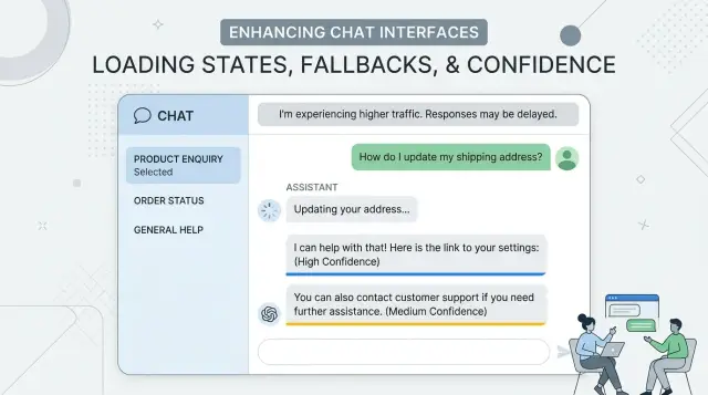
Table of Contents
Why users get confused fast
Users don't see your model router, retry logic, or provider rules. They only see the surface. If one answer arrives in 2 seconds and the next takes 12, the product feels unreliable even when the system behaves exactly as designed.
People notice timing changes faster than most teams expect. A chat that feels quick one minute and slow the next starts to feel moody. Users stop asking, "Is the answer good?" and start asking, "Is this broken?"
Tone shifts make that worse. One reply sounds short, direct, and sure. The next sounds soft, cautious, or oddly formal. A product team may see normal model variation. A user sees a product that changed its mind halfway through the conversation.
Silent retries do even more damage. When a request fails in the background and the interface says nothing, the screen looks frozen. People click again, rephrase the question, or leave. Even if the retry works a few seconds later, the pause already planted doubt.
Confusion turns into mistrust when certainty keeps changing. If one answer sounds very sure, the next is full of hedging, and a third corrects the first, users read that as randomness. They don't think about different confidence patterns across models. They think, "Why should I trust any of this?"
A support chat shows the problem quickly. A customer asks about a refund policy and gets a crisp answer right away. Then they ask a follow-up, wait in silence, and get a longer reply in a different tone with softer wording. Nothing important changed behind the scenes except model behavior, but the product now feels unstable.
What users need to know
People don't need a lesson on models, vendors, or routing rules. They need answers to three simple questions: Is the app still working? Is it trying another path? Should I trust this answer right away?
When a reply takes longer than usual, explain the wait in plain language. "Still working" or "Checking another source" is enough. Most users read silence as failure. A short status message keeps them calm without dragging them into backend details.
If the app switches to a second route, say so. Keep it neutral: "That is taking too long, so we're trying another route." This explains the pause without making users wonder which provider won or lost. The app should feel steady even when the tools behind it change.
Slow and uncertain are different things. A slow answer can still be right. A fast answer can still be shaky. Use one label for timing and another for confidence. If you mix them together, people start to assume every delay means lower quality.
The wording also needs to stay consistent across the product. If chat says "working," a form says "processing," and a results page says "thinking," users waste attention decoding the phrasing instead of using the feature.
A small set of labels usually works best:
- Working on it
- Trying another route
- Answer may need review
Teach these states once and repeat them everywhere. If the team swaps providers next week, the user shouldn't need to learn a new language to understand what the app is doing.
Show waiting in a calm way
When a screen goes blank, users start guessing. In an AI product, that guess is often "it froze," even when the system still works. Put a short status line on screen in the first second, such as "Writing a reply..." or "Checking your request..." A spinner alone is too vague.
If the wait gets longer, the message should change. People stay patient when the product tells them what is happening in plain words and doesn't drown them in detail.
A simple timing pattern works well:
- In the first 1 to 2 seconds: "Drafting an answer..."
- After a few more seconds: "Still working. This request is taking a bit longer."
- After a longer delay: "You can keep waiting, cancel, or come back later."
That last step matters. Give users a clear way out. A visible "Cancel" action respects their time, and a "Continue later" option helps when the task may take a minute or more.
Keep the last useful result on screen while the next one loads. If a support chat already showed account details or the previous reply, leave that content visible instead of replacing it with an empty state. People feel more in control when they can still read, copy, or act on something.
Picture a support chat that checks an order and then drafts a reply. The user should still see the order summary while the answer loads, along with a calm line like "Checking order details..." That feels steady. A blank panel with a spinning circle feels broken.
Users don't need a lesson about model behavior. They need a product that acknowledges the wait, updates them as time passes, and never leaves them staring at empty motion.
Hide provider changes from the user
Users care about whether the answer is clear, fast enough, and stable. They usually don't care which model wrote it. If the screen says "Provider A failed, switching to Provider B," the product feels shaky even when the result is fine.
Keep one voice across every answer. Set simple rules for tone, length, formatting, and refusal style, then apply them before text reaches the screen. If one model sounds casual and another sounds stiff, people notice the switch right away.
Name the task, not the model. Status text like "Drafting your reply," "Checking account details," or "Summarizing this chat" tells people what the app is doing. Vendor names belong in internal logs, dashboards, and support notes, not in the main interface.
Small details matter more than teams expect. Use the same timestamp format, the same loading text, and the same done state for every request. If one provider streams text and another returns a full answer at once, the UI should still feel consistent. A shared response contract helps: the same fields, the same error shape, the same confidence label, and the same fallback behavior.
That contract lets your team swap providers without redesigning the screen every time pricing changes, latency spikes, or a model starts drifting. It protects user trust while giving the product team room to route work behind the scenes.
You still need to track every vendor switch, just out of sight. Log the request ID, the reason for the switch, latency, and whether quality dropped. The team gets the data it needs, and the user gets one calm product.
Explain fallback without causing doubt
When the first model times out, silence feels like failure. A short status line works better than a spinner that just keeps spinning. Say what the app is doing in plain words: it's trying another route to finish the same request.
Keep that message calm and brief. Users don't need provider names, model codes, or a story about outages. "Still working. Trying a backup path now." is enough for most products. In a support chat, that tells people the app hasn't lost their place.
The message should also say what stays the same. Users often worry that a second attempt means the app forgot the question or will answer with less care. A brief note removes that doubt: their prompt, chat history, and attached context are still there. If the answer may take a bit longer, say that too.
A few lines of microcopy usually cover it:
- "This is taking longer than usual. Trying another route now."
- "Your message and context are still in place."
- "If this attempt fails, you can retry."
If the second attempt fails, give users a clear retry button instead of another vague status message. Put it near the failed response area and keep the label simple: "Retry" or "Send again." If a retry changes anything, such as response speed or available context, say so before they click.
Tone matters more than clever wording. Don't imply that the system is broken. Don't pretend nothing happened either. A calm fallback message tells users the app is still in control, their input is safe, and they have a clear next step if the backup path doesn't work.
Show confidence in plain words
Users can handle uncertainty. What they dislike is fake precision. A label like "97.43% confident" looks exact, but in most products it tells them very little. Simple bands work better: high, medium, and low.
Those bands need meaning that matches the task. A support answer can earn "high" if the system found the right order, matched the account, and found one clear policy. The same evidence might still be only "medium" for a refund because money is involved and the cost of a wrong action is higher.
Keep the wording steady across models. If one provider answers and another takes over, the label should still mean the same thing to the user. That keeps the interface calm and provider-agnostic.
When confidence drops, add one short reason in plain language. One sentence is enough:
- "Low confidence - I could not verify the account details."
- "Medium confidence - two policy rules seem to conflict."
- "Low confidence - this request is unusual, so a person should review it."
That reason matters more than the label. It tells users what went wrong, and it explains why the product is slowing down or asking for help.
For actions with real risk, confidence should change the flow. If the system wants to issue a refund, close an account, or send a legal reply, ask for review when confidence is not high. Users accept a pause when the reason is clear.
A support chat is a good example. "I found your last invoice and shipping record" feels solid. "I may be missing part of your billing history" feels honest. Both are better than a floating score that jumps from 82.1 to 79.8 after a provider switch.
Plain words build trust because they explain the limit, not just the output.
A simple flow your team can build
A good interface starts with a plain state map. The user asks a question, the app starts work, something returns, or it doesn't. If your team names each step clearly, the interface feels steady even when the model behind it changes.
A simple flow often looks like this:
- Request sent.
- The app shows active work.
- The first route slows down, so the app retries.
- The app switches to a backup route if needed.
- The app shows an answer or a clear timeout.
Each state needs one short line of copy. Keep the tone calm and neutral. "Working on it" is better than "Using backup model." "Trying again" is better than "Provider error detected." Users care about progress and outcome, not your routing logic.
Time limits matter more than most teams expect. Pick them early, then keep them consistent. Show active work right away, trigger a retry after a few seconds, switch routes after a longer delay, and stop at a fixed timeout. If the app waits too long without saying anything, people assume it broke.
Test the wording across every route, not just the fastest one. A sentence that feels fine on a quick answer can feel vague on a slow fallback. Run the same prompt through your primary and backup paths, then check whether the copy still makes sense at each delay point.
You also need basic tracking. Measure when a request starts, when the user sees first progress, when a retry happens, when fallback starts, and when the user leaves. Those points show where trust drops. If people leave during fallback, the delay may be too long or the message may sound uncertain.
This flow is simple on purpose. Teams ship it faster, users understand it, and you can improve it with real behavior instead of guesses.
A realistic example from a support chat
A customer opens a support chat and asks why an invoice shows two charges. The product already has the ticket title, the last payment date, and a short account summary, so the interface keeps that summary visible while the answer loads. That small choice helps a lot. People stay calmer when they can still see the details they just entered.
The first model handles the easy pass. It reads the help content, checks the ticket context, and drafts a reply that covers the most common billing case. If it answers quickly, the customer gets a clear response in a normal chat flow, not a wall of system status.
Sometimes that first model takes too long. Maybe the prompt is larger than usual, or the service is slow for a moment. After a fixed timeout, the app sends the same request to a slower backup model that does better with longer reasoning. The customer should not see the route change, and the screen should not flicker, reset, or lose the draft state.
Instead, the UI keeps the ticket summary in place and shows one short note: "This is taking a bit longer than usual. I'm checking your case." That line is enough. It explains the wait without naming a provider or making the product sound unsure.
On the support side, the agent can see the full path. A small status line in the internal panel might say that the first route timed out and the backup route answered a few seconds later. The agent can also see which help sources shaped the reply and whether the model had low confidence in part of the answer.
The customer doesn't need that detail. They need one stable conversation, a reason for the delay, and a useful answer when it arrives. The support agent needs the routing history because that helps with review, escalation, and prompt fixes later.
This pattern keeps trust intact. The product looks steady even when the model behind it changes mid-request.
Mistakes that create mistrust
Users forgive a slow answer sooner than a confusing one. Trust drops when the screen changes its story without telling them why.
A common mistake starts in routing, not in the model. If the app sends a simple request down a slow path, or retries in the background and swaps in a different answer later, users blame "the AI" even when the product made the bad choice.
A few patterns cause trouble fast:
- The app waits a long time, then replaces the first answer with a new one and gives no note. That feels like the system changed its mind.
- The copy mixes words like "maybe," "likely," "probably," and "sure" without clear meaning. Users can't tell whether those words reflect confidence or random phrasing.
- The UI says which vendor is active or which one failed. Most users don't care, and the rest may wonder why the product feels unstable behind the scenes.
- Every retry clears the whole screen. Users lose context, scroll position, and trust in what they already read.
- Error text says the AI failed when the real issue is timeout handling, weak fallback rules, or bad request routing.
A support chat shows this clearly. A customer asks about a refund. After a delay, the app shows one answer, then silently replaces it with another. The screen jumps, the wording shifts from confident to hesitant, and the message mentions a different provider. Even if the second answer is better, the product now looks shaky.
Consistency matters more than technical detail. Keep the conversation in place, use one plain confidence scale, and explain updates in simple language such as "We checked again and updated this answer." That kind of note feels honest without dragging users into provider churn.
Quick checks before you ship
Most trust problems start with tiny bits of copy, not the model itself. A product can route requests well and still lose users because one screen sounds calm while another sounds vague or defensive. These small moments usually decide whether the experience feels reliable.
Read every state message out loud. If a loading line sounds stiff, too technical, or oddly cheerful when spoken, it will feel worse when someone is waiting on an answer. Error text needs the same test. People notice tone quickly.
Then test the wait experience at real time gaps. At 2 seconds, a short "Working on it" may feel fine. At 10 seconds, users want a bit more context. At 30 seconds, they need a clear next step, such as staying on the page, trying again, or sending a shorter request.
A few checks catch most rough edges:
- Submit a long question, trigger a retry, and confirm the full draft stays in place.
- Force a fallback to another model and make sure the text box, files, and selected options do not reset.
- Lower confidence on purpose and check that the answer asks for review instead of sounding certain.
- Open the same flow in chat, search, and any side panel. The product should sound like one team wrote it.
This matters more than teams think. If fallback wipes a draft once, many users will stop trusting the product. If a low-confidence answer sounds firm, they may trust it too much.
One short review pass can catch all of this. Sit with someone outside the team, give them three common tasks, and watch where they pause. Their hesitation usually points to the exact line that needs work.
What to do next
If you're applying frontend patterns for multiple AI models, start small. Pick one flow that gets real traffic every day, such as support chat, search, or a drafting screen. A busy flow shows confusion quickly, and it gives you enough feedback to fix the rough parts.
Make the interface honest before you expand it. Users don't need provider names or routing rules. They do need clear waiting states, a fallback state that explains the delay, and a simple confidence message that tells them how much care to use.
- Choose one high-traffic flow and map every user-visible state.
- Add calm wait states, fallback states, and plain-language confidence labels before a wider rollout.
- Release to a limited group first, then watch support tickets and session data for friction.
- Adjust the wording, timing, and retry rules based on what users actually do.
This often reveals the real problem. Teams think they need better models, but the first fix is usually better wording during delays or a clearer note when the product switches to a backup path.
After release, review two things side by side: what users asked for help with, and where they paused, retried, or dropped off. If people keep asking, "Why did the answer change?" your fallback copy is too vague. If they wait in silence and leave, your loading state is too thin.
Some teams can handle this in-house. If your product mixes several models and the UI still feels shaky, an outside review can save time. Oleg Sotnikov, through oleg.is, works as a Fractional CTO and startup advisor and helps teams tighten AI product architecture, routing, and infrastructure without turning the interface into a vendor status screen.
One well-fixed flow beats a broad rollout that leaves people guessing.
Frequently Asked Questions
What should users see while the app is waiting for an answer?
Show a short status line right away. Text like "Working on it" or "Checking your request" tells people the app still runs. If the wait grows, update the message instead of leaving a spinner alone.
Should I tell users which AI model or provider is answering?
No. Most users care about speed, clarity, and stability, not vendor names. Keep provider details in logs and support tools, and let the product speak with one steady voice.
Is a spinner enough for slow AI responses?
A spinner by itself feels vague after a few seconds. Add plain text that says what the app is doing so users don't assume it froze.
When should the UI mention fallback or retry?
Tell them when the first route takes too long and the app is trying another path. Keep the wording calm, such as "This is taking longer than usual. Trying another route now." That explains the delay without making the product sound shaky.
How should I show confidence without confusing people?
Use plain labels like high, medium, and low instead of exact scores. Then add one short reason when confidence drops, so people know whether they should trust the answer or ask for review.
What should stay on screen during retries or longer waits?
Keep the last useful content visible. If the user already sees account details, a draft, or the previous reply, leave it on screen while the next step loads. Blank states make people feel lost.
When do I show a Retry button instead of just a status message?
Give users a clear retry button after a real failure or timeout. If the app still works and just needs more time, show progress first. A retry button helps only when the current attempt won't finish soon enough.
How do I stop tone shifts when different models answer?
Set one style for tone, length, formatting, and confidence labels before text reaches the screen. That way, even if the backend switches models, the conversation still feels like one product.
When should the product ask for human review?
Ask for human review when the answer could trigger money, account, legal, or other risky actions and confidence is not high. Users usually accept that pause when you explain the reason in plain words.
What should I test before shipping a multi-model AI interface?
Test real delays, not just the fastest path. Force retries and fallback, then check whether the draft stays in place, the wording still makes sense, and users always have a clear next step.


