Frontend domain modeling for complex B2B product screens
Frontend domain modeling keeps components, state, and routes tied to real business terms, so complex B2B screens stay clear and teachable.
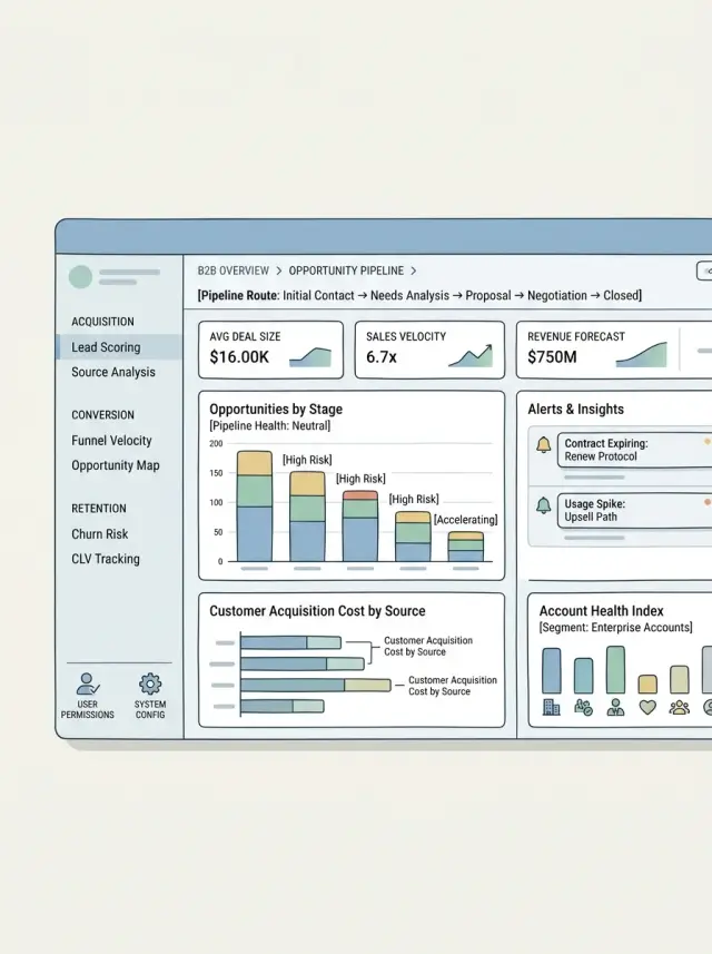
Table of Contents
Why these screens get hard to teach
A new teammate opens a B2B screen and sees tabs, filters, drawers, and forms. They can click around, but they still do not see the business flow. They do not know what has to happen first, who can change what, or which action turns a draft into something final.
The problem usually starts with language. Sales says "account," support says "customer," and the code says "entity." Those words can point to the same thing, or almost the same thing, and that small gap creates real confusion. People stop asking "what is this rule?" and start asking "what do we call this here?"
Another common problem is scope. One page becomes a search tool, a review queue, an editor, an approval step, and an audit view all at once. That feels efficient for a while. Then nobody can explain the screen in one clean sentence, because users are doing several jobs in one place and each job has different rules.
Generic code names make the problem worse. When the UI is built from components called MainPanel, InfoBlock, or DataTable, the business meaning disappears. A new engineer can read the code and still miss that one section exists only for finance, or that one button changes a status and kicks off follow up work for operations.
That is why naming matters so much on B2B products. If the words in components, state, and routes do not match the words people use in meetings, the screen becomes something the team has to memorize. When a screen needs a long walkthrough before someone can safely edit it, the naming has already failed.
Start with the words people already use
Most confusing B2B screens fall apart at the naming stage. The UI says one thing, sales says another, and support uses a third term on calls. New teammates then have to learn the product twice: once in business language, and once in screen language.
Start with the nouns people already use. Look at sales notes, support tickets, onboarding docs, and recorded demos. If people keep saying "purchase request," "approver," "vendor," and "credit limit," those are not random labels. They are the words the business uses to describe the work.
One concept should have one name. If the team uses "purchase request," do not rename it to "item," "record," or "submission" just because it feels shorter in the UI. Those swaps look harmless, but users assume different words mean different things.
Vague labels cause trouble fast. "Item," "data," "details," and "panel" may look tidy in code, but they teach nothing. ApprovalQueue tells the team what belongs there. DataPanel does not.
Some terms need a one line definition because teams mix them up. "Order" and "purchase request" often sound close, but they may sit at different points in the workflow. "Approver" and "reviewer" can also mean different permissions. Write one plain sentence for each term and keep that note where product, design, and engineering can all see it.
This is a small habit, but it saves time. A screen becomes easier to explain, easier to name in code, and easier to change later without turning into a word puzzle.
Name components after domain concepts
A component name should tell the team what business thing it shows or what business action it handles. If a buyer, approver, or account manager already uses that term in meetings, the code should use it too.
Names like RightPanel, TableSection, or StepTwoForm do not last. They describe where something sits, not what it means. Move the layout a month later and the name stops making sense.
Clear names survive redesigns. PurchaseRequestSummary, ApprovalDecisionForm, SupplierTermsCard, and ShipmentExceptionList all teach the screen while you read the component tree. A new developer can open the page and guess the flow without asking for a tour.
Keep layout pieces separate from business pieces. Sidebar, PageHeader, and TwoColumnLayout are fine when they only handle spacing and placement. The moment a component owns a business rule, give it a business name instead.
Shared components need some restraint. A generic DataCard may save a few lines today, but it can blur meaning if every card on the page follows different rules. Reuse the shell if you want, then wrap it in a domain name like CreditLimitCard or ApprovalHistoryPanel.
There is a simple test for this. Read the component tree out loud. "PurchaseRequestPage > PurchaseRequestSummary > ApprovalDecisionForm" sounds like a real screen. "Page > RightPanel > WidgetBox" sounds like office furniture.
Let state mirror the same model
A screen gets confusing fast when the state tree mixes business facts with UI details. If the business talks about a request, an approver, and a decision, the code should use those same ideas.
A purchase approval screen is a good example. Store request, approver, and decision as separate concepts, even if one form edits all three. They change for different reasons. The request holds facts about what someone asked for. The approver is the person or role allowed to act. The decision is the outcome, with its own status, note, and time.
Keep UI state somewhere else. A modal opening, a tab switch, or a loading spinner is not business data. When those pieces sit together in one blob, people stop trusting the state shape because everything looks equally permanent.
The split is usually simple. Business state looks like request.status, request.amount, approver.id, and decision.result. UI state looks like isReasonDialogOpen, activeTab, and isSubmitting.
Names matter as much as structure. Use names that describe real facts, not where the field sits on the screen. billingContact ages well. leftPanelContact does not. decision.reason is clear. secondStepValue is a future bug.
Catch all objects usually make this worse. formData starts small, then turns into a junk drawer for fields, flags, and temporary values. A few weeks later, nobody knows which properties map to saved data and which ones only exist to keep the screen working.
A useful rule is this: a new teammate should understand the state shape without seeing the UI. If they can read it and say, "This is a request waiting for an approver's decision," the screen will stay teachable.
Make routes follow the workflow
Routes should answer two questions quickly: what record is this, and what step is the user on? If a sales manager lands on a screen for a purchase approval, the route should point to that approval first, not to a generic page name or a UI container.
Put the main business object in the route shape and keep it there even when the layout changes. People remember "purchase approval" or "vendor invoice." They do not remember "details page" or "workspace view."
Route params deserve the same care. Use the ID name people use in tickets, docs, and support chats. If the business says approvalId, use that. Do not hide it behind vague names like id or itemId. A new teammate should be able to read the route config and know which record the screen loads without opening three other files.
The route should follow the work itself. If users move from draft to review to approval, those are real route states. A tab switch, a collapsed sidebar, or a filter panel usually is not. Layout tweaks come and go. Workflow steps stay stable much longer.
Modals need a stricter rule. Most modals are temporary UI and should stay local to the page state. Give a modal its own route only when a person can explain it in plain words and share it with someone else. "Open the dispute for approval 1842" is easy to explain. "Open the third overlay on the review screen" is not.
This sounds small, but it changes how teachable a screen feels. When routes match the job, support calls get shorter and handoffs feel less messy.
A simple process for a new screen
Start by forcing the screen into one plain sentence. If you cannot say what the screen does in everyday language, the UI will drift. "Review and resolve an invoice dispute" is clear. "Manage dispute workflows" is not.
That sentence gives the screen a job. It also keeps naming grounded in business language instead of UI jargon that only the team understands.
Before you open the editor, write down three things: the objects on the screen, the actions people can take, and the rules that limit those actions. For an invoice dispute screen, the objects might be dispute, invoice, customer, and resolution. The actions might be assign, approve, reject, and request documents. A rule might be that only finance managers can approve a credit.
Once those words are stable, use them everywhere. Pick the route name, state shape, and component names early, while the model is still small. A route like disputes/:id/review teaches more than a vague path like workspace/item/123. State names such as disputeStatus and resolutionDraft are easier to read than currentData or formState.
Then build the main path first. Ignore odd branches for a moment and make the common case work from start to finish. Can a person open the dispute, read the facts, choose a resolution, and submit it without stopping to guess? If not, edge cases will only make the screen harder to follow.
A short process helps:
- Write the screen's job in one sentence.
- Name the business objects and actions.
- Lock the route, state, and component names.
- Build the happy path.
- Add exceptions after the main flow feels obvious.
Then test the screen in a very human way. Ask a teammate to look at it for two minutes and explain back what the screen is for, what they can do, and what happens next. Do not coach them. If they use different words than your UI, or miss a rule that matters, the screen is still teaching the wrong model.
That kind of test catches confusion early. It is much cheaper than a rewrite after the screen grows into ten modals and five tabs.
Example: purchase approval in a wholesale app
A wholesale team does not think in generic UI terms like review, item, or submit. They talk about purchase requests, approvers, budget notes, finance comments, and approval decisions. If the screen uses those same words, people learn it faster and developers make fewer wrong guesses.
Start with the route. A path like purchase-request/123 tells the team what the page is about before they open the code. review/123 is too vague. A few months later, nobody remembers what kind of review it was, and the route stops teaching anything.
The same rule helps with component naming. PurchaseRequestSummary is clear. ApprovalDecisionForm is clear too. A developer can scan the file tree and understand the page without opening ten files. Compare that with names like HeaderCard, MainForm, or ReviewPanel. Those names describe layout, not the business job.
State should follow the same model. Keep request, approver, comments, and decision as separate parts of state. That small choice matters. If approval fails because the approver changed, you know where to look. If finance wants to save comments as a draft, you do not have to untangle one large object that mixes everything together.
The labels people see should match the same model. If buyers say "purchase request" and finance says "approval decision," the UI should say that too. Do not rename them to softer product words like "task" or "response" just because they are shorter. Shorter is not clearer.
Picture a buyer opening request 123, checking line items, and sending it to finance. When the page, state, and component names all match that job, the screen becomes much easier to teach. New teammates can follow the same path in the code that users follow on the screen.
When one screen does more than one job
Most messy B2B screens break down when one page tries to be a workspace, audit log, chat room, and admin panel at once. People stop teaching the screen with business words and start using position words like "the tab on the right" or "the button near the footer." That usually means the page lost its center.
Pick one object to lead the page. It might be a purchase request, invoice, shipment, or contract. The page title, route, main summary, and primary actions should all point to that one object. Users should know what they are looking at within a few seconds.
Then separate the other jobs into clear parts. Comments should feel like comments, not like approval notes mixed with random updates. Approvals need their own area with status, owner, and next step. History should stay read only and easy to scan, because people open it to answer "what changed" fast.
Use the business terms people already know. Call sections "Approval," "Comments," and "History" if those are the real names. Avoid labels like "side rail" or "activity module." Teams can teach business words. They cannot teach layout words for long.
A side task deserves its own page when it starts pulling attention away from the main object. You can usually spot that moment. People spend more time in the side task than in the main record. It has different permissions. It needs its own filters or bulk actions. Or it creates and edits a different business object.
A wholesale approval screen is a good example. If the page is about one purchase order, keep approve, reject, comment, and review history there. But if users start editing supplier terms, changing warehouse rules, or managing user roles from the same screen, the page now does too many jobs.
That is where teams get confused. A page for one purchase order should not slowly turn into vendor management. If an action belongs to another object, move it to another page and connect the two with clear names, not clutter.
Mistakes that confuse the team
Bad naming rarely breaks a screen on day one. It breaks trust first. A teammate opens the code, sees familiar words, and then learns those words mean something else.
One common problem starts with component names. If OrderPanel sometimes shows a quote, sometimes a purchase request, and sometimes an invoice, the name stops teaching anything. People then read props, API fields, and old comments just to figure out what object they are dealing with.
Generic hooks cause the same trouble in a quieter way. A hook called useEditor or useWorkflow sounds neat, but it becomes a problem when it hides real business rules. If that hook decides who can approve a discount, who can reopen a request, or when a form locks, the logic has drifted away from the business terms the team uses every day.
Label drift is another one. Support starts calling something an "approval request" while the code still calls it a "ticket." The UI, the route, and the state now speak three different dialects. New developers get lost fast, and bug reports take longer to trace.
Routes drift too. If users talk about purchase approvals but the URL says manage/items/123, the route stops helping. Good route names act like small documentation. Vague ones make every screen harder to explain.
Big state objects are another trap. Teams often pack every editable field into one giant object because it feels faster. A month later, changing a note triggers validation for attachments, resets approvers, or marks the whole screen as dirty.
If you want quick warning signs, look for these: one component name covering several business objects, generic hooks owning business rules, labels and code names no longer matching, or one state object controlling unrelated parts of the screen.
If a wholesale approval screen has request details, approvers, comments, and attachments, those parts should also exist in code as separate concepts. When the names match the business, the screen stays teachable.
Quick checks before you ship
A useful test is simple: hide the design and read the names. Look at the route, page title, component names, and state fields. If a new hire can guess the page's job in under a minute, the screen will be easier to build, debug, and teach.
Ask one blunt question: "What is this page for?" If the answer comes back as "approval queue" or "supplier dispute review," you are in good shape. If the answer is "a dashboard with cards and filters," the naming still follows layout, not the business job.
A short review catches most problems. The route, visible labels, and component names should use the same nouns. State fields should describe business facts, not just UI behavior. You should be able to point to each major section and name the business action it supports. And a teammate should be able to explain the screen without saying "widget," "panel," or "table thing."
The noun test is stricter than it looks. If the URL says "requests," the tab says "Approvals," and the code says "ReviewBoard," people will waste time translating. Pick one word for one concept and keep it everywhere.
State needs the same discipline. approvalStatus, reviewerId, and creditLimitExceeded map to real facts. leftPaneOpen and activeCard can still exist, but they should stay local to the view. When shared state is full of visual terms, the business model has gone missing.
One small exercise works well before release. Ask a product manager, support teammate, or new engineer to explain the screen back to you using only business words. If they stumble, rename first. Those names will become the language your team teaches to everyone else.
What to do next with your team
Pick one screen that people avoid touching. It is usually the one that grew over time, carries too many exceptions, and uses words that mean different things to product, sales, and engineering. Clean up that screen first. If the team can turn one messy screen into a clear example, the next screens get easier.
Keep the rewrite small. You do not need a full redesign. Rename the parts that map to the business, trim state that mixes unrelated ideas, and make the route read like the workflow people already talk about.
A simple team pass works well. Choose one screen that keeps causing confusion in reviews, QA, or support. List the business terms people use in meetings and tickets. Agree on one name for each concept and use it in the UI, components, state, and routes. Then save those names in a short note that product and engineering both accept.
That note should be boring on purpose. Ten to fifteen terms is enough. If a product manager says "approval request" and a developer says "review item," pick one and stick to it. Teams move faster when they stop translating the same idea back and forth.
Do not treat the naming note as permanent. Review it when the workflow changes, when a new edge case appears, or when another team starts using different words. If the business model moves, the screen model should move too.
Some teams need an outside view because the product language and screen structure are already tangled. In that case, a fractional CTO can help review product architecture before the confusion spreads. Oleg Sotnikov at oleg.is does this kind of advisory work with startups and smaller companies, especially when product language, frontend structure, and delivery have drifted apart.
A good first move this week is enough: pick the screen, book one naming session, and rewrite the note the same day.
Frequently Asked Questions
Why does naming matter so much on complex B2B screens?
Because people learn the product through words first. If the UI says one thing, support says another, and the code says a third name, teammates spend time translating instead of understanding the workflow.
How do I pick the right business terms for a screen?
Start with the nouns people already use in sales calls, support tickets, demos, and docs. If the business says "purchase request," keep that name in the UI, code, and route unless the team agrees on a better single term.
When is a generic component name okay?
Use generic names only for layout pieces that handle placement, like Sidebar or PageHeader. Once a component owns business rules or shows business data, give it a domain name like ApprovalDecisionForm or PurchaseRequestSummary.
How should I structure state so the screen stays teachable?
Keep business facts separate from view details. Store things like request, approver, and decision apart from activeTab or isDialogOpen so the model stays easy to read and debug.
What should a good route name do?
Make the route answer two things fast: what record this is and what step the user is on. Names like purchase-requests/:approvalId/review teach more than vague paths like workspace/item/:id.
What do I do when one screen tries to handle too many jobs?
Give the page one clear job and one main object. If comments, approvals, history, and admin tools all fight for attention, split side tasks into their own pages before the screen turns into a cluttered workspace.
What is the first step when I design a new B2B screen?
Write one plain sentence for the screen before you build it. If you cannot say what the page does in everyday language, the naming and structure will drift fast.
What are the warning signs that a screen model is getting messy?
Look for names that cover several business objects, giant state blobs like formData, and routes that hide the real record. Those usually mean the screen no longer matches how the business talks about the work.
How can I quickly test whether a screen is easy to teach?
Ask someone new to the screen to explain it back using only business words. If they fall back to phrases like "the right tab" or "that panel," your naming still follows layout instead of the workflow.
When should we ask for outside help with screen architecture?
Bring in outside help when the team keeps arguing about terms, the page mixes several workflows, or small changes keep breaking unrelated parts. A fractional CTO can review the product language, code structure, and workflow model before the screen grows harder to fix.


