Front-end error handling that helps support fix issues
Front-end error handling should separate user input mistakes, server failures, and stale state so users see clear messages and support gets useful reports.
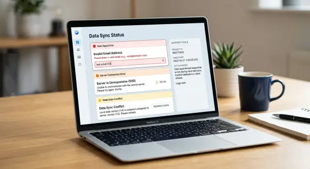
Table of Contents
Why one generic error message causes trouble
A toast that says "Something went wrong" looks harmless, but it blocks the next step for everyone.
The user doesn't know whether they typed a bad value, lost connection, or opened an old page. Support doesn't know where to start. The developer who gets the ticket usually has to guess.
Once the message disappears, the report gets even thinner. Most users write "it failed" and attach a screenshot of the toast. That image shows the screen, but not the cause. It rarely captures the field that triggered a validation problem, the request that hit a server error, or the stale data still sitting in the browser.
Generic errors also push teams toward the wrong fix. A developer may inspect the API first because the message sounds serious, while the real issue is a form rule on the page. Support may tell the customer to try again three times when the app actually needs a refresh because the page state is old.
A vague message hides the details support needs right away: what the user tried to do, what the app expected, where the failure happened, and what the user can do next.
Without that detail, every ticket turns into an interview. Support asks for steps, then a timestamp, then browser info, then another screenshot. The user gets annoyed. The developer receives a handoff with half the facts and often starts in the wrong place.
Good error handling fixes that while the app still knows the action, the form state, and the response it got back. Instead of "your app is broken," support starts getting reports like "saving failed after I changed the email field" or "I edited a record that had old data until I refreshed." That cuts guesswork fast.
Sort errors into three buckets
If every failure ends up as "Something went wrong," support has to guess, and that guess usually starts in the wrong place. A simple bucket system gives everyone the same language.
Use plain names that a support agent can repeat back to a user without sounding technical. "Form error," "server error," and "out-of-date page" work better than vague labels or internal codes.
A form error means the user can fix the problem on the same screen. The email format is wrong, a required field is empty, or a date makes no sense. Keep the message close to the field, say what needs to change, and let the user try again.
A server error means the app couldn't finish the request even though the user did their part. That includes failed API calls, timeouts, network loss, and backend bugs. Tell the user to retry, wait, or contact support if the problem continues. Don't blame the form when the server failed.
An out-of-date page is different. The user may have opened a record, left the tab alone for twenty minutes, then tried to save old data after someone else changed the same record. The app still works. The server may still work. The page state is just stale. Users need a refresh, a reload of the record, or a conflict message that shows what changed.
Those three buckets should map to three clear actions:
- Form error: fix the field and submit again
- Server error: retry or report the issue
- Out-of-date page: refresh and review recent changes
That mapping helps support immediately. When a user says, "I got an out-of-date page error," the agent already knows not to ask them to clear every field and start over.
One small rule helps even more: use the same bucket name in the UI, logs, and support notes. If the screen says "server error" but the log says "transport exception" and support calls it a "sync issue," people waste time translating instead of solving the problem.
What users should see for each type
Users can recover from most errors if the screen tells the truth in simple words. A generic toast helps nobody. Good messages explain what happened, what didn't happen, and what to do now.
For user mistakes, keep the message next to the field. If the email is missing "@", say that beside the email box. If a date is in the wrong format, show the expected format and keep the user's input in place so they can fix one thing and move on.
Short, direct messages work best. "Enter a valid email address" is better than "Your submission contains invalid data." The next step should be obvious from the message itself.
Server failures need a different tone. Don't make users guess whether they caused the problem. Say that the app couldn't save or load data because the server failed to respond or returned an error. Keep their form data on screen and give them one main action, such as "Try again."
A little detail helps here. "We couldn't save your changes. The server returned an error. Try again in a minute" is plain and useful. If you have a request ID or timestamp, show it in small text so the user can share it with support without hunting for it.
Stale client state needs an even clearer warning because users can lose work. This happens when a record changed after the page loaded, often because another person edited it or the user had the form open too long. Stop the save before it overwrites newer data.
A message like "This customer record changed since you opened it" is enough to start. Then offer one primary action, such as "Reload latest version," and one secondary action, such as "Copy my changes." If possible, show which fields changed so the user doesn't have to compare the whole form from memory.
A simple example makes the difference clear. If a user edits a phone number, a field error should point to the phone field. A server error should keep the typed number and offer retry. A stale data warning should say another update exists and ask before replacing it.
Step by step: build an error flow people can use
Good error handling starts before you write a single toast. You need a path from failure to action, so users know what to do next and support gets enough detail to help.
A simple build order works better than clever code.
Start with the actions that can fail. Saving a form, loading a table, uploading a file, refreshing a session, and deleting a record all fail in different ways. Write those actions down first, because hidden failure points are where vague bugs come from.
Then give each failure one bucket in code: user input error, server failure, or stale client state. A bad email format belongs to the first bucket. A 500 response belongs to the second. A form edited on old data belongs to the third.
Use one error shape everywhere. Keep it small and consistent, with fields such as type, code, message, requestId, and details. The UI can read it, logs can store it, and support can search it.
Next, decide where each message should appear. Inline text works for field mistakes. A page banner fits load failures. A modal or blocking message makes sense when stale client state means the user must refresh before doing anything else.
Attach context every time. Include the request ID, the page name, the user ID or account ID, and the action that failed. If support gets a report that says "save failed on customer edit" with a request ID, they can usually trace it in minutes instead of guessing.
Then test the flow with real broken states, not happy-path mocks. Use an expired session, a slow network, a validation miss, old cached data, and a forced 500 response. Watch what the screen says, what gets logged, and what support would receive.
A good check is simple. Every error message should answer one question. For users, that question is "What do I do now?" For support, it's "What exactly failed, and where?" If your flow answers both, fewer reports turn into dead ends.
What support needs in every report
Support teams solve issues faster when the report helps them replay the problem. The app should capture the facts while they're fresh, not after the user has guessed what happened.
Users should only need to add a short note in plain language. They shouldn't have to remember every step or copy technical details by hand. That's where reports usually fall apart.
A useful report includes five things:
- the action the user tried, such as "saved changes to a customer record"
- the exact message shown on screen, copied word for word
- the time the error happened, with timezone if your users work in different regions
- the request ID or trace ID tied to that failed action
- whether retrying, refreshing, or editing the input changed the result
Each item saves real time. The exact message helps support tell one bug from another. The time lets them search logs without guessing. The request ID points to one failed call instead of a whole batch of traffic. The note about what fixed it is often the fastest clue of all.
For example, a user updates a customer phone number and taps Save. The app reports: "Validation failed: phone format is invalid," plus the time and request ID. Support now knows this is probably a user input error, not a server failure. If the report instead says the save failed, a refresh fixed it, and the second attempt worked, support should check stale client state or caching before they inspect backend rules.
Keep the report easy to send. A copy button works better than asking users to type details into a chat box. If you offer screenshots, ask for them only as extra context because text is easier to search. Also avoid pulling in private data unless support truly needs it.
A real example: editing a customer record
A sales rep opens a customer record and updates the email address. She types alex@@company.com by mistake. The app should catch that before it sends anything to the server.
An inline field message works better than a toast here. Mark the email field, explain what is wrong in plain words, and keep the draft in place so she can fix it in a second. That is a user input error, and the browser can handle it right away.
She corrects the email and clicks Save again. This time the format is fine, so the request goes out. Then the API returns a 500 error.
Now the message should change completely. Don't point back to the email field, because the field isn't the problem anymore. Tell her the save failed on the server, keep her changes on screen, and give her a safe retry option. A short message like "We couldn't save your changes. Nothing was lost." is enough.
A bit later, she retries. While she was waiting, a teammate changed the same customer in another tab and saved first. The next response should not look like the server error either. This is stale client state.
The app should say that the record changed elsewhere and ask her to refresh and review the latest version before saving again. If possible, show what changed so she doesn't have to guess. That extra step prevents accidental overwrites, which support teams hate cleaning up.
In one short editing session, you now have three different error types:
- a field validation error before save
- a server failure during save
- a version conflict after someone else changed the record
That's why clear labels matter behind the scenes. If the user reports a problem, support can tell what happened: the bad email never left the page, the 500 came from the server, and the last failure came from an outdated copy of the record.
Mistakes that waste support time
Weak error handling turns a small bug into a long support thread. Support can't help much when every failure looks the same, the user loses work, and the logs say almost nothing.
The first mistake is the generic toast. If the app shows "Something went wrong" for a bad email address, a timeout, and an edit conflict, users report all three the same way. Support then has to guess whether they should ask the user to fix the form, try again later, or reload fresh data.
Another common mistake is telling people to retry when the form data is the problem. If a field is invalid, the app should point to that field and say what to fix. A retry button for bad input wastes time and trains users to click again and again instead of correcting the value.
Dropping the user's draft after an error is even worse. People don't care whether the fault is in the browser or the server. They care that ten minutes of edits disappeared. Keep the draft on screen, keep the changed fields, and make it easy to submit again after the issue is fixed.
A few patterns cause most of the pain. One message covers every error type. The app asks for a retry when the form needs a fix. The screen resets and removes unsaved changes. Logs keep only "save failed" with no request ID, status code, or record ID. Old client data triggers the same message as a real server outage.
That last one creates a lot of noise. If the user edits a customer record that someone else already changed, the app should say the page is out of date and offer a refresh or compare step. If you label that case as a server failure, support starts checking uptime and backend logs for a problem that doesn't exist.
Logs matter just as much as the user message. Support needs enough detail to sort the report fast: what action failed, which record the user touched, whether the server returned 400, 409, or 500, and whether the client state was stale. Hide those details, and every ticket turns into a back-and-forth chat.
A simple rule works well: tell users what they can do next, and tell support what actually happened. When those two messages match the error type, cases move much faster.
Quick checks before you ship
A small review before release saves hours of support churn later. If a screen can fail in five different ways but shows the same red toast every time, users guess, retry at random, and file weak bug reports.
Read each message out loud before you ship. It should name the problem in plain words and tell the user what to do next. "Session expired. Refresh and try again." works better than "Unexpected error occurred."
Run through the flow and ask one simple question for every error: what should the user do now? The answer should fit on the screen. Fix the field, retry the request, refresh data, or contact support with a reference ID. If the next action is unclear, the message isn't ready.
A few practical checks catch most weak spots. Keep field errors next to the field. Show a retry option only for temporary problems. Add a short support ID to server failures. Warn before the app overwrites newer data. Keep entered work when you can.
One quick test can expose most gaps. Open a form, leave one field wrong, force a timeout, then change the same record in another tab. You should see three different messages, three different actions, and one clean report path for support.
Small teams feel the difference first. When support and engineering share the same queue, a clear message plus a support ID can cut the back-and-forth from ten minutes to one.
What to do next
Don't roll this out across the whole product at once. Pick one screen that gets real traffic and real complaints, like editing a customer record, changing billing details, or submitting a signup form. Map the three failure paths on that screen: user input errors, server failures, and stale client state.
That small exercise usually exposes the mess fast. Teams often find one message hiding three different problems, which leaves users guessing and support digging through logs. Write down what the user did, what the app knew at that moment, and what support would need to confirm the cause.
Then rewrite the messages so each one leads to an action. "Enter a valid email address" is clear. "We couldn't save your changes. Please try again" is only half useful unless you also tell the user whether their draft is still there. For stale data, say it plainly: the record changed somewhere else, so the page needs a refresh before saving again.
A simple report box helps more than another toast. Let users copy a short block into a support ticket with the screen name, record or customer ID, request ID or error ID, time, app version, browser, and the action they took. Keep it short enough that people will actually send it.
Then review real support cases every month. Read a handful of tickets and sort them again. If many "save failed" reports turn out to be stale client state, change the message and the bucket. If people keep making the same input mistake, fix the form and validation rules instead of asking support to explain it over and over.
One cleaned-up screen can cut repeat tickets, save support time, and show the team what to change next.
If your team wants a second pair of eyes on the buckets, reports, and app flow, Oleg at oleg.is works with startups and small companies as a Fractional CTO and advisor. A short review of one busy screen is often enough to spot the first fixes.
Frequently Asked Questions
Why is "Something went wrong" a bad error message?
Because it hides the cause and gives nobody a clear action. Users do not know whether they need to fix a field, retry the request, or refresh old data, and support has to guess from a vague screenshot.
What error types should I use in the UI?
Use three buckets: form error, server error, and out-of-date page. That gives users, support, and developers the same words for the same problem.
How should I show a form validation error?
Put the message right beside the field that caused the problem and say what to fix in plain words. Keep the user’s input in place so they can correct one value and submit again.
What should a server error message say?
Tell the user the action failed on the server and make it clear they did not break the form. Keep their draft on screen, offer a retry, and show a request ID or timestamp if you have one.
How do I handle stale client state?
When the page holds old data, stop the save before it overwrites newer changes. Say that the record changed since the user opened it, then offer a refresh or reload and, if you can, show what changed.
Should the app keep user input after an error?
Yes, keep the draft whenever you can. People care about their work more than the technical cause, so do not wipe edited fields after a timeout, a 500, or a retry prompt.
What should every support report include?
Include what the user tried to do, the exact text on screen, the time it happened, and the request ID tied to that action. Add whether retrying, refreshing, or changing the input fixed it, because that clue often points to the cause fast.
Where should each error message appear?
Match the placement to the problem. Inline text fits field mistakes, a banner fits load failures, and a blocking dialog fits stale data when the user must refresh before they can continue.
How can I test error handling before I ship?
Break the flow on purpose before release. Try a bad field value, a timeout, an expired session, and an edit conflict in another tab, then check whether each case shows a different message and a clear action.
Where should I start if I want to improve error handling?
Start with one busy screen such as editing a customer record, billing details, or signup. Those screens usually expose the mess fast and give you enough real reports to improve the wording, logging, and report flow.


