Feature naming rules for labels users understand fast
Feature naming rules help teams pick labels users can predict, search, and discuss, so fewer people open support tickets over simple UI wording.
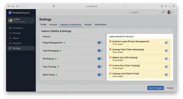
Table of Contents
Why simple labels still confuse people
A label can look perfectly clear to the team that built it and still confuse the person seeing it for the first time. Support tickets often start with tiny words like "sync," "workspace," or "session" because those words feel obvious inside the company and fuzzy outside it.
Users are not refusing to learn the product. They are moving fast. They read a label, make a guess, and keep going. If that guess is wrong, they click the wrong thing, miss the right feature, or ask support a question that the product name created.
Internal team language makes this worse. A product team may use "instance" to mean a separate environment, while a new user reads it as a copy, a version, or a single record. The team hears one meaning. The user sees three.
That gap shows up in support work every day. Someone opens a ticket asking where billing settings went, but the settings still exist under "organization." Another person wants export options and looks for "download," not "data portability." The feature exists. The name hides it.
Even short labels fail when they describe the system instead of the task. Teams name things after backend logic, architecture, or old project names because those terms feel precise. Users care about what they are trying to do right now. They look for "invite team members," not "seat management."
That is why feature naming rules matter. Good names help people guess correctly on first read. They cut down on the chance that someone clicks through three menus before giving up. They also make search work better, because users type the words they already know, not the ones your team invented.
A useful name does two jobs at once. It tells users what will happen if they click, and it matches the words they would say to a coworker or support agent. When those two things line up, people find features faster and support gets fewer avoidable tickets.
What people need from a feature name
People do not read labels the way product teams do. They scan for the job they want done. If they want to invite a coworker, change billing, or turn off emails, they look for those words first. A feature name should match that intent.
That is why plain language beats clever wording. Users search with everyday terms, not the jargon your team uses in roadmaps or Slack chats. If someone types "export report," a label like "Reports export" gives them a fair chance. A label like "Data outbound" does not.
Good feature naming rules make a product easier to predict. Before users click, they should already have a rough idea of what will happen. "Two-factor authentication" gives a clearer signal than "Advanced sign-in." "Saved drafts" works better than "Work in progress." The best names lower doubt.
A name also has to work out loud. People repeat feature names in support tickets, team chats, and calls. If the label sounds awkward, vague, or too close to something else, confusion spreads fast. One person says "alerts," another says "notifications," and support now has to guess which screen they mean.
In practice, four things matter most. The name should match a task the user already has in mind. It should use the words people would type into search. It should sound natural in a sentence. And support should be able to repeat it back without translating it first.
That last part gets missed a lot. When a customer says, "I can't find draft sharing," the reply should use the same words they see on screen. If support has to mentally convert the label first, the name is creating extra work for no reason.
A simple test helps. Read the name without the rest of the design around it. Then ask whether a new user would know what it does, what words to search, and how to mention it to another person. If the answer feels shaky, the label needs another pass.
A simple process for choosing a name
Good names start with the job the user wants to do. They do not start with the name your team gave the code, the service, or the project. If a customer wants to "share reports automatically," a label like "Dispatch engine" will slow them down and create questions.
The fastest way to find a clear name is to collect the words people already use. Look at support tickets, sales demos, onboarding calls, search terms, and chat logs. People often tell you the label they expected without meaning to.
A short process usually works better than a long naming debate. First, write the user task in plain language with a verb and an object, such as "Export data" or "Invite team members." Then pull real phrases from customer conversations. If five people say "backup" and nobody says "snapshot policy," that tells you a lot.
Next, draft a few options for the same feature. Keep them short, concrete, and close to everyday speech. After that, put the best option on the actual screen. A name can look fine in a document and feel wrong once it sits next to menu items, buttons, and helper text. Finally, check where else the name has to work. It should still make sense in navigation, search, help text, and a support reply.
Testing the name inside the product matters more than most teams expect. A label may sound clear on its own but become vague in context. "Rules" might work in one menu, while "Approval rules" works better on a crowded settings page.
Drafting several options also helps teams avoid falling in love with the first idea. Most first-pass names come from internal habits. The second or third option is often simpler, and simple usually wins.
This is where feature naming rules help most. They give teams a repeatable way to choose terms users can predict, search, and say out loud. If someone can find the feature, mention it to a coworker, and recognize it in help text, the name is doing its job.
Rules that make names easier to predict
Users guess what a label means before they click it. If the name uses words they already know, they usually guess right.
Start with familiar language. "Export data" works better than "Data portability," and "Share link" beats "Generate token." People look for the result they want, not the internal method your team built.
Name the outcome whenever you can. "Download invoice" is clearer than "Create PDF artifact." Pick common verbs and nouns. "Save draft," "Block sender," and "Change password" are easy to scan because they describe a direct action.
Give each word one meaning across the product. If "archive" means hide from the main view, do not use it somewhere else to mean delete. Products can live with plain labels for years. They struggle when one screen says "members," another says "users," and a third says "collaborators" for the same thing.
Cut extra words when they do not add meaning. "Notifications" is often enough. "Manage notification preferences" is longer without telling the user much more. Words like "manage," "advanced," "preferences," and "settings" often sneak in during design reviews because they sound safe. Most of the time, they blur the action.
Say the label out loud. This catches more problems than people expect. Imagine a customer saying, "I can't find auto-renew" or "Where do I change billing email?" If the label matches natural speech, support conversations move faster. If it sounds like internal jargon, people stall.
Plain names do not make a product feel less smart. They make it feel easier to use, which is what users notice first.
Write names people can search and discuss
Most users do not remember your internal term. They search with the words they already know. If your label does not match those words, they miss the feature, ask support, or click around until they give up.
Good feature naming rules start with search behavior, not branding. Watch the words people type into product search, help chat, and support forms. If they search for "invoice export," do not call the feature "data output."
Clever names are expensive. They may sound polished in a meeting, but they hide the action. A name like "Smart Shield" forces users to guess. "Two-step login" or "Login security" gives them something they can predict, search, and repeat to a coworker.
Keep nearby labels close to each other. If the menu says "Notifications" and the page title says "Message preferences," people wonder if they opened the wrong place. Small wording gaps create real confusion, especially when someone tries to explain the path in a chat or screen share.
A simple rule helps here: if two labels point to the same thing, they should share the same main words. They do not need to match perfectly every time, but the menu item, page title, search result, and support reply should sound like they refer to one feature.
A quick team test works well before release. Show the feature to two teammates for a few seconds, hide it, and ask what they would search for. Then ask how they would tell a customer to find it. If both people use the same words, you are probably close. If one says "billing export" and the other says "download invoices," your current label may still be too vague.
Settings pages make this especially obvious. "Privacy" is broad. "Profile visibility" is easier to search, easier to discuss, and easier for support to reference. When labels use plain words that people already say out loud, the product feels simpler than it really is.
A realistic example from a settings page
Open a settings page and imagine two labels: "Sync Hub" and "Smart Flow." They may sound polished, but they force people to guess. Does "Sync Hub" import data, export it, or connect two tools? Does "Smart Flow" send emails, move records, or trigger background tasks?
Most users will click one just to find out. Some will back out. Some will ask support before touching anything, because settings pages feel risky and nobody wants to break a live workflow.
Now rename those same items to "Import data" and "Send updates automatically." The tone is less fancy, but the meaning is clear before the click. A person who wants to bring customer records into the product knows where to go. A person who wants the product to keep others updated can spot the second option in a second or two.
That small change removes a lot of hesitation. People do not need to learn your internal terminology first. They can match the label to the job they want done.
Search also works better with plain names. Users are far more likely to search for "import data" than "sync hub." The same goes for team chat. A manager can tell a coworker, "Turn on Send updates automatically," and the coworker can find the exact label without asking a follow-up question.
Support gets a direct benefit too. Instead of replying with a translation, the team can use the exact words on screen: "Open Settings and choose Import data." That kind of answer is faster to write and easier to follow. It also cuts down on the back-and-forth where support says one thing, the product says another, and the user is left guessing.
Vague names try to sound special. Clear names do a better job. On a busy settings page, that usually matters more.
Mistakes that create extra support work
Support tickets often start with a naming problem, not a broken feature. A person reads a label, makes a quick guess, clicks, and gets a different result. That gap creates the familiar tickets: "Where did this go?", "Why did this change?", or "I thought this did something else."
Internal codenames are a common cause. Teams get used to names like Phoenix, Orbit, or Falcon because they use them every day. Users see those words and have no clue what they do. A label should explain the job, not preserve team history.
Trouble grows when one word means two different actions. If "Export" downloads a CSV on one screen but sends data to another tool on a different screen, people stop trusting the app's language. They start clicking slowly, checking help docs, or asking support before they act.
The same problem shows up when marketing and the product use different terms. If the website says "automations" but the app says "rules," users have to translate every message, tutorial, and conversation. They will search with the first term they saw, and if your app uses another one, they assume the feature is missing.
Vague labels are worst when the action has risk. Soft wording can sound polite, but it hides the real outcome. "Manage," "clean up," or "update" should not sit on buttons that disconnect an integration, remove billing details, or delete data. Clear words feel blunt, and that is fine. People need warning, not charm.
Very short labels can cause the same damage. Saving four characters is rarely worth the confusion. Words like "Prefs," "Config," "Sync," or "Status" look neat, but each can mean several things. When space gets tight, cut decoration first and protect the meaning.
You can usually spot naming trouble quickly. Support agents keep rewording the same labels in replies. Users call the same feature by two or three different names. Search terms in help docs do not match the app. Or people trigger risky actions and say they misunderstood the button.
If support keeps explaining a label, the label is not working. A slightly longer name often costs less than another month of avoidable tickets.
A quick review checklist
A name can look fine in a design file and still cause trouble once real people use it. A fast review catches most of that before the label reaches customers, support, and sales.
Use this checklist on every new label, and run it again before release if the screen changed during design or development:
- A new user should have a fair guess about what happens before clicking.
- The phrase should match the words a customer would type into search.
- Sales, support, and product should all say the same name in writing and out loud.
- The label should still make sense on a small screen, where helper text may disappear.
- If another screen uses a different word for the same action or object, pick one term and fix the rest.
A short test makes this even better. Show the label by itself to someone who has never seen the screen before. Ask what they expect to happen, where they would look for it later, and what word they would use when asking support about it.
Small mismatches add up. A settings page with "Access," "Members," and "Permissions" might seem clear to the team that built it, but users may treat those words as the same thing. If only one of them controls who can invite new people, the cleanest fix is often a more direct label, not another tooltip.
Good feature naming rules are usually boring. That is a good sign. When people can predict, search, and repeat a label without stopping to think, the name is doing its job.
What to do next with your team
Pick one part of the product and review every label on that screen or flow. Do not start with the whole app. A settings page, billing area, or invite flow is enough to show where your naming breaks down.
As you review, pair the UI with real support evidence. Read recent tickets, chat logs, sales call notes, and onboarding recordings. Pay attention to the words customers use on their own, especially when they describe a feature without knowing its official name.
A small audit sheet helps keep the team honest. For each label, note where it appears, what users seem to think it means, the phrases they search or use in tickets, the replacement name your team wants to test, and whether the new name is shorter, clearer, or both.
Then change the worst names first. Start with labels that create repeat questions, wrong clicks, or failed searches in help docs. You do not need a full naming cleanup before release. Fixing five painful labels can cut more support noise than renaming fifty harmless ones.
After each change, watch ticket themes for a few weeks. Look for fewer "Where is this?" questions, fewer confused handoffs between support and product, and fewer cases where customers use three different terms for the same thing. If nothing changes, the new label may still be too vague.
Treat feature naming rules as part of product maintenance, not a one-time workshop. Teams often argue too long about what sounds clever. Users care more about what sounds obvious.
An outside view can help when a debate stalls. That can come from a support lead, a product advisor, or an experienced Fractional CTO. Oleg Sotnikov at oleg.is often helps teams tie labels back to user language, product structure, and support cost. A short review from someone who has seen many products can save weeks of internal back-and-forth.
If your team leaves the meeting with one cleaned-up screen and one metric to watch, that is enough to start.
Frequently Asked Questions
Why do even simple labels confuse users?
Because users scan for the job they want done, not your team’s internal term. If a label names the system instead of the task, people guess, click the wrong thing, or ask support.
What makes a feature name clear?
Start with a plain action and object, like Export data or Invite team members. A clear name tells people what will happen when they click and uses words they would already say or search for.
Should labels be short or descriptive?
Short helps only when the meaning stays clear. Notifications works, but vague labels like Sync or Prefs save space and add confusion.
How do I find the words users actually expect?
Look at support tickets, onboarding calls, sales demos, chat logs, and product search terms. Those places show you the words people already use when they do not know your official label.
How can I test a label quickly?
Try a quick test with someone who has not seen the screen. Show the label alone, ask what they think it does, what they would search for, and how they would mention it to support.
Do the menu label and page title need to match?
Yes. If the menu says one thing and the page title says another, people think they opened the wrong place. Keep the main words the same across navigation, search, help text, and support replies.
What kinds of labels create the most support tickets?
Internal codenames, vague brand-style names, and one word with two meanings cause the most trouble. Labels like Smart Flow, Orbit, or Manage force users to guess.
How should I name risky actions?
Use direct words that match the real outcome. If an action deletes data, disconnects an integration, or removes billing details, say that plainly instead of hiding it behind soft wording like Update or Clean up.
When should we rename an existing feature?
Rename it when support keeps translating it, users search with different words, or people click it and expect another result. A slightly longer label often costs less than weeks of repeated confusion.
Where should my team start with a naming cleanup?
Begin with one painful screen, such as settings, billing, or invites. Fix the labels that cause repeat questions, wrong clicks, or failed searches, then watch whether those tickets drop after the change.


