Design system boundaries that stop prop soup early
Learn how design system boundaries keep shared components simple, move business rules into features, and prevent prop soup before reuse starts to break.

Table of Contents
What prop soup looks like
Prop soup starts small. A shared component begins with a few clear options, then slowly turns into a bag of switches, exceptions, and one-off settings. What used to feel simple now needs a long prop list just to render one screen.
You see it when someone opens a component and spends more time reading its API than using it. A button that once had size, variant, and disabled now also wants isCompact, withIcon, iconSide, iconOnly, loadingText, showSpinner, useBrandColor, and three props nobody fully trusts.
Most teams do not create this mess on purpose. It grows one request at a time. A sales page needs a special style. An admin page needs extra validation. One customer flow needs a warning state that only appears in one narrow case. Nobody wants to fork the component, so they add one more prop and move on.
After a few months, the names stop making sense. You get pairs like compact and dense, and nobody can explain the difference. You get flags that fight each other, like isPrimary with variant="secondary", or hideFooter next to footerActions. The component still works, but nobody can guess what will happen without testing it first.
That usually means the boundary is off. The component no longer handles presentation alone. It starts carrying business rules, page rules, and old decisions that belonged somewhere else.
Reuse gets slower as the API grows. People stop asking, "Does this fit my screen?" and start asking, "Which mix of props gives me the least broken version?" Small changes take longer because every new option might break an older case. Reviews slow down too. A teammate sees a new prop and has to ask whether it reflects a real design need or just another patch.
At that point, the shared component is not saving time. It is collecting confusion.
Why shared components start to rot
Most shared components do not rot because a team planned badly. They rot because the fastest fix feels small. A product team hits a deadline, sees a component that is almost right, and adds one more prop to cover one screen. It saves time today, so nobody argues.
The problem starts when that rule moves into the library instead of staying in product code. A modal now knows about billing state. A table now cares whether a user is on a trial. A form field changes behavior for one admin flow. Each choice looks harmless on its own.
Then people copy the pattern. One exception gets accepted, so the next team adds another. Soon the component API carries bits of onboarding, permissions, pricing, and reporting logic. The team still calls it reusable, but it is only reusable if everyone accepts the same pile of special cases.
A simple button shows how this happens. It starts with a few clear options like size, tone, and disabled state. Later, one team adds a prop for checkout loading text. Another adds a lock icon for restricted actions. Another adds tracking behavior for a campaign page. The button still looks like one shared piece, but it now carries business rules from three different parts of the product.
That hurts reuse. The component tries to serve many screens, but it serves each one a little badly. Simple screens drag around options they do not need. New screens still need workarounds because the old props were built for somebody else's case. The API grows, and the intent gets fuzzy.
Testing cost is usually what makes the rot obvious. A small change in layout, validation, or button behavior now touches settings, checkout, admin tools, and marketing flows. Teams retest far more UI than the change deserves. They also move slower because nobody feels sure which prop mix another screen depends on.
A healthy library gives teams plain building blocks. When a shared component needs to know too much about plans, roles, or page logic, it has crossed the line.
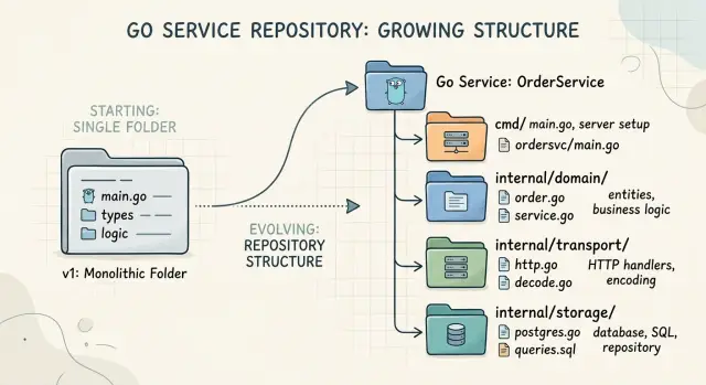
Where business rules should live
Shared components should handle UI concerns, not product policy. A button can know its size, style, loading state, and disabled state. It should not know who can approve a discount, which plan unlocks a feature, or whether step 4 is available before step 3.
That line matters because the design system should own structure, visual states, spacing, and accessibility behavior. It can expose generic inputs like disabled, selected, error, or loading. Those props describe what the UI should show, not why the product chose that state.
A good shared component answers a narrow set of questions: how should this look, what state is it in, how does it respond to input, and what content does it display?
Pricing rules, permission checks, and workflow rules belong in feature code. That is where the product already knows the account type, user role, current step, billing status, or approval state. Feature code can make the decision, then pass the result down as plain UI props.
Wrappers help a lot here. They let a product team keep business logic close to the feature while still using the same shared building blocks underneath.
Say a team has a generic Button in the design system. The billing area might create an UpgradePlanButton wrapper that checks the customer plan, seat count, and payment status. After that logic runs, it renders the shared Button with a label, a disabled state, and a click handler. The shared button stays clean. The billing logic stays where it belongs.
This also keeps the shared API small. Once a component starts collecting props like planTier, userRole, canApprove, requiresManager, or hideForGuests, it stops being shared in any real sense. It becomes a product component wearing a design system badge.
Small APIs are easier to read and easier to trust. A developer can open the component, scan five or six props, and understand it fast. That saves time during reviews and cuts down on accidental misuse.
When you feel pressure to add one more business prop, pause and move up a level. Put the rule in a wrapper, a container, or feature logic. Let the shared component stay boring. Boring components age well.
A simple way to draw the line
Take one component that already feels annoying to use. Not the worst one in the codebase, just one people hesitate to touch. When a component needs a long prop list and half the team cannot remember what each flag does, the boundary is already blurry.
Write down every prop it accepts. Then sort them into a few plain groups: visual props that change how it looks, interaction props that change how people use it, business props that reflect product rules or workflow state, vague props that make you stop and ask what they mean, and conflicting props that should never appear together.
This small audit usually shows the problem fast. Color, size, spacing, and icon placement belong in the shared component. Click handling, open state, and keyboard behavior often belong there too. But if a prop changes who can approve something, whether a user may see a price, or which status unlocks an action, that logic should move out.
A wrapper is usually the cleanest fix. Keep the shared component plain, then create a product-specific wrapper that feeds it the right values. For example, a shared Button can handle style and disabled state. An ApproveInvoiceButton wrapper can decide when approval is allowed, what text to show, and which event to fire. The shared part stays reusable. The business part stays readable.
Names matter more than most teams admit. Props like mode, variant2, type, or special hide intent. Rename them until another developer can guess the result without opening the component file. showWarningIcon is clearer than alertStyle. canEdit is clearer than editable when the app decides access.
Then remove bad combinations. If isArchived and canSubmit should never be true together, do not leave that choice to every caller. Split the API, add a wrapper, or drop one prop. Good design system boundaries feel boring in the best way. People use the component without reading a long note or memorizing a dozen exceptions.
One example from a product team
A product team starts with a clean idea: build one shared checkout form shell and use it everywhere. At first, it feels right. The form only needs fields, labels, error messages, and a submit button. The API is small, easy to read, and safe to reuse.
Then real selling rules show up.
A discount code works for one product but not another. Tax changes by country. Some regions need a postal code before the team can calculate the total. Business customers need a tax ID field, but only in a few markets. A simple form turns into a rule engine with inputs.
The prop list grows fast: country, region, discountType, discountValue, taxMode, showTaxId, requireCompanyName, allowGuestCheckout, recalculateOnBlur. A new developer opens the component and has no idea which props are safe to combine. One change for Germany breaks Canada. Another fix helps subscriptions but hurts one-time payments. After a while, nobody trusts the shared component.
The problem is not the form itself. The problem is that checkout rules moved into the shared layer.
A healthier split is simpler. The checkout feature decides which fields to show, applies discount and tax rules, and chooses the right validation. The shared form handles layout, inputs, error display, and focus states. It stays unaware of pricing policy and region rules.
That split usually means adding a feature container. The container reads the cart, customer type, and region. It calculates totals, picks the right validation, and passes plain UI props down to the shared form. Instead of asking the form to understand every checkout case, the team asks it to do one job well: present the form clearly and respond well to user input.
This is where design system boundaries save time. Shared components should handle how things look and behave on screen. Feature code should decide what the business allows.
When teams make that cut early, reuse stays healthy. The shared form remains boring in the best way. And boring components rarely surprise anyone during release week.
How to reshape a messy component
If a shared component keeps gaining flags, stop adding to it for a few days. A short freeze gives the team room to see the mess clearly. You can usually spot two kinds of props fast: props that control appearance, and props that smuggle product rules into the shared layer.
A messy component rarely needs a full rewrite. Most teams do better with a slow cleanup that protects old screens while they move logic out.
A simple cleanup path works well:
- Pause new props for a short cleanup pass. Treat the current API as legacy, even if only for one sprint.
- Add a thin wrapper for old screens. The wrapper can translate old props into the simpler shape you want to keep.
- Move one rule out at a time. Put pricing logic, permission checks, or onboarding rules in the feature screen or feature hook, not in the shared component.
- Write a few examples that show the new boundary. Keep them small and realistic so other teams can copy them.
- Delete dead props after teams switch over. If nobody uses a prop anymore, remove it instead of keeping it around "just in case".
That thin wrapper matters more than people think. It lets you improve the component API without breaking half the product. The shared component becomes smaller right away, while older pages keep working until each team has time to update.
Say a shared PlanCard has props like isEnterprise, showUpgradeWarning, canStartTrial, and regionNotice. That component is doing too much. Keep the card responsible for layout, text slots, and visual states. Let the billing page decide who sees a warning or which notice appears.
Examples help the new shape stick. Write two or three small cases in your docs, tests, or story files: a plain card, a card with a badge, and a billing page wrapper that adds business rules outside the shared layer. People copy examples more often than they read rules.
Cleanup is not done when the new API ships. It is done when the old props are gone. If you leave dead props in place, the next deadline will drag the same mess back in.
Mistakes that bring the mess back
Teams rarely ruin a component in one big move. They do it in small, rushed edits. One deadline arrives, someone adds one more boolean, and the component now has to handle a new rule that belongs somewhere else.
That is how prop soup returns. A clean button, card, or form wrapper turns into a place where product decisions, pricing rules, permission checks, and odd one-off cases pile up.
The same mistakes show up again and again. A team adds a flag just for one release, then leaves it there. Someone hides real logic behind vague names like mode, variant, or context. A presentational part starts loading data on its own, so a simple UI block now knows about APIs, loading states, retry rules, and empty results. A rare case becomes the default path because nobody made a wrapper for the special flow. Old props never leave, so new people keep asking what they do and whether they are still safe to touch.
A common example is a checkout summary that began as a small display component. Later it gets props like isEnterprise, hasPastDueInvoice, fetchTaxRate, and showRetentionOffer. None of those ideas belong to the same layer. The component still renders fine, but nobody can predict which prop combinations make sense.
The fix is usually boring, and that is a good sign. Put data loading in a container or page-level hook. Put business rules in a feature layer. Keep the shared component focused on rendering clear inputs like text, price, status, and actions.
Teams also need the nerve to delete. If a prop has no users, remove it. If one screen needs custom behavior, wrap the shared component instead of teaching the base component a new trick. That habit keeps reuse healthy and stops the same mess from coming back a month later.
Quick checks before you add another prop
Most bad props look harmless when you add them. A team needs one special case, the change feels small, and a shared button or card gets one more switch. Six months later, nobody knows which prop does what, or which combinations are safe.
A good first filter is simple: does this prop change how the component looks, or does it inject product policy? Size, tone, spacing, and icon position usually belong in the component. Rules like "show this only for paid users" or "disable after three failed attempts" do not. Those rules belong in the product layer, often in a wrapper or in screen logic.
Before you add anything, ask a few blunt questions:
- Would a different team understand this prop name in ten seconds?
- Does it describe a visual change rather than a business rule?
- Can it clash with another prop and create weird states?
- Could a small wrapper solve this without changing the library?
- Will you still want to support this API next year?
That third question saves a lot of pain. If isCompact and showFullMetadata can both be true, what happens? If variant="primary" and isDanger both try to control color, which one wins? Once two props can fight, people start guessing. Guessing is how shared components turn into prop soup.
Wrappers are often the cleaner fix. Say the billing team needs a button that shows a lock icon for unpaid accounts and opens an upgrade flow on click. The design system button should not learn billing rules. An UpgradeButton wrapper can decide the text, icon, disabled state, and action, while the base button stays simple.
The last check is maintenance. Every new prop becomes part of the promise you make to other teams. If the name feels narrow, temporary, or tied to one screen, it probably does not belong in a shared component. That is how design system boundaries keep reuse healthy: the base pieces stay plain, and product-specific behavior stays close to the product.
What to do next
Start with one component that everybody complains about. Pick the one with too many props, too many conditionals, and too many exceptions. If a button, card, or table only makes sense after a long Slack thread, it is a good audit target.
Look at that component in real use, not in isolation. Check how many props exist only because one product area needed a special rule. That is usually where the boundary slipped. A shared component should handle structure, visuals, and basic behavior. Feature code should decide business rules.
A short working rule helps more than a long document: the design system owns layout, tokens, states, and accessibility; feature modules own permissions, pricing logic, eligibility, and product-specific copy; wrappers connect the two when a product flow needs both; and if a prop exists for one screen only, it probably does not belong in the shared component.
Then review wrappers and feature modules with the team. Open a few real files and ask simple questions. Does this logic belong to the product flow? Does this prop exist because the base component is missing a visual option, or because business logic leaked into it? You can settle a lot of debates in 20 minutes when the code is on screen.
If the line still feels blurry, an outside reviewer can help. Oleg Sotnikov at oleg.is works with startups on product architecture and Fractional CTO advisory, including cleanup like this when shared components start carrying business rules they were never meant to hold.
Do the audit, write the rule, and clean one component this week. One solid example makes the rest of the codebase much easier to judge.
Frequently Asked Questions
What is prop soup?
Prop soup is a shared component that collects too many props, flags, and one-off options. It starts simple, then grows until people spend more time decoding the API than using the component.
How can I tell a shared component has gone too far?
A good warning sign is confusion. If people ask which prop mix is safe, or they need tests just to predict the output, the boundary is off and the component likely holds rules that belong elsewhere.
Which props belong in a shared component?
Keep visual and UI state props in the shared layer. Things like size, tone, spacing, disabled, loading, error, and content slots usually fit because they describe what the UI should show.
What should stay out of a design system component?
Leave product decisions in feature code. Plan checks, role checks, approval rules, checkout logic, and region rules should stay close to the screen or feature that owns them, then pass plain UI props down.
When should I create a wrapper instead of adding a prop?
Use a wrapper when one product area needs special behavior but the base component still works for the UI. A wrapper can decide text, disabled state, icons, and click behavior without teaching the shared component about billing, permissions, or workflow rules.
How do I audit a messy component?
Start by writing down every prop and sorting them by purpose. You will usually spot visual props, interaction props, vague names, business rules, and props that clash with each other. That makes the cleanup path much easier to see.
Should I rewrite a messy component from scratch?
Most teams should refactor slowly, not rewrite. Freeze new props for a short time, add a thin wrapper for old usage, and move business rules out one piece at a time so old screens keep working.
What do I do about props that conflict with each other?
If two props can fight, fix the API instead of asking every caller to guess. Split the component, rename the props, or move the logic into a wrapper so each call site has one clear path.
Should shared components know about billing, roles, or API data?
No. A shared component should focus on rendering and interaction, not on product policy or fetching feature data. Let a container, page hook, or wrapper load data and make decisions first.
How do we stop prop soup from coming back?
Set a simple team rule and enforce it in reviews. If a new prop exists for one screen, sounds temporary, or describes business policy instead of UI state, keep it out of the shared component and solve it in feature code.