Build less UI: where AI should replace extra screens
Build less UI by spotting screens that should turn into guided forms, queues, or assisted actions, with practical checks and examples.
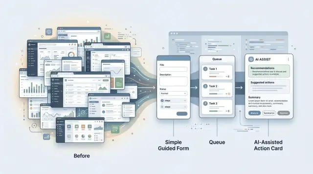
Table of Contents
Why extra screens create more work
Every extra screen adds friction to simple work. A user has to stop, read, choose, confirm, wait, and remember where they are. That seems minor in isolation. Across dozens of tickets, invoices, approvals, or updates, it becomes real time lost.
The cost shows up most in routine tasks. When someone already knows the job, they do not want another page that repeats the same context in a different layout. They want the system to carry that context forward and help them finish faster. A screen that exists only to separate one small decision from the next usually slows people down more than it helps.
Teams often add pages because of exceptions. One unusual customer request appears, then a special approval path, then a finance or legal rule. Instead of folding those moments into a guided form or an assisted action, the product gets another screen. A year later, the common path feels bloated because rare cases shaped the whole design.
Training gets harder fast when a product has too many custom flows. New hires do not just learn the work. They learn where each page lives, which order to open them in, and which fields matter only in certain cases. They make cheat sheets. They keep notes in chat. They ask, "Which screen do I use for this again?" That is a design problem.
When the product feels heavier than the task, users create workarounds. They skip fields, paste the same text again and again, keep side spreadsheets, or ask someone else to finish the awkward part. Some teams even move work back to email because email feels faster than the official flow. That hidden side work is often the real cost of extra UI.
Growing software teams run into this all the time. The product gets more screens, but the work itself does not get clearer. Often the better move is to remove a page, keep the user in one place, and let AI handle the messy setup in the background.
Signs a screen should not exist
Some pages do almost nothing. They ask for the same handful of fields, force one click, and send the user to the next step. That is a strong clue the page is not helping. It is just a hallway between two rooms.
Weak screens often contain one tiny decision: approve or send back, pick a template, confirm a date. If people spend five seconds there, a guided form, inline prompt, or assisted action usually works better than a full page.
Watch what people actually do, not what the spec says. If they pause and ask a teammate, "Which button do I use here?" the design has already failed. A screen that depends on shared team lore is usually hiding a simpler pattern.
Repeated input is another clue. If the same fields appear in the same order every time, the system should prefill most of them and ask only for what changed. That cuts clicks and reduces errors. It also makes "build less UI" a practical rule instead of a slogan.
Sometimes the form is not the real work. The real work sits in the notes, exceptions, and short comments around it. Support teams see this constantly. The dropdown says one thing, but the note explains what happened, why it matters, and what should happen next.
In cases like that, the page should probably shrink into a queue with suggested actions. People can review the case, skim the context, and accept or edit the next step without opening a separate screen.
A quick test helps:
- Remove the page if it mostly pushes work from one status to another.
- Fold it into the previous step if users usually change only one field.
- Start with comments or context if the note box matters more than the form.
- Rethink the design if managers have to explain the page every week.
Good product UX does not reward extra screens. It keeps the pages that help people compare options, think carefully, or catch risk, and cuts the ones that only keep the process moving.
Choose the simpler pattern
When a task feels messy, teams often answer with more UI. That is usually the wrong fix. The better pattern depends on the shape of the work.
Use a guided form when people give short, predictable input. If the same few fields appear every time, a custom flow only adds clicks and doubt. A guided form can ask one thing at a time, prefill known details, and let AI turn rough notes into clean structure. Refund requests, intake forms, and bug reports usually fit this pattern.
Use a queue when one person reviews many similar items in a row. Queues work well for support triage, invoice checks, moderation, and lead qualification. The layout stays stable, so people can move quickly without hunting through tabs or reopening filters. In repetitive work, rhythm matters more than flexibility.
Assisted actions fit tasks where the next move is obvious but the drafting takes time. AI can write the first reply, suggest tags, summarize a case, or prepare the next ticket state. The person still decides what to send or approve. That keeps control with the human while removing the blank-page problem.
Full custom flows still matter in some areas. Keep them for work that is rare, risky, or full of exceptions. Security changes, pricing updates, contract edits, and anything that needs a careful audit trail usually deserve more control. Compress those jobs too much and people miss details that matter.
A simple rule works well: when the task repeats, compress it. When the task changes a lot from case to case, give people more room to inspect and edit. Teams that build less UI often end up with better UX because users spend less time managing screens and more time finishing work.
Jobs AI can absorb
AI works best on the work around the work. A person still makes the call, but AI can gather context, clean up inputs, and remove small steps that slow people down.
One easy win is prefilling fields from past activity. If a customer already gave their company name, plan, shipping address, or common request type, the system should not ask again. AI can pull that data in, suggest likely values, and leave the person to confirm or correct them.
History summaries are another good fit. People lose time opening five tabs just to answer one simple question. AI can turn a long trail of notes, messages, orders, or tickets into a short brief so the next person starts with the facts instead of a scavenger hunt.
Drafting also saves more time than many teams expect. AI can suggest a reply, pick a label, or propose the next step based on similar cases. The human should still review it, especially when tone, risk, or money is involved, but editing a decent draft is faster than starting from an empty box.
Review queues often beat full custom flows. If ten items share the same pattern, AI can group them into one queue and show the common reason, confidence level, and suggested action. That is usually better than sending staff through ten near-identical screens.
Missing data is another place where AI helps. Instead of blocking the user with a dead-end error, it can ask a follow-up question in plain language. A guided form feels lighter when it asks only for what the system still does not know.
This is how you build less UI without making the product feel thin. Keep screens for judgment, approval, and unusual cases. Let AI handle setup work: fill the blanks, compress the history, sort the pile, and ask for the one missing detail.
How to collapse a flow step by step
Bloated flows usually start with one bad assumption: every exception needs its own screen. It rarely does. Smaller flows work better when you map the decisions first and design the UI second.
Start with the real task, not the current pages. Take one common job, like approving a refund, assigning a bug, or reviewing a sales lead. Write down each decision a person makes in order. Keep it plain: accept or reject, high or low priority, ready now or needs more info.
Once you can see the decision points, the extra UI becomes easier to spot. Many screens collect data nobody uses. Some fields exist because they were easy to add, not because they help anyone choose the next action.
A simple way to shrink the flow is this:
- List each decision in order.
- Mark the few inputs the business actually needs for each one.
- Remove fields that do not change the outcome.
- Rewrite vague steps as guided prompts with clear choices.
- Test the smaller version on one real task from start to finish.
That fourth step matters more than teams expect. Open text boxes feel flexible, but they push too much thinking onto the user. A guided form can ask, "What is the issue?" and offer a short set of options. An assisted action can prefill the likely owner, priority, and next step. The user stays in control, but stops doing clerical work.
Take a support workflow. A team might open a ticket, tag the product area, assign severity, pick an owner, and write an internal summary across four screens. In many cases, one queue plus a compact form is enough. The system can suggest severity from the ticket text, route it to the right team, and ask one follow-up question only when the signal is weak.
That is what "build less UI" means in practice. You are not hiding complexity. You are moving routine sorting, lookup, and form filling out of the way.
Run the smaller flow with a real person and a real case. Watch where they stop, reread, or open another tool for context. Fix those moments first. That is usually where an extra screen tried to cover confusion instead of solving it.
A realistic example from a support team
A support agent opens a ticket about a damaged order and a refund request. In many tools, that simple case sends the agent through separate tabs for order details, shipping status, payment history, return policy, and manager approval.
That design looks thorough. It is mostly overhead. The agent spends time hunting for facts the system already has, then copies them into another screen just to move the case forward.
A better setup keeps the agent on one guided form. When the ticket opens, AI pulls the order history, shipment events, past support messages, and the policy notes that apply to that order. The screen shows the useful facts first: purchase date, item price, delivery date, claim reason, and any past refunds.
The agent does not need to think about where each fact lives. They answer a few clear questions, such as whether the customer sent a photo, whether the item is still within the return window, and whether the damage affects use. The form can prefill most fields, so the agent mostly checks and confirms.
Then the system suggests the next action with a short reason. It might recommend a refund when the order fits the policy, a replacement when stock is available and shipping damage is clear, or escalation when the case breaks policy or looks unusual.
That suggestion is not the final word. The agent can change it. But most of the routine thinking is already done, which saves a surprising amount of time over a full day.
Managers should not review every case. They should see an exceptions queue with high-value orders, repeat claims from the same customer, policy conflicts, or cases where the evidence is weak. That way, managers spend time on the few tickets that need judgment instead of rubber-stamping the easy ones.
Fewer screens means fewer clicks and fewer places for mistakes to hide. The team resolves common issues faster, and the product team maintains one clear flow instead of a maze of pages.
Mistakes that create worse products
Cutting screens can go wrong when teams also cut clarity. That is the fastest way to turn a simpler product into a risky one.
One common mistake is hiding a serious action behind one vague button like "Fix it" or "Send." If the user cannot tell what AI will change, who will see it, or whether money, data, or customer records are involved, the design is too thin. Simple should still feel explicit. A short preview, a plain label, and one sentence about the result do more than an extra page full of interface chrome.
Another mistake is treating AI output as final by default. Drafts, summaries, triage decisions, and suggested replies need review points that match the risk. A support agent can skim a reply before it goes out. A finance manager should approve a refund. Medical or legal workflows need even tighter control. The more damage a bad answer can cause, the more visible the check should be.
Teams also keep old screens around "just in case." Then users have two ways to do one job, and neither feels right. If the new guided flow handles the common case well, remove the old path or hide it behind an advanced option for staff who truly need it.
Data entry is another easy place to make the product worse. If the system already knows the customer, plan, order number, or recent activity, do not ask people to type it again. Pull it in, confirm it, and let them correct it when needed. Repeated fields do not create trust. They create friction and more errors.
Some decisions should never become fully automatic. AI can sort, draft, and suggest, but it should not make the final call on hiring, firing, fraud claims, safety issues, or account closures without a person in the loop. Good products save time. They do not remove judgment where judgment matters.
Quick checks before you design another page
When a workflow feels messy, pause before adding UI. Mess usually comes from too many handoffs, too many decisions, or too much blank space.
Look at the task as if you were doing it for the first time under a little time pressure.
- If people click through three small steps to submit one request, combine them into one guided form.
- If the first version of the work follows a pattern, let AI draft it and let the person edit.
- If the job is mostly sorting, approving, or routing items, use a queue instead of a custom page.
- If odd cases matter, keep one clear fallback path so people do not get stuck.
- If a new hire needs side notes to finish it, the flow asks for too much.
Many products split one simple support task into separate pages for intake, classification, draft reply, escalation, and review. That may look tidy in a mockup, but it slows real work down. One workspace can often do the same job: the request comes in, AI suggests a category and a first reply, and the agent either sends it, edits it, or passes it to a reviewer.
That fallback matters. AI can handle routine noise, but users need one safe exit when the draft is wrong, the request is unusual, or the customer is upset. Keep that path easy to find. Do not bury it behind extra states or hidden menus.
The most honest test is simple. Sit a new teammate down and watch them try the task without training notes. If they hesitate at every step, another page will not save the flow. A smaller, clearer action usually will.
What to do next
Pick one workflow that feels noisy and annoying, not one that feels high-profile. The best first target is usually a task people repeat every day: triaging support tickets, approving refunds, routing leads, or collecting missing project details. If the work mostly moves information from one box to another, it is a strong candidate.
Write down the current path before you change anything. Count how many screens people open, how many times they retype the same facts, where work pauses, and where someone asks a coworker what to do next. Then measure three simple things for a week: time spent, error rate, and handoffs.
A small pilot beats a full rebuild most of the time.
- Map the workflow in plain language on one page.
- Mark each step as decision, data entry, review, or exception.
- Replace one low-risk step with a guided form, queue, or assisted action.
- Keep the old path for edge cases during the test.
- Compare the new path against your baseline after a week or two.
This keeps people honest. Teams often assume a new screen will help because it looks clearer in a mockup. Then they ship it and discover that users still ask for help, copy notes, or click through six states to finish one small job.
A narrow support pilot is a good place to start. Use one intake flow. Let AI summarize the issue, suggest a category, draft the reply, and ask for the missing detail in a guided form. If agents still need a full page for rare cases, keep it. Most tickets will not.
If you want a second opinion before spending engineering time, Oleg Sotnikov at oleg.is works with startups and smaller teams on workflow design, AI-first software development, and Fractional CTO support. A short review can usually tell you where AI should replace screens and where full UI still earns its keep.
The next week matters more than the perfect plan. Pick one workflow, measure it, test one smaller pattern, and watch what people stop doing.


