Separate browse state from edit state in admin apps
Learn when to separate browse state from edit state in heavy admin apps, with clear screen rules, common traps, and a practical design flow.
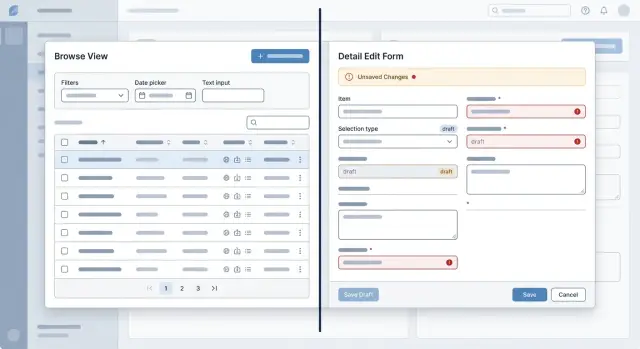
Table of Contents
Why one screen state turns into a mess
Teams usually decide to separate browse state from edit state only after a screen starts failing in small, annoying ways.
At first, one shared state feels simple. The list, filters, selected row, drawer, and form all live in one place, so shipping feels faster. Then the page grows.
A user filters orders by status, clicks a row, opens the detail panel, changes a field, closes it, and returns to the list. Now the filter is gone, the selected row changed, or the form still shows data from the previous record. None of those bugs looks dramatic on its own, but together they make the screen feel unreliable.
Browsing and editing do different jobs. Browse state helps people move through data. It holds search text, filters, sort order, pagination, and current selection. Edit state helps people change one record safely. It holds draft values, validation errors, dirty flags, save status, and unsaved changes.
When one shared object controls both jobs, those concerns start colliding. A list refresh wipes form fields. Selecting a new row overwrites a draft. Saving a form reloads data and clears the user's place in the list. Actions in one part of the screen keep changing another part.
This gets worse in heavy admin tools, where one screen often carries years of extra behavior. A bulk action changes selection. A background refresh changes record data. A side panel opens with stale values because the list updated but the form did not. Developers patch around it with extra flags, one off effects, special cases, and reset rules. The code gets harder to read, and timing bugs start to hide in plain sight.
The symptoms are familiar: filters reset after save, a form shows old data until you click twice, validation errors stick to the next record, or a selected row disappears after pagination. QA files bugs that engineers cannot reproduce the same way twice.
That is the point where teams finally split the screen. Once you separate browse state from edit state, the screen is easier to reason about, and users stop paying for internal coupling.
What belongs in browse state
Browse state is everything that helps a person find the right record and keep their place while looking around. It is closer to navigation than editing.
That memory matters more than teams expect. In a busy admin app, people rarely open one item, make one change, and leave. They scan, compare, close, reopen, and jump between records. If the list resets every time, the app feels slippery.
Browse state usually includes search text, saved filters, sort order, page number, page size, visible columns, and row selection. It can also include a simple view choice, such as table or card view, if that changes how people scan results. None of this changes the record itself. It only changes how the person gets to it.
Think about a support lead reviewing failed orders. She filters to "payment failed," sorts by newest first, opens three orders in a row, and compares notes before sending one to finance. Her filters and current page should stay put the whole time. She is still doing one task: finding and reviewing a set of records.
A simple rule works well here. If the state answers "Where am I in the list?" or "How did I narrow this down?" it belongs in browse state. If losing it would force the user to search again, it almost certainly belongs there.
This state should survive normal movement around the screen. Opening a detail panel should not reset filters. Closing a panel without saving should not change pagination. Switching from one record to another should not drop the current sort order. Returning to the list after a quick edit should feel like nothing moved unless the user changed it.
Keep browse state easy to restore from the URL, local screen memory, or both. Users notice when the app remembers their place. They notice even faster when it does not.
What belongs in edit state
Edit state should hold only what the user changes inside the form. That includes draft values, field errors, section errors, and a dirty flag that tells you whether anything changed.
When you separate browse state from edit state, the form becomes its own small workspace. The table, filters, sort order, and selected row stay steady while the user edits one record.
A customer form makes this easy to see. If someone changes a billing name, clears a tax ID, and types an invalid email, edit state should store all three facts: the current draft, the validation result, and the fact that the record is no longer clean.
Keep the draft close to the form
The form should own the rules that explain how fields behave. If changing country should reset state or province, keep that rule next to the country field logic. If a checkbox unlocks two extra inputs, keep that behavior in the same form layer.
When teams spread those rules across the whole page, small changes get risky. A list refresh can wipe a draft. A sidebar can show stale data. One innocent refactor can break validation in a place nobody expects.
Edit state also needs a few action states. It should know whether the form is idle or saving, whether the last save failed, whether cancel needs confirmation, what the last saved snapshot looked like, and how to reset the draft back to it.
Those actions should not touch the list unless the save succeeds. Cancel should discard the draft and restore the original record. Reset should restore the last loaded version. Save should update the record only after the server accepts it.
This separation makes bugs easier to spot. If a user edits an order and the list suddenly jumps to page one, browse logic leaked into form behavior.
One rule helps a lot: keep every edit concern inside a form boundary. Put field rules, validation, dirty tracking, submit logic, and reset logic there. The rest of the screen can read the final saved result, but it should not manage the draft.
That is what keeps a large admin screen understandable after it grows from 6 fields to 60.
Where to draw the line
The split gets clear when you ask two plain questions. Browse state answers, "Which record am I looking at, and how did I get here?" Edit state answers, "What did I change inside this record, and is it saved yet?"
Think of an orders page. The left side has filters, sorting, pagination, the selected order ID, and maybe a saved view. That is browse state because it helps the user find and inspect one order out of many. The right side has shipping address edits, internal notes, status changes, validation errors, and a dirty flag. That is edit state because it belongs to the current record, not to the search session around it.
Teams get sloppy when they let form drafts depend on list filters, or when they reset the form every time the table refreshes. Users lose trust fast. A filter change should never wipe unsaved notes. A form reset should never change the current page, sort order, or search query.
Some actions do need both states, and it helps to name them early. "Open selected record" reads the current selection from browse state and creates a draft for edit state. "Save and go to next" uses the current draft and the next record from the list. "Warn before leaving" checks for unsaved changes before the user pages, filters, or selects another row. "Refresh list" updates browse results without touching the draft unless the current record no longer exists.
That last case matters in list and detail screens. Data changes under users all the time. If another teammate archives a record, the list can update while the form keeps the local draft visible and explains what changed. That behavior feels calm and predictable.
A practical rule is simple. If the user can keep editing the same record after changing filters, tabs, or page size, that data belongs in edit state. If the data helps choose a record, group records, or move through results, it belongs in browse state. Draw that line early, and the screen stays readable as the app grows.
How to split a screen without breaking work
Most teams break a busy admin screen when they refactor too much at once. A safer path is smaller and much less exciting. Start by mapping the screen as it works today, not as you wish it worked.
Write down every field, button, filter, tab, bulk action, autosave rule, warning, and background refresh. Hidden behavior matters. If a refresh updates totals, or switching records keeps the same filters, that behavior needs a clear home.
Then tag each piece of state on purpose. Filters, sorting, paging, selected rows, and column visibility belong in browse state. Form values, validation errors, save status, dirty flags, and upload progress belong in edit state. Shared state should stay thin, and in many screens it is only the current record ID, route params, and permissions.
Move filters and paging out of the form first. That step is low risk and often clears half the confusion. Then add a draft model for edits before touching save logic.
Teams often skip the draft model and pay for it later. The draft should hold unsaved changes separately from the last saved record. When a user types into a field, the app updates the draft, not the browse data and not the server copy.
This matters most on screens that show a list and a detail panel together. Imagine an order screen with filters on the left and an order form on the right. If someone edits a shipping note, changing pages in the list should not wipe the note. At the same time, canceling the edit should not reset the list filters. Separate state makes both actions predictable.
After each step, test the boring flows people use every day. Cancel. Refresh. Switch to another record. Open a record, edit two fields, then switch back. If any of those actions leak data across records or lose a draft, stop there and fix it before moving on.
A cleaner screen does not always need more code. It needs fewer mixed responsibilities in one place. That is what makes admin app architecture easier to trust.
A real admin screen example
Picture an orders screen that support staff use all day. The main area shows a table of orders. At the top, they can filter by status, search by customer name, and move through pages of results. On the right, they can open one order in a side panel to check details or add a shipping note.
This screen stays calm when the app treats browsing and editing as two different jobs. The table state is about finding the right order. The panel state is about changing one order. Mixing those two usually creates the mess people blame on "complexity" when the real problem is structure.
Browse state should keep the current status filter, the customer search text, sort order, selected page, and which row is open. Users expect that state to stay put while they inspect several orders.
Edit state should live inside the side panel. If a staff member types a draft shipping note such as "leave at side door" and then clicks another row by accident, that draft should not leak into the table state. It should stay attached to the open order, with its own dirty flag, validation, and save action.
A clean split is straightforward. The table owns filters, search, pagination, and row selection. The side panel owns form fields, validation errors, and unsaved drafts. Saving updates the order record, but it does not reset the table controls. After save, the list refreshes in place.
That last part matters more than most teams expect. If someone saves an order and the screen jumps back to page 1, clears the "pending" filter, or drops the customer search, they lose context right away. In a busy admin app, that feels broken even if the save worked.
A better flow is simple. The user filters orders to "paid," searches for "Miller," opens order #1842 in the side panel, adds a shipping note, and clicks save. The panel shows the updated order. The table still shows the same filtered results on the same page. If the order status changed, the row updates or disappears only if it no longer matches the current filter.
That is what it means to separate browse state from edit state in a way people can trust.
Mistakes that make screens hard to trust
Trust drops fast when one admin screen changes more than the user asked it to change. A filter disappears, a different row opens, or a typed value jumps back to the old one. People stop feeling in control, and then every save feels risky.
The most common cause is simple: the form writes directly into the same object the table uses for display. A user clicks a row, changes a field, and the list updates before they save. Now the table shows draft data as if it were real. If validation fails or the user cancels, the screen has already lied once.
Another bad pattern appears after saving. The user edits one record, hits Save, and suddenly the table resets to page 1 with default filters. That usually happens because browse state and edit state live in one shared store, so a refresh for the detail panel also wipes the list state. In a busy back office tool, that costs time every hour.
A support team sees this a lot with customer records. Someone filters the table to "trial users," opens one account, fixes a billing note, and saves. If the filters reset, they have to rebuild the view and find their place again. After a few rounds, people start avoiding edits unless they have extra time.
The data model can make it worse. Many screens keep server data, local draft changes, and validation errors in one object. That sounds tidy, but it creates constant confusion. You cannot tell what came from the backend, what the user changed, and what the UI added to track errors. Small bugs get hard to trace because everything touches everything else.
Row selection is another quiet source of damage. If users have unsaved edits, the screen should not let selection change without a clear choice. When a stray click loads a new row and replaces the draft, people feel tricked. Even a warning does not help much if it appears only sometimes.
A screen feels reliable when each part keeps its own promise. The list remembers how the user is browsing. The form keeps a separate draft. Validation stays with the draft, not with the fetched record. It is less clever, but much easier to trust.
A short review checklist
Most state bugs look small in a ticket and huge in real work. A support agent might be on page six of a customer list, open a record, change two fields, then search for something else to compare details. If that quick browse action wipes the draft, people stop trusting the screen.
A short manual review usually finds the problem faster than a long spec. Try to break the flow on purpose.
- Change filters, sorting, or page number while a draft is open. The list can update, but the draft should stay intact unless the user clearly chose to leave that record.
- Save a record after searching or paging deep into the list. The app should keep the same browse context. If save sends users back to page one, they lose their place.
- Press Cancel after editing several fields. The form should snap back to the last saved data for that record, not blank values, list defaults, or stale data from a previous selection.
- Switch to another record or refresh the list while the detail view is open. Show one clear warning only when real loss can happen, and never reload over the user's draft without asking.
One extra smell is easy to miss: hidden coupling. If a filter change, list refresh, or save action resets the form in three different places, the screen will keep surprising people. That usually means the list and the editor still share too much state.
Good form state management feels boring in the best way. Users can search, sort, page, save, cancel, and switch records without wondering what the screen will do next.
Next steps for your team
Pick the screen that creates the most support noise. That is usually where browse and edit state got mixed together over time, and users now pay the price with lost filters, odd refreshes, and forms that change when they only wanted to look around.
Do not start by moving components. Start with a plain document and name the boundaries. Write down which state belongs to browsing the data set and which state belongs to editing one record. If a piece of state answers "Where am I in the list?" it stays on the browse side. If it answers "What am I changing right now?" it belongs to edit state.
A small team can do this in one working session: choose one painful screen, list every state value on it, mark each one as browse, edit, or shared, challenge every shared value, and sketch the new data flow before touching code. That step saves rework. Teams often refactor the UI first and only later discover that the real problem was state ownership, not layout.
Roll the split out in one workflow, not across the whole app. A good first target is a common job such as reviewing orders, updating a customer record, or fixing one field in a long form. Keep the old behavior everywhere else for now. That makes the change easier to test and easier to explain to support staff.
Then measure something concrete for two weeks. Count edit mistakes, abandoned forms, support messages about "my changes disappeared," or how often users reopen the same record because they lost their place in the list. Even a modest drop tells you the split is working.
If the app is large or the team cannot risk a rewrite, Oleg Sotnikov at oleg.is can review the screen structure as a Fractional CTO and help map a safer refactor plan. That kind of outside review is often enough to fix state ownership without turning the whole admin app upside down.
One clean screen is enough to set the standard. After that, the next refactor usually gets easier because the team can point to a pattern that already works.
Frequently Asked Questions
What is the difference between browse state and edit state?
Browse state helps people find records and keep their place. Edit state holds the draft, errors, and save status for one record so a table refresh or row change does not wipe the form.
What should go into browse state?
Put search text, filters, sort order, page number, page size, visible columns, and row selection there. If losing that value would make the user search again, it belongs in browse state.
What should go into edit state?
Keep draft values, field errors, dirty tracking, save status, and the last saved snapshot inside the form. That gives the editor its own workspace and stops table actions from changing unsaved work.
Where should the selected record ID live?
Treat the current record ID as thin shared state when both sides need it. The list can choose the record, and the form can open a draft for that record without owning the whole table state.
How should the screen handle unsaved changes?
Show one clear warning before the user leaves the record, changes selection, or pages away. If they stay, keep the draft; if they leave, discard it on purpose instead of replacing it by accident.
Should saving a form reset the list or filters?
After save, update the record and refresh the list in place. Do not reset filters, sort order, or pagination unless the user changed them.
What should happen when the list refreshes in the background?
Refresh the results without touching the draft unless the record disappeared or no longer exists. When that happens, keep the form stable long enough to explain what changed instead of snapping to another row.
Should browse state live in the URL?
Store browse state in the URL, local screen memory, or both. Users expect the app to remember filters and page position when they close a panel, go back, or reload.
What is the safest way to refactor a messy admin screen?
Start by moving filters, sorting, and paging out of the form layer. Then add a separate draft model for edits and test simple flows like save, cancel, refresh, and switch record after each step.
What signs show that browse and edit state are mixed together?
Watch for filters resetting after save, drafts showing on the wrong record, validation errors sticking to the next item, or the table showing unsaved values. Those bugs usually mean one shared object controls both browsing and editing.


