B2B product onboarding that keeps setup easy to teach
B2B product onboarding works better when setup happens in stages, defaults cut extra choices, and progress stays visible from first login.
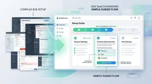
Table of Contents
Why new accounts get stuck in setup
B2B onboarding often fails before users see anything useful. The product asks them to make a string of choices they don't understand yet, so every screen feels like a test. People slow down when they're unsure. Many leave.
A new account owner usually wants one thing: get the team in and finish one real task. Instead, many products open with workspace rules, permissions, naming options, billing details, and integrations. Some of those settings matter later. They create friction when users still need an answer to a simpler question: "What should I do first?"
Early forms make this worse. Teams often see fields for company structure, reporting preferences, compliance details, and custom roles before they've used the product once. Most of that can wait. Ask for it too soon, and setup turns into admin work. Admin work rarely feels like progress.
When the product doesn't guide the next step, users fall back to the safest option: booking time with sales, support, or customer success. That call often isn't about real complexity. It's about missing direction. People need the product to say, in plain language, what to do now, what can wait, and what they'll get when they're done.
The first session shapes how people judge the whole product. Even if daily use is simple, users remember a confusing start. If a team admin spends 25 minutes guessing through settings, they'll tell coworkers the product feels heavy.
You see this all the time. A manager creates a team account on Monday morning and plans to invite five coworkers before lunch. Ten minutes later, they're still working through forms and unclear options, so they stop and book a demo for later in the week. The product may be good. The setup made it feel harder than it is.
What people need in the first 15 minutes
The first 15 minutes should answer one question: "Can I do the thing I came here to do?" Good onboarding feels smaller than the full product. People need one clear win, fast.
Start with an outcome they can see on screen. In a CRM, that might mean importing a few contacts and seeing them in a pipeline. In an AI workspace, it might mean running one prompt on company data and getting a useful answer. The result doesn't have to be perfect. It has to be real.
Ask only for the details that unlock that first task. Name, email, workspace name, maybe one data source. Billing choices, custom fields, brand settings, team structure, and detailed permissions can wait until the user has a reason to care.
The wording matters more than many teams expect. New users don't know your internal terms, and they shouldn't need to learn them before they can work. "Add teammate" is clearer than "provision seat." "Connect data" is clearer than "create ingestion source." If a label sounds like it came from a planning document, rewrite it.
Optional work should stay optional. Setup loses people when it blocks the main task with steps that feel nice but unnecessary. Let users skip advanced settings, extra integrations, and profile details without penalty. Bring those back later, after the product has earned some trust.
A strong first session is usually simple: create the account with basic details, complete one real task with sample or live data, show the result right away, and invite one teammate only if that helps finish the task.
Many teams design setup for a fully configured account. New users don't need that on day one. They need enough to make progress, understand the labels, and leave knowing the product already works.
Break setup into clear stages
Many setup flows fail because they mirror the product's internal structure. New customers don't think in modules, permission tables, or integration panels. They think, "Can I get this account working today?"
A better flow groups steps by user goal. Put related tasks together so each stage feels like one small job with a clear finish. That makes the product easier to learn, easier to remember, and less likely to end in a support call.
A simple order works well in most products. Start with account basics. Move users into one real task that matches the product's main use. Bring in other people if needed. Save advanced settings for later.
The order matters. Account basics are necessary, but they should stay light. Ask for only what the team needs to start. Then move them into real work quickly. If they create a first project, send a first document, or run a first workflow in the first session, they'll understand the product better than they would after five more settings screens.
Advanced options shouldn't block the first run. Keep them available, but place them behind a clear "Do this later" step. Most teams don't need custom roles, edge-case rules, or detailed branding before they see the product working.
Stage length matters too. Each stage should feel finishable in one sitting. Five minutes is great. Ten is still fine. If a stage takes 20 minutes, split it. People lose focus fast when they can't tell how close they are to done.
Picture a team lead opening your product between meetings. They should be able to finish account setup, complete one meaningful action, and leave with a working account. Fine-tuning can wait until the team is already getting use from it. That's usually the difference between momentum and drop-off.
Cut decisions with sensible defaults
Most new teams don't want full control on day one. They want to get through setup, invite one coworker, and try the product with real work. If every screen asks them to choose from ten options, they'll slow down or stop.
Start by preselecting settings that fit most accounts. Pick the timezone from the browser, turn on standard notifications, and use a simple permission model such as admin, manager, and member. Early on, a calm setup beats perfect customization.
Starter templates help for the same reason. A sales team shouldn't build pipeline fields from scratch if most teams use the same few: company name, stage, owner, and next step. A support team can start with a default queue, priority field, and response status. People learn faster by editing something real than by facing an empty screen.
Tell people when a default is safe
Defaults feel risky when users think they're making a permanent choice. Remove that fear with plain language. A short note like "Most teams keep this for the first week" or "You can change roles later without losing data" does more than a long help article.
Use a simple test. A default should fit most new teams, avoid blocking early use, stay easy to change later, and explain the trade-off in one sentence.
A small example makes this clear. Imagine a new operations team creating its first workspace. If the product already includes a starter workflow with request type, owner, due date, and status, the team can start in minutes. If they have to design every field before they see the first task, setup turns into homework.
Make changes easy after setup so defaults don't feel like a trap. Put settings in obvious places, keep names simple, and show what will happen before a user saves a change. If a team wants custom roles or extra fields on day three, that should take a few clicks, not a support ticket.
Good defaults help people start with less thinking. That matters more than offering every option up front.
Make progress visible at every step
A spinner tells people almost nothing. It says the product is busy, but not what finished, what failed, or what comes next. In onboarding, that gap creates doubt fast.
Named steps work better than one loading state. "Create workspace," "Add teammates," "Connect data," and "Review settings" give people a map. They also make support easier because the user and the team can talk about the same step instead of guessing where setup stopped.
Completion marks matter just as much. When someone finishes a task, show a checkmark, a short success message, and the next action. People shouldn't have to wonder whether the setting saved or whether they need to repeat the step.
Good progress indicators also set expectations. You don't need exact timing. A note like "about 2 minutes" or "this import can take 10 to 15 minutes" is enough to reduce repeat clicks and refreshes. If a task runs in the background, say that clearly and tell users what they can do while they wait.
A few details usually make the biggest difference:
- Show the current step and the total number of steps.
- Mark finished tasks right away.
- Explain what remains in plain language.
- Save progress automatically.
- Keep unfinished tasks visible on the main account screen.
Return visits are where many setup flows fall apart. Someone starts setup, gets pulled into a meeting, and comes back later. If the product opens to a blank dashboard, they have to rebuild context from memory. That's when support calls start.
Keep progress visible after they return. If step 3 of 5 is still running, show that state on the dashboard. If one task is blocked, say what's blocking it, such as admin approval or a domain check. A new account should always answer two questions within a few seconds: what's done, and what should I do next?
A simple example from a new team account
A sales manager opens a new account for a five-person team on Monday morning. She wants the team working today, not after a week of training.
The product gives her a ready-made pipeline as soon as the account opens. It already has simple stages like "New lead," "Qualified," "Demo booked," and "Closed." She can rename them later, but she doesn't need to make that choice now.
A short progress bar keeps the flow moving without pressure. It shows four steps: create workspace, invite team, import contacts, view dashboard. Each step takes a minute or two, so setup feels finite.
She invites four teammates by email. The product doesn't stop and ask for roles, territories, approval rules, or report access. Everyone joins with a sensible default profile, and she can tighten permissions later.
Next, she uploads a small CSV with 50 contacts. The importer maps common fields on its own, so she only checks a couple of columns instead of matching every field by hand. That alone can save 15 to 20 minutes and avoids a lot of first-day frustration.
By the end of the flow, the dashboard is live. It shows total contacts, deals by stage, recent activity, and who has accepted the invite. The team now has something real to look at and discuss.
What stays out of the way matters just as much. Custom reports, scoring rules, automations, and rare settings sit behind a "Set up later" option. The manager knows they exist, but the product doesn't force those decisions before the first win.
That's why setup gets easier to teach when it has a clear order. One person can create the account, bring in a small set of real data, and show the team a working screen in under 15 minutes.
How to redesign your current setup flow
Start with a plain inventory of the setup you have today. Write down every task, screen, field, import, approval, and email that a new account touches. Most teams think their setup is six or seven steps until they map it and find 15.
Then sort those tasks with one test: does this block the first useful result? If the answer is no, move it out of the opening path. New users don't need to finish every admin job before they can see the product work.
The rewrite is usually straightforward. List every setup task in the order people hit it now. Mark each one as "blocks first result" or "can wait." Keep only the blockers in stage one. Move the rest into later prompts inside the product. Then give stage one a clear finish line.
That changes the shape of setup. Instead of one long tunnel, you get a short first stage that leads to a real outcome quickly. If your product asks a team to import data, invite coworkers, set permissions, connect billing, and customize reports, stage one might need only one data import and one basic user role.
After that, test the new flow with someone who has never used the product. Don't coach them. Watch where they stop, what they reread, and which choices make them hesitate. One confused pause often tells you more than a long feedback form.
Track a few simple numbers each time you test: time to first useful result, the step where people stop, the step where they ask for help, and the step they skip or rush through.
If several people stall at the same point, fix that point first. Don't redesign the whole setup at once. A shorter first stage, fewer decisions, and one visible finish line often cut support calls more than a big visual refresh.
Good setup feels a little boring, and that's fine. People remember getting something useful quickly. They rarely miss the extra forms you removed.
Mistakes that turn setup into a support call
The fastest way to turn setup into a meeting request is to ask for everything before users can do one useful thing. New accounts shouldn't need to finish billing rules, permission trees, naming standards, and integrations before they can create a workspace or invite one teammate. When people can't take a real action early, they assume the product will stay hard.
Jargon makes that worse. Labels like "tenant," "policy object," or "deployment mode" may sound normal to the product team, but they slow down buyers, admins, and operators. Plain language works better because it tells people what happens next, not how your team talks about the system.
Long forms create another support trap. If someone spends ten minutes filling fields and only sees errors at the end, frustration rises fast. Check inputs as people type, explain the problem in one sentence, and point to the exact field that needs work.
Restart rules are just as damaging. If one missed field wipes a page or sends users back to the start, many people stop. Keep their entries, keep their uploads, and return them to the exact step they left.
Optional settings often cause the most confusion because products treat them like required setup. A team can usually start with defaults and adjust later. If an account can run without custom roles, advanced routing, or detailed automation rules, move those items out of the main path and label them clearly as "Set later."
A founder setting up a new engineering workflow doesn't need every CI/CD toggle before the first repository sync. The same rule holds across B2B products: first help people complete one real task, then offer deeper control.
If support calls keep coming from setup, look for a few patterns: too many decisions before the first action, labels that sound like internal product language, errors that appear only at the end, forms that punish one small mistake, and optional settings mixed into required steps.
Each of these mistakes teaches users to hesitate. A better setup flow teaches them to move.
A short review checklist
A setup flow usually looks clear to the team that built it. The better test is simple: can a first-time account reach one useful result quickly, without a long call or a support ticket? If the answer is no, the flow still asks for too much.
Run this review after every onboarding change. Watch someone new go through setup from a blank account, and don't guide them. The moments where they pause, reread, or leave the page tell you more than any internal review.
Keep the checklist practical:
- Time the first stage. A new account should reach the first useful milestone in about 10 minutes.
- Check the reason behind each step. People will do the work if the screen explains why it matters in plain words.
- Split required work from later work. Advanced settings and edge cases can wait until the account already does something useful.
- Review your defaults against real customer behavior.
- Look for stopping points: where users quit, reopen a step, skip something, or contact support.
A shorter flow isn't always fewer screens. It's fewer decisions, better defaults, and clearer language at the exact moment people need it.
One practical test helps. Ask whether a new team can complete one real action during setup. That might mean inviting a colleague, creating the first project, or turning on one alert. If they leave with half-filled forms and tasks saved for later, the setup still needs work.
Next steps for your product team
Most teams know their setup has problems, but they try to fix all of it at once. That usually slows the work and hides the real issue. A better process starts smaller: watch where new users stop, then fix that point first.
Pick one setup path and study it end to end. Don't mix five account types, ten edge cases, and every sales request into the same review. Choose the path that matters most for new accounts, then watch three first-time sessions without helping. You'll usually spot the same pause, the same confused question, or the same skipped step.
That first stall point deserves attention before any bigger redesign. If users freeze at a permission screen, don't spend two weeks polishing the final dashboard. If they get stuck on naming, importing, or inviting teammates, fix that moment and measure what changes. Small repairs often remove more friction than a full rewrite.
Your copy needs the same discipline. Teams often write setup text with internal labels, product shorthand, and terms only employees use. New customers don't think that way. Use the words they already say in calls, demos, and support tickets. "Connect your billing system" is clearer than a branded feature name.
The plan can stay simple: watch three first-time sessions on one setup path, mark the first repeat stall point, rewrite the copy around that step in customer language, then change one screen and test again.
If the flow feels too tangled to fix from inside the team, an outside review can help. Oleg Sotnikov at oleg.is works with startups and small to medium businesses as a Fractional CTO and advisor, and this kind of onboarding review fits naturally into that work. Sometimes a clear outside pass is enough to turn a hand-held setup into something users can finish on their own.
Frequently Asked Questions
What should a new user achieve in the first 15 minutes?
Aim for one real result. A new user should create the account, do one useful task, and see the outcome on screen within about 10 to 15 minutes.
If they leave with only forms completed, setup still asks for too much.
What information should we ask for during initial setup?
Ask only for details that unlock the first task. Usually that means basic account info, a workspace name, and maybe one data source or one teammate.
Save billing, custom fields, brand settings, and detailed permissions for later unless they truly block first use.
Should billing and integrations come before the first real task?
No. Let people reach value first.
If billing or an integration does not block the first useful action, move it out of the opening flow and bring it back after the account starts working.
How many steps should setup have?
Keep the first stage short and finite. Three to five named steps usually works well if each one takes only a few minutes.
When one stage drags past 10 minutes, split it. People lose momentum when they cannot tell how close they are to done.
What makes a sensible default in onboarding?
A good default fits most new teams, does not block early use, and stays easy to change later. It should help people start with less thinking.
Tell users that the default is safe. A short note like "you can change this later" removes a lot of hesitation.
How do we make setup progress clear?
Show named steps, finished states, and the next action. Users should always know what they completed and what they need to do now.
A spinner alone is not enough. Add simple timing notes for longer tasks and keep unfinished work visible on the main screen.
Why do users book a demo or support call instead of finishing setup?
Most teams ask for too many decisions too early or use labels that sound like internal product language. Users get unsure, stop, and book time with someone instead.
That support call often points to missing direction, not real product complexity.
How can we audit our current onboarding flow?
Map every setup task, screen, field, and email in the current flow. Then mark each item with one question: does this block the first useful result?
Keep only true blockers in stage one. After that, watch a few first-time users go through the flow without help and note where they pause or quit.
What should happen when someone leaves setup and comes back later?
Return them to the exact step they left, keep their entries, and show current status right away. Do not drop them onto a blank dashboard.
When they come back, the product should answer two things fast: what is done and what should happen next.
When should we introduce advanced settings, and when does outside help make sense?
Bring in advanced settings after the first win, not before. Most teams can start with defaults for roles, automations, routing, and reports.
If your setup still feels tangled after a few rounds of testing, an outside review from an experienced Fractional CTO can help you cut the flow down to what new accounts actually need.


