Architecture diagram for non-engineers in four boxes
Learn how to draw an architecture diagram for non-engineers on one page with four boxes for users, systems, data, and failure paths.
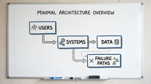
Table of Contents
Why teams struggle to explain the system
Most founders can explain the product in a minute. They know what the customer does, what gets sold, and where the money comes from. The trouble starts one layer below that, when someone asks which system does what, where data goes, or what fails first when a step breaks.
Operators have a different need. They do not want a tour of every service or table. They want one page they can scan quickly and use in a real conversation. If a customer order gets stuck, they need to know where it entered, who touched it, and which team should look next.
Engineers often make this harder than it needs to be. They draw every service, queue, retry, internal name, and edge case that built up over time. The page might be accurate, but it stops being useful. A diagram for non-engineers should answer simple questions first. It does not need to prove how much complexity sits underneath.
That is also why meetings drift. One person talks about the website. Another talks about the payment provider. Someone else asks about refunds or failed emails. Without a shared picture, the group jumps between details and nobody sees the whole flow.
A familiar version of this goes like this: the founder describes the customer journey, the operator asks where status updates come from, the engineer opens a diagram with 17 boxes, and the meeting ends with more questions than answers.
The gap is mostly about translation, not intelligence. Each person understands their part. They just picture the system at different zoom levels.
Teams fix this with less detail, not more. One page forces a choice. Show the parts that matter to users, operations, data, and failure points. That is usually enough to clear up confusion and make the next discussion much shorter.
The four boxes on the page
A useful diagram for non-engineers should fit on one page and stay plain. If you need ten boxes to explain the basics, the page is trying to do too much.
Start with four boxes because they answer four simple questions: who starts the action, what systems do the work, what information moves, and what happens when something fails. Founders and operators usually care about those answers far more than server names or code details.
The four boxes are simple:
- Users
- Systems
- Data
- Failure paths
Users are the people who trigger the flow. That might be a customer, a support agent, a sales rep, or an admin.
Systems are the apps and services involved. Keep this to the few that matter for the action you are explaining.
Data is what moves between those systems and where it ends up. Use everyday labels like order, invoice, refund request, or login token.
Failure paths show the break points. Show what can fail, what the user sees, and who gets alerted.
The order matters. Most people understand a system faster when they can read it left to right or top to bottom. A user starts something, systems respond, data moves or gets stored, and failure paths show where the normal flow stops.
Keep each box short. Three to five lines is usually enough. If the systems box turns into a crowded map of every vendor, database, queue, and internal service, split the topic and draw a second page later.
A small example makes the format clear. A customer taps "Pay." The website sends the request to a payment service and an order service. Payment status goes back to the website, and the order record stays in storage. If the payment service times out, the customer sees a failed payment message and support gets an alert.
That is enough for a first draft. Anyone in the room can point to a box and ask a useful question. That is the whole point.
How to draw the first draft
Pick one business event and stay with it. A new user signs up, a customer pays, or a refund gets approved. One action gives the page a clear start and a clear end.
Use a blank page in landscape mode. Put the user on the left, because that is where the action starts. Put your internal systems on the right, in the order they respond.
This layout works because people read it like a story. For a non-technical audience, that matters more than perfect technical detail.
Start with the user action at the top, such as "Customer pays." Draw one box for the user or team that starts it. Then draw two to four boxes for the internal systems that handle it. Place each data store under the system that writes to it, and connect the boxes with arrows for the normal path only.
Keep that first path plain. If the flow is "customer -> app -> payment service -> order system," draw only those arrows first. Do not add every API call, retry, or background job on the first pass. Teams often ruin the first page by trying to prove how much they know.
Put data stores below the systems, not floating in the middle. That makes ownership easier to understand. If the app writes user records, place the user database under the app. If the order system writes refunds, place the refund store under that box.
After the happy path is clear, add one failure line. Just one. Pick the first break people actually worry about, such as "payment declined" or "order save failed." Draw that line from the step where the problem starts, and label what the user or operator sees next.
A good first draft fits on one page and feels almost obvious. If someone from sales, support, or operations can follow it in 30 seconds, you drew enough. If they still need a spoken tour, remove boxes until the story reads cleanly.
What to write inside each box
Each box needs just enough detail for a non-technical reader to follow the system. If someone from sales, support, or operations can scan the page and explain it back, you have enough.
Use the names people already use in meetings. Write "Web app," "Billing service," "CRM," or "Support team" instead of internal code names. Familiar labels save time because nobody has to ask what "checkout-v2" means.
A useful box usually needs three small parts: the name of the system or team, one short note about what it does, and sometimes an owner if that helps with handoffs.
That note should stay short and plain. "Takes customer orders" works better than a technical description. "Stores customer records" is better than naming tables, services, and background jobs.
Keep labels tight. "Web app" is easier to scan than "Customer-facing order management frontend application." If a box needs a full sentence to name it, the label is too long.
Skip details that only engineers use to debug. Server names, ports, cloud products, repo names, and vendor trivia make the page noisy. For a general audience, those details distract from the real question: what is this thing, and why is it here?
A small example helps. One box might say "Web app" with the note "Customers place orders and check status." Another could say "Billing service" with "Charges cards and sends refund requests." That is enough for a one-page system diagram.
Owner labels can help when work crosses teams. If a handoff often gets stuck, add a short note like "Owner: Support" or "Owner: Finance ops." Do this only where it clears up responsibility. If every box has an owner and none of those labels change a decision, leave them out.
Each box should answer one simple question: what does this part do for the business? Write that answer in plain language, and the rest of the diagram becomes much easier to read.
How to show data without a database lecture
Most diagrams get vague when they label a box "database" and stop there. People outside engineering do not need table names. They need to know what the business stores, what moves, and what can go wrong.
Plain names work better than technical labels. Write "customer email," "subscription status," or "refund amount" instead of "users table" or "S3 bucket." Those labels tell a founder or operator what is actually at stake.
A simple rule helps: show data at three moments. Mark where it enters the system, where it changes, and where it leaves. If a customer fills out a form, that is entry. If a support agent edits an order, that is change. If the system sends a receipt, payout file, or report to another tool, that is exit.
Stored data and moving data are not the same thing. A customer record sits somewhere until someone needs it. A message or event is a signal in motion, like "payment failed" or "refund requested." Put stored data inside the system that keeps it, and put messages on the arrows between boxes. That small choice clears up a lot of confusion.
You do not need fancy labels. "Stores customer profile and billing status," "sends payment success event," "exports daily CSV to finance," or "deletes inactive leads after 90 days" already tells the story.
Manual steps matter more than teams expect. If someone downloads a CSV, copies data into a spreadsheet, or pastes IDs into another tool, write that on the diagram. Those handoffs often cause delays, duplicate records, and quiet mistakes.
Mark sensitive data anywhere it appears, not only where it lives long term. A payment form, a support inbox, and a CSV sent to finance may all touch private details. A small tag like "personal data" or "card data handled by payment provider" is enough.
Once the page stays readable, people ask better questions. They stop asking "Where is the database?" and start asking "Why does finance still need a manual export every Friday?" That is a much better conversation.
How to show failure paths
A clean diagram can hide the part people care about most: where things break. If you skip failure paths, founders and operators assume the happy path is the whole system. It never is.
Start with the top three breaks. More than that turns a one-page diagram into a wall of arrows. Pick the failures that affect money, trust, or support load.
Draw each failure beside the normal flow, not in a separate corner. People understand a system faster when they can compare what should happen with what happens when it goes wrong in the same spot.
Most failure paths fall into three plain categories: the request never reaches the next system, the next system replies with an error, or the system says "done" but the data does not match later.
For each break, write who notices first. That detail matters a lot. If the customer sees it first, support hears about it late. If monitoring catches it first, the team has a chance to fix it before anyone complains.
Then add one short note for the next action. Keep the words plain: retry, alert, queue for review, or manual fix. You do not need a full recovery plan on the page. You just need enough detail so a non-engineer can answer a simple question: does the system recover on its own, or does a person need to step in?
Mark customer-visible failures in everyday language. Skip terms like "timeout" or "exception" unless everyone in the room uses them. Write what the person experiences instead: "payment spins and never confirms," "user sees duplicate charge," or "confirmation email does not arrive."
If a failure can cost money or create duplicate work, call it out clearly. Operators care about cleanup. Founders care about risk. One clear label gives both groups the same view in a few seconds.
If someone can read the page and point to the break, the first observer, and the next action, the diagram is doing its job.
A simple example: online order and refund
Use a business flow that almost everyone understands. An online order works well even for people who do not care how the code works.
You can draw it with four boxes: the customer and app, the payment service, the main database, and the back office tool that ops uses.
The order path is simple. The customer places an order in the app. The app sends a payment request to the payment service. If payment succeeds, the app saves the order in the main database. The back office tool reads that order data so ops can see the new order, confirm details, and answer customer questions.
That already gives founders and operators a useful one-page view. They can see who starts the action, which outside service handles money, where the order record lives, and which internal team sees it.
The refund path makes the diagram more honest. An ops person opens the back office tool and starts a refund. That request goes to the payment service, not straight to the database. If the refund succeeds, the system updates the order status in the database and the back office tool shows the new status.
If the refund fails, do not hide it. Draw one more arrow in a different color or mark it with "failure." Route that path to support and finance with a short note. Support gets the customer issue. Finance checks whether money left the account. Ops may retry or handle the refund manually.
That is why a diagram like this should show failure paths, not just happy paths. A founder can look at the page and ask better questions right away: who notices the failed refund first, who talks to the customer, and which system shows the true status? Those questions often matter more than the code.
Mistakes that confuse non-engineers
Most bad diagrams fail for a simple reason: they mirror the engineering org chart, not the way founders, support staff, or operations teams think about work.
The first mistake is drawing too much too soon. If page one shows every service, queue, worker, and internal API, most readers stop after ten seconds. Group the moving parts by job instead. "Website," "payments," and "order system" work better than twelve tiny boxes with arrows everywhere.
Names cause trouble fast. Engineers may know what "orion," "billing-v2," or "refund-sync" means. Everyone else has to guess. A one-page system diagram should use plain labels that match business language. If a support lead says "refunds tool," write "refunds tool."
Another common problem is mixing the system you have today with the one you want next quarter. That creates fake clarity. A founder looks at the page and assumes the future design already exists. Keep the current state on one page. Put ideas, migrations, and planned changes on a separate draft.
Manual work often disappears from technical diagrams even when people do it every day. That is a problem because hidden human steps are where delays and errors pile up. If someone checks fraud alerts, exports a CSV, approves a refund, or resends a failed order by hand, show it on the page.
A simple example makes this obvious. A customer asks for a refund, the payment system declines it, and support steps in. If the diagram only shows system boxes, it misses the real workflow. Someone from support or finance may need to review the case, retry the action, or contact the customer.
Failure paths also need an owner. "Payment failed" is not enough. Who sees it first? Who decides what happens next? When a step breaks, add a short note near the path such as "support checks," "finance approves," or "engineering fixes webhook."
A quick review catches most confusion. Can a new hire understand every box name? Does the page show what happens now, not later? Are manual steps visible? Does each failure path have a person or team attached? If any answer is no, the page is still too close to engineering shorthand.
A short review before you share it
If someone needs you in the room to explain the page, the page is not done. A good diagram for non-engineers should let a new hire read it once and explain the flow in about a minute.
Start with direction. Arrows should move in one obvious way across the page. Left to right is usually easiest. When one line goes right, another goes up, and a third loops backward, people stop following the story and start decoding the drawing.
Words matter just as much as arrows. Use the names your team already uses in meetings, tickets, and support chats. If everyone says "payments," do not relabel it as "transaction layer." Fancy labels slow people down.
A fast review catches most problems. Ask a new teammate to retell the flow without your help. Trace every arrow with your finger and check that the direction stays consistent. Make sure box names match the words used by product, support, and engineering. Mark where data sits, such as customer records or order history, and where it crosses into another system. Then show one or two failure paths that happen in real life, not ten edge cases.
The data part should stay plain. A reader does not need a database lecture. They only need to see where information rests and where it moves. "Customer details stay in CRM" and "order total goes to billing" already tells the story.
Failure paths need the same treatment. Pick the cases your team sees often. Maybe payment succeeds but inventory check fails. Maybe a message to the shipping system never arrives. Show what breaks, who notices, and what happens next. One honest failure path teaches more than five vague warning icons.
This review is short, but it saves time later. People rarely argue about the drawing itself. They argue because the drawing hides a step, uses the wrong word, or skips what happens when something fails.
When two people from different teams tell the same one-minute story from the page, it is ready to share.
What to do after the first page
A one-page diagram should settle real decisions, not sit in a slide deck. Bring it into planning calls, bug reviews, launch prep, and hiring conversations. If nobody can point to a box and say "this team owns it" or "this step fails here," the page still needs work.
Use the draft to settle a few things early. Decide what is inside the current release and what stays out. Decide who owns each box, who approves risky changes, and who responds when something breaks.
Handoffs need the same attention. Most confusion does not come from code. It comes from the gap between teams, like when support promises a refund, ops changes an order, and engineering never sees the edge case.
A short checklist helps. Mark one owner for each box. Label what moves between boxes. Note the failure that matters most at each handoff. Add a vendor or internal tool only if people need that detail to act.
Do not file the diagram away after the first meeting. Update it when the product changes shape, whether that means a new payment step, a new AI workflow, a new vendor, or a manual approval that became automatic. Small edits every month beat a big rewrite once a year.
A stale page causes real damage. People trust it, skip questions, and make the wrong call fast. That is worse than saying, "we need ten minutes to redraw this."
Bring the page into meetings with founders, ops, and engineering together. Founders use it to test scope and risk. Ops teams use it to spot bottlenecks and messy handoffs. Engineers use it to catch hidden dependencies before release.
If you want an outside review, Oleg Sotnikov at oleg.is does this kind of work as a Fractional CTO and startup advisor. A fresh read from someone who has seen both startup systems and larger production environments can help you spot unclear ownership, missing failure paths, and extra complexity before those issues get expensive.
The page is ready when it answers simple questions in under a minute: who owns this, what data moves here, what breaks first, and who hears about it. If the room can answer those without debate, the diagram is doing its job.
Frequently Asked Questions
Why should I use only four boxes?
Four boxes force you to keep the story simple. Most people need to see who starts the action, which systems do the work, what data moves, and what happens when something breaks. That usually covers the first real questions in a meeting.
What should the four boxes be?
Use Users, Systems, Data, and Failure paths. Read them in order from left to right or top to bottom so the page feels like a short story instead of a technical map.
How much detail belongs on the first diagram?
Keep only the parts someone needs to understand the business flow. Show the user action, two to four system boxes, the main data touchpoints, and one or two common breaks. Leave out retries, ports, repo names, and other engineering details on page one.
How should I label each box?
Write the names people already say in meetings, like "Web app," "Billing service," or "Support team." Add one short note about what each box does, such as "takes orders" or "stores customer records."
Should I show databases and data stores?
Yes, when they affect the flow people care about. Put data stores under the system that writes to them, and name the business data, not the technology. "Order record" or "refund amount" tells a clearer story than a generic database label.
How many failure paths should I include?
Start with the top three breaks that affect money, trust, or support work. Put each one next to the normal flow, say who notices first, and note the next action, like retry, alert, or manual review.
Do manual steps belong in the diagram?
Yes, you should. If someone exports a CSV, approves a refund, or copies data into another tool, put that on the page. Those steps often cause delays and mistakes, so hiding them makes the diagram less useful.
What if my system feels too complex for one page?
Split it by business event. Draw one page for signup, another for payment, and another for refunds if needed. A smaller page helps people understand the flow faster than one crowded diagram full of tiny boxes.
How do I know the diagram is clear enough?
Hand it to someone who was not in the draft and ask them to explain it back in about a minute. If they can follow the arrows, name the systems, point to the data, and tell you what fails first, the page is ready.
When should I update the diagram?
Update it whenever the flow changes in a way that affects ownership, data movement, or failure handling. Small edits every month work better than a big rewrite later, because stale diagrams make teams trust the wrong picture.


