AI rollout scorecard for department heads to judge pilots
Use an AI rollout scorecard to track time saved, rework, error rate, and review effort so department heads judge pilots by daily results.

Table of Contents
Why polished demos can mislead a team
A polished demo turns a messy job into a clean two-minute clip. The prompt is prepared, the sample is easy, and nobody counts the edits that happen before or after the screen share. The tool looks faster than real work because most of the hard parts stay off camera.
Daily work is slower and less tidy. People stop to check names, dates, totals, tone, and policy wording. They paste in missing details, fix formatting, and rerun weak output. Those minutes rarely show up in a demo, but they fill the day. A manager who only sees the first answer may think the team saved an hour when the team actually spent 25 minutes reviewing and fixing.
Repetition makes the problem bigger. If one answer has a small mistake, one employee can catch it. If that same mistake shows up in 80 tickets, invoices, or summaries, the cost grows fast. Repeated work multiplies bad output.
Staged tests also hide awkward cases. A vendor or internal champion usually picks a task that works well, uses clean input, and avoids edge cases. Real work is not that polite. Customers write vague requests. Files arrive half complete. Rules conflict. People switch between systems and lose time.
Teams also do a lot of cleanup after the stopwatch ends. Someone rewrites a reply before sending it, asks a coworker to check a number, or fixes records later so the report looks right. On paper, the pilot still looks fast. In practice, the team carried extra review work all week.
Leaders need numbers from ordinary work, not demo polish. Count the full task time, the review effort, the rework created, and the error rate that slips through. An AI rollout scorecard gives a much fairer picture than a smooth live demo. Demo polish can impress a room for ten minutes. Normal operating data shows whether the tool still helps on a crowded Tuesday afternoon when nobody has time to babysit it.
What to measure on one page
A pilot can look great when it writes fast, but speed alone can fool a team. If people spend extra time checking, fixing, or redoing the work, the gain disappears. One page is enough if it tracks the numbers that change day-to-day work.
Keep the scorecard simple and keep it stable. The same columns should stay in place every week. If managers change the rules halfway through, the numbers stop meaning much.
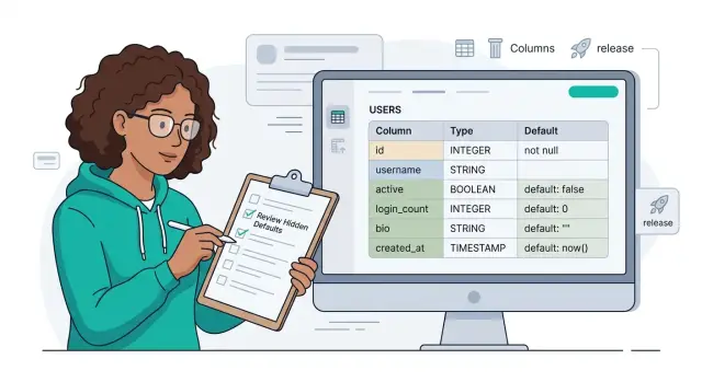
Track five things: finished tasks during the week, minutes saved per finished task, minutes spent correcting output, errors scored under the same rule each week, and review time spent by staff or managers.
Minutes saved should come from real work, not guesses made after a demo. If a support agent usually needs 12 minutes to answer a ticket and now needs 8, log 4 minutes saved. Tie that estimate to completed work so the math stays honest.
Rework needs its own line. Teams often hide it inside normal work, and that makes a pilot look better than it is. If staff rewrite half the draft, fix wrong facts, or clean up tone, count that time.
Error rate also needs a fixed rule. Pick a small set of error types and use that same rule every week. A support team, for example, might count wrong refunds, incorrect policy answers, and missing customer details. Do not loosen the standard on a busy Friday.
Review effort should stay in minutes, not a simple yes or no. A manager who glances at five answers for two minutes is doing different work from a specialist who checks every line for 40 minutes. Those minutes show whether the pilot reduces work or simply moves it to someone else.
Task volume matters too. A week with 40 tasks and a week with 400 tasks should not sit side by side without context. Compare per-task numbers first, then look at weekly totals.
When one page shows time saved, rework, error rate, review effort, and volume together, leaders can judge the pilot by operating results instead of demo polish.
Set a baseline before the pilot
If you skip the baseline, every result turns into an argument. One manager says the team got faster. Another says quality slipped. You need a clear before-and-after record so the scorecard reflects daily work, not memory.
Start with one workflow that shows up every week in roughly the same volume. Pick something common and repeatable, like processing refund requests, drafting sales follow-ups, or sorting inbound tickets. Avoid rare tasks, edge-heavy cases, or work that only spikes at month end.
Then time a sample of normal tasks before anyone touches AI. For many teams, 20 to 30 tasks is enough to smooth out odd days. Measure the full task time, and if a reviewer checks the work, measure that review time too. A process can look fast for the person doing it and still cost more if someone else spends extra minutes fixing it.
Write down what counts as an error before the trial starts. Be blunt and specific. "Wrong customer name" is clear. "Poor quality" is not. If the team keeps debating whether something counts, the rule is too loose. You can also split hard errors from minor edits so the numbers stay honest.
Use the same reviewer through the trial if you can. Review standards vary more than most teams expect. If one reviewer is strict and another waves things through, your comparison breaks.
Keep the baseline in one shared sheet that everyone can see. It does not need fancy charts. Task date, task type, time spent, review time, error count, and a short note on what went wrong are enough. That sheet becomes your control group. When the pilot starts, log AI-assisted work in the same format. If the workflow, error rules, and reviewer stay steady, you can judge the pilot on actual operating results instead of polished output on a good day.
Build the scorecard step by step
A scorecard does not need special software. A plain spreadsheet works if each row represents one finished piece of work.
Keep the first pilot narrow. Start with one team, one repeatable task, and one tool. If you test three tools across five workflows, nobody will know what caused the result. A support team answering refund emails or a sales team drafting follow-up notes is enough for the first pass.
The scorecard should capture work the same way every time. Staff should fill in the row while they do the job, not at the end of the week from memory.
A simple row can include the date, task ID, staff role, whether the task was AI assisted, start time, finish time, review minutes, rework, and final error status. That is enough to show what happened without turning the sheet into a burden.
The AI assisted field matters more than many teams expect. People switch between manual work and AI help in the same week. If you do not mark that clearly, your totals get muddy fast.
For task time, keep the rule simple. Record when the person starts the task and when they finish the first complete output. Then add review minutes after a manager, teammate, or checker approves it.
Review effort needs its own column because fast drafts can still waste time. If AI saves 12 minutes on drafting but adds 15 minutes of checking, the pilot is going backward.
Add a rework tag when someone has to make a second pass after review. A yes or no field is enough at first. If you want one more layer, note the reason in a few words, such as wrong tone, missing fact, or policy miss.
Keep error tracking blunt. Did the item go out clean, or did someone catch a real mistake? Do not argue over minor style choices. Count errors that affect the team, the customer, or the business.
At the end of each week, compare six things with the baseline: volume finished, average task time, review minutes, rework rate, error rate, and total staff hours used. That weekly check shows whether the tool helps the operation or just looks good in a demo.
A simple example from a support team
A support lead tests AI draft replies on refund emails instead of rolling the tool out to the whole queue at once. Six agents handle the same mix of refund tickets for four weeks, with similar volumes of simple returns, damaged-item claims, late deliveries, and payment disputes. That keeps the comparison fair enough to judge the work, not the mood of a busy week.
The AI writes a first draft, but agents still check every reply before sending it. On simple cases, the tool helps right away. If a customer asks for a refund within policy and the order data is clear, agents spend less time typing the same explanation again and again.
Average handling time on those simple tickets drops from about 6 minutes to 4 minutes. Rework stays low because the draft is usually close to final. Error rate barely moves, so the team gets a real win: faster replies without more cleanup later.
Disputes tell a different story. When a customer argues about fees, claims an exception, or mixes several issues into one email, the draft often sounds too confident or picks the wrong policy wording. Agents slow down, read the order history twice, and rewrite large parts of the message.
On those tickets, review effort rises from about 1 minute to nearly 3 minutes per reply. Total handling time does not improve. Some weeks it gets worse because supervisors step in to check edge cases before agents send them.
The scorecard ends up showing a split result. Simple refunds produce clear time savings with low rework. Late delivery complaints show a small gain, but only when shipment data is complete. Policy disputes show no gain and a lot more review work. Fee exceptions are slower than manual replies because agents have to be careful with the wording.
That result is useful because it is specific. The pilot does help, but only in narrow cases. The team can keep AI drafts for routine refunds, turn them off for disputes, and write stricter templates for any message that could create a policy or legal problem. That is a better decision than calling the whole pilot a success because the demo looked smooth.
How to read the scorecard
A scorecard only helps when you read the numbers together. If time saved rises but rework rises too, the pilot may not help much at all. You may simply move effort from the first draft to the cleanup stage.
A simple example makes this obvious. If a team saves 15 minutes writing customer replies, then spends 12 minutes fixing missing details, odd tone, or wrong claims, the gain is thin. Fast output looks good in a demo. It looks less impressive in daily work.
Speed should not win every argument. In sensitive tasks like refund decisions, policy explanations, or compliance notes, a small drop in errors can justify slower work. If the team spends a bit more time but sends fewer wrong answers, that can still be the right trade.
Look for pressure points
Review effort often tells the truth before the other numbers do. When leads or specialists spend more time checking AI output each week, the process has a weak spot. Usually the prompt is too loose, the source material is messy, or staff do not know where AI output ends and human judgment starts.
Separate simple cases from complex ones. If you lump them together, easy work can hide real trouble. A support team may do well with account unlocks and order-status replies, then struggle with disputed charges or policy exceptions. Those are different jobs, and the scorecard should treat them that way.
Set the decision rules before you look at the results. Expand when time saved stays real, rework stays low, and review effort does not creep up. Limit use when AI works for simple cases but slows down complex ones. Stop or redesign the process when errors stay high or managers spend more time reviewing than staff save.
The pattern matters more than any single number. A good pilot makes work easier without pushing hidden effort onto someone else.
Mistakes that distort the numbers
Bad pilot data usually comes from a loose test, not a bad tool. A neat dashboard can hide sloppy testing very quickly.
An unusual busy week is one of the easiest ways to get fake results. Ticket spikes, month-end close, a product launch, or a staff shortage can change how people work for reasons that have nothing to do with AI. You may see more output, but the team might simply be rushing, skipping notes, or delaying follow-up work.
Another problem appears when one expert handles every AI-assisted item. That person writes better prompts, spots weak answers faster, and fixes issues almost on instinct. The score then measures one strong operator, not what the wider team can repeat.
Mid-test changes can ruin the sample even when the change looks small. If you switch models, rewrite prompts, add a new tool, or change who reviews the work, you changed the system. Keep a simple log of those changes. If the workflow changes in a meaningful way, start a new count.
Volume can fool you too. Teams love to say they finished 40 items instead of 25, but that number means little if corrections doubled. Track how many minutes people spend fixing drafts, how often work gets sent back, and how many errors reach a customer or another team.
Mixed task types create another bad average. Ten easy requests and three messy cases should not sit in the same bucket. If you group simple work with exception-heavy work, the result tells you very little. Split the score by task family, or at least by complexity.
A good scorecard stays boring on purpose. Keep the week normal, spread the work across regular staff, freeze the prompt and tool, and count correction time with the same care as output. If one rule changes, note it beside the numbers. If two rules change, restart the sample.
Quick weekly checks
Weekly numbers drift for boring reasons. Someone changes the task, a manager counts errors in a new way, or the team forgets to log review minutes. Then the scorecard tells a story that is not real.
Spend ten minutes at the end of each week checking the setup before you discuss results. That small habit prevents false wins and false alarms.
- Confirm the team is still running the same task with the same start and end points.
- Check that the baseline still reflects the manual process.
- Make sure everyone logs review time under one shared rule.
- Count all errors, not only the ones customers see.
- Look at volume before you trust the trend.
Review effort usually goes wrong first. One person records only approval time. Another records approval, edits, and back-and-forth with a coworker. The second person is not slower. They are just measuring honestly.
Error counts get messy in the same way. Teams often track visible mistakes but ignore quiet fixes caught before release. That makes the pilot look cleaner than it is. If a staff member rewrites half the AI draft before it ships, count that as rework.
Sample size matters more than people want to admit. Do not trust a weekly pattern built on a tiny batch. Wait until the team handles enough normal work to smooth out unusual cases.
If one of these checks fails, flag that week and keep it out of your comparison view. A plain scorecard with clean numbers beats a polished chart built on shifting rules.
What to do after 30 days
After 30 days, drop the demo talk and look at the work. The scorecard should answer one question clearly: which tasks still save time after review, fixes, and follow-up.
Keep AI on the jobs where the gain survives real use. If a team saves 30 minutes drafting a reply and spends only 5 minutes checking it, that is a good trade. If the same task saves 20 minutes and then needs 25 minutes of edits, approval chasing, or cleanup, the pilot did not help.
Some work needs more restraint. Tasks that depend on judgment, tone, risk, or policy often look fast in a pilot and messy in production. Legal wording, sensitive customer cases, pricing decisions, and executive messaging all fit that pattern. On those jobs, AI may still help with first drafts, notes, or summaries, but people should keep control of the final call.
Before you expand usage, fix the process problems that weakened the first round. Most weak results come from the same few issues: vague prompts that produce uneven output, approvals that happen too late, missing examples of good work, thin staff training, or no clear owner for review and feedback.
Share the numbers with team leads and finance, not just the pilot group. Team leads can spot hidden review load that never shows up in a tool dashboard. Finance can compare labor saved, software cost, and any extra spend on oversight or error correction.
A simple decision rule works well after the first month. Mark each task as keep, limit, or redesign. Keep the ones with steady time savings and low error rates. Limit the ones that need heavy judgment. Redesign the ones where prompts, approvals, or training keep dragging results down.
If you want a second opinion on the numbers, Oleg Sotnikov at oleg.is can review the scorecard as a fractional CTO or startup advisor. That can help when a team has decent raw data but still is not sure where to expand, where to pause, and what to fix first.