AI fallback UX: clear recovery paths users actually use
AI fallback UX helps users recover when a model refuses, stalls, or answers badly. Route them to search, forms, or human support.
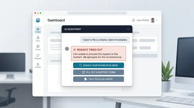
Table of Contents
Why dead ends make people quit
People can forgive one bad answer. They rarely forgive getting stuck.
When a chat tool refuses a request and offers no next step, the refusal feels random. Users do not know whether the rule makes sense, whether they asked the wrong way, or whether the app simply cannot help. That uncertainty pushes them out.
Timeouts cause a different kind of damage. A spinner that hangs for 20 seconds looks like a bug, not a delay. Most people wait a little, try again, then give up. If they lose what they typed, the second attempt feels worse than the first.
Nonsense answers are often the most expensive failure. A wrong but confident reply sends people down the wrong path, wastes time, and lands them in support anyway. Now the support team has to solve the original problem and undo the confusion.
In that moment, users usually ask themselves a few simple questions: did this break, is there a better place to do this, and do I need a real person? If the interface answers none of them, people leave.
Starting over by hand is where frustration spikes. Someone explains a problem in chat, gets a refusal or gibberish, then has to open search, find a form, retype the issue, and attach screenshots again. That feels like punishment for trying the faster option first.
A small SaaS company sees this quickly. A customer asks how to change account access for a teammate. The assistant replies with something vague, then stops. The customer opens help docs, cannot find the page, sends a support message, and pastes the same details again. One weak answer just turned a simple task into extra work for both sides.
Dead ends also damage trust in quieter ways. Even when users stay, they stop relying on the assistant for anything that matters. They save harder questions for email or phone, support volume goes up, and the chat box starts to feel cosmetic.
A failed answer is not always fatal. A failed answer with no recovery path usually is.
Name each failure before you design the fix
A failed reply is not one problem. It is four or five different problems that happen to look similar on screen. If you treat them all as a generic error, people get the same vague message whether the model refused, stalled, guessed, or lost access to a tool.
This is where fallback design often breaks. The fix starts with naming each failure in plain product terms, not model terms. A support team can work with "billing lookup failed" or "answer looks unrelated." They cannot do much with "model issue."
A simple split works in most products:
- Refusal: the model will not answer because of policy or uncertainty.
- Timeout: the reply takes too long or never arrives.
- Bad answer: the model responds, but the answer is wrong, off-topic, or confusing.
- Tool error: the model tries to use search, account data, or another system, and that system fails.
After that, decide what your product can actually detect. A timeout is easy. A tool error is usually easy too because the tool can return a clear failure. Refusals often show up through model metadata or a known response pattern. Bad answers are harder, so do not pretend you can catch all of them. Catch the obvious ones, such as empty replies, broken formatting, or answers that ignore the user's last message.
Each failure needs one safe next action. One is enough. Too many choices slow people down when they are already stuck. A refusal might send the user to search or to a short form that reframes the request. A timeout might offer retry. A bad answer might route them to a human. A tool error might open the same task in a standard form instead of chat.
Keep that action beside the failed reply, not hidden in a menu or buried at the bottom of the page. If the chat cannot help with a billing change, place "Open billing form" right there. If the model keeps drifting, place "Talk to support" in the same message bubble. The closer the exit sits to the failure, the more often people use it.
Write fallback messages people can act on
When a model fails, people want two things right away: a plain explanation and a next step. Most fallback copy fails because it sounds like a server log, or worse, like the user caused the problem.
Say what happened in normal language. "I couldn't answer that" is better than "The request could not be processed." If the reply may be wrong, say so. Short, plain wording is easier to trust when something already feels broken.
Give one main action first, then one backup option. Too many choices make people pause. If the answer might exist in your help content, the first button can be "Search help." If the issue needs a person or account access, add "Contact support" as the second option.
A solid fallback message is simple. Explain the problem in plain words, offer one clear next step, add one backup option, and keep the user's last message visible above the input box.
That last part matters more than many teams expect. If someone types a long billing question and the screen clears it after a timeout, frustration jumps fast. Keep their text on screen so they can edit it, retry, or paste it into a support form without starting over.
Keep blame out of the message. Avoid lines like "I didn't understand your request" or "Please rephrase correctly." Put the failure on the system, not on the person. "I couldn't complete that" feels calmer and more honest.
A billing example makes the difference obvious. Weak copy: "Error. Unsupported intent." Useful copy: "I couldn't confirm that charge. Search help for refund rules, or contact support for account-specific help." The second version gives people a path instead of a dead end.
The message is not filler text. It is a decision point. If someone can read it in three seconds and know what to do next, it is doing its job.
Build the recovery path step by step
Start with the job, not the chat. People open a bot because they want to finish something: update a card, find an invoice, change a booking, fix a login problem. Write down the top tasks first. If a task matters to the business or saves support time, give it a recovery path before you launch.
Next, map where the model can fail during each task. Refusals are easy to spot. Timeouts are obvious too. The harder problem is the answer that sounds fine but does not help. Mark the moments where users need a fact, an approval, or a clear next action. Those are the places where a fallback must appear fast.
A good path gives people the right exit, not every exit at once.
- Send them to search when the answer already exists and they can finish on their own.
- Use a form when your team needs account details, screenshots, or a short description.
- Route to a person when the issue is urgent, emotional, or tied to billing, access, or trust.
- Carry the chat summary into that next step so people do not repeat themselves.
That summary matters more than teams expect. If the user already shared an order number, device type, and the exact error message, keep it. Put it into form fields, attach it to the ticket, or show it to the support agent. Even a two-line summary can save several minutes and lower the chance that the user quits.
Keep the handoff narrow. If the model fails on a refund request, offer "Search billing help," "Send billing form," or "Talk to support." Do not dump six buttons on the screen. People choose faster when each option has a clear purpose.
Then test the full flow on mobile and desktop. A fallback that looks clean on a laptop can get messy on a phone. Long summaries get cut off. Buttons wrap. Forms feel longer. Run a few real tasks from start to finish and time them. If a user cannot recover in under a minute, the path still needs work.
Choose the right exit for the job
A fallback should send people to the best next step for their problem. If every failure ends with the same generic contact button, people feel stuck. The exit should match the task.
Simple factual questions usually belong in search. If someone asks about pricing rules, shipping times, password reset steps, or a feature limit, search is often faster than waiting for support. People can scan a few results and move on.
Forms work better for requests that need details. If a user wants to change account data, dispute a charge, file a claim, or report a bug, a form gives structure. You can ask for the order number, date, screenshot, and contact details in one place instead of dragging the user through five chat turns.
Some cases should go straight to a person. Do that when the issue is urgent, emotional, or risky. If someone says a payment failed before payroll, a refund is missing, or they are angry and confused, chat should stop pretending it can fix everything.
A simple rule works well: send fact-based questions to search, send updates and claims to forms, and send urgent or sensitive cases to a person.
Timing matters too. Before a handoff, show what the user can expect. "Chat with a specialist in about 3 minutes" is clear. "Email reply within 1 business day" is clear too. Silence makes people guess, and they usually guess the worst.
Let people switch paths without starting over. If they move from chat to search, keep the topic. If they move from chat to a form, carry over the summary and any details they already typed. If they ask for a person, pass along the conversation so they do not repeat the whole story.
One small rule helps a lot: match the exit to the effort. A one-line answer should not open a long form. A fraud claim should not end in search results. When the exit fits the job, the fallback feels useful instead of broken.
Example: a billing question that goes off track
A common failure looks ordinary, which is why teams miss it. A customer opens chat and asks why a recent charge looks wrong.
The model replies with a vague answer. It mentions taxes, plan changes, or usage, but it misses the account detail that actually explains the charge. Maybe there was a one-time add-on. Maybe a renewal happened on a different date. Maybe the customer sees two charges and assumes both went through.
If the app only says "Sorry, try again," most people will stop, guess, or leave annoyed.
A better move is to give the user a clear choice under the failed reply:
- View billing help
- Submit charge review
- Talk to support
Each path solves a different problem. Billing help is for quick self-serve questions. A charge review is for cases that need account checking. Support is for people who are upset, blocked, or short on time.
The review form should open half-finished, not empty. It can carry over the chat summary, order number, charge date, and the customer's last question. The user should only need to confirm details and add anything the model missed.
That small step matters more than teams expect. If a person has to retype the whole story, many quit halfway through. If the form is ready in seconds, they usually complete it.
Human handoff needs context too. When the support agent joins, they should see the original billing question, the model's weak reply, and the account detail the model failed to use. Then the agent can skip the same useless loop and check the charge right away.
In practice, this turns a messy chat failure into a short path with a clear end. The customer either finds the billing rule, submits a clean review request, or reaches a person who already knows what went wrong.
Common mistakes that trap people
Many fallback flows fail for a simple reason: they protect the system, not the user. When the model refuses, stalls, or replies with nonsense, people want one clear next step. If that step is hard to spot, most of them leave.
One common mistake is hiding the fallback in small text under the main reply. A tiny "contact us" line or a faint secondary button feels like a last resort, not a real path forward. Put the recovery option where people already look, and name it in plain words.
Another mistake is sending every failure to the same generic form. A billing issue, a login lockout, and a product question do not need the same exit. If every dead end leads to one catch-all form, users assume nobody will read it or route it well.
Teams also waste goodwill when they ask people to repeat the whole issue. If the chat already has the order number, account email, or the last two failed prompts, carry that context forward. Nobody enjoys typing the same problem three times just to reach a person.
Loops are even worse. The bot fails, suggests a new prompt, then returns to the same broken path with slightly different wording. After two rounds, users stop experimenting. They decide the tool cannot help.
Human handoff often breaks at the worst moment. Some teams block access to a person unless the user picks the "right" category or retries the bot several more times. That might save queue space on paper, but it raises anger fast. If someone hits repeated failure, give them a direct path to a human.
A billing example makes this obvious. If a user asks why they were charged twice and the assistant answers with a refund policy that does not fit, do not send them back to "ask another question." Send them to billing support with the chat summary attached.
Good fallback UX feels calm and direct. The user should see what failed, what they can do now, and how much effort the next step will take. If your fallback hides the exit, forgets context, or blocks human help, it is a trap, not a backup.
Quick checks before you ship
Run this test with a real customer question, not a polished demo prompt. Use something vague, emotional, or slightly confused, then follow the fallback path from start to finish. If the flow makes your team hesitate for even a second, users will hesitate longer.
A few checks catch most problems:
- Each error state should point to one obvious next action.
- If you send people to search, open search on the right topic instead of a blank field.
- If you send people to a form, keep the original message, account details, and any useful context.
- If you hand the case to a person, show the expected reply time in plain words.
- Track what happens after the fallback so you can see where people recover and where they leave.
The small details decide whether this works in real life. Test the flow on mobile. Test it when the user is logged out. Test it with a slow connection. Make sure the form still keeps context if the page reloads, and make sure the search result actually answers the question you routed there.
Analytics need some care too. Track the failure type, the next action shown, the action the user picked, and the final outcome. That gives you a simple view of what is working. If users often choose human support after the same model error, your fallback message or search route is probably weak.
One honest test helps a lot: ask someone outside the team to break the bot on purpose. If they can always find a sensible next step without asking you what to do, the flow is ready. If they get stuck, launch later and fix the gap first.
What to do next
Start with the failures users hit most often. Pull a week or two of bot transcripts, then sort the misses by two things: how many people saw them, and how much damage they caused. A broken refund flow matters more than a strange answer in small talk.
Keep all failure types in one view. If refusals live in one dashboard, timeouts in another, and bad answers only show up in support tickets, patterns stay hidden. Put them together so your team can see where the assistant stops helping and where people leave.
A simple scorecard is enough. Track how often the bot refuses to answer, how often it times out or stalls, how often it answers but sends people the wrong way, and what users do next: retry, search, open a form, or ask a person.
Then fix one path all the way through. Do not rewrite the whole assistant first. Pick a high-volume journey, such as billing, order changes, or account access, and make the recovery path clear from start to finish. If the bot fails, the user should land somewhere useful in one step, not after three more confusing prompts.
This is where careful fallback design pays off. A small repair on a busy path can cut repeat chats, reduce support load, and save users a lot of irritation. One clean route to search or a human often does more than a long list of prompt tweaks.
Be strict about measurement after the fix ships. Watch whether users finish the task faster, whether support gets fewer repeated questions, and whether handoffs contain enough context for a person to help without starting over.
If your team wants an outside review, Oleg Sotnikov at oleg.is works with startups and small businesses as a Fractional CTO and advisor on AI-first product, support, and automation systems. That kind of review can help when the problem is not the prompt alone, but the full path around it: routing, forms, human handoff, and the systems behind the chat.
Frequently Asked Questions
What does fallback UX mean?
Fallback UX is what your product shows when the assistant refuses, stalls, gives a weak answer, or loses access to a tool. A good fallback explains the problem in plain language and gives the user one clear next step so they can still finish the job.
Why do users quit after a failed chat reply?
People can forgive a wrong answer once, but they leave when they hit a dead end. If chat fails and the screen gives no clear next step, users assume the tool broke, cannot help, or will waste more of their time.
Which failure types should I handle first?
Start with four failure types: refusal, timeout, bad answer, and tool error. You can detect timeouts and tool errors first because they usually show up clearly, then add checks for obvious bad replies like empty output or answers that ignore the last message.
What should a fallback message say?
Write fallback copy the way a person would explain it in support chat. Say what happened in simple words, put the failure on the system, and offer one main action first with one backup option if needed.
When should I send someone to search, a form, or a human?
Send factual, self-serve questions to search when users can finish on their own. Use forms for requests that need details like account data or screenshots, and send urgent, sensitive, or trust-related issues straight to a person.
How many choices should I show after a failure?
Show one obvious action and, at most, one backup option. More buttons slow people down when they already feel stuck, and many users will pick nothing if every path looks similar.
How do I stop users from repeating themselves?
Keep the user's last message visible and carry it into the next step. If chat opens a form or routes to support, prefill the summary, order number, date, and any other details the user already shared.
What is a good fallback for billing questions?
Billing issues need a narrow handoff because the model often misses account-specific details. Give people a clear route to billing help for simple questions, a charge review form for account checks, or support when they feel blocked or upset.
How do I test whether my recovery flow actually works?
Run real, messy questions through the full flow on desktop and mobile. If someone outside your team can hit a failure and still find a sensible next step in under a minute, your recovery path is probably in good shape.
What should I measure after launch?
Track the failure type, the next action you showed, what users picked, and whether they finished the task. Watch for patterns like repeated handoffs to support after the same error, because that usually means your message or routing still needs work.


