AG Grid vs TanStack Table vs MUI Data Grid for B2B apps
AG Grid vs TanStack Table vs MUI Data Grid: compare license costs, editing effort, and performance tradeoffs for B2B dashboards.
Why this choice gets messy fast
Most B2B tables do far more than show rows. They sort, filter, edit, validate, pin columns, remember user settings, and handle bulk actions in one screen. That gets messy fast, even when the first demo looks simple.
Teams often start with the visible stuff. They compare column menus, styling, or how quickly a basic grid renders. The real friction usually shows up later, when product asks for rules like "sales managers can edit price, but only after approval" or "press Enter to move to the next invalid cell." Those details shape the build more than the visual layer.
That is why AG Grid vs TanStack Table vs MUI Data Grid is rarely a clean checklist. One team needs dense, spreadsheet-style editing. Another needs full control over rendering and already has strong React skills. A third wants something that fits neatly into an MUI app and works with little setup. Popularity will not answer any of that.
Row volume changes the decision faster than many teams expect. A table with 500 rows and light filtering can feel fine in almost anything. A table with 50,000 rows, grouped columns, live edits, and server-side data exposes weak choices quickly. Developers usually feel the pain first: messy state, awkward keyboard flow, custom validation logic, and slower delivery.
Picture an internal order screen for a distributor. Staff filter by region, edit delivery dates inline, validate credit limits, and tab through cells all day. If the grid handles display well but fights editing, the team burns weeks on workarounds before users start complaining.
The best pick depends on the product you are building now and the version you expect six months from now. If editing rules, permissions, and data volume are likely to grow, a "good enough" choice can get expensive long before anyone argues about design.
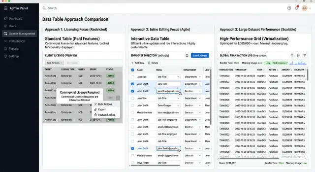
What each option is built for
These three tools can all render rows and columns, but they ask your team to make very different tradeoffs. The main split is simple: how much the library does for you, and how much you still need to build yourself.
AG Grid works best when the table is a large part of the product and users expect a lot from it on day one. Think dense B2B screens with sorting, filtering, pinned columns, grouped rows, keyboard use, bulk actions, and Excel-like behavior. You get a lot without writing every table rule yourself. The tradeoff is less freedom. Your team usually adapts to AG Grid's model, learns its API, and accepts that the grid will shape part of the UI.
TanStack Table sits at the other end. It gives you table logic, not a finished table. That changes the whole project. You control the markup, styling, cell layout, and interaction patterns, which is great when a standard grid is not enough or your product has very specific UX rules. The tradeoff is obvious: your team builds more. Menus, inline editing behavior, empty states, sticky headers, and a lot of small polish work often land on you.
MUI Data Grid is the comfortable middle option for teams already using MUI. If your app already relies on MUI forms, dialogs, and theme settings, the grid usually drops in with less friction. It feels familiar, and standard admin screens come together quickly. That makes it a practical choice for internal tools and SaaS back offices where the table matters but does not need every advanced feature on day one.
A quick way to separate them is simple. Choose AG Grid when the table itself needs deep behavior fast. Choose TanStack Table when custom UI matters more than ready-made features. Choose MUI Data Grid when your product already leans on MUI and needs a sensible default.
One detail gets underestimated all the time: table logic and table UI are not the same job. AG Grid handles more of both. TanStack Table mostly handles logic and leaves the interface to you. MUI Data Grid gives you a familiar interface and decent built-in behavior, but less freedom than a headless tool. That difference usually predicts the real workload better than any feature chart.
How to choose in five steps
Teams often test the cleanest screen in the product. That hides the real cost. In B2B apps, the hardest screen usually decides whether this choice feels simple or expensive six months later.
-
Start with your worst table, not your nicest one. Pick the screen with the most columns, the messiest filters, the most editing rules, and the most user complaints. If a grid works there, the easier screens usually fall into place.
-
Write down the facts before you compare tools. Note your row count, how often people edit data, whether they edit one cell or whole rows, and which user roles see different actions. A read-only reporting screen has very different needs from an operations screen where staff update records all day.
-
Separate what you need now from what can wait. Sorting, filtering, and pagination are common. Pinned columns, tree data, copy and paste, validation, bulk edit, and keyboard-heavy workflows change the choice much faster. If you will need those soon, count them now instead of pushing them into a vague future phase.
-
Check your design system before you fall in love with a demo. If your app already leans on MUI, MUI Data Grid may save UI work and reduce inconsistency. If you want full control over rendering and behavior, TanStack Table often fits better. If you need many built-in features quickly, AG Grid can save a lot of custom code.
-
Build a small spike with real data and one annoying workflow. Use a screen that includes filtering, editing, permissions, and enough rows to feel real. Give it a day, then compare scroll feel, edit speed, setup time, and how much code your team had to write around the grid.
Imagine a sales ops page with 10,000 rows, managers who can edit discounts, reps who can only edit notes, and finance users who need export rules. A polished demo tells you almost nothing. A short spike on that exact screen tells you a lot.
That last step saves the most time. Teams rarely regret a one-day test. They often regret choosing a grid from a marketing checklist and then rebuilding missing behavior across the product.
How licensing changes the budget
Licensing can change the budget more than most teams expect. The cheapest option on paper can cost more after a few months.
Start by separating free use from paid use before anyone builds real screens. Teams often prototype with a free tier, then discover later that row grouping, Excel export, advanced filtering, tree data, or deeper editing sit behind a commercial plan. By then, the table is already wired into forms, tests, and user flows.
AG Grid has a free Community edition and a paid Enterprise tier. MUI Data Grid has a similar split, with an MIT base and paid Pro or Premium plans. TanStack Table is MIT and very flexible, but it is headless. You do not buy a finished grid. You buy time with code.
That difference matters in a B2B app. A paid grid may look expensive at first, but it can still be cheaper than asking your team to build pinned columns, keyboard behavior, validation states, and export tools from scratch.
A basic budget check needs four answers. Which features must ship in the first release? Which of those sit behind a paid plan? How many teams, products, or internal tools will use the same grid? And how hard will it be to replace later if pricing or terms change?
The third question gets missed a lot. One product team might absorb a license fee without much pain. Three teams across sales, support, and finance can turn that same fee into a real line item. Procurement, renewals, and seat rules add friction that never shows up in a front-end estimate.
Switching later sounds easy. It rarely is. Once users depend on a table's editing model, shortcuts, filters, column sizing, and saved views, changing libraries means more than swapping components. You usually rewrite behavior, update tests, and retrain users.
If your product may spread across several admin tools, price the grid for year two, not just for the demo you need this month. That matters even more when you are comparing licensing for React data grids, because the cheaper choice today can become the more expensive one once the missing features pile up.
What editing really costs
The expensive part of table editing is rarely the input field. The cost shows up in the full path from click to save, then in everything that happens when the save fails.
A B2B team usually starts with a simple goal: change a status, fix a price, update a customer note. A week later, they also need validation, unsaved change warnings, role rules, retry logic, and a clear error message when the API rejects the update.
AG Grid often gives you more out of the box for editing-heavy screens. TanStack Table gives you more freedom, but you build much more yourself. MUI Data Grid sits in the middle for many teams, though the real effort still depends on how custom your workflow is.
Count the whole edit flow
Map each step before you pick a table. If you skip this, the demo looks easy and the real work lands in your app code.
Ask your team to test the full set of common cases: one-cell edit with instant save, full-row edit with cancel and revert, bulk updates across many selected rows, validation rules that depend on other fields, and server errors, slow saves, or conflict states.
That last part matters more than people expect. If two sales ops staff edit the same row, what does the user see? If a field accepts only approved values, where does that rule live - in the cell editor, the form state, or the API response?
Fast editing needs keyboard support
Mouse-friendly editing is not enough for back-office work. People who update 200 rows a day want Tab, Enter, Escape, arrow keys, copy and paste, and predictable focus after every save.
This is where custom builds get expensive. TanStack Table can support fast workflows, but your team has to wire much of that behavior. AG Grid usually reduces that work. MUI Data Grid can be a practical middle ground if your editing needs stay fairly standard.
Custom editors add another layer. A date picker, async select, currency field, or multi-step approval input each brings form logic, validation, edge cases, and tests. A table choice that saves two days at setup can still cost three extra weeks once your product manager asks for "just one custom editor" in six columns.
If editing is central to the product, count engineering hours around save states and keyboard flow, not just how nice the table looks in a demo.
Where performance starts to matter
Performance problems rarely show up in the first demo. They appear when your table has the row counts your team actually works with, plus real filters, custom cells, bulk actions, and inline editors. A grid that feels instant with 200 sample rows can feel clumsy with 12,000 customer records.
Start with your real numbers. How many rows load on a normal day? How many columns stay visible? How often do users sort, filter, edit, and jump between pages? In many B2B tools, the trouble starts less from raw row count and more from what each row needs to render.
AG Grid usually holds up well when you push large tables hard, especially if you need grouping, pinned columns, heavy interactions, and lots of built-in behavior. TanStack Table can also feel fast, but it gives you parts, not a finished grid. That means performance depends on how your team builds cells, memoizes state, and wires virtualization. MUI Data Grid often feels fine for standard admin screens, but complex custom renderers and frequent edits can make slow spots easier to notice.
A simple test beats guesswork. Load the row count your users really have. Sort and filter columns with custom cells. Scroll quickly while menus, tooltips, or editors are open. Edit several rows in a row and watch for input lag.
Custom cell renderers are where many teams get surprised. A status badge, dropdown, avatar, and action menu in every row look harmless until someone scrolls through 8,000 records. Then each extra component adds work. If your users open menus and editors all day, measure that path first. Smooth scrolling alone is not enough.
Server-side pagination starts to make sense when the browser holds too much data or when filtering and sorting already depend on network-backed data. Virtualization matters earlier than many teams expect, especially if rows are tall or cells do more than print text. If you already know the table will grow, plan for that from day one. Rebuilding the table layer later is a slow, annoying job.
A simple B2B example
Imagine a sales ops team working in one table all day. Each row is a customer account. Columns show account name, region, account owner, deal stage, renewal date, health score, and an internal notes field. Reps filter by region, managers keep the first columns visible while they scroll, and everyone exports slices of data for weekly reviews.
This screen looks simple until people use it for six hours a day. A read-only list can hide a lot of weaknesses. Once users update stages, add notes, sort by renewal date, and expect each change to leave a clear audit trail, the differences show up quickly.
With AG Grid, this setup often feels complete sooner. Column pinning, strong filtering, export options, and serious cell editing already fit the product. If the team wants a table that behaves more like a spreadsheet, AG Grid can save a lot of custom work. The tradeoff is setup complexity, plus license cost if you need the advanced features.
TanStack Table works well for the same screen when the team wants full control over behavior and design. You can shape filters, editors, and row actions exactly how the product needs them. That freedom has a price. Someone still has to build the editing flow, export behavior, pinned columns, keyboard support, and the small details that make daily use feel smooth.
MUI Data Grid sits between those two. It usually gets a React admin screen moving faster than TanStack Table, and the basic experience feels familiar to many teams. But a busy sales screen can outgrow the free tier quickly. More advanced editing, broader export needs, and heavier use tend to push teams toward the paid version.
This comparison gets much easier when you picture one screen like this. If people mostly scan, filter, and open a detail page, a lighter setup can work fine. If they live inside the table and make hundreds of small edits every day, the table stops being a simple component. It becomes part of the product, and weak choices start costing time every week.
Mistakes that waste time later
Teams often start with comparison charts. Charts hide the expensive part: your actual screen. A grid can look perfect on paper and still slow the team down once filters, bulk actions, permissions, validation, and odd business rules show up together.
Build one real page before you commit. Use the messiest screen you expect to ship, not the clean demo table with ten columns and read-only rows. If the grid feels awkward there, the problem usually gets worse after three more requests land.
A common mistake is treating editing as a small add-on. Read-only tables are easy to demo. Editing is where time disappears. Inline validation, dirty states, keyboard flow, save conflicts, dependent fields, and role-based rules can turn a "simple" table into a mini app.
Teams also waste time when they separate license price from development cost. That math is incomplete. A paid grid can cost less overall if it saves two weeks of custom work and cuts future maintenance. A cheaper option can become the expensive one if developers spend sprint after sprint rebuilding features the product team assumed were already there.
Team fit matters more than most comparison posts admit. A headless tool can frustrate a team that needs built-in editing, resizing, and enterprise behavior right away. A heavier grid can feel restrictive if the team already has strong table patterns and wants full control. And the first workflow to test is the editing flow, not the first read-only screen.
A small B2B admin screen makes this obvious. A customer table looks harmless until sales wants inline status changes, finance wants locked fields, support wants bulk updates, and managers want exports that match current filters. That is when a fast decision turns into rework.
The safer move is less exciting and much more useful: prototype the real workflow, count the custom behavior, and ask who will maintain it six months later. That answer usually points to the right choice faster than any feature chart.
Quick checks before you commit
The decision gets much clearer when you stop comparing demos and build one real screen. Pick the hardest table you expect to ship soon, maybe an orders view with filters, bulk actions, inline edits, validation, and fast keyboard use. If your team cannot get that screen working in a few days, the choice is already telling you something.
A short trial usually exposes the parts that sales pages hide. Ask one developer to build the first serious table from scratch, not a toy example. Ask two non-developers to try editing cells, tabbing across rows, fixing validation errors, and saving changes. Then estimate the cost again after adding the paid features you will probably need six months from now, and ask who will maintain the grid when the person who built it is on vacation.
Speed matters early. A grid can look good in a polished demo and still fight your team in daily work. If column setup, sorting, editing rules, and server-side data take too much custom code, you will feel that drag on every new screen.
Editing is where many teams make a bad call. Simple read-only tables rarely stay simple in B2B apps. Users want paste support, row validation, undo, keyboard flow that feels normal, and clear error states. If those basics feel awkward in testing, they will feel worse once the table holds real business data.
Price can also change shape later. A tool that looks cheap on day one may get expensive once you need advanced editing, grouping, export, or enterprise support. The reverse is true too: a paid grid can be cheaper if it saves two weeks of custom work every quarter.
The last check is team ownership. If one specialist becomes the only person who understands the grid, you have a maintenance problem. The safer choice is often the one that a second developer can read, fix, and extend without a long handover.
What to do next
Do not roll a grid choice across the whole product after a nice demo. Test it on the messiest screen you have. Use the workflow with bulk edits, validation rules, sticky columns, role rules, and enough real rows to make the UI sweat. A short trial on that screen will tell you far more than a week of opinions.
Use a small scorecard so the team compares the same things. Build one real workflow, not a toy table. Measure edit speed, render lag, and developer time. Note which features need a paid license or extra custom code. Then ask one product person and one engineer to score the result.
When the trial ends, write down why you picked it. Keep it to half a page. Future teammates should be able to see whether you chose based on licensing, editing depth, team familiarity, or performance under load. That note saves time six months later, when someone asks why one grid won and another did not.
This decision also needs a review date. Row counts grow. Editing rules get stricter. A simple admin screen can turn into an operations tool with approvals, audit trails, and heavy inline editing. When that happens, the tradeoff changes. This is rarely a one-time choice you never revisit.
A good trigger for review is easy to spot: the table gets much larger, users start editing several fields per row, permission rules become more complex, or the team begins adding workarounds just to make the grid fit.
If this choice will affect product architecture, delivery speed, or cost, an outside review can help. On oleg.is, Oleg Sotnikov offers Fractional CTO advice for startups and smaller teams that need help with product architecture, infrastructure, and AI-first development workflows. A short review is often cheaper than rebuilding table logic after the wrong choice reaches production.
Frequently Asked Questions
Which grid is usually best for heavy inline editing?
If users spend hours editing inside the table, start with AG Grid. It usually gives you tab flow, pinned columns, validation hooks, and spreadsheet-like behavior with less custom code than a headless setup.
When does TanStack Table make more sense than AG Grid?
Pick TanStack Table when your UI rules matter more than built-in grid features. It fits teams that want full control over markup, styling, and cell behavior and accept that they will build more themselves.
Is MUI Data Grid enough for most admin screens?
Often, yes. If your app already uses MUI and the table mostly needs sorting, filtering, selection, and standard editing, MUI Data Grid gets you moving fast with less setup.
Are the free versions enough for a production B2B app?
Sometimes for simple read-only or light-edit screens, but many teams hit paid limits once they need grouping, export, tree data, or richer editing. Check license boundaries before you wire the grid into forms and tests.
How many rows should I test before choosing a grid?
Test the row count your users actually see, not a tiny sample. A table with 200 rows can feel fine almost anywhere, while 10,000 rows with custom cells and filters can expose lag, awkward state, and slow editing fast.
What is the fastest way to compare these tools?
Build one ugly, real screen in each tool, or at least in your top two choices. Use real data, one annoying workflow, and one day of effort, then compare edit speed, scroll feel, and how much code your team had to write around the grid.
Why does table editing take so much longer than expected?
Because the hard part is not the input field. Teams spend time on validation, save errors, dirty states, permissions, keyboard flow, conflict handling, and custom editors like date pickers or async selects.
When should I move sorting and pagination to the server?
Move that work to the server when the browser starts holding too much data or when filters already depend on backend rules. If users work with large datasets, live edits, or saved views, server-side data usually keeps the screen simpler and faster.
Is switching grids later really that hard?
Usually, yes. Once users depend on shortcuts, column sizing, saved views, and edit behavior, a swap means code changes, test updates, and user retraining, not just a new component.
What should I write down before I commit to one grid?
Keep a short note with your row counts, editing rules, license needs, design system constraints, and why the winning tool matched your hardest screen. That note helps when the table grows or a new developer asks why you chose it.