Admin panel design for safer money and record changes
Admin panel design for teams that change money or records: warnings, staged confirmations, and audit trails that prevent costly operator mistakes.
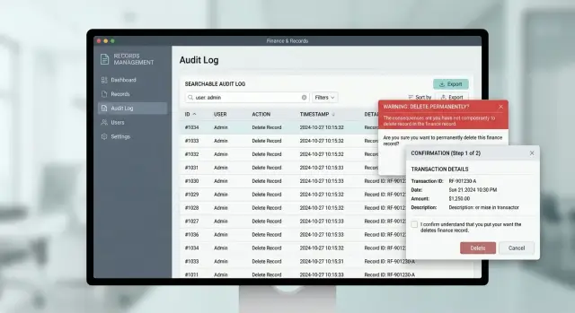
Table of Contents
Why these screens fail under pressure
Operators do not use admin screens in calm, perfect conditions. They work through queues, answer messages, switch tabs, and handle the odd cases automation could not solve. Speed matters, so people lean on pattern recognition. They scan for the familiar button, the familiar amount, the familiar customer name, and click fast.
That is where weak design starts to hurt. In a normal app, a vague button is annoying. In a finance or records screen, the same vague button can issue a refund, overwrite a balance, cancel an order, or lock a customer out. A label like "Update" or "Submit" tells the operator almost nothing when the action has real consequences.
Names and numbers blur together under pressure. Two customers may share a last name. Two invoices may differ by one digit. A support agent who means to fix record A can easily open record B when the layout puts similar items side by side and does little to separate them. That is not carelessness. The screen asks people to spot tiny differences while moving quickly.
Hidden side effects make things worse. An operator may think they are correcting one field, but the system also triggers a payout retry, changes a ledger status, or sends a customer email. A small fix turns into a bigger mess. Now someone has to undo several changes, explain what happened, and hope no money moved twice.
Teams often blame training, but training cannot fix a confusing screen. People forget steps when the desk gets busy. They take the shortest path that seems safe. Good admin panel design accepts that reality and makes the risky path feel clearly different from the routine one.
When a team moves money or edits formal records, safety depends on tiny details: button text, spacing, visible record context, and clear cause and effect. Get those details wrong, and even skilled operators will create errors while trying to fix them.
Make risky actions obvious
Do not hide danger behind vague buttons. If an action changes money, deletes data, or updates a legal record, the label should say exactly what happens. "Refund payment" is safer than "Submit." "Delete customer record" is safer than "Save changes" when the action is permanent.
Routine edits and high risk actions should not sit in the same visual zone. Keep everyday work like updating a phone number or adding a note near the main form. Move destructive actions to a separate area with more spacing and a stronger visual treatment, so an operator does not hit them while working fast.
Context near the button matters as much as the button text. Show the amount, account name, last four digits, invoice number, or record ID right beside the action. A support agent should not need to scan the whole page again to check what they are about to change.
A short line such as "Refund $842.15 to card ending 1842" prevents a lot of bad clicks. The same applies to record work. "Archive patient file #A-44721" is much safer than a generic archive button on a crowded page.
Duplicate actions also cause trouble. If the screen has one refund button in the header and another at the bottom, people start to wonder if they do the same thing. Sometimes they click both. Keep one clear action for one result. If you need fast access, make the page easier to scan instead of repeating controls.
People under pressure do not read every word every time. They scan, recognize patterns, and act. Clear labels, better spacing, and visible identifiers cut the chance of a costly mistake without slowing experienced operators down.
Write warnings that help people decide
A warning on a risky screen has one job: help someone make the right call in a few seconds. "Are you sure?" does not do that. By the time people see it, they already think they are right.
Warnings should work as decision support, not decoration. The text should name the action in plain words, show the exact record or payment involved, and spell out the result of clicking the button.
If money moves right away, say that. If the system will lock a record, cancel an invoice, notify a customer, or change a balance, say that too. Operators should not have to guess what happens next.
A useful warning usually answers four questions:
- What changes now?
- Can the change be undone?
- Who or what does it affect?
- What side effects happen immediately?
That difference sounds small, but it changes behavior. "Delete record?" is vague. "Delete vendor record #4821 now. This removes saved bank details and breaks the next payout run until a new record is added" gives someone a real reason to pause.
Final actions need blunt language. Skip soft phrases like "may affect data" or "this could have consequences." If the action is final, write "You cannot undo this after confirmation." If only part of it is reversible, name that part.
Scope matters just as much. People take more care when they see the blast radius. "Suspend account" is thin. "Suspend account for Northwind Imports. All 12 users will lose access now, and scheduled exports will stop" is much harder to misread.
Specific wording also helps new staff. A tired support agent can still judge a warning that says, "Refund $420 to invoice #1842 now. The customer will get a refund email today. You cannot cancel this after submission." That is far safer than a generic popup with two buttons.
Warnings do not need drama. They need facts. If one sentence can stop a duplicate refund or the wrong record edit, it earned its place on the screen.
How to build a confirmation flow
Start by naming every action that can cause loss, confusion, or cleanup work. Teams often focus on delete buttons, but the bigger risk may be a partial refund, a balance adjustment, a record merge, or an edit to a settled transaction. Any change to money, account history, or formal records deserves a short pause.
A simple way to sort risky actions:
- money changes staff can undo
- money changes nobody can reverse
- record edits that affect reporting or compliance
- bulk actions that can hit many users at once
- permission changes that let the wrong person act later
When an operator clicks one of these actions, show a short warning first. Skip the legal essay. Say what will change, who it affects, and whether the team can undo it. "Refund $240 to card ending 4242. This cannot be reversed" is clear. A long block of text gets ignored.
Most actions need one direct confirmation step. Confirm the exact action, not a vague prompt like "Are you sure?" A button label such as "Confirm refund of $240" works better because it forces a quick mental check before submission.
Use a second step only when the action is permanent or very costly. That extra step should add a little friction, not a puzzle. You can ask the operator to type REFUND, re-enter the amount, or pick a reason from a short list. Save this for actions that can lose real money or remove records for good. If you put two-step confirmation on routine work, people stop reading and click through by habit.
After submit, show the result right away. Tell the operator if the action succeeded, failed, or is waiting for approval. Then show the next useful move, such as viewing the updated balance, adding an internal note, or retrying with corrected details. That last screen prevents duplicate clicks and keeps a small mistake from turning into a bigger one.
Keep an audit trail people can use
Treat the audit trail as part of the job, not a hidden log for later. When money or records change, support staff need to see the full story fast. If they have to open three screens and guess what happened, the log failed.
Each entry should answer four basic questions in one view:
- Who made the change?
- When did they make it?
- Where did the action come from?
- What changed?
"Where" does not need to be fancy. In many teams, it is enough to show whether the action came from the admin panel, an API token, a scheduled job, or a known office IP label. That alone helps separate a human mistake from an automated rule.
The before and after values should sit side by side. If an operator edits a payout amount, billing status, or customer name, show the old value next to the new one in the same row. People spot errors much faster when they can compare both values at a glance.
Manual overrides need a reason every time. A blank text box works, but a short preset list often works better for busy teams. Reasons like "duplicate charge," "bank rejection," or "verified with customer" make the log easier to scan later. Free text can add detail when needed.
Search decides whether the audit trail helps or slows people down. A support agent should be able to search by user name, account ID, payment ID, and time range without learning a complicated query tool. If a customer says, "my refund changed around 3 PM," the agent should find that event in seconds.
Picture a common case. A support rep fixes the wrong refund amount during a rush. Later, finance checks the case and sees the rep's name, the exact time, the source, the old amount, the new amount, and the note that explains the override. Nobody has to ask around in chat or make a second risky edit.
If the trail lets a tired operator answer "what changed?" in ten seconds, it is doing its job.
Give operators a way to recover
People make worse decisions when a screen leaves them with one bad choice: commit now or block the customer. Good admin panel design gives staff a safe way to pause, undo, or ask for help.
If a change is easy to reverse, offer a short undo window right after submission. This works well for actions like changing an email address, reopening a ticket, or fixing an internal note. A simple "Undo for 30 seconds" message often works better than a heavy confirmation box before every click.
For money movement or record edits with wider impact, do not push changes live the second someone presses save. Put them in a pending state first. That gives the operator a moment to review the summary, lets another person approve it when needed, and gives the system time to run basic checks.
A recovery path should stay visible on the same screen as the action history. If an operator refunds the wrong payment, they should not dig through three menus to fix it. They need to see what changed, who changed it, when it happened, whether the action can still be reversed, and who can approve a correction.
Some cases should never depend on one person making a fast guess. If the amount is large, the account is locked, or the record touches a closed period, give staff an "Escalate" option right next to the action controls. People under pressure will click something. It is better to give them a clear handoff than force a risky choice.
A busy support desk makes this obvious. An agent spots a duplicated payout five minutes after submission. The best screen lets them freeze settlement, add a short reason, and send it to finance review in one place. That stops the second mistake, which often happens when someone tries to fix the first one too fast.
Corrections should create new entries, not erase old ones. Keep the original action, the reversal, and the reason together. When staff can see that full chain, they can fix problems quickly and leave a record other people can trust.
A payment correction on a busy support desk
This is where admin panel design proves itself. An agent has six chats open, a phone call on hold, and a customer asking why a payment still looks wrong. They search by email, click the first match, and land on the wrong customer record.
The page should not hide the risk. It should put three facts near the action button: the customer name, the amount about to change, and the last four digits tied to the payment method. That small block takes a second to scan, but it gives the agent something solid to compare against the support ticket.
The ticket says Maria S., refund $180, card ending in 4421. The screen says Marina S., refund $180, card ending in 4412. Under pressure, people often notice only the amount. A good screen makes the other details hard to miss.
When the agent clicks "Correct payment," the system should not jump straight to save. It should open a staged confirmation with the same details repeated in plain text and ask the agent to confirm the last four digits before the change goes through. That extra step is short, but it catches the mismatch. The agent stops, closes the dialog, and searches again.
This works because it asks for a real comparison, not a blind "Are you sure?" click. Generic confirmations become background noise after a week. A specific prompt forces the agent to look back at the case and the record.
The follow-up should stay just as clear. The audit log should show that the agent opened Marina's account, started a payment correction, canceled at confirmation, then completed the correction on Maria's account two minutes later. A team lead can review the case without guessing. The customer gets a clear answer. The agent fixes the problem without creating a second one.
Mistakes that make errors worse
Bad screens rarely fail in a dramatic way. More often, they nudge tired staff into small mistakes. On a busy support desk, one wrong refund, one edit to the wrong account, or one duplicate correction can create hours of cleanup.
One common mistake is hiding the record ID until the final step. Operators often work from a ticket number, invoice number, or account reference. If the screen keeps that detail out of view, people rely on memory and names that look similar. Keep the record ID visible from start to finish, especially near any action that changes money or legal records.
Button styling causes trouble too. If "Save note" and "Reverse payment" share the same color and weight, the screen tells the user they carry the same risk. They do not. Safe actions should look calm and routine. Risky actions should look different enough that a rushed operator pauses for half a second and reads.
Too many confirmations create a different problem. Teams add popups to every action because that feels safer. After a week, staff stop reading them. They click "Confirm" by habit, even when the action really is dangerous. Save friction for the moments that deserve it, such as deleting a record, changing a payout amount, or overriding a lock.
Locks can turn into traps as well. If a record suddenly becomes read-only and the screen does not say who locked it or why, the next person guesses. They may open a second ticket, edit a duplicate record, or ask engineering to unlock everything. A short note solves much of this: who locked it, when, and what task they were doing.
Logs fail in quieter ways. Many teams record every event, then bury those events in a wall of text nobody can filter. That is not much better than having no log at all. A support lead needs to search by record ID, user, action type, and time window in seconds, not minutes.
A simple rule helps: every safety control should answer one operator question fast. Am I in the right record? How risky is this action? Why can't I edit this? Who changed it? If the screen does not answer those questions, the control adds stress instead of safety.
A quick review before release
Before release, ask one blunt question: can a tired operator make a risky change without guessing? If the answer is yes, the screen is not ready.
Run this review on every action that moves money, edits records, deletes data, or changes account access. Small wording problems cause real damage on these screens.
- Read every risky button label out loud. It should name the exact target, not a vague action like "Submit" or "Confirm." "Refund payment #18427" is clear. "Process refund" is not.
- Open every warning and check whether it explains the result. People should know what changes, who sees it, and whether they can undo it.
- Compare the confirmation text with the action text. If the button says "Reverse transfer," the dialog should say "Reverse transfer for invoice #18427." It should not switch to softer language like "Continue."
- Trigger one test change and inspect the audit entry. It should include who made the change, what changed, when it happened, and a reason someone can search later.
- Ask a teammate to make a mistake on purpose. They should see how to fix it without asking support, reading a long guide, or making a second risky edit.
The audit entry matters more than many teams think. Six weeks later, nobody remembers why a balance changed by $72. A useful record says, "Ava Patel changed payout from $480 to $408 for vendor Northwind at 14:32 UTC. Reason: duplicate fee correction." That gives support, finance, and engineering something they can use.
Recovery should be just as clear. If a person can void a payment, they should also see whether they can reissue it, reopen the record, or ask for approval to repair the mistake. Hidden recovery paths turn one bad click into a long incident.
If even one of these checks fails, fix the screen before release. Cleanup after launch usually costs more, and the operator who gets blamed is often the person who had the worst interface.
What to do next
Start with one screen that can cause real damage. Pick the page where staff can change a payment, edit a customer record, reverse a charge, or close a case. If a wrong click can cost money or create a long cleanup, start there.
Map every action on that page. Write down what the operator can do, what data changes, who feels the effect, and whether the action can be undone. This simple pass usually reveals weak spots faster than another design review.
Then run one real task with the people who use the screen. Ask a support or finance teammate to handle a normal correction while you watch. Do not explain the flow. Watch where they stop, reread, or guess. That is where the screen needs better warnings, a clearer reason field, or a safer recovery path.
A short review usually covers enough:
- Mark actions that move money, overwrite records, or remove access.
- Check whether each risky action has a clear warning before it happens.
- Check whether the person must give a reason when the change needs later review.
- Check whether the team can undo the action or repair it without a manual back office scramble.
You do not need a big redesign to get safer results. Often the fix is small: rename one button, add a balance impact note, require a reason, split one dangerous action into two steps, or make the audit history readable enough for support to trust it.
If your team handles payments or sensitive records every day, an outside review can help before errors pile up. Oleg Sotnikov at oleg.is works with startups and small businesses as a fractional CTO and advisor, and a second technical opinion on approvals, audit trails, and recovery paths can catch problems early.
Frequently Asked Questions
Why are vague buttons dangerous in admin panels?
Because people scan and click fast when work piles up. A label like Submit or Update does not tell them if they will save a note, send money, or lock an account. Say the exact action instead, like Refund $240 or Archive record #4821.
What details should I show near a risky action?
Put the amount, customer or account name, and a unique identifier right next to the action. Last four card digits, invoice number, or record ID help people catch lookalike names and near-match records before they click.
What makes a warning actually useful?
Write warnings that help someone decide in a few seconds. Name the exact action, the exact record, what changes now, and whether anyone can undo it. If the action also sends an email, changes a balance, or stops access, say that plainly.
When should I use a two-step confirmation?
Use one direct confirmation for most risky actions. Add a second step only when the action is permanent, expensive, or hard to repair. Typing REFUND or re-entering the amount works well for those cases because it forces a real check.
Is an undo option better than a confirmation popup?
For small, easy-to-fix changes, yes. A short undo window often works better than a popup before every click. For money movement, settled transactions, or formal records, use a pending state or approval step instead of a simple undo.
What should an audit trail include?
Keep it simple and searchable. Show who made the change, when they made it, where it came from, and the before and after values. If staff can add a reason for manual overrides, finance and support can sort out mistakes much faster.
How do I stop people from editing the wrong record?
Keep the record context visible from start to finish. Show the record ID, customer name, and other identifiers on the page and inside the confirmation dialog. If two records look similar, ask the operator to confirm one detail, such as the last four digits, before you apply the change.
What should I do with large or sensitive changes?
Give staff a safe handoff. Add an Escalate option, let them freeze or pause the action, and show who can approve the fix. That beats forcing one person to guess under pressure and then clean up a bigger mess later.
What design mistakes make errors worse?
Do not style safe and dangerous actions the same way. Do not repeat the same action in multiple places. Skip generic popups on every click, because people stop reading them. Also, never hide locks or action history behind extra screens when someone needs to fix a problem fast.
How can I review a screen before release?
Run one real task with a support or finance teammate and stay quiet while they use the screen. Watch where they hesitate, guess, or miss record details. Then check the button text, warning text, confirmation step, audit entry, and recovery path before you ship.


